A survey by advertising agency MGH found that 77% of restaurant-goers visit a restaurant’s website before dining in or ordering out. Want to give your audience a taste of what your establishment offers? You’ll need to nail your restaurant’s website design.
A “slice” of “aged” great user experience…
A “handful” of mouth-watering visuals…
And all the thoughtful touches that will make your site feel like an extension of your in-house dining experience. We know these are the ingredients that will turn every website visitor into a future diner.
But putting together a sensational design isn’t easy. It’s hard to figure out what approach to take. And delivering a professional and “appetizing” look requires an expert hand.
To help you get started, we’ve put together this master list of the coolest restaurant website design examples in 2022. Read on to learn the most important DOs to attract visitors.
We’ll also reveal the top DON’Ts you should avoid and answer common questions on modern restaurant website design.
The Dos: Amazing Restaurant Web Design Examples
Great food meets great design. The following are some of the most impactful website designs in the industry.
We’ve grouped them by their top features. Stunning background image. Genius color scheme. Smooth-sailing layout. Attractive interior photos. These are the DOs you want your designer to include.
We’ve also outlined each site’s cool design features so you know why each one is effective at enticing diners. Let’s take a peek, shall we?
1. Intriguing background image or video
Crown Shy
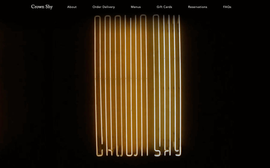
What makes the Crown Shy website unforgettable is the dramatic background images. The homepage is the best. It evokes an upscale NYC vibe, making the design an exact match for the brand.
Other cool features include the following:
- The overall design is clean and uncluttered, helping the user focus on the essential.
- With a healthy use of contrast, navigating the site feels effortless.
Petrossian
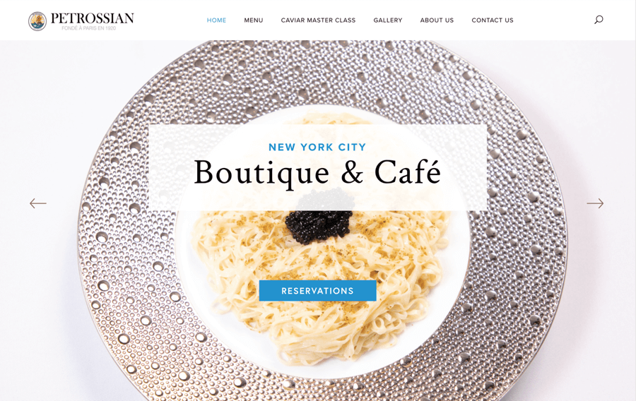
Delectable background images make the Petrossian website irresistible. It’s almost as if you can taste the flavors and feel the textures of the food.
What we also like about this design:
- The high-level photography signals the passion the owners of this boutique restaurant have for their craft.
- The bright, airy visuals create a welcoming feel. Perfect for a downtown café.
Dirt Candy
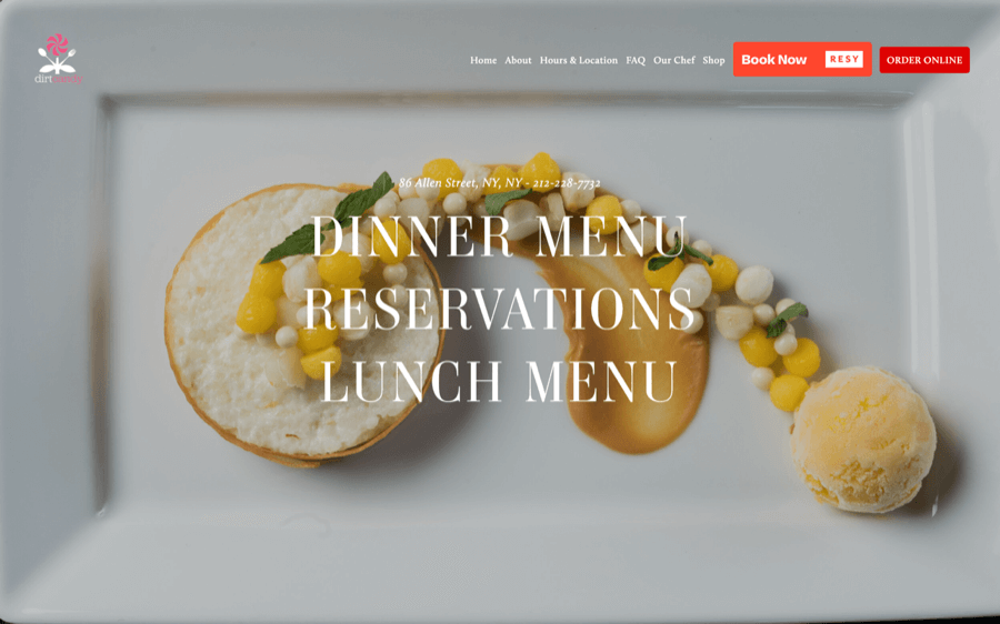
The Dirt Candy website is a careful mix of simple and strange. The high-resolution photography mesmerizes. Seriously, you can’t unsee this stuff. Tomatoes, cabbage, squash, and peas – Dirt Candy turns everyday veggies into fascinating art.
We also liked:
- The designer takes the curiosity up a notch with unusual typography.
- The CTAs, or calls to action, are very pronounced. This beckons the visitor to explore further.
Usha Foods
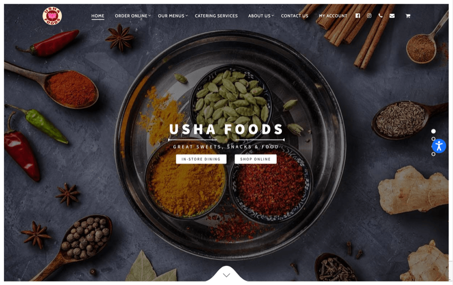
The home page image for Usha Foods says it all. Bright colors. Traditional spices. Authentic ingredients. You feel comforted and intrigued at the same time.
Also noteworthy about this website design example:
- The evocative background contrasts with the white navigation, which adds to the user experience.
- The homepage image does a nice job conveying the traditional style of this NYC caterer.
2. Brilliant use of color scheme
Rezdora
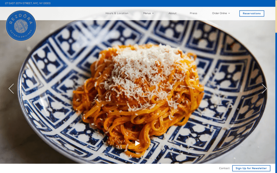
The designer for the Rezdora website uses a tried-and-true blue with earthy pastels. This creates a sense of ease and airiness.
Here’s what makes this use of color so effective:
- Consistency: Even the photos of the dishes feature similar colors — pinks, spring green, golden yellows.
- This attractive color palette is both inviting and stylish without feeling overwhelming.
Gramercy Tavern
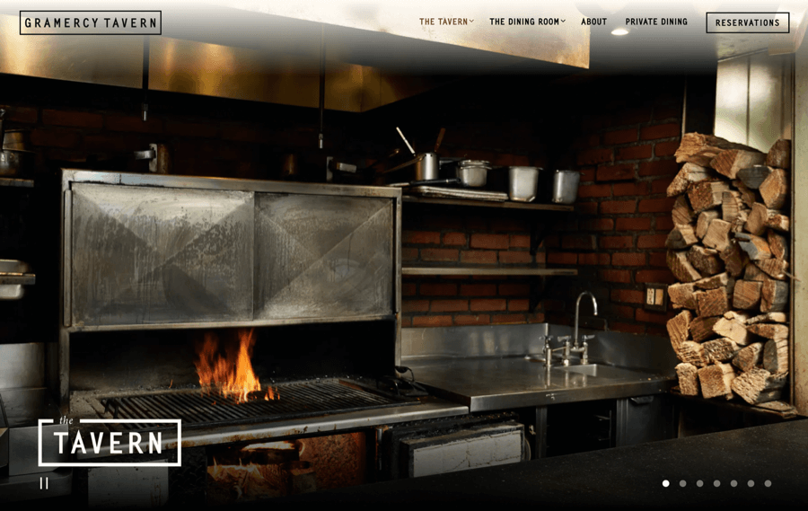
Gramercy Tavern is one of the best web design examples that harmonize color with light and shadow. It’s a smart combination of vivid imagery and crisp typography.
These are some of the other cool features we love:
- The photography is very atmospheric. You can imagine yourself eating here.
- But you still don’t get lost in the images – with the black and white contrast, you don’t lose the ease of navigation.
Dhamaka
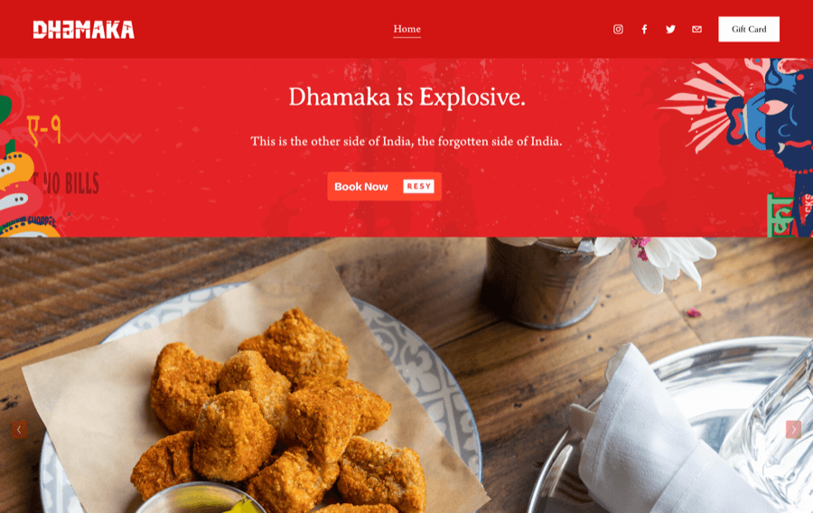
This is definitely a bucket-list restaurant. Bright red frames gorgeous photos of Indian cuisine and a colorful interior. The bold choice of color says it all. Dhamaka serves up “unapologetic Indian” cuisine.
Here are some of the other cool features we love:
- It’s not just the red. From the spunky logo to the colorful illustrations, the design is energizing all the way through.
- Dhamaka wasn’t afraid to put their menu over a fiery red background – no one does that.
Don Angie
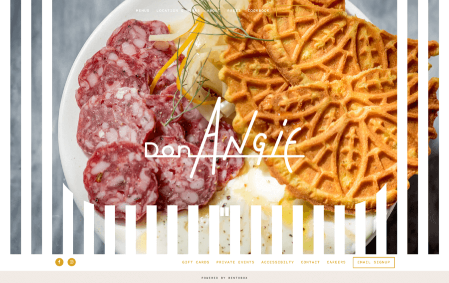
It’s hard not to fall in love with this small restaurant design. Don Angie is a charm in the city.
Interesting colors and textures. A menagerie of shapes and fonts. There are dozens of noteworthy Italian restaurants in New York City, but this one stands out like a heart-warming friend you can’t wait to catch up with.
Other winning design choices for this site are:
- The creative logo with tons of personality.
- The storytelling through photos. Both of these features add layers of depth to the brand.
3. Well-structured layout
Adda
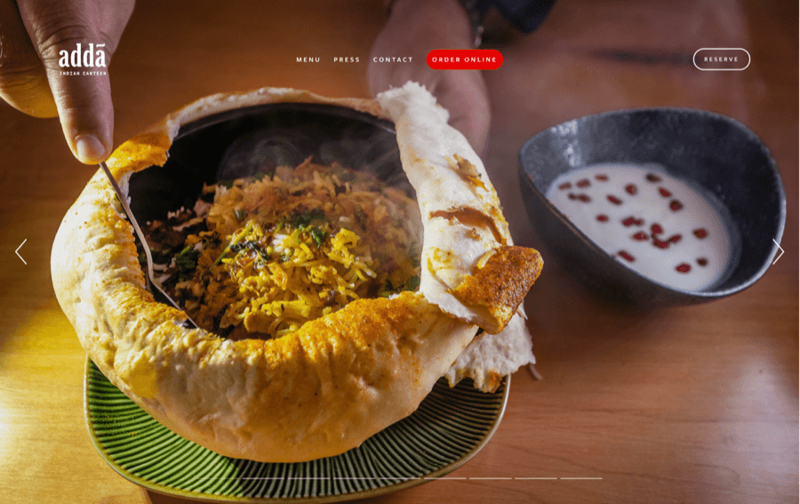
Adda achieves the gold standard for design layout. Even a first-time customer would have no problem moving through the natural flow of the site, from discovery and consideration to order online or reserve a table.
We also liked how:
- The site uses a large number of categories and pages. But with a clear structure, it’s still easy to navigate.
- The use of light and shadow creates the effect of delicious food in your face. Yum!
Oxomoco
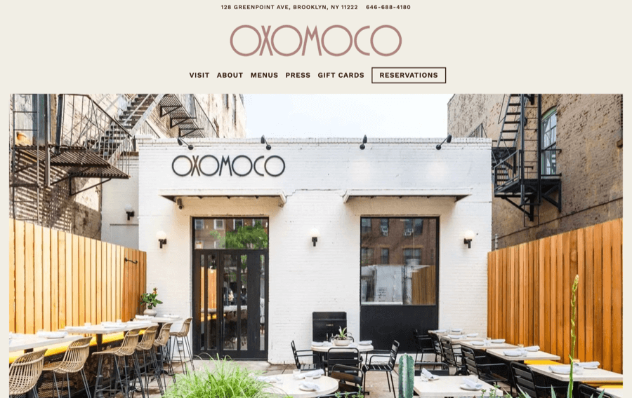
Oxomoco uses a basic structure. Everything you need is on the first page. This simplicity makes it easy to get acquainted with all the essentials before leaving the site.
Other cool features we love:
- The neutral color palette complements the minimalist feel of the structure.
- With the site’s muted background, the food photography draws the eye.
Olmsted
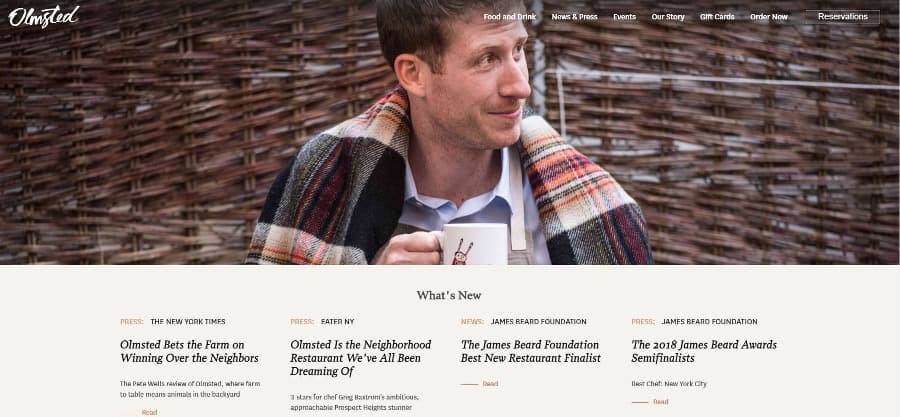
You’ll notice the reviews are front and center on the Olmsted website. Neighborhood-friendly. Animals in the backyard. And award-winning. What else do you need to know?
Why this works:
- The layout definitely builds trust. The down-to-earth depiction of the chef in the main image builds it even more.
- The designer also did a great job of ensuring smooth navigation. Quite a feat, considering how much information is on the site.
The Freakin Rican
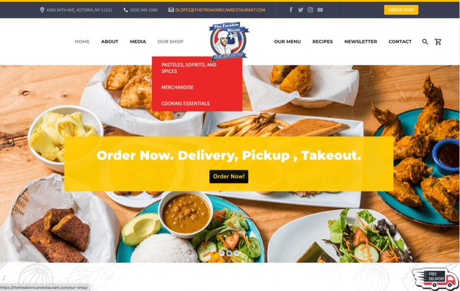
Blocks and cubes make this a fun website to browse. There’s a lot going on at The Freakin Rican — in a good way! But the clear call-out squares make it easy to focus.
What also makes this a great restaurant website example:
- The designer was clever with color. Hints of bright colors contrast with grayscale at just the right moments.
- The CTAs are placed throughout the site. Visitors always know what to do next.
4. Attractive photos of interior and visitors
Catch Restaurants
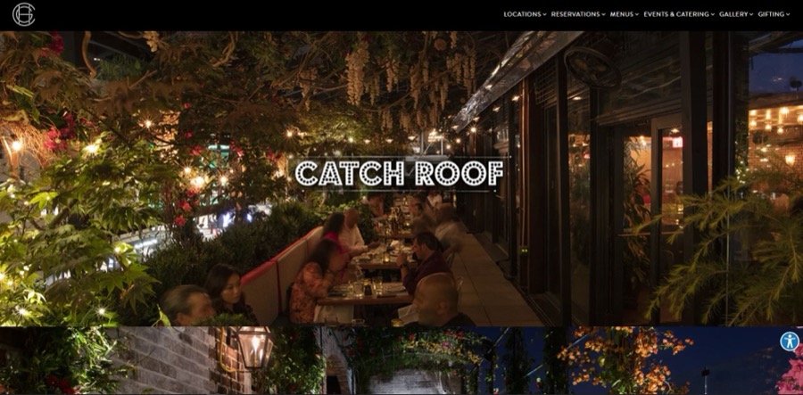
This Catch Restaurants website stands out because of the sheer number of beautiful images. They don’t just use one interior photo. You get every angle of the dining room, outdoor patio seating, and the flower garlanded entranceway. Plus dessert.
And let’s be honest. A pistachio cheesecake close-up ranks up there with the most iconic images of all time.
There’s more to love:
- The roll-over effect on the images is perfect.
- With minimal text, this restaurant website is all about engaging the senses. As it should be.
Yuzu
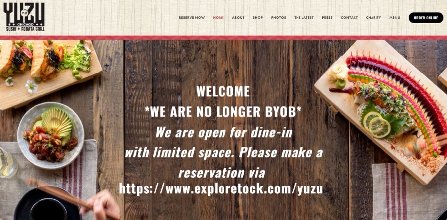
If you have it, show it off with a photo gallery. Yuzu doesn’t hold back. The website features a stunning display of creativity and sushi artistry.
Some of the other cool features are:
- The wood grain in the photos and the design – it’s a unique approach.
- The design cuts to the point. There’s no long scrolling before the Order Now button.
Bacchanalia
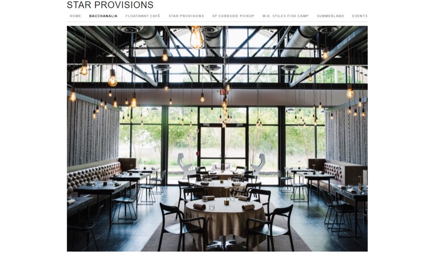
This small Atlanta restaurant features an industrial-chic interior. To show it off, the web designer uses a carousel header. When you land on the Bacchanalia site, you get a feel for both the ambiance and the food.
Here’s what we also love:
- The logo. It has a hidden secondary role – it teaches you how to actually pronounce Bac-cha-nal-ia.
- The team page. Few restaurants feature more than the chef. But this one lets you know there’s a whole team making the magic happen.
5. “Tasty” online restaurant menu examples
Sure, a stunning website design can sell your food for you. But if your menu isn’t as delicious as the rest of the site, you could miss out on business. The reality is, most diners – both delivery customers and those that want to dine in – are checking out your online menu.
Food delivery has spiked since the pandemic. And the majority of these at-home diners – 64% of delivery customers according to the 2021 National Restaurant Association report – prefer ordering directly from the restaurant.
Of in-house diners, 86% are looking at restaurant menus online before making a reservation.
Use this to your advantage. Showcase your restaurant’s style, ambiance, and passion for food with great menu design. Here are some of our favorite restaurant menu examples.
Van Da
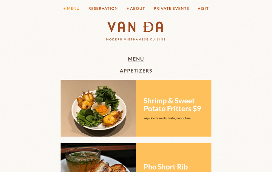
With high-quality images of each item, Van Da has a very tasty menu. It’s a mouth-watering experience before you even walk through the front door.
Here’s what else we like about this menu design example:
- The large typography pairs well with the generous photography.
- Using an individual block layout for each item makes the menu easy to browse.
Gage & Tollner
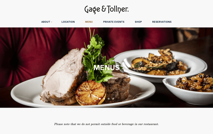
The elegant typography makes the Gage & Tollner menu attractive. The reason it’s so effective is that the text subtly signals the sophistication of the restaurant, yet it’s still clear and informative.
Other tasty features include:
- The image carousel gives you a taster of what’s to come.
- Including the plush red seating, the dark wood tables, and the obviously expensive plates says so much about the type of restaurant this is but without distracting from the food.
Via Carota
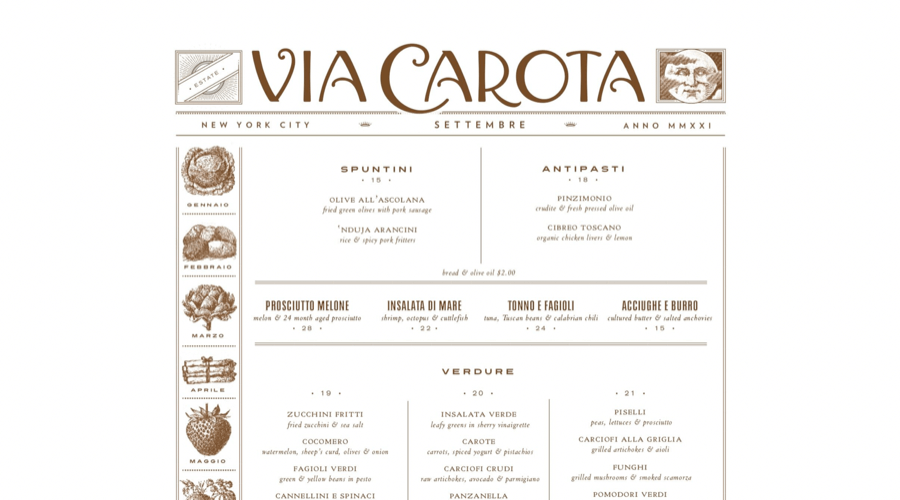
Via Carota takes a seldom-used menu design approach. Rustic illustrations and charming typography blend nicely to create a welcoming online menu.
Also brilliant about this menu:
- While some of the text is in Italian, the layout ensures the menu is easy to understand by grouping different types of dishes together.
- The off-white and coffee color choice is impeccable. There’s contrast, but it also makes the menu look stylish.
Davelle
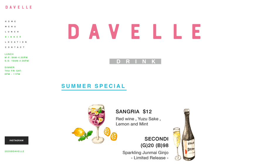
Davelle has its delicious dishes and its creativity on display. Taking an unconventional approach to menu design like this coffee shop does let you better convey mood.
Why we think this menu design is an inspiring example:
- The colored pencil illustration style is a perfect fit for the restaurant’s wabi-sabi interior design style.
- The overall atmosphere has that – my favorite-restaurant-that-no-one-knows-about vibe. A masterful design accomplishment considering Davelle’s popularity.
Skip the hassle of dealing with an inexperienced designer.
Get started with Epiic today.
The DON’Ts: Unattractive Restaurant Website Design Examples
All of those beautifully designed web examples make it look easy! But the reality is, there’s a lot that can go wrong when designing a website for a restaurant or café.
Poor-quality photos. Confusing navigation. A cluttered layout. Bad design diminishes the user experience and inspires people to run to your competitors rather than book a reservation.
Let’s look at what features you definitely don’t want in your restaurant web design.
1. RestaurantGuru
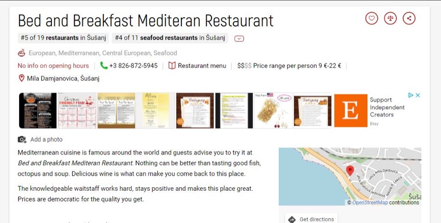
This website is the poster child for bad design. It’s stuffed with images and information. But there’s no clear user flow.
Here’s why else we give this site two thumbs down:
- The photos themselves are poor-quality – the plating is cluttered and the food looks greasy.
- Overall, the site isn’t set up to encourage conversions.
2. Lillo Cucina Italiana
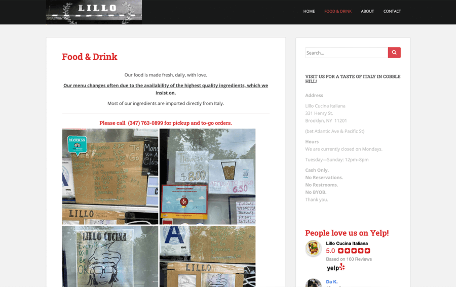
Honestly, this site looks like it was created in the ’90s. Aside from appearing outdated, visitors have to dig through a long list of food and drink options to figure out what’s on the menu.
Other reasons we found this website to be rough around the edges:
- The site is poorly organized. This casts a negative impression and could cause users to click away.
- The reviews listed on the sidebar are super positive. However, because they aren’t well-placed in the design, it’s easy to overlook them.
3. Los Tacos No. 1
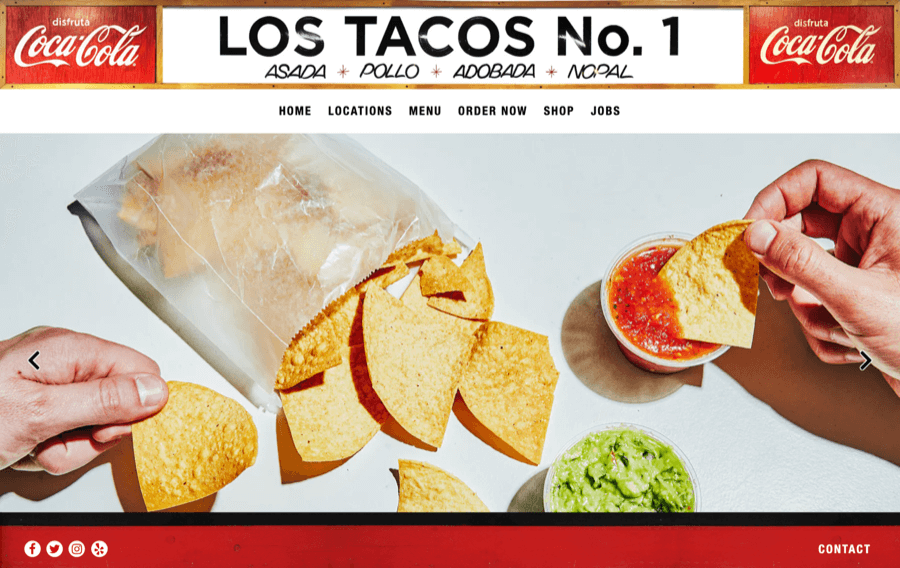
With this website, the problem isn’t the photos. What’s wrong is the way the design is implemented. Too many non-button labels make the navigation feel chaotic. Also, the huge header and footer make it difficult to see the content on the site.
Other problems we noticed include:
- The varying typography and overuse of bold text make the plain text look invisible.
- Without a separate page for catering that conveys the benefits, the website isn’t set up to convert potential catering customers.
Don’t feel like you have to build an amazing website alone.
Epiic designers can create your website for you.
Our Handy Website Design Checklist
Now you’ve seen all the cool features that work. And what doesn’t. So it’s time to roll up your sleeves and start designing.
Whether you’re doing it yourself or hiring a pro designer, here are the key ingredients you need to cook up an amazing website for your restaurant.
Let’s start with the fun part: colors and fonts. As you might have guessed, getting the colors and fonts right is a big deal. The wrong ones can confuse your customers or diminish the user experience.
But when you find your color and font nirvana, you have the foundation for a clear, enjoyable experience for everyone who visits your website.
For your colors, you want to create a cohesive aesthetic. So, you’ll choose three or four main colors and use them for all your major design elements. You can also add matching touches to your photography and illustrations. If you’re not sure how to get started, use a free tool like HueSnap or Coolors to generate palettes for you. When choosing, think about your restaurant’s tone and personality.
Is it fun and spunky? Think red, purple, or even a little gold. Want to appear sophisticated? Try earthy colors or grays with jewel tones. Pastels are charming. And citrus colors are always upbeat.
Choosing the best font may seem easy. Until you realize how many options you have. And how much a slight shift in typography alters the feel of your design.
Geometric, typewriter, casual – as with the colors, think about what font best reflects your brand. Also, make sure you’re choosing fonts that are easy to read. If you’re new to the world of fonts, you can learn more about different types and how to choose them from Google’s beginners’ guide to web fonts.
Your logo is your identifying mark. It should be unique, high-quality, and a clear emblem of your brand and values. It should also convey “who” your brand is – 42% of consumers say a logo effectively conveys a brand’s personality.
This is one area of design you can’t afford to get wrong. The reality is, an amateurish logo will make your brand appear unprofessional. It can also make people less likely to trust your brand.
If you don’t have pro experience, hire a designer for your logo. That way, you’ll have a recognizable logo to use on your digital and print materials that you feel proud of.
Now you can start compiling the pieces of your website. For a modern restaurant website, you want to have quality visuals that reflect your brand. No stock images. And no generic designs.
Also, make sure you’re focusing on your chosen color palette when deciding what style approach to use for your images and banners. Do the photographs of your restaurant’s interior and menu items work with your colors? Is there a sense of visual cohesion?
A good designer will plan the structure and layout on paper first. This will give you the opportunity to see how everything fits before getting started.
You can opt for a pre-made restaurant website theme. However, be wary of using a cheap theme that you can’t customize to your needs. You don’t want your web design to look generic. Nor do you want to be restricted to an elementary look because your layout is too limiting.
Once you’ve created the website structure, test it out in different browsers and devices. Does the site look the same? Are there any issues with navigation? Do your fonts appear clear and easy to read whether you’re looking at your website from your desktop or your mobile phone?
Now it’s time to refine your design. Think about how you can improve the design to enhance the user experience.
Here are some factors to think about:
- Do you have large blocks of text? Consider making smaller paragraphs and adding descriptive subheadings.
- Is there enough space between your images and graphics or does the site feel cramped?
- Is the text on the navigation bar easy to see? Could you improve the color contrast, size, or font?
- Are you using a font that’s easy to read for your body text?
- Are your CTA buttons placed appropriately? Does a visitor know what next steps to take on each page?
Videos will engage your site visitors and keep them on your site for longer. Also, as a restaurateur, they give you the chance to show off your food, your expert chefs, and your restaurant’s atmosphere.
When you upload them to a video hosting platform, you can then include them on your website and across your restaurant’s social media pages.
Now for the icing on the cake. Include professional content to express why your restaurant is the place to dine.
The copy should be conversion-oriented and to the point – no flowery text or paragraphs about how great you are. Simply the essential.
Then, organize your text in a way that takes the reader on a journey. They should experience your story. The passion behind the food. And they should know how they can enjoy your menu either by ordering online or making a reservation.
Not sure you can handle every piece on your own?
Pick the design plan to revolve around your budget.
Frequently Asked Questions
Even with an understanding of the do’s and don’ts of web design and a checklist, you still have to figure out what approach to take.
These tips can help. When thinking about the design, factor in:
- Your ideal buyers. Who are your patrons? What style will resonate with them?
- Why they are on your site. They are there to find out about your hours, policies, and menu. They also want to know what dining there (or ordering from your restaurant) will be like. So show them.
- Is your website helpful for both new and returning users? Make sure both types of visitors will have a good experience.
- Does your site have the same feel as your physical space? Whether you run a trendy café, a family eatery that serves comfort food, or an elegant fine dining restaurant, this should be obvious at first glance.
There’s no best website theme or style when it comes to restaurant web design. The key to getting the best results is to start from your story – the why behind your business. And then craft a design that reflects both who you are and why your food should mean something to your customers.
Your web design should include accurate address, phone number, and hours of operation info, your menu, enticing photographs, clear CTA buttons to order food or book a reservation, and links to your social media pages.
If you want to take your conversions up a notch, encourage visitors to sign up for your restaurant’s email newsletter. This will help to build trust and loyalty with diners.
The same way you would cook any recipe. Define your end goal. Gather all your ingredients. And then put everything together using a structure that makes all the different elements feel like one cohesive whole.
Dec 03, 2021


Andy Zenkevich
Andy is a seasoned CEO with years of hands-on experience in SEO, link building, content marketing and website development. His deep understanding of the digital landscape and passion for content marketing make him a trusted voice in the industry.