
Andy Zenkevich is the Founder and CEO of Epiic, a hospitality marketing agency helping boutique hotels and experiential stays grow direct bookings through data-driven marketing, SEO, content, and operational strategy.
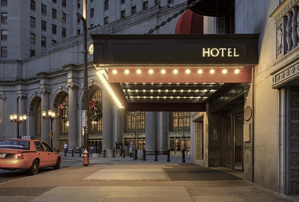
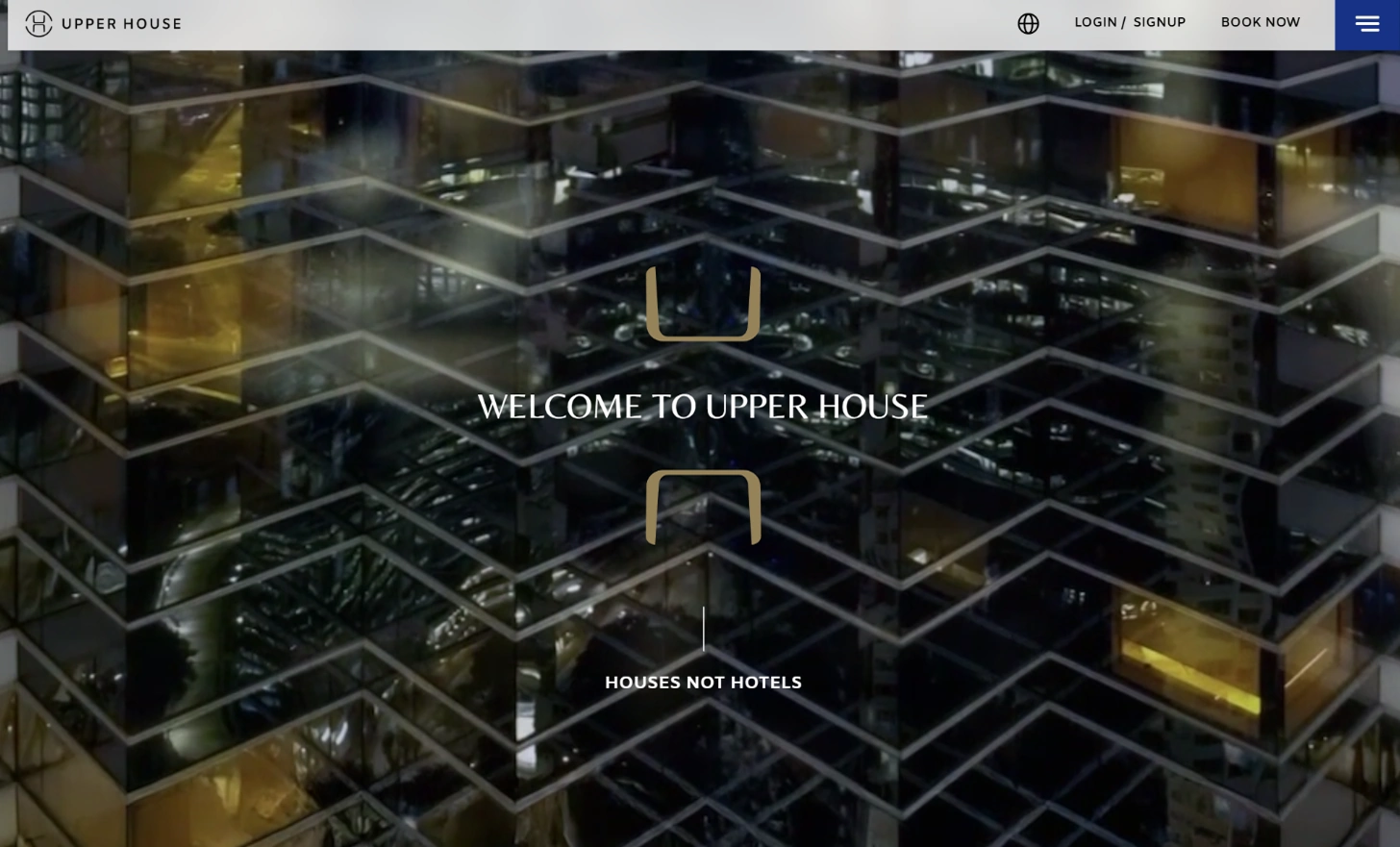
Hoteliers will be the first to tell you that the accommodation industry is highly competitive. So, what’s one of the best ways to showcase your hotel, motel, resort, or bed and breakfast? A stellar hotel website design, of course!For many brands, though, achieving a great website is easier said than done; it takes effort to make a memorable site.
If you’re ready to make your brand shine with an impactful online presence, we’ve got just the thing. The hotel website design examples and ideas below will help you understand what truly stellar websites look like.
We’ll discuss what elements you need on your site, why you need them, and a few common design mistakes to avoid. We’ve also included a practical checklist for properties taking the DIY route or working with a hotel website design and development agency.
Ready for your crash course in great hotel website design? Let’s go!
What makes an
engaging hotel website design?
We’ll get to our hotel website design examples in just a minute, but first, let’s make a small stop and ask two important questions. What exactly is it that makes a hotel, motel, or resort website stand out, and why does it matter if your site stands out?
While every hotel website is unique in its way, the most engaging — and the most effective — sites share a few common features.
- Relevant content. All great hotel websites include great content. This includes eye-catching images, well-written messages, and engaging brand storytelling.
- A user-centered experience. Your site is only as good as your user thinks it is. That’s why a user-centered site is an absolute must. This feature includes everything from responsive design to menu and site navigation to loading time.
- An aesthetic appearance. People will judge your brand by your hotel website. A lovely and professional layout design makes visiting your site more impressive and enjoyable.
These elements affect more than appearance. Navigation, mobile performance, page speed, content structure, and accessibility also form part of a hotel website’s on-page SEO foundation.
We’re not saying that a great bed and breakfast website is your ticket to the big time or that a poorly designed site will doom your luxury hotel brand. Quality hotel website designs do offer a range of benefits.
They are:
- An easily accessible information source for potential customers;
- A cost-efficient way to increase brand awareness and exposure;
- The perfect tool for online booking and sales;
- A great way to show off your unique brand identity and style;
- A fantastic tool to help you track and analyze visitor metrics so you can make better marketing decisions.
A hotel website should not only look distinctive. It should move visitors smoothly from inspiration to room selection and checkout. That conversion journey is a central part of any strategy designed to increase direct bookings and reduce reliance on OTAs.
18 impressive hotel website design examples
Whether you’re building a motel website or a new website for your bed and breakfast, we’ve got the inspiration you need.
From elegant apart-hotel website designs to cultured boutique hotel websites, we’ve put together 18 great site examples. We’ve categorized the sites by their main cool design element, but we also included other features we love as well.
Powerful background images & videos
- Chateau Vaudreuil
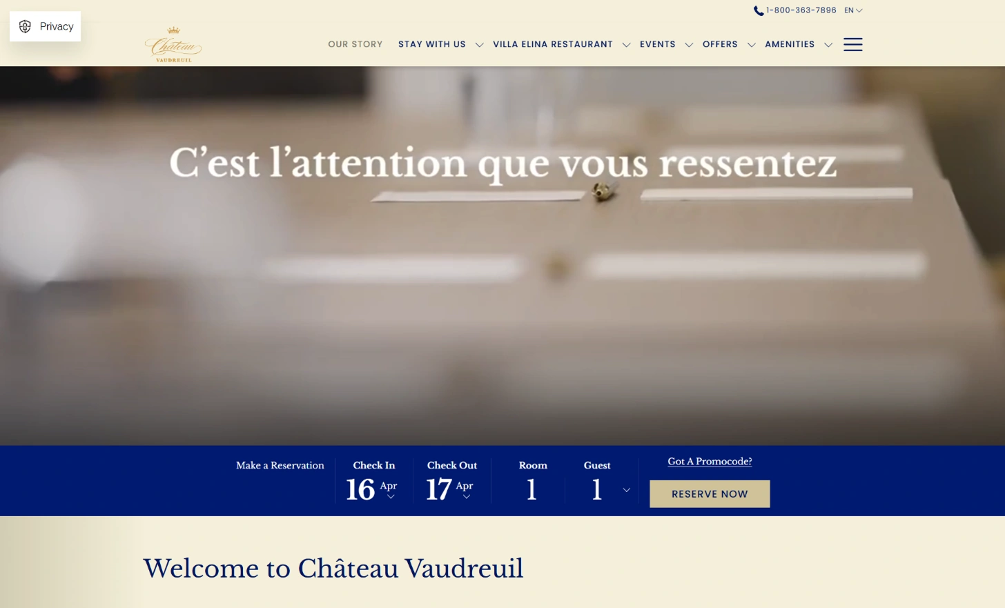
Stunning aerials. Gorgeous nature scenes. Beautiful interiors. The Chateau Vaudreuil site perfectly captures the luxurious feel of this 5-star haven in the Montérégie with its lovely background images. An additional still-photo gallery at the bottom of the page only heightens this effect. We also give top marks to:- the refined color scheme,
- easy “Check Rates” button,
- clean layout.
- Capella
The welcoming background image for Capella Hotels and Resorts offers a cozy view and a lovely look at the surrounding landscape. It makes a great statement right off the bat. The impactful logo and carefully considered typography design are the icing on the cake for this hotel website design. - Nayara Tented Camp
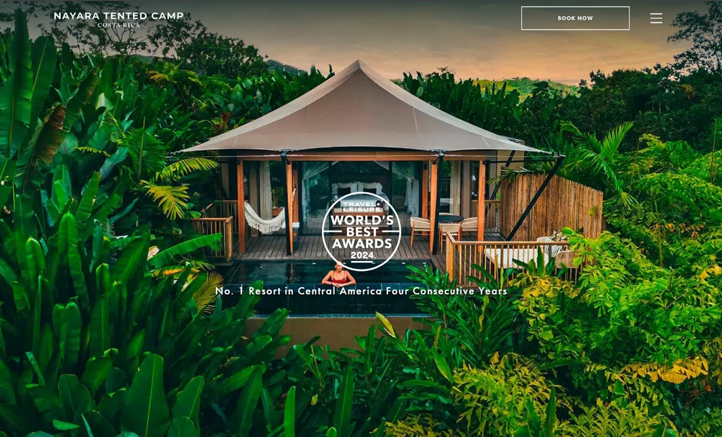
Bright hues define the Nayara Tented Camp website and fit in well with the tropical color scheme. With the vibrant green, pop of yellow, and cool blues offsetting the neutral tones, this background image is one of our favorites. We love the simple typography style that lets the visuals shine and the fun, functional CTA (call-to-action) buttons spread across the page. - The House Collective
We love the sensational background image on The House Collective homepage. It’s interesting, it’s beautiful, and it encapsulates the essence of the company. The meditative pictures are enhanced by a pronounced color scheme and lovely typography. And we can’t forget to mention the great menu design and interactive homepage features, of course!
Logical menu & navigation design
- Hôtel Monville
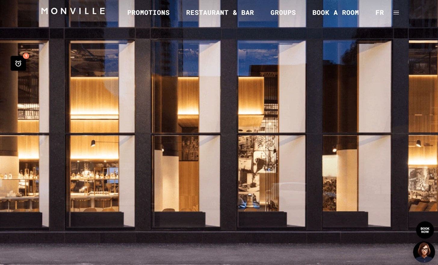
We’re very impressed by the side menu design that Hôtel Monville implements on their hotel website. It melds with the color scheme but isn’t too over the top. It’s the perfect intersection between function and aesthetics. Also of note are a great use of visual images and icons that help get the message across with minimal written content that makes navigation a breeze. - La Réserve Paris
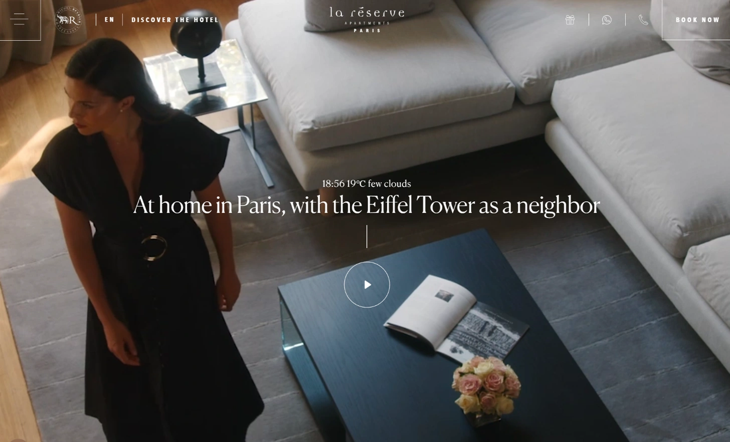
One of the best apart-hotel websites that we’ve seen, the La Réserve Paris site is an exclusive experience for those wishing to enjoy a luxurious stay in Paris. The elegant menu design is the star of the show, offering all the info you need without being overwhelming. We’ll also give top marks for gorgeous visuals, a lovely layout, and a convenient booking button at the top of the page. - Alila
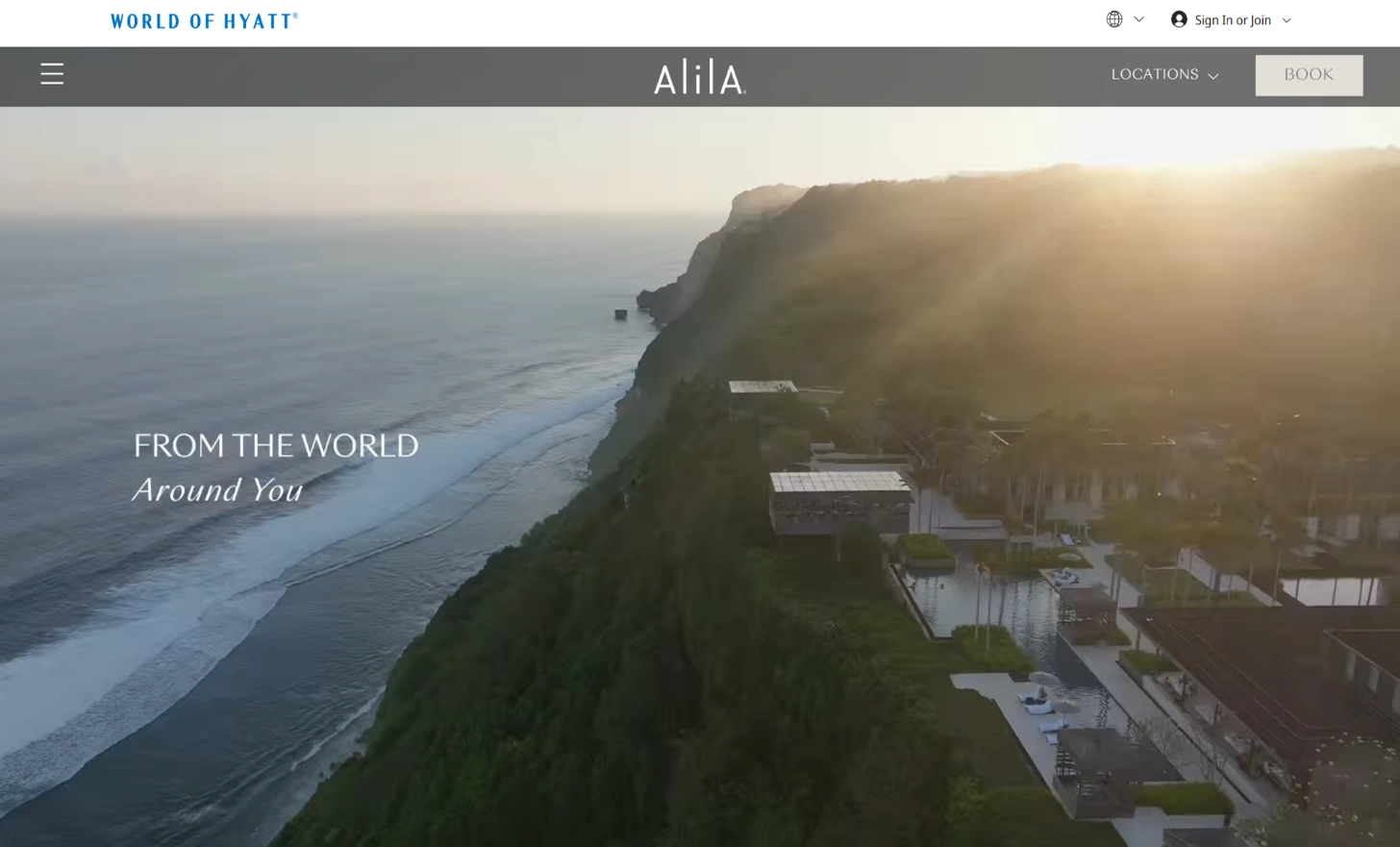
The Alila hotel and resort brand is well known for its luxury locations. We think they should be equally well known for their wonderful menu design. This design allows you to easily find what you need without sacrificing aesthetics or functionality. We also like how the menu appears when you scroll upwards, ensuring it’s always visible. - Belmond
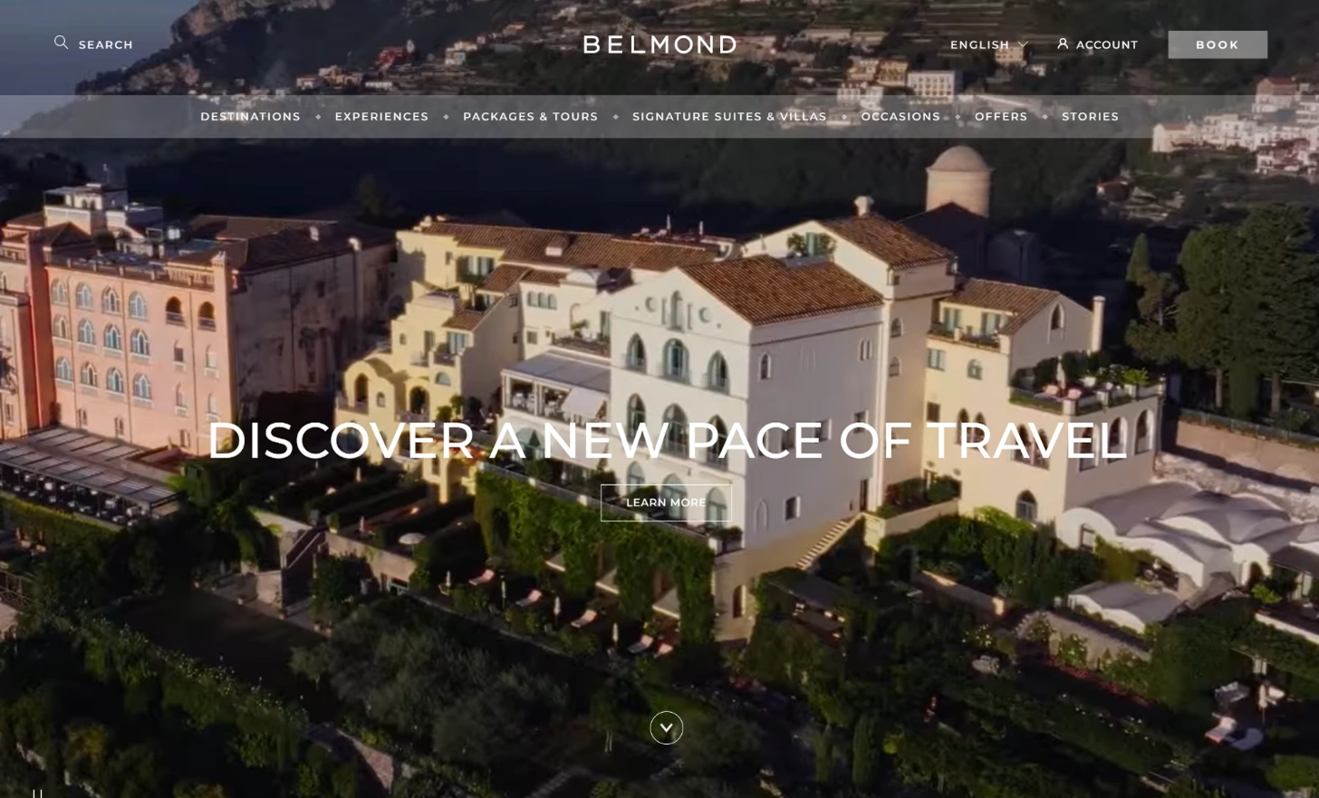
The minimalist menu design for the Belmond hotel website is a perfect contrast to the vibrant and active background image slideshow. And it is also easy to navigate, with only a few useful options that all fit well on the screen. We love the typography that adds to the simple feel and the great homepage layout as well.
Clear and catchy brand messaging
- Zum
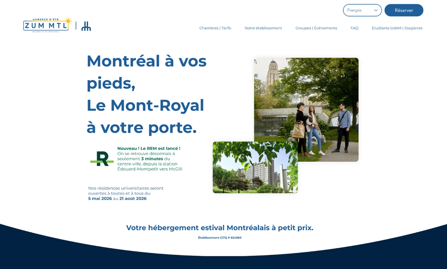
We’re big fans of the confident copywriting on Zum’s site, which tells guests that they can “expect it all” at Zum. Their style and personality come through clearly in the brand messaging, making them seem super cool, modern, and friendly. Also, did we mention the awesome logo and contemporary color scheme that pulls everything together? - Mashpi Lodge
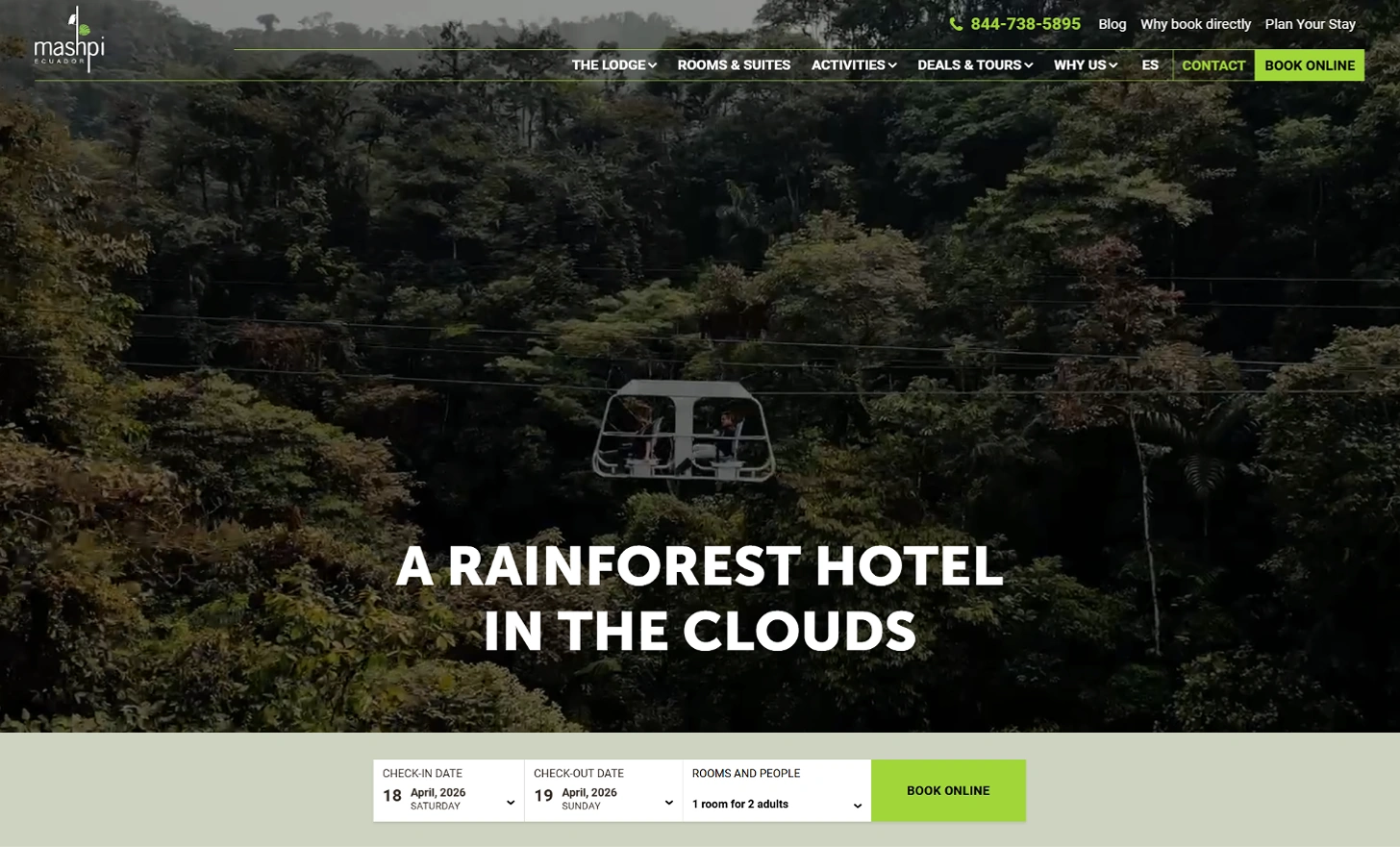
Everything on the Mashpi hotel website works together to convey their brand and style as a magical getaway that you won’t find anywhere else. We love the descriptive copywriting, potent headers, and great use of testimonials on this hotel website. Every element on the site helps to cement the brand messaging. - NIHI Sumba
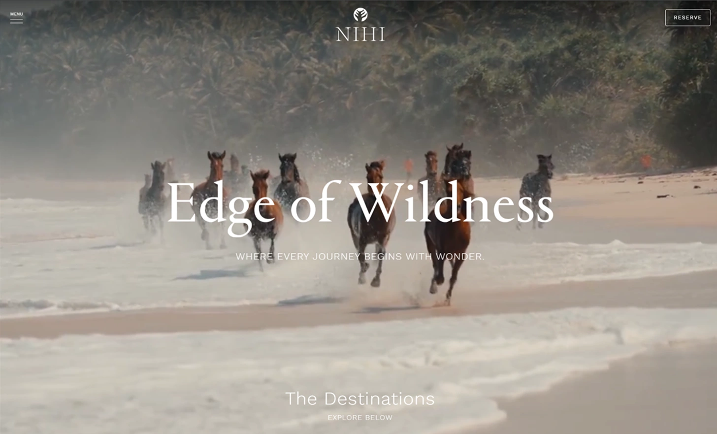
Both the video background and punchy copywriting style convey powerful messages about NIHI’s brand. This is one hotel website design that doesn’t waste time on unnecessary or flowery information — you get exactly what you’re looking for with no fuss. We also want to throw in a good word for the cool logo and plethora of interesting and well-shot visuals. - Viceroy
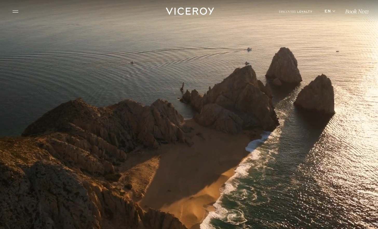
Viceroy hits the nail on the head in terms of brand messaging on its website. Its clear mission statement and positioning as a luxury hotel and distinct voice make this site shine. We also love the unique typography design and color scheme, as well as the fun gallery of pictures on the homepage.
Well-ordered layout
- The Leela
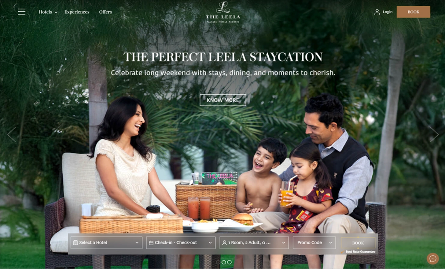
We love the look of The Leela Palaces, Hotels and Resorts site. Navigating is a breeze, thanks to its clean, well-organized layout. Gorgeous pictures offer additional assistance in breaking up what little written content the site has. Top it off with just the right amount of white space to keep things simple and uncluttered, and you have the recipe for a great site! - Fasano
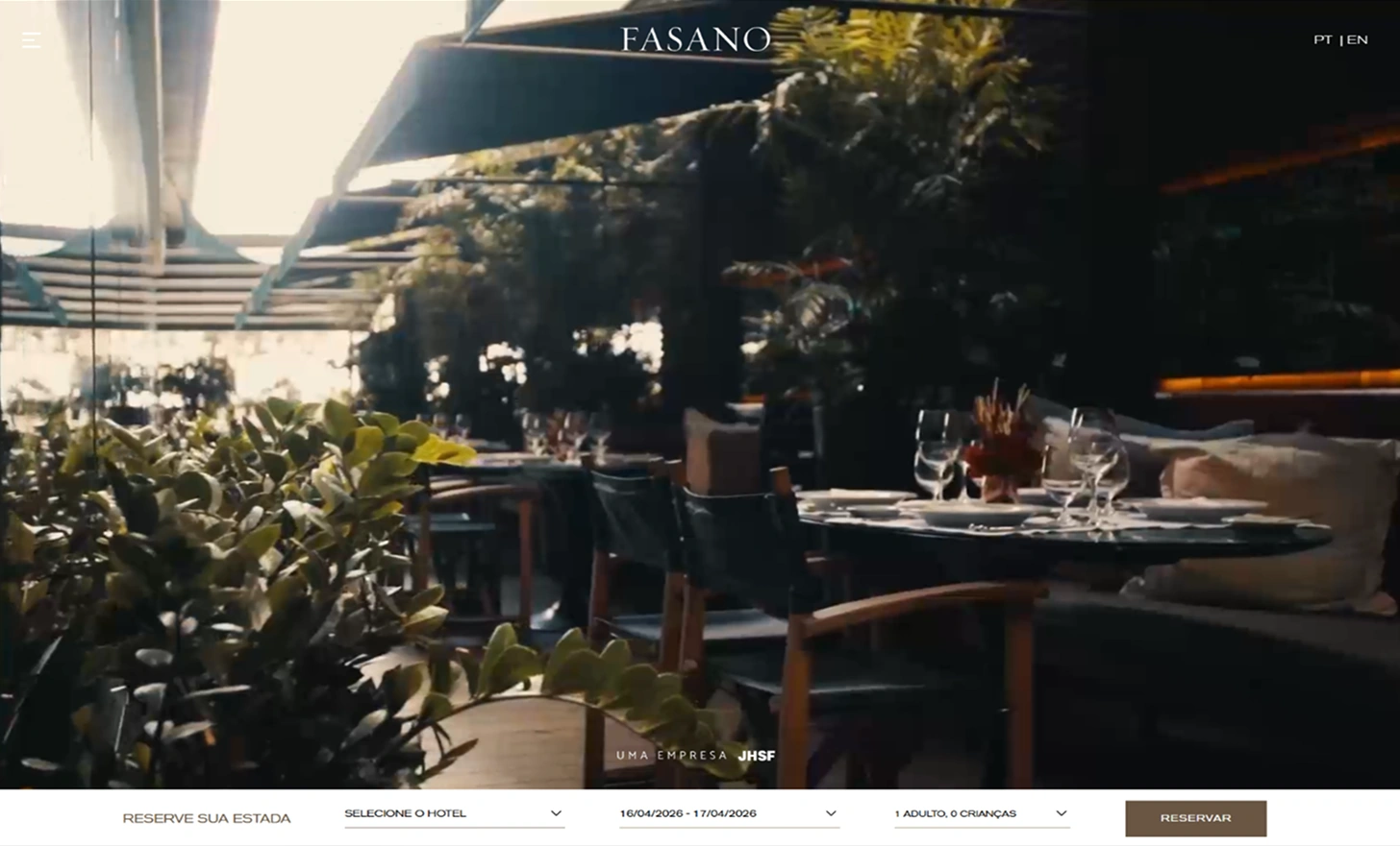
The Fasano hotel website has minimal written content, which works well for it. Pictures are universal, so Fasano invests in some great visuals. They also use a well-organized layout design to keep all their similar images clustered together. As a result, the homepage isn’t too long and is easy to navigate. Cheers to the designers for nailing their responsive design and menu design as well! - Four Seasons Hotels and Resorts
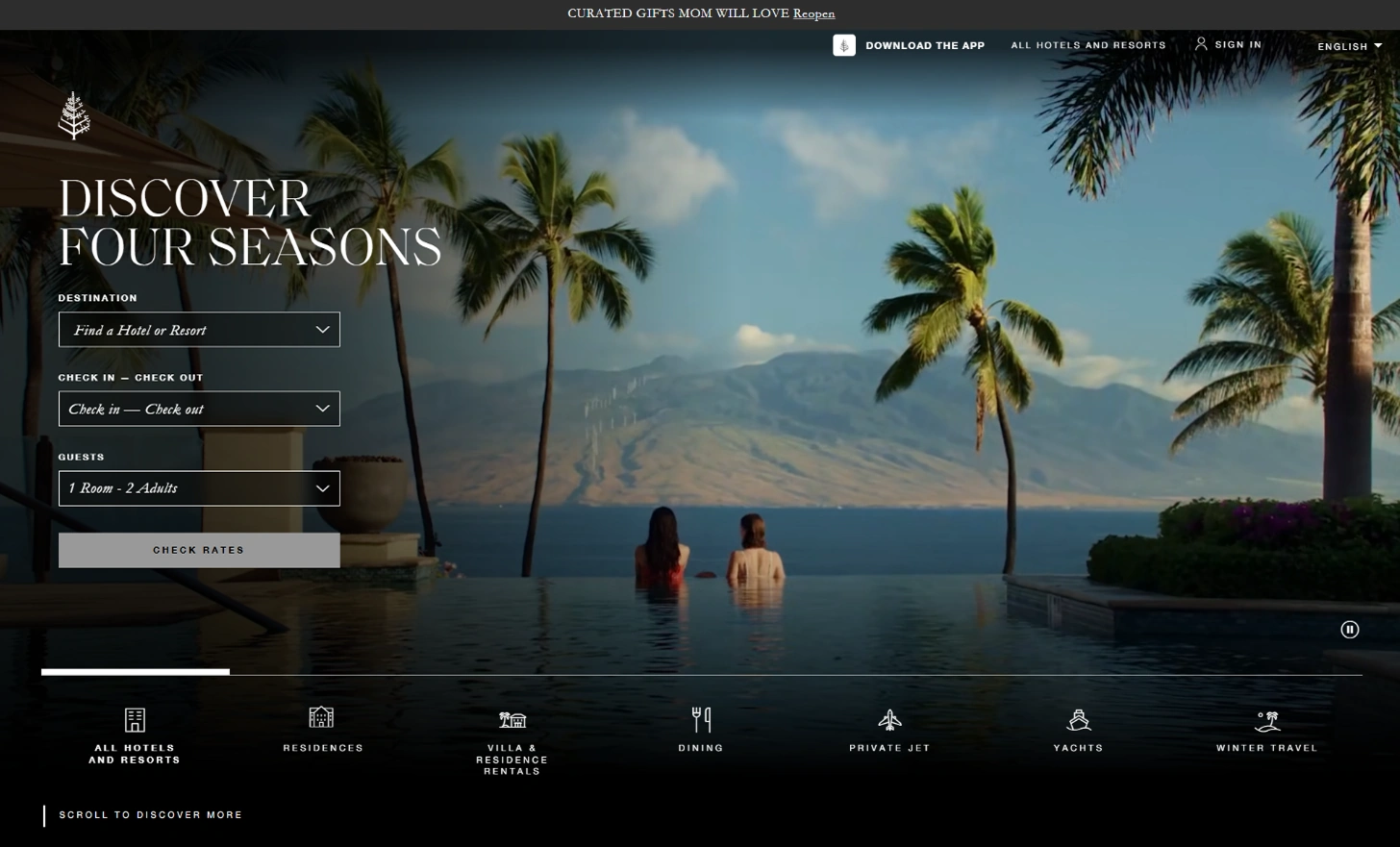
When it comes to site layout, sometimes less is more. The Four Seasons website uses lovely visuals and limited text balanced with plenty of white space to make this homepage functional and beautiful. We love how the balance of each section helps create an easy navigation experience. The modern color scheme and a plethora of relevant CTA buttons are also a very nice touch.
Typography in design
- Viceroy
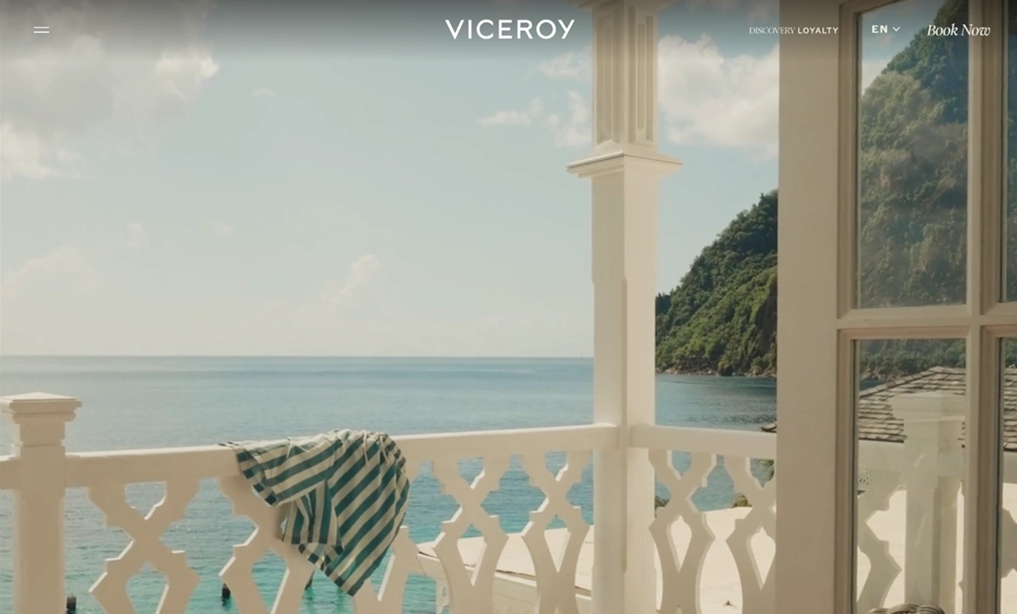
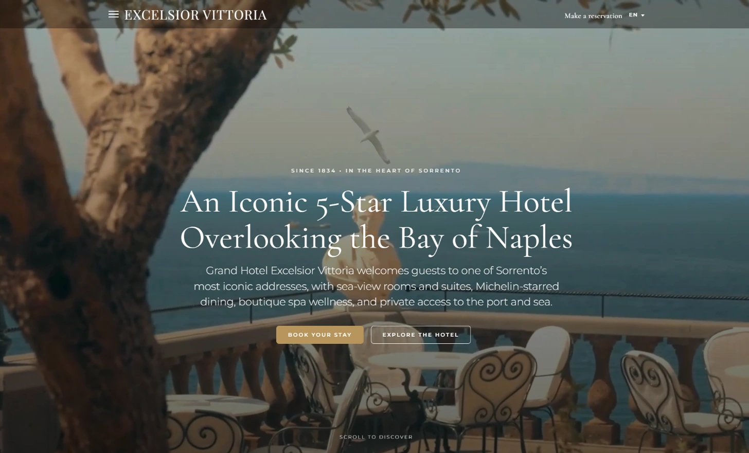
We thought we were being sneaky, but you caught on — yes, Viceroy has made our list not once, but twice! This time, we’d like to point out the typography. It’s big. It’s bold. It’s luxurious (just like the brand). We like the mix of large, industrial letters and softer, curvier ampersands. The typography also utilizes the color scheme to add just a touch of flair to the page. - Excelsior Vittoria
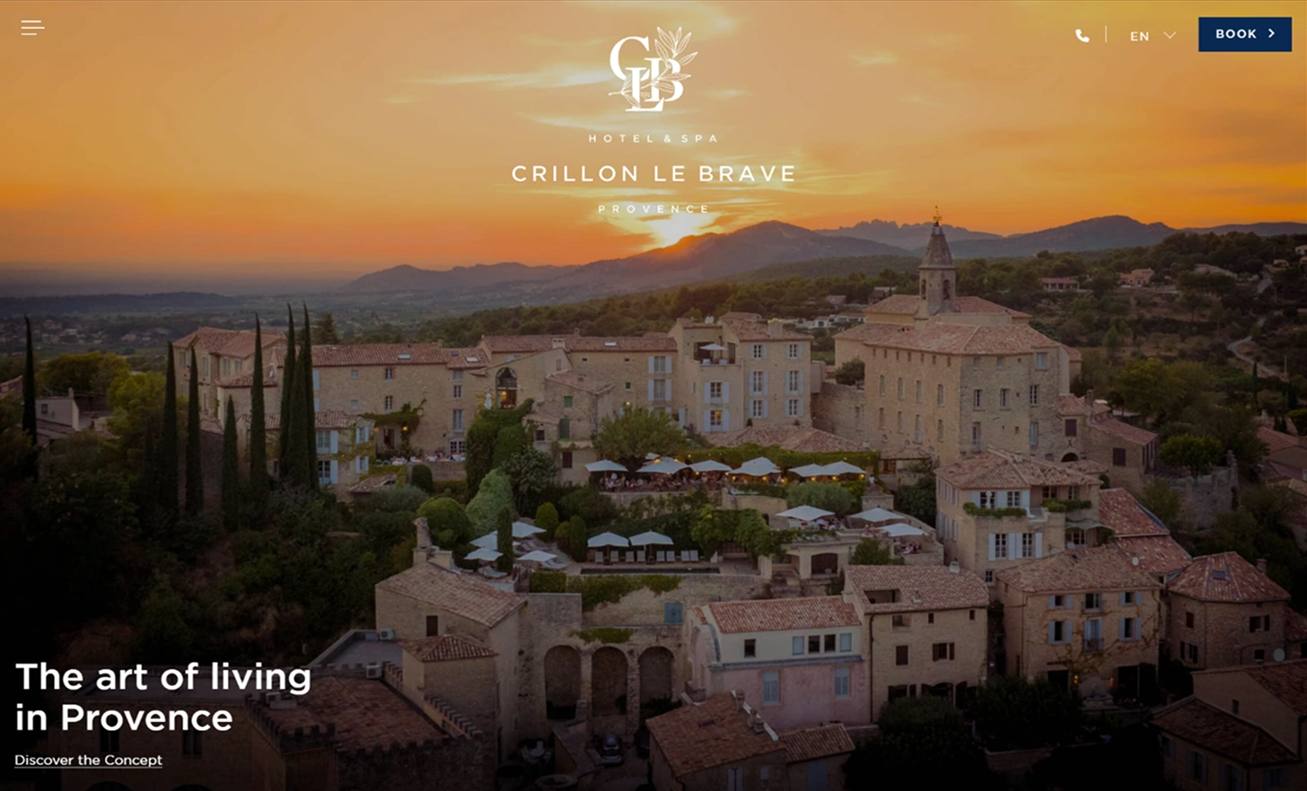
Excelsior Vittoria’s boutique hotel website uses typography design to create a hierarchy of information that makes the site easier to use. They stick with neutral colors and a minimalist style that beautifully complements the feel of the hotel website design. We’ve also got to give credit for the beautifully designed logo, floating footer/menu bar, and gorgeous visuals. - Hotel Crillon Le Brave
The Hotel Crillon Le Brave has a lot of written content on its site, but the typography design keeps things clean and manageable. We like how the hotel website uses strong, bold headings and more moderate, readable fonts throughout. Also spectacular are: the menu designs, soothing color scheme, and easily accessible booking button at the top of the screen.
4 hotel website designs that need improvement
We’ve seen the best, now let’s visit some sites that need a bit of a remodel.
These four hotel websites are great examples of what to avoid to ensure your visitors keep coming back to your hotel, motel, or resort website again and again.
- Gran Hotel Ciudad
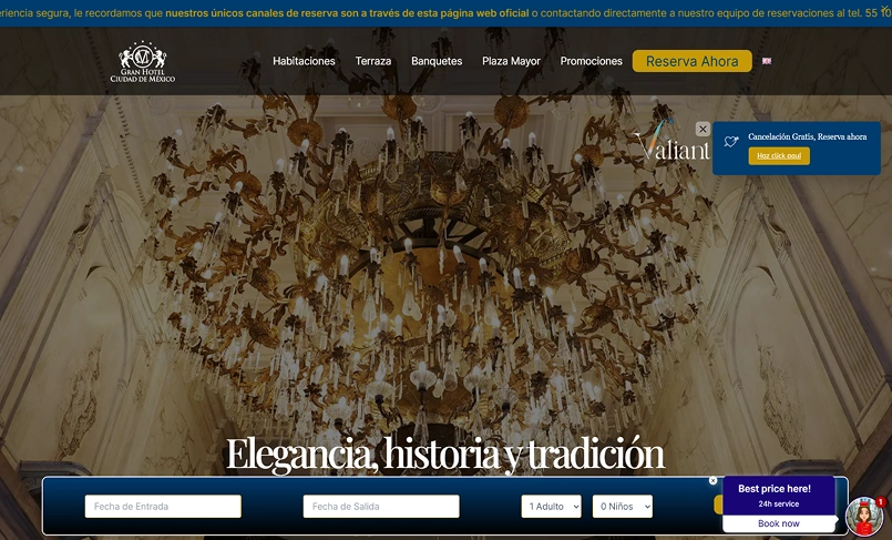
This hotel website design has potential but needs to tighten up several elements. The layout is a little strange when it comes to sizing and scale. The typography is all over the place and the color scheme does offer as much contrast as it should, which makes things difficult to read. The fuzzy images are also a bit lackluster. - Lemontree Hotels
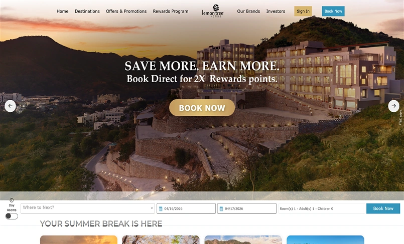
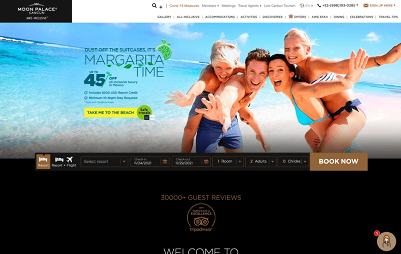
This hotel website really lets us down when it comes to responsive design! To make matters worse, there’s no real flow to the page and no cohesive design when it comes to typography or color scheme. A little extra attention would definitely help this site look and feel more professional. - Moon Palace
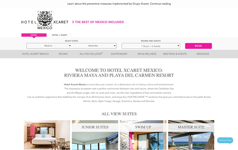
Another issue of contrast: this hotel website design works with a difficult color scheme and font color that makes it hard to read. Overall, the site is a little confusing and could do with a professional touch to help get their brand message across. - Hotel Xcaret Mexico
We’ll admit that this hotel website design doesn’t captivate us at first glance — this does not seem like the site for a luxury hotel. An unappealing layout, heavy wall of text, and unmotivating calls to action also add to our dissatisfaction with this one.
Your handy hotel website design checklist
Now that you’ve got some great ideas for your site, the question is where to begin. We’ve put together a helpful checklist to get you started.
-
Pick the right fonts + colors for your brand
We all know not to judge a book by its cover, but these are websites we’re talking about — looks matter. Be sure to choose some great colors and fonts so that your site makes the best impression possible. You may want to use some color psychology here, or at least have someone look over your choices with a very critical eye.
-
Design a high-quality logo
Your hotel logo is what your customers will associate with your image — so make sure it looks great! It helps to have a concept in mind that’s inspired by your identity and personal style. Remember, it should be simple, memorable, and beautiful. Utilizing a professional designer can help ensure you’ve got the best logo possible.
-
Come up with great visuals
High-quality images are a must for any hotel website. Why? Customers want to know what they’re paying for. Great pictures are one of your best investments. Be sure to include a variety of shots. Exteriors, common rooms, individual rooms, social events, dining/menu options, and any other special features are great ideas.
-
Organize your site’s structure
An ounce of prevention is worth a pound of cure — a maxim that’s especially true when it comes to website design. You’ll be very grateful that you took the time to plan your site’s structure before you start putting things online. Doing this saves you both time and effort. While you’re planning, remember to keep things simple and look at your site through the users’ eyes.
-
Make sure things are responsive
These days, responsive design is an absolute must as many customers use various technologies to plan and book their trips. Responsive design used to be the garnish on top of a well-designed site, but now it’s more like the main ingredient. Test out your site thoroughly and often to make sure it’s always working correctly.
-
Fine-tune the layout
An easy-to-follow layout will make your guests happy — and a happy guest is what we all want. Once you’ve got content on the site, take the time to reorganize the layout so that things flow well. If they don’t, you’ll only ensure your site users get fed up and click away. Put yourself in your guests’ shoes and focus on both site aesthetics and function.
-
Add movement and interest with videos
You have limited space on your site, so what’s one of the best ways to make use of it? With a video, of course! Your videos should tell a story and make your brand more personable and accessible to viewers. And remember, don’t upload videos right to your site or you risk slowing down your hotel website. Instead, upload them to YouTube, Vimeo, or another hosting platform.
-
Make the written content count
You’d be surprised how many different ways there are to say the same thing. But how you write your content matters since written content can help showcase your brand and style.
Copy should be useful, relevant, and compelling, so if a professional copywriter you are not, be sure to reach out to the experts.
Frequently asked hotel website design questions
Website costs vary. Building your site with a free website builder can cost next to nothing. Engaging an expensive designer for fancy boutique hotel websites can cost thousands upon thousands of dollars. Price differences usually depend on the level of customization you need, how large your site is, and who designs your site.
Aside from the great hotel website ideas, features, and elements we’ve listed above? Here are a few more things that we think your hotel/motel website or other accommodation sites should include:
- Contact details,
- Awards or other professional recognitions,
- Online booking buttons,
- Any deals or special events,
- Tracking and analytics tools,
- Lots of CTA (call-to-action) buttons.
A good hotel, resort, motel, or bed and breakfast website portrays your brand and space in its best light. It also provides a user-friendly experience that helps visitors find all the information they need.