When you look at some of the best restaurant menu examples, you can see how it’s not just great food that entices customers. It also is – a great design.
Everyone in the restaurant business knows the importance of food presentation. People taste food with their eyes before they put it into their mouths. So, before your diners feast on your brilliant plating design, they’ll look at your menu.
A well-crafted menu piques your customers’ curiosity. It can compel them to try something unexpected. Or even splurge on your pricier dishes.
How can you get these results? Your restaurant menu has to be far more than a list of food. It has to convey an experience. This is how you hook your diners: with the promise of a gastrointestinal experience no true foodie can resist. 🤤 Ever!
To help you create a tasty menu, we’re sharing the essentials of good design. We’ve also curated some of our favorite restaurant menu designs.
Read on to witness menu nirvana and discover what you need to craft the best menu design for your restaurant.
Hacks & “Ingredients” of a Tasty Restaurant Menu Design
Like any good chef, we need to understand the ingredients we’re working with. Here are the key elements you should have in your menu design:
1. Plenty of white space
Make it easy for customers to browse your menu. Use lots of white space. That means no dreary blocks of text or long lists of dishes and drinks.
2. Brand cohesion
I don’t care how much you love the brush-like appearance of Mahogany Script. Or the way tangerine highlights ocean blue’s fun side. If a font, color, or style doesn’t fit, do Not use it.
3. Quality photos
Use photographs to show off some of your most irresistible items. But don’t go overboard. In fact, with restaurant menu design, less is always more. Only use very high-quality photos, if any. And, use them sparingly.
4. The Golden Ratio
The Golden Ratio is a mathematical ratio that exists everywhere: nature, music, architecture. And – in design. Use it to create the layout for your menu if you want to achieve a balanced, aesthetically pleasing look of it.
5. A spotlight on high-value items
We’ve got another golden design tip for you. To help sell your top items, place your high-value dishes in the golden triangle. This is the center of the page, followed by the top-right corner and the top-left corner.
This is the route the eyes take when they look at a menu, so keep the dishes you want to sell the most in this area.
6. Smart use of color
When you look at examples of attractive menus, you’ll notice a lot of thought goes into color choice.
Bright and bold. Unwavering neutral. Or something else entirely. There’s no perfect formula for choosing a color scheme. But you Do want the colors that:
- look good together;
- complement your restaurant’s interior design;
- give diners a good user experience by guiding them from one section to another.
7. Order, not chaos
Another important design element is organization. There should be a clear flow from appetizers to entrees to side dishes, drinks, and desserts.
You might also want to set the order of your menu items by ingredients. For example, meat, fish, and vegetarian. Gluten-free and vegan. Or – spicy, medium, and mild. Use a structure that will help your customers find what they are looking for.
8. Simplicity
Also, try to keep your menu design as simple as possible. That means no more than six or seven items in each section. And no confusing ordering options.
Don’t be that restaurant that lists 80 different items. A simple restaurant menu will do the job.
9. Creativity
And finally, make your menu design unique to your restaurant.
Variety is the spice of life. When diners go out to eat, they don’t want your Italian, Japanese, or Tex-Mex restaurant to be just like every other Italian, Japanese, or Tex-Mex restaurant. Show them how you are different through your food, your interior, and – your menu design.
With Epiic designers, you can get all the design work you need
without breaking the bank.
Amazing Restaurant Menu Examples
Here’s our list of must-see restaurant and café menu ideas. Our picks for the best menu design have all the right ingredients. Clean structure. Spot-on colors and typography. A great user experience. And, of course, a nice, creamy dollop of creativity.
Take a look and find out what good design looks like. Then, bring this insight back to the drawing board so your pub, café, or restaurant can craft the perfect menu.
1. Kittyhawk Cocktail Bar
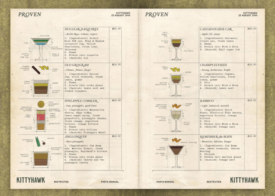
The Kittyhawk menu is pure genius. It’s a cocktail menu that uses diagrams to show how each drink is made. The design makes the drinks look tasty while also giving customers a lesson in mixology.
This restaurant menu sample is also cool because:
- Making the drink menu diagrams look like aircraft diagrams is a brilliant move. Perfect for a cocktail bar named after a WWII aircraft.
- There is a lot of information for each cocktail. But with a neat, chart-like appearance, it’s still easy to digest.
2. Fat Cow
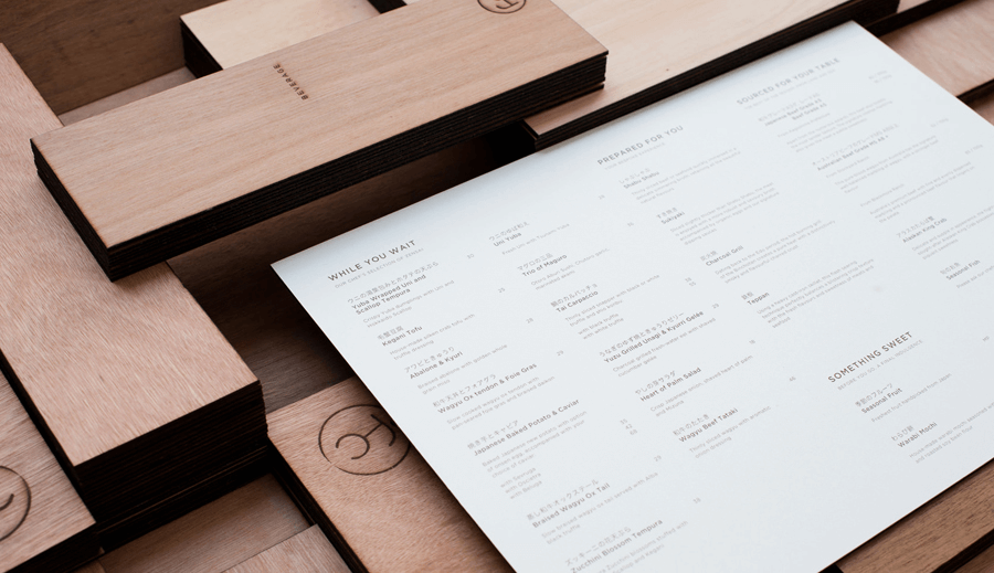
A typographic menu paired with a Japanese wabi-sabi-style beef restaurant. Utterly sublime. Everything about the design is pragmatic and economical – nothing that doesn’t need to be there is not there. Which is the same philosophy that underpins the dining experience at Fat Cow.
We also chose this restaurant menu because:
- The purist design is very easy to read, making the menu user-friendly.
- Laser etching the logo in the wood menu holder has the same look as cattle branding. Nice touch for a Wagyu beef restaurant.
3. Vera
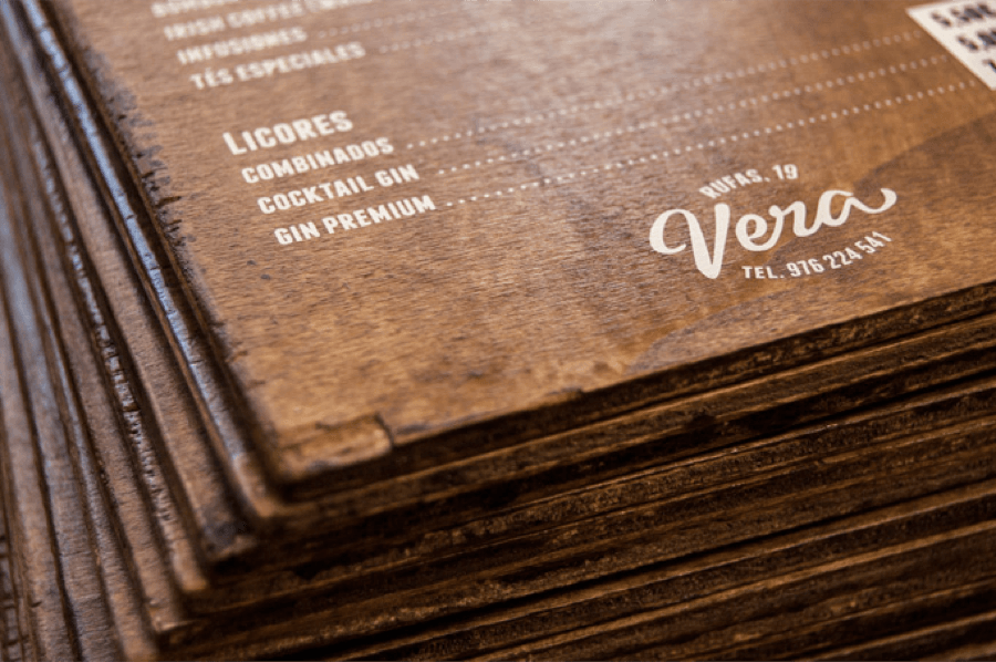
We give Vera’s menu design five stars for originality. Using wood is not something you usually see with a bar menu page.
Also awesome about this design:
- The eggshell color contrasts nicely with the dark wood. This makes it easy to read the wooden menu page.
- An added bonus: the wood will outlast any paper menu.
4. Chick-a-Biddy
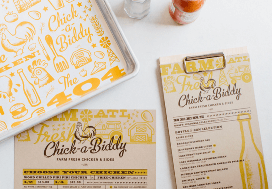
The Chick-a-Biddy menu is an example of a well-balanced design. There’s creative use of typography, illustrations, and color accents. While there’s a lot going on, the menu doesn’t feel busy. It’s easy to understand and very informative.
Other features we like are:
- The use of bold, heavyset fonts for the subheadings. This simple technique prevents information overload.
- The mustard yellow color accent. It’s uniform throughout, which streamlines the overall aesthetic.
5. Kuro
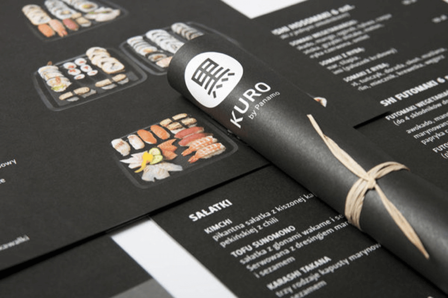
Kuro takes an innovative approach to presentation. They hand-roll the menus – it’s a nice touch for a sushi restaurant.
Other reasons why this is one of our favorites:
- The dark tones and white font create great contrast.
- The images are colorful without taking away from the sleek, minimalist vibe.
6. Noble Experiment
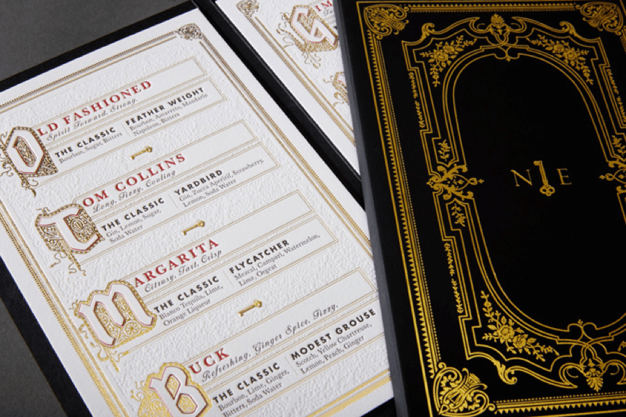
Ornate but not overdone, Noble Experiment’s menu uses unique elements to turn a simple restaurant menu into something fantastic. From the three-color letterpress to the gold-foil stamped cover, someone put a lot of care into this menu.
Why else we love this one:
- The rich detailing makes the menu itself feel like an experience.
- The designer used a lot of white space. This allows the customer to savor each item. And each ingredient. Exactly the effect you want with a drinks menu.
7. Evo Kitchen + Bar
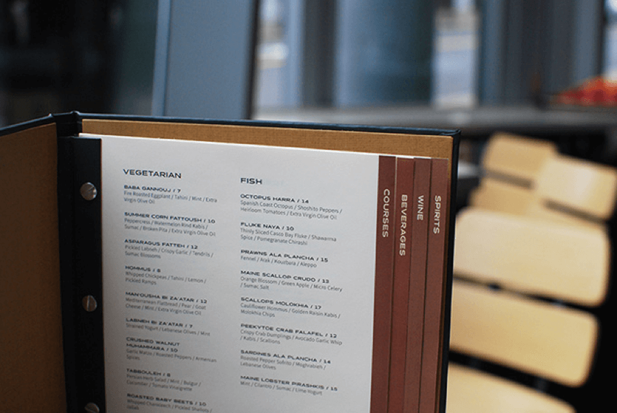
There are no graphics on this menu. But it still conveys the mood of Evo, an ultra-chic Middle Eastern restaurant in Maine. The high-quality typography is all you need to sell this restaurant’s small plates and craft cocktails.
Other examples of smart menu design include:
- The masculine color scheme and simple design, which let the beautifully crafted dishes speak for themselves
- Using food categories – a great way to organize a large menu
8. Alamo
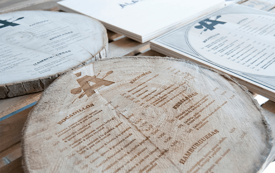
Alamo takes the cake for originality. Printed on slabs of wood, the menu feels like part of the restaurant’s interior.
What else we like about this restaurant menu sample:
- The design has a rustic feel, which pairs well with the Alamo’s cooking style.
- The logo is in-your-face and saucy. This adds an element of fun to the austere style.
9. C. Señor
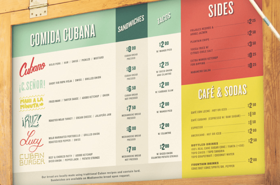
A striking color combination. Playful fonts. An easy-to-follow layout. Everything comes together in the C. Señor menu.
We also think these features are cool:
- The category typography stands out with a 3-D style.
- Beachy colors create a welcoming, tropical feel that’s perfect for a sandwich and taco shop.
10. La Principal
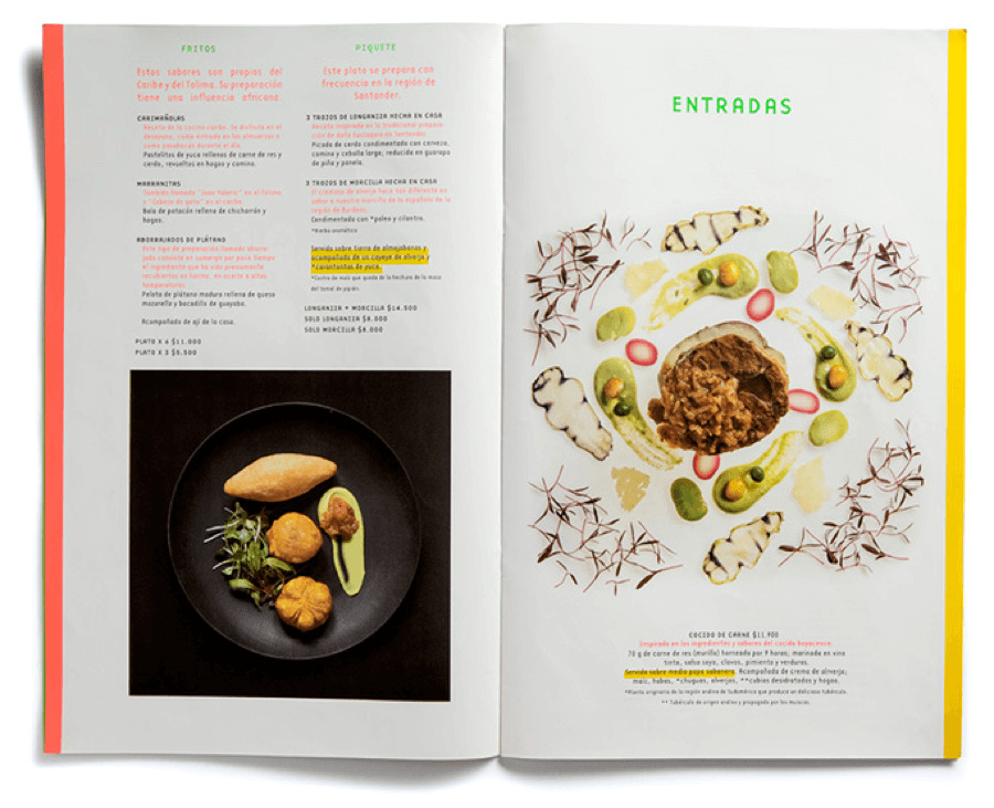
La Principal uses artistic food photography and bright colors. This menu is really effective at provoking appetite.
What we also like:
- Contemporary colors make the design feel energetic and fresh.
- The designer uses colorful page borders to add flair without distracting from the food.
11. Jackson’s Bluff
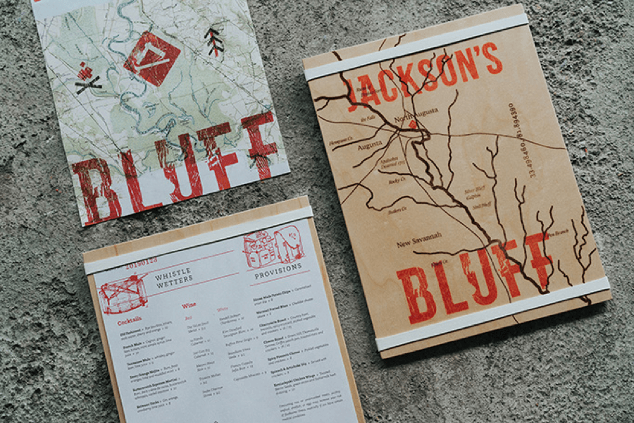
The unusual graphic style and materials give the Jackson’s Bluff menu a creative edge. The map illustration invites you to go on a journey when you visit this rooftop bar.
Also worth noting:
- The details are spot-on. From the Menu No. feature to the textured printing style, everything adds to the ambiance.
- The outdoorsy color palette helps to bring the customer further into the brand experience.
12. Bule Bule
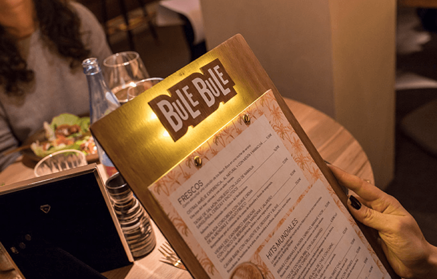
And to complete our list of amazing restaurant menu designs – a light-up menu! Ta-da.
Bule Bule menus come with a switch on the back. Turn them on and you get a glowing halo around the logo. A brilliant idea for their cozy, dimly lit interior.
We also chose this menu because:
- The design is practical. The restaurant can easily switch out the menu when they want to make seasonal changes.
- The decorative background looks great sandwiched between the plain wood base and simple black-and-white list of dishes.
Get a winning menu design for your restaurant.
Awful Restaurant Menu Examples
Now that you’ve seen some of the best restaurant menu ideas, let’s take a look at what you definitely don’t want to do when designing the menu for your café, pub, or a restaurant.
Problems like clutter, low-quality photography, and a confusing structure can make diners lose their appetite. A poor menu experience also degrades the perception people have about your brand.
Even if your food tastes great, if customers have a bad taste in their mouth before they even order, their overall experience won’t be positive.
Here are examples of bad menu design. Study them carefully so you know exactly what to avoid.
1. Ugly food photography
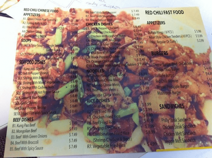
The low-quality background image makes it almost impossible to read the menu. There’s not enough contrast. And the extreme close-up makes the food appear unappealing.
2. Too much information
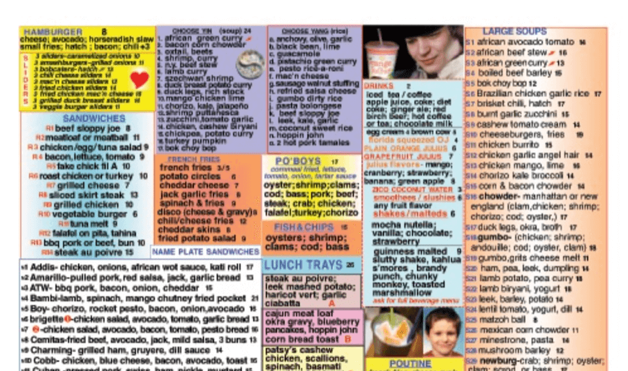
Don’t try to fit too much on the page. Without white space, it’s too hard to read the menu. Also, nothing here leads the customer. The color choices are confusing, and the photos are of people, not delicious food.
3. Chaotic illustrations
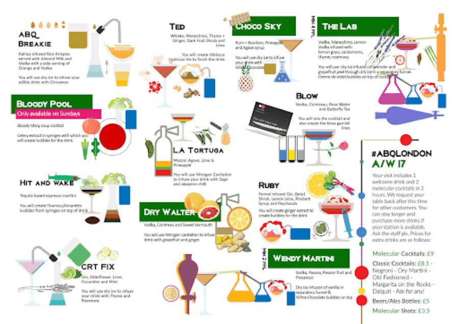
This menu has a scattered look. They had good intentions here, but the design looks amateurish. It’s difficult to make sense of the layout, increasing the chance that someone will make a mistake when ordering.
4. Outdated look
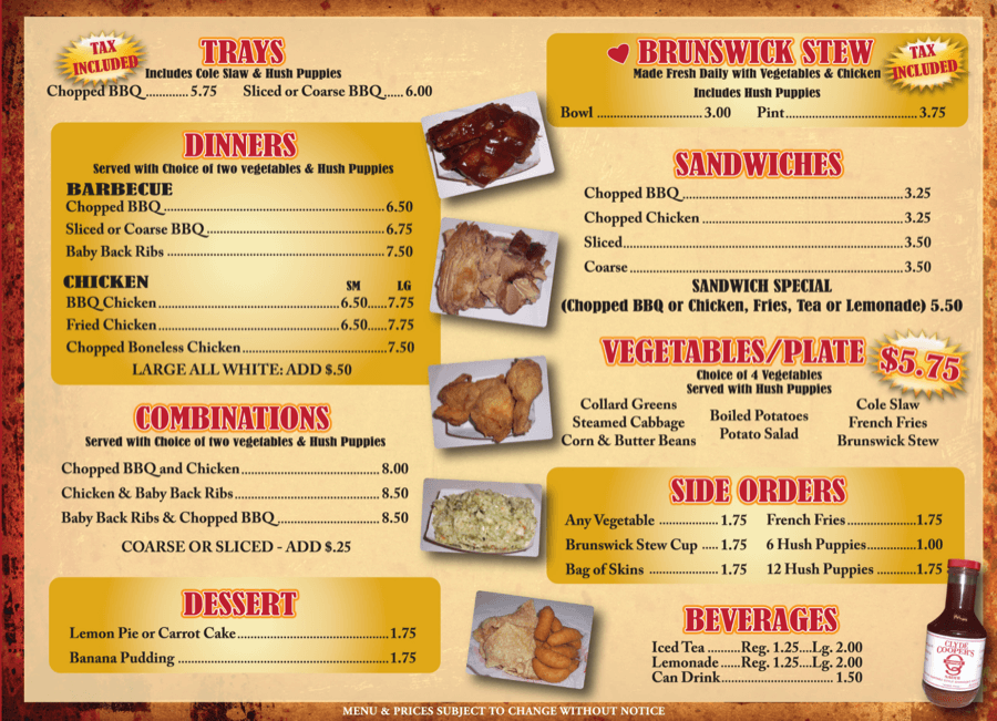
This menu looks like it’s from the ’80s. And in this case, that’s not a good thing. Also, the food photos make you want to run for the hills rather than order what’s on this menu.
5. Clumsy structure
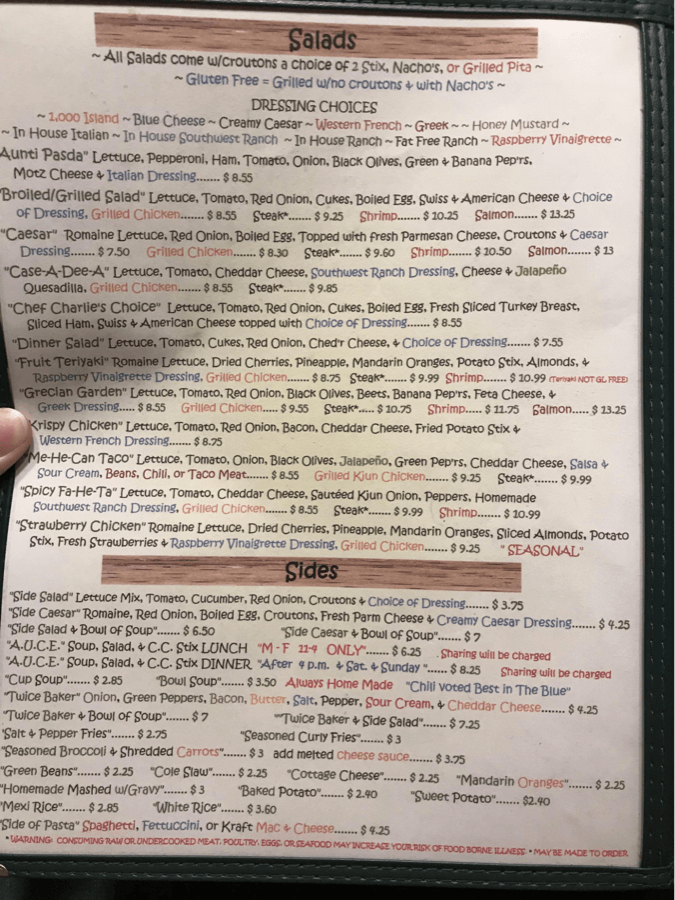
Here’s another menu in desperate need of white space. The text is too compact, and the random font colors don’t add value. There’s also zero structure, making it tricky to comprehend.
To Sum Up
When coming up with your menu, look at restaurant and café menu designs that provide the customer with a clear path. Keep in mind, your menu isn’t just a piece of paper that lists food. It’s a tool to help you sell.
Choose a design subscription to best suit your restaurant.
The bottom line is, you need to strive for a five-star experience every time someone walks through your doors. And your menu is one of the first things customers look at. So nail that first impression with a tasty menu design.
Restaurant Menu FAQ
The average diner spends two minutes looking at a menu. If you place menu items strategically and use a clear structure, you can encourage customers to spend more while dining at your cafe or restaurant. With great design, you make those two minutes really count.
A regular menu will list all your items. But there are several other menu types you can use as well:
- A la carte – means the menu items are sold separately.
- “Du jour”– refers to dishes served during the day.
- A fixed price menu – lets the diner choose what they want for each course without a change in price.
- The beverage menu – lists beer, wine, cocktails, and non-alcoholic drinks like coffee, soda, and juice.
- Dessert menus – come after the meal to encourage diners to order something sweet after eating.
When designing your menu, think about if using a separate menu makes sense based on your restaurant’s dining experience. For example, if you serve a huge array of beverages, you might want a wine menu, a coffee menu, and a cocktail menu to avoid clutter on your main menu.
When writing your menu, focus on the essentials. You don’t need to list every ingredient. Instead, choose key ingredients that convey the flavor profile of a dish or drink.
You can also include cooking techniques in the description to add interest. One thing not to do? Don’t over-emphasize the price. Let your customers think about what they are going to eat. Not how much they are spending.
When determining the categories, you can go traditional. Breakfast, lunch, dinner. Beef, fish, veg. Noodles, soups, and rice dishes. Or, think outside of the box. How you structure your items depends on what you serve. And, it depends on what’s popular at your restaurant.
No matter what you decide, make sure it’s compelling.
Think of it this way: every design decision you make should in some way enhance the user experience. What menu items to list. How to describe them. How to organize them. Colors, typography, even the type of paper. Every detail counts.
Dec 07, 2021


Andy Zenkevich
Andy is a seasoned CEO with years of hands-on experience in SEO, link building, content marketing and website development. His deep understanding of the digital landscape and passion for content marketing make him a trusted voice in the industry.