What’s the point of coming up with awesome products and services if no one ever uses them? You may have invented the next best thing to sliced bread, but if your customers aren’t buying, then it’s no win for you.
Of course, you probably know that the answer to the above issue is – advertising.
Unfortunately, all your competitors know that, too.
If you truly want your advertisements to stand out and get results, you’ve got to focus on advertising design.
But what exactly is advertising design? To put it simply, it is all the visual elements of your advertisements (also called ads). While it’s often used interchangeably with the term “graphic design advertising”, ad design differs in one notable way. Its sole purpose is to sell your product or service.
This handy article will tell you all you need to know about the most prominent types of advertising. We’ll also discuss some of the best advertisements we know of and offer a few great tips to help with your next design.
Ad design isn’t a one-and-done kind of job.
Epiic offers unlimited graphic design for a flat monthly fee.
The 9 Types of Advertising Design & 18 Epic Advertisement Examples
Back in the good old days of 2007, market research firm Yankelovich estimated that each person saw roughly 5,000 ads per day. Now imagine what that number is over a decade later.
As one in thousands, how do you – as an advertiser – stand out? The first step is to choose the right type of advertising graphic design for your situation – niche and goals. To get you started in the right direction, we’ve compiled nine of the most popular ad types below, along with their pros, cons, and a few examples of the best advertisements we’ve come across.
Direct mail advertising / email marketing
It’s one of the most traditional forms of advertising: direct mail (also fondly referred to as snail mail) and its digital counterpart – email. Direct mail can include things like postcards, catalogs, and flyers; emails are the online equivalent. It doesn’t matter whether it’s appearing in a virtual inbox or a physical mailbox. Mailed advertisements provide a great way to target your audience.
Pros:
- Both direct mail and email offer a relatively high ROI.
- Direct mail is more tactile and offers a different scope for creativity.
- More likely to be noticed because it’s sent directly to your audience.
Cons:
- It’s impossible to make corrections or change anything once it’s been sent out.
- Printed mail can be more expensive and less sustainable than digital options.
- Many emails are never read at all.
Example 1. Here’s one example of a hilarious direct mail ad. Interesting and eye-catching, KitKat’s Chunky ad makes mail fun again with its spoof on a missed delivery form. This ad works thanks to its personalization, script typography, and humorous approach.
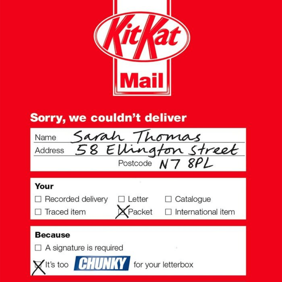
At this point, the free candy bar is just the icing on the cake. 😉
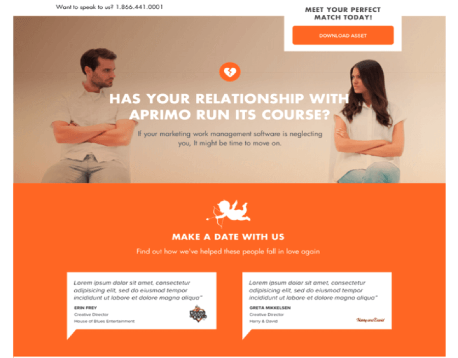
Example 2. This next ad is a great example of how visual design can help get your message across. The ad urges audiences to “move on” if their marketing work management software is being neglectful.
It backs the message up with an awesome image that reiterates a broken relationship, then urges you to “make a date” with the company.
Display advertisements
A display ad uses text, visuals, and a website link to get your attention and direct you to a website. Banner ads are one of the most common forms of display advertising. You can find them everywhere, from websites and social media platforms to your favorite apps.
However, display ads do have to compete with other information. That means the best display advertisements have a catchy design that gets noticed quickly.
Pros:
- Can use images, engaging videos, static or animated text, audio, etc., to connect with your audience.
- One of the easiest ad types to create and implement.
- A relatively inexpensive ad type.
- Can still positively impact brand awareness even if click-through rates are low.
Cons:
- People are likely to tune out your ad, especially if it’s not impactful.
- These ads don’t offer rather high click-through rates.
Example 1. PlayerUnknown Battlegrounds wins the display ad game. Why? Because its ad is so recognizable! Even if you’ve never played before, the bold typography, bright colors will no doubt catch your attention. And the use of one of the most powerful words in marketing — free — is also a great call.

Example 2. On a totally different yet equally effective note, there’s the Bulldog Skincare ad. It’s an irresistible combination of eye-catching colors, adorable animals, and humorous situations.
In other words, it’s a creative way to sell an everyday product. 💪

Event advertising
One of the best ways to connect with your audience is in person, which is what can make event advertising so effective. Events can include everything from hosting a product launch, taking part in a charity or sports event, or just getting a booth at your local trade show. While you’re there, you can use event advertising methods. Things like brochures, pamphlets, banners, and (our favorite) free branded items are always popular. 👍
Pros:
- Can be fun to get your team more involved in the advertising process!
- Additional benefits include increased brand perception, lead generation opportunities, and more.
- Offers a huge variety of ways to participate (i.e., handing out branded items, hosting contests, etc.)
Cons:
- Is often very expensive and time-consuming
- You don’t know how the event will turn out in advance.
Have a look at these two event posters. They couldn’t be more different — but they’re both equally effective.
Example 1. The first one has a minimalistic, eye-catching design, which is important in today’s busy world. The electric color scheme, typography, and CTA to “dance all night” sends out the easy-to-understand message. It’s time to have fun. 💃🥳

Example 2. Colors are equally important in the second ad, where vibrant pink and bright teal help catch your attention. Where most colleges might opt for more subtle hues, this event poster goes big and bold to stand out.
We love how the strong lines help direct attention to the main message, and the creative design highlights the theme of the event.

Social media ads
More people are on social media than ever before (more than 4.5 billion, to be exact). The main thing to remember when it comes to social media advertising is that you’ve got to know your audience. If you don’t, you’ll end up with a lot of people mindlessly scrolling past your company ad because it just isn’t relevant.
Be relevant and stand out if you want to win the social media marketing game.
Pros:
- Tons of platforms and potential customers to engage with.
- Offers a way to more precisely target your audience based on demographics.
- One of the easiest advertisement types to take part in.
Cons:
- Social media isn’t necessarily built for advertising; most people aren’t looking to buy while they scroll.
- Smaller businesses may have a tough time getting enough exposure to make it worthwhile.
- Doesn’t offer the best ROI compared to other methods.
Example 1. Here’s a creative approach to social media advertising done by Paricott.

While the subject may be a simple paper cup, the design turns it into something awesome and attention-grabbing. It’s fun, it’s clever, and it’s inspiring, which will make you look twice when you scroll past it on social media.
Example 2. The low contrast between the green phone and background combined with the vibrant food makes you look twice.
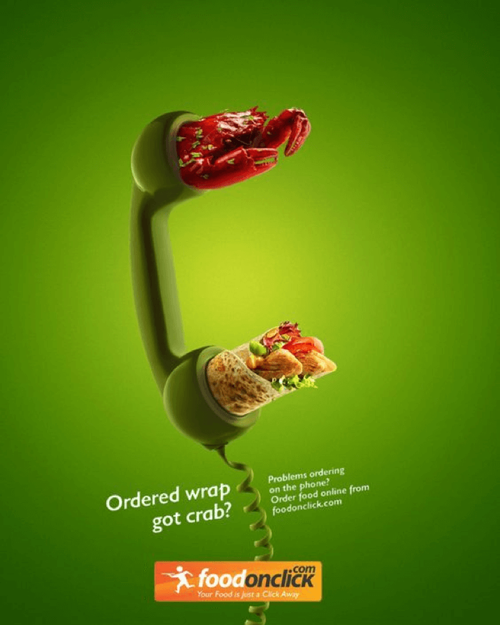
We love how there’s just enough copy to explain the image, there’s a good CTA, and the company name is front and center.
Newspaper / magazine (print) ads
Print ads may seem old school in today’s digital world, but you’d be surprised how well they still work. This type of advertising includes printed materials such as newspapers and magazines. They may not be as targeted as some types of advertising, but they often make up for this with a very broad reach.
Pros:
- Can reach audiences that digital marketing does not.
- A print ad often makes more of an impression and is considered more trustworthy.
- Can give you access to customers already interested in your industry.
Cons:
- Your ad usually needs to be print-ready (it requires no additional work).
- Some types of print ads can be pretty expensive.
- Timing can be tricky.
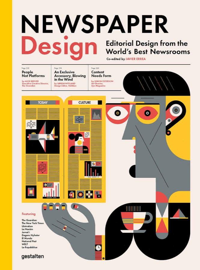
Example 1. If magazine covers seem boring to you, think again — this creative approach to cover design is instantly noticeable. 🤓 The funky graphic, bright colors, and pleasing layout help attract attention.
Yes, even for those who couldn’t care less about printed periodicals!
Example 2. But don’t think that color is the only way to go. Even black-and-white designs can be interesting, especially if done right as in the example below.
This designer evoked the nostalgia of old-time newspapers in a creative new way.
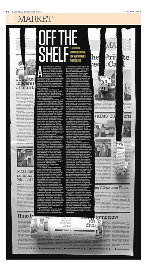
The careful destruction of the page that reveals the story is unusual and highly effective. 💪
Outdoor advertisements
Outdoor ads are — you guessed it — located outdoors. 🤓 They include everything from billboards and buses to flyers and posters. They’re also one of the most effective forms of non-digital advertising.
Like print ads, what outdoor ads lack in targeting power, they more than make up for with their broad reach.
Pros:
- Great way to reach huge amounts of people quickly.
- Good placement can positively impact impulse buys.
- Very great for raising brand awareness.
Cons:
- Have to be impactful to draw your audience’s attention away from their device / activity.
- Can be hard to track how effective the ads are.
- May be more expensive than other advertising types.
Example 1. Titan’s billboard is a creative and unique way to advertise its product. The ad makes great use of the large space with a dynamic leather belt design that stands out.

The billboard also has adequate white space and limited copy, making it easy to understand even if you only get a glimpse.
Example 2. This Formula ad also makes clever use of the space it’s in. We love the hyperbole that adds humor to the visual and makes it memorable long after you’ve driven past.
The limited copy and product picture help explain the whole ad, making it a very effective piece.

PPC (pay-per-click) advertising
With PPC advertising, you’re able to make your ad visible on the most coveted spaces on Google, Facebook, LinkedIn, etc. The catch? You pay every time someone clicks on your ad.
Pros:
- Once you’ve chosen the budget, demographic, ad design, etc., the platform will take care of the rest.
- Provides immediate visibility.
Cons:
- You have to pay for every click even if they don’t lead to any conversion .
- Won’t help your marketing efforts in the long run unless you also rank organically.
- Can get expensive over time.
- Many of your TA (target audience) ignore sponsored search results.
Example 1. Heinz does a great job of attracting attention with this clever visual — and that’s one of the main goals of PPC ads.
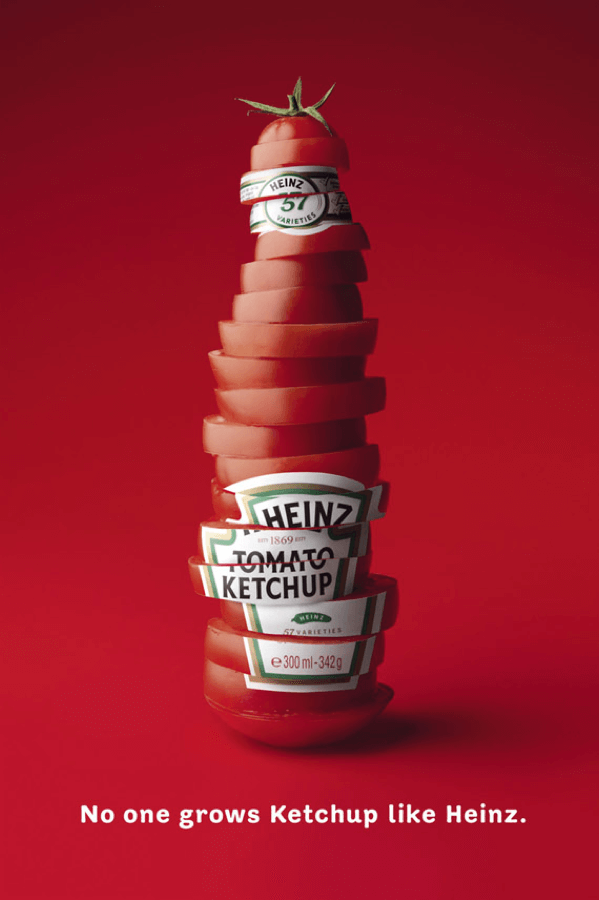
There’s just enough info to tell you about the product and company, and the funky picture is fun enough to catch your eye.
Example 2. Here’s another creative and attractive example that shows how to get some attention.

This ad uses color contrast to make a statement. It also uses a clever combination of the well-recognized location symbol and the company’s product to get the message across.
Impactful ads take time and effort.
Luckily, Epiic can help with unlimited professional designs.
Video / commercial ads
Video ads are one of the most effective ways to augment your branding and marketing efforts. Why? Because they’re so popular!
Once upon a time, commercials were strictly found on TV, but ever since the birth of YouTube, there’s been a dramatic increase in online videos. But, whether they’re interrupting your favorite show or you’ve searched for one on the web, no one can deny that video ads are effective.
Pros:
- Proven to help increase conversion rates.
- Allows you to tell a story and simplify complex topics or concepts.
- Are more dynamic and engaging than flat, 2D ads.
- Can appear anywhere from banners, apps, other videos, websites, etc.
Cons:
- Usually requires more time and effort to make.
- The video market is highly saturated.
Example 1. Here’s a creative Google ad that combines the nostalgia of a popular Christmas movie with a staple product of today’s world. What makes this ad so effective is, in part, its entertainment value.
Google also makes a power move by showing how things might have ended if only poor Macaulay Culkin had had a Google Assistant. 😎
Example 2. Have you noticed the trend yet? Groupon sure has — humor sells! This commercial ad urges you to support small businesses through Groupon’s services.
It’s a wonderful mix of informative dialogue and hilarious actions.
Window display advertising
Digital advertising might be bigger than ever, but that doesn’t mean that physical ads have died out just yet. Window displays (born from the pesky habit we have of window shopping) are a pretty unique type of advertising.
Like any ad, they’re designed to capture your attention and make you interested in buying a product. These displays are any products, signs, posters, or other objects located in the front window area of a physical store.
Pros:
- It can make a great first impression.
- It’s a great way to alert customers to promotions, deals, offers, etc.
- Different displays can target different demographics.
Cons:
- Limited to businesses with a physical location and adequate ad space.
- Requires time and effort to plan and build.
Example 1. Hello, color! It’s the first thing you notice about this window display for a Timberland shoe store. What a great way to capture your attention, right?
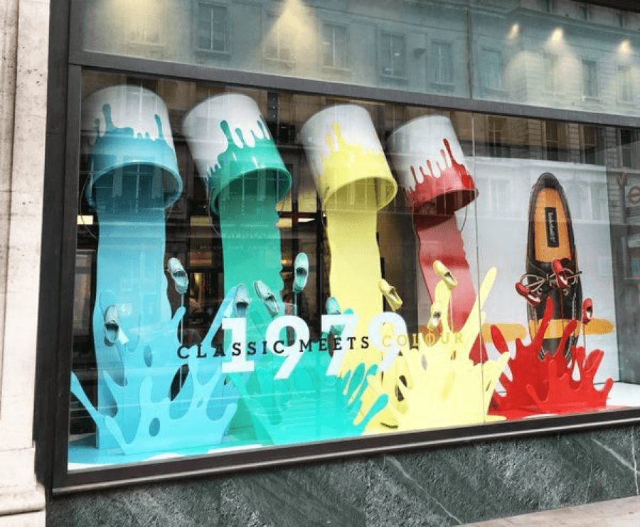
Not only does this unusual and creative display captivate, but it also does a great job of showcasing the product. The banner and window text offer additional context and complete the look.
Example 2. Here’s another example of an eye-catching window display.
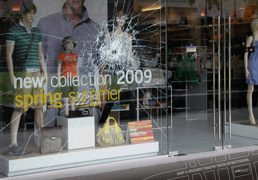
This clothing store utilizes a broken glass design — very out of the ordinary for most department stores. Here, though, it makes you take another look at their display.
Ad Design Tips to Make Your Product / Service Shine
Today it’s not enough just to have an ad — it has to look on point. So, how exactly can you make your company stand out with great ad design? Here are a few tips:
- Get creative. Don’t follow in anyone’s footsteps, even if you have a similar product or service.
- Keep it simple. Minimalist designs are a lot nicer to look at. Gain your audience’s attention with a clean and easy-to-digest ad, then direct them to where they can learn more. Always ask yourself: do I need this element? If not, cut it out!
- Don’t forget a CTA. A nice ad without a call to action is nothing more than a pretty face. For real results, let your audience know what they should do next.
- Embrace the power of visuals. Remember the old saying “show, don’t tell?” It’s important here, too! Most people are going to notice visuals first, so make sure they’re good and use a variety of techniques. Experiment with:
- Visual relationships
- Symbols
- Negative space
- Optical illusions
- Color
- Historical objects or people
- Patterns
- Pop culture elements
and more…
- Be honest. Advertising has gained a bad rap for being untruthful — don’t join the ranks of companies that got called out for exaggerating product claims. Hyperbole can be useful and even funny, but be sure that it doesn’t come across as deceptive.
- Keep your copy short. Your copy should only be as long as your audience’s attention span — these days, that’s usually pretty short. Some ads are successful without any copy whatsoever.
- Evoke emotion. Emotion sells — use it! Your message should make your audience feel something.
- Represent your audience. Try to represent as many niches of your audience as possible. After all, everyone likes to feel like they’re being seen.
And here’s one last tip. If you’re just starting out, not seeing the results you want, or are getting overwhelmed, it’s okay to turn to professionals for help with your company ads! 🧐
Attracting attention on a budget?
It can be done! Check out our prices today.
Great Advertising Does Make a Difference
No one ever got far in the advertising game by mimicking the competition. When you think outside of the box, experiment, be bold — that’s when you’ll start seeing some results.
It doesn’t matter what product or service you’re selling, or which advertising type you’re implementing. Your goal is to create memorable, trustworthy, and engaging ads. So, get inspired by these advertisement examples and tips and start creating!
Advertising and graphic design are not the same things. Advertising is artwork that is created specifically to help sell a product or service. Graphic design can be used for marketing, but also for various aspects of branding such as logo, typography, signage, etc.
Text? No text? Visuals? No visuals? Digital? Not digital? Humor? Seriousness? Unfortunately, unlike spandex clothing, advertising design doesn’t come in a one-size-fits-all option. What works for someone else won’t necessarily work for you. So, don’t try to copy other ad designs, but do:
- Be memorable.
- Be creative.
- Stay true to your brand, personality, and values.
- Make sure your message is clear.
There are many different types of advertising design. The nine most popular forms of advertising design (discussed in detail above) are:
- Email/direct mail ads
- Display ads
- Event advertising
- Social media ads
- Printed ads
- Outdoor ads
- PPC ads
- Video ads
- Window displays
Jan 19, 2022


Andy Zenkevich
Andy is a seasoned CEO with years of hands-on experience in SEO, link building, content marketing and website development. His deep understanding of the digital landscape and passion for content marketing make him a trusted voice in the industry.