We get it. When you’re a small business, you’ve got a lot of competition; and that means that you need to know how to stand out in the crowd. A fabulous product (or service) is a great start, but if you can’t reach potential clients then your great ideas will only take you so far.
Luckily, brands like yours have got several tools at their disposal. One of the most effective? A great small business website design! According to Forbes, simply having an online presence can mean the difference between growth and increased revenue, and… well, not enjoying those benefits.
You don’t have to be a professional web developer or designer to make a great site (although it sure does help). We’ve put together a crash course designed for small business owners like you who are interested in creating or upgrading your website.
Keep reading below for info on the benefits of having a site, the dos and don’ts of site design, and over 20 examples of websites to draw on for inspiration.
The Benefits of a High-Quality Small Business Website
Not too long ago (when the internet was only a gleam in our eyes), most of us relied on phone books, newspapers, or word-of-mouth to find and vet businesses. Sure, options were limited, and it usually took a lot longer to find what you needed, but they were simpler times.
These days, everyone and their dog has a website. That means that your business needs to join the party if you want to be seen by your potential clients.
A great website is one of the best ways to give your brand a competitive edge, simply because everyone is online anyway — putting your business in front of all these potential clients is a no-brainer. However, investing some time and effort into a truly great small business website pays off in the long run.
Well-designed websites:
- Act as a dedicated space for showcasing your brand, services, products, and personality.
- Help build your credibility and trustworthiness, which makes clients more likely to choose you.
- Make it easier to reach your target audience, generate leads, and expand your business.
- Offer the perfect space for customers to learn about your brand and find information.
- Help save time (for you and the customer) by providing easy access to information/online sales.
- Can act as a convenient e-commerce platform.
- Are a great way to facilitate conversation and interact with your customers and clients.
- Can contribute to your marketing efforts.
It’s easy to see why even the most recognizable brands still spend time and money implementing great corporate website design, right? The benefits are just too good to ignore.
Don’t let your customers slip away.
See how Epiic can help you design an awesome website.
So, what does a great website look like?
21 Inspiring Small Business Website Design Examples
Just because you’re a small business doesn’t mean you have to limit yourself with boring or small design choices. These top website design examples show just how powerful your site can be.
We’ve organized the list by the features we’re most impressed with, but we’ll also talk about some other things each site does right.
Ready to get inspired? Let’s go!
a. Images that speak for themselves
Velasca
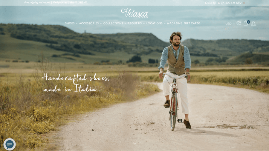
Velasca is an Italian men’s fashion brand that specializes in handmade shoes and accessories, and it really steps up the game when it comes to images. We love the high-quality photos and videos that showcase the products and the cultivated brand personality.
We also love the:
- Fun animated line drawings.
- Neutral color scheme.
- Unique menu design, complete with vibrant images.
Allbirds
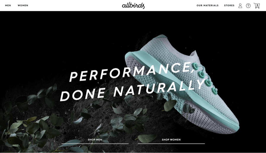
The Allbirds shoe company puts its best foot forward when it comes to site design. They use colorful, high-quality images that pop out from the muted neutral color scheme to create a clean, professional look. The dynamic homepage video adds additional interest.
We also love the:
- Clean and intuitive layout.
- Clear CTAs spread throughout the site.
- Sleek site design.
Covered Bridge Chips

Covered Bridge Chips (creators of kettle-cooked potato chips) don’t mince words on their site. Why bother when an image is just as good? When you click through the full-screen hero image carousel you’ll see some great photos of the brand, the product, and a fun intro video.
We also love the:
- Great scroll-through process section.
- Bold and exciting color scheme.
- Fun animated homepage product design.
Ivory & Deene
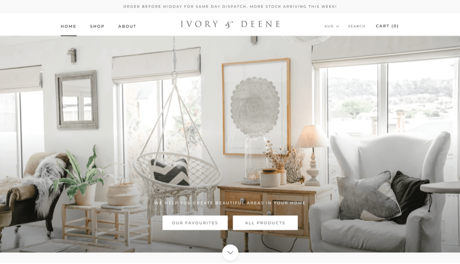
This Australian home décor store showcases its beautiful items with gorgeous photography in a clean grid design. We love how Ivory & Deene keep their images in line with their overall theme of elegant simplicity.
We also love the:
- Sophisticated and simple color scheme.
- Clean menu design.
- Graceful and functional typography.
Tattly
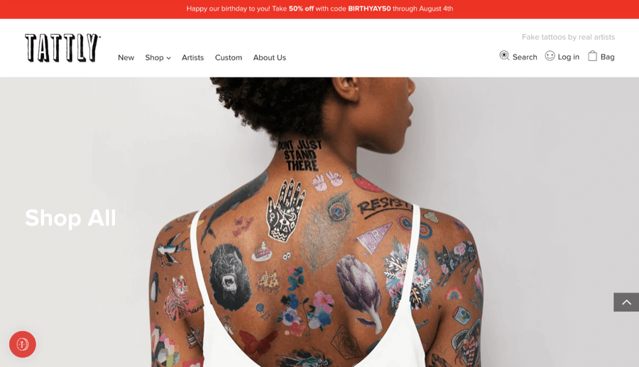
The professional artists at Tattly create and sell temporary tattoos for those who love awesome body art but aren’t so wild about a lifelong ink commitment. We love the bright grid of pictures that model the tattoos and also function as a gateway to the different product categories.
We also love the:
- Funky and memorable logo.
- Relatable, laid-back, and enjoyable copywriting.
- Traveling menu bar.
b. Easy-to-navigate menu designs
Brosa
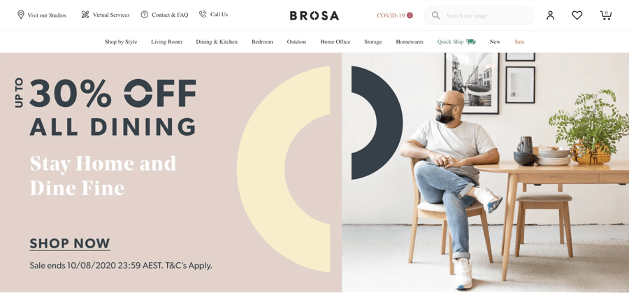
Brosa is an Australian-based online furniture and décor store with lots to see. Their huge range of inventory isn’t a problem, though, as the site designer has kept things simple with an easy-to-navigate menu that gets customers to their desired product in no time.
We also love the:
- Bold color block design.
- Furniture image icons and other pictures.
- Strong typography that mimics the logo.
Ratio Coffee
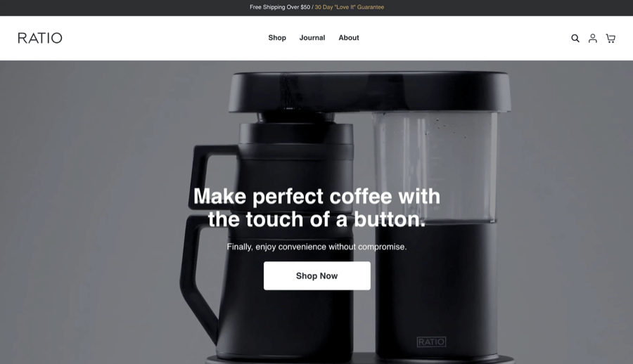
This ultra-modern company sells high-tech coffee machines that look like something from out of this world. The futuristic design of Ratio Coffee’s product and the overall theme is augmented by its smooth, intuitive menu.
We also love the:
- No nonsense typography.
- Clean and minimalist layout with plenty of white space.
- Dynamic brewing video.
Zee.Dog
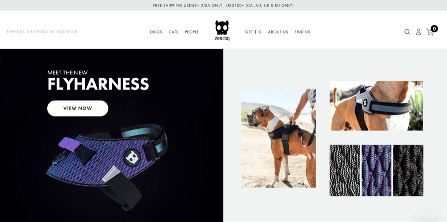
Zee.Dog is a unique company that sells pet accessories for man’s best friend (and for cats as well). They’ve got a huge range of products — but with clear and intuitive, neat menu categorization, their extensive selection remains neat and easy to navigate.
We also love the:
- Image-based homepage design.
- Impactful and memorable logo.
- Down-to-earth copywriting style.
Pop Chart
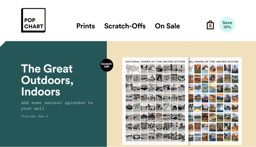
Wall décor has never looked so good thanks to Pop Chart, a company that specializes in unique posters. Their smooth and simple menu utilizes bold fonts, color, images, and even some interactivity to create a dynamic design.
We also love the:
- Clean layout with plenty of white space.
- Distinctive typography.
- Grid-layout of product images.
c. The coolest color schemes
Leif
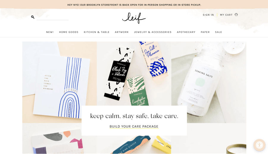
LEIF is a home goods store that sources unique items from around the globe. Its site uses a subtle pastel color scheme that fits perfectly with the personality of the brand. The overall theme of the site is graceful and refined, and the color scheme only supports that.
We also love the:
- Exquisite typography elements.
- Classy and accessible menu design.
- Minimalist Homepage.
MFMG
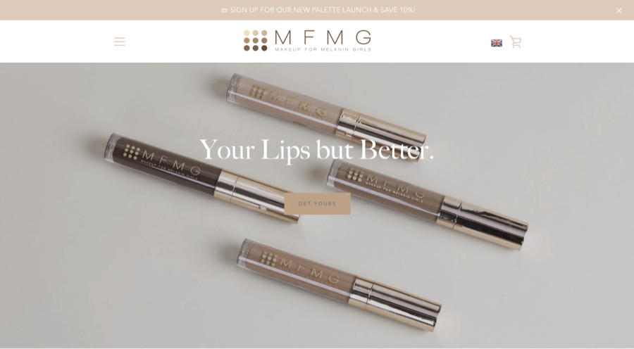
Makeup For Melanin Girls (MFMG) nails their color scheme. Of course, we’re not surprised that they’re absolutely fabulous with hues since colorful cosmetics are what this brand is all about. We love the way that the color scheme mimics the range of product colors.
We also love the:
- Awesome colorful logo.
- High-quality images and video content.
- Homepage testimonial carousel.
La La Land
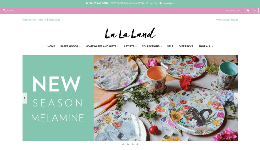
La La Land’s site sports a fresh and fabulous color scheme perfectly on par with their trendy gift and homework product line. We adore the vibrant, lively colors used throughout the site.
We also love the:
- Interactive collections flyouts.
- Blocky layout style.
- Typography that keeps things well-organized.
Studio Neat
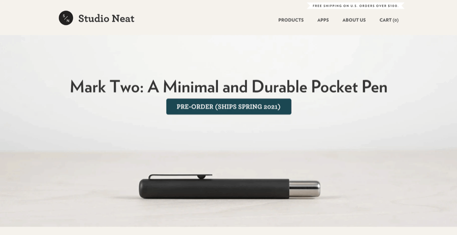
The stark, no-nonsense color scheme on the Studio Neat site may look out of place on another brand, but here it works. The neutral colors and bold typography do a great job reflecting the simple, effective brand personality.
We also love the:
- Effective use of curves and shapes.
- Amazing minimalist logo.
- Contrast between grainy and high-quality images.
d. Functional and fabulous layouts
Millk
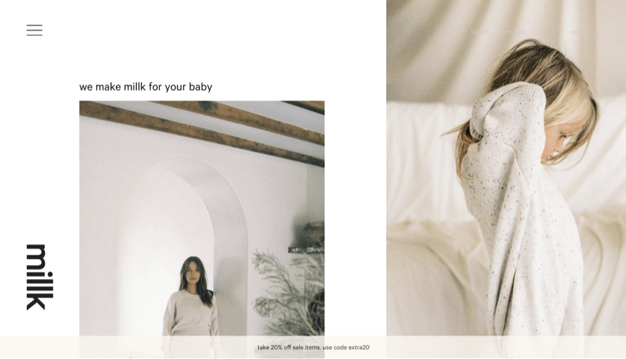
Millk, an Australian-based children’s handmade clothing brand, does an excellent job combining white space and other elements to create an aesthetic, easy-to-use site. The simple image collection and limited written content make the homepage a pleasure to peruse, especially for customers who are in a rush.
We also love the:
- Soothing color scheme.
- Minimalist menu.
- Simple and childlike typography style.
Madsen
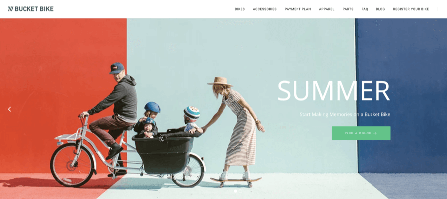
Madsen, a manufacturer of family bucket bikes, really takes us for a ride with their awesome layout. Their homepage has a lot of information on it, but they balance images, text, and white space perfectly so that things don’t seem cluttered or confusing.
We also love the:
- Beautiful blocks of color on the homepage.
- Use of videos and images.
- Click-through testimonials section.
Traackr
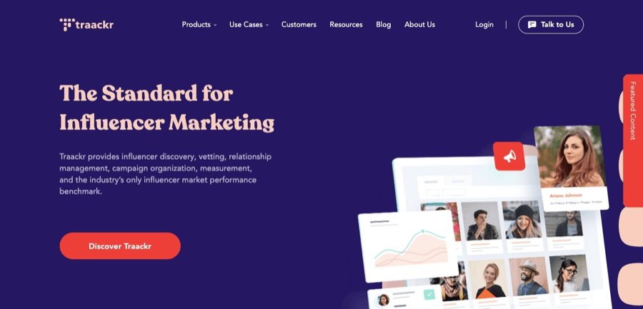
We love the way that Traackr — a brand designed to vet influencers — uses layout to keep their site looking clean and professional. They’ve got a great organizational method that combines testimonials, images, and written content for a professional yet informational appearance.
We also love the:
- Powerful, colorful typography.
- Rotating images.
- Clear and relevant CTA buttons.
Moat
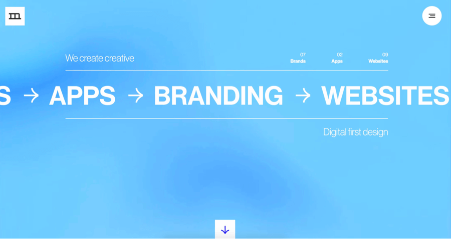
Moat works with customers to build websites, apps, and provide other online services. They’ve got a great layout in place, with sections that flow naturally and are kept distinct by interesting images and carefully considered typography.
We also love the:
- Interactive scrolling menu design.
- Minimalist black and white logo.
- Textured background.
e. Impactful Typography
Alley
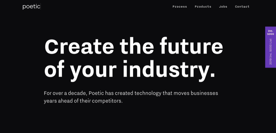
Alley helps businesses implement custom software and technology to promote growth. Their typography choices are bold yet not overpowering, offering an aesthetic and functional appearance that looks exceptional. We love the unique way they use color, size, and spacing.
We also love the:
- Focus on visuals and screenshots.
- Straightforward content and layout.
- Dynamic hero video.
World Financial Group
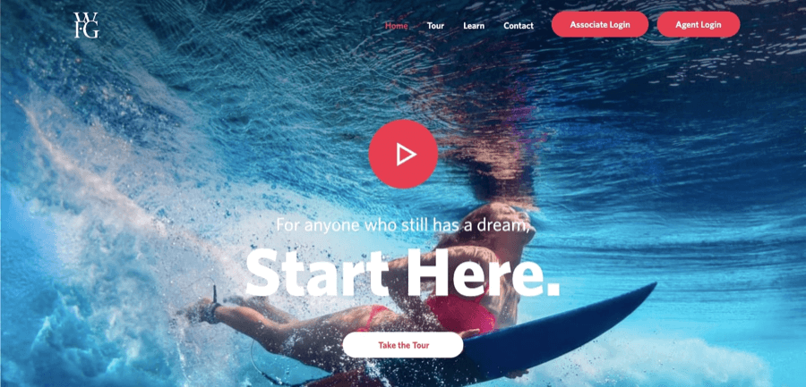
It’s hard to believe that a financial website could be so awesome, but the World Financial Group site is just that. Their dual-color typography style adds interest without affecting the professional corporate website design appearance, and well-placed headings help break up written content so that it’s easy to read.
We also love the:
- Down-to-earth tone of voice.
- Gorgeous background image.
- Traditional blue color scheme.
Confluera
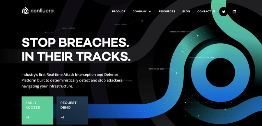
Confluera is a cyber-attack detection and mitigation company with a site that proves their designer knows what they’re doing. The typography this site uses ensures that the most important messages and numbers stand out, making it much easier for potential clients to learn about Confluera’s services.
We also love the:
- Easy-to-navigate layout.
- Simple and effective dropdown menu.
- Notable use of statistics.
Make It

The Make It company offers access to unique workspaces across London. Their bold company is perfectly captured by their bold site — especially the typography. The size, color, and even shape of the font make it hard to ignore anything on this site.
We also love the:
- Full-screen hero video.
- Dynamic moving elements.
- Bright, enthusiastic color scheme.
Excited to get started on your site?
Our pro designers are here to help. How?
Room for Improvement: 4 Site Design Don’ts
No site is perfect, but some are better than others. These four sites are great examples of what not to do when designing your website.
1. Thiel Foundation
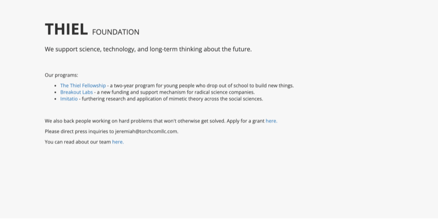
Minimalism is trending these days, but this site takes it a bit far. With no visuals, hardly any written content, and no color, this site reminds us more of a dictionary page or a 404 error notice than anything else.
The site designer has made it difficult to keep the audience’s attention and showcase the brand with a website like this.
2. Gates N Fences
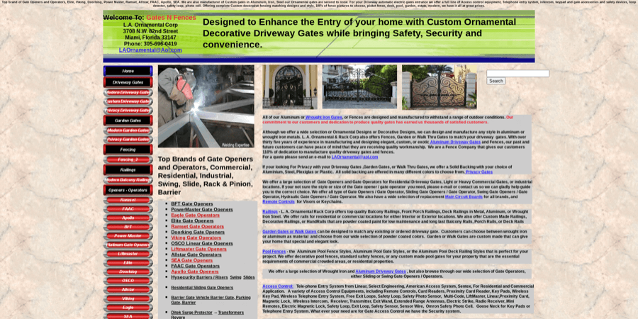
This site doesn’t skimp on written content, but they did skimp on formatting. The result is a hard-to-read, confusing and unimpressive website.
We’re also a bit put off by the mismatched green, tan and red color scheme, textured background, and cluttered layout.
Overall, not a professional look…
3. Rover P6 Parts

We wouldn’t call this site boring, but neither would we call it a success. Our main concern is the brutal typography, overly bright and mismatched colors, and low-quality visuals.
Altogether, these elements make the site feel more like a bad spam ad than a professional brand we’d want to work with.
4. Industrial Painter
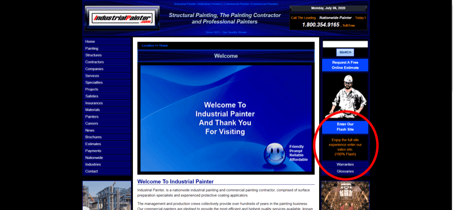
This site needs some help when it comes to navigation — mainly because it’s not really there. If it’s hard for customers to find where they want to go, you can kiss them goodbye.
This site also lacks relevant visuals, a strong color scheme, and an intuitive layout that would make it easier and more enjoyable to use.
Think you don’t have the budget for a great site?
Think again. 😉
To Sum It Up
Small business doesn’t mean small design, it just means you need to think big! A well-designed website can help you reach potential customers and grow your business into the beautiful entity you know it can be.
And remember, if you’re still worried about making the right choices for your site, you don’t have to do it alone. There are several great web design services for small businesses like yours. So, get out there and start creating!
You’ve seen the best and you’ve seen the worst; now it’s time to put your creativity to work. We’ve put together a small design checklist to get you started on the path to an awesome website.
What do you want your site to say about your brand? Are you sophisticated and professional? Fun and energetic? Choosing the right color and font can help instantly communicate your brand personality to current and potential customers. And, of course, great colors and typography are vitally important for an aesthetic site.
Our advice: Looking for color inspiration? Delve into the world of color and font psychology (all in the name of your business, of course!) for an interesting and informative place to start.
A brand without a logo? We think that’s as embarrassing as forgetting to put on proper pants for that important Zoom meeting. If you don’t already have a logo, it’s time to get one. Not only will it make your brand look more professional and trustworthy, but it will also help current and potential customers identify your goods or services.
Our advice: Great-looking logos can be hard to create — it may be worth it to get some professional help.
What’s one easy way to keep people interested in your website? Give them something nice to look at! It’s important to invest in high-quality visual content that’s relevant to your brand, especially if you’re selling products online.
Our advice: Steer away from stock photos whenever possible — your site visitors will appreciate the extra effort you put into your images.
Save yourself some time (and a headache) later on by taking a minute to outline your ideal site layout before you begin uploading content. Some proper planning will yield better results, fewer future adjustments, and a happier site designer.
Our advice: You can use an online tool or even just good old paper and pencil to create a serviceable wireframe.
Few things will annoy site visitors more than an unresponsive design. Invest in the tools that will make your site a pleasure to view, whether that be from a phone, laptop, desktop, or tablet.
Our advice: Make responsive design a priority from the get-go. Non-optimized design is thought to be one of the top reasons that site visitors bounce.
A user-friendly site is a sure way to please your online consumers, so take the time to ensure your website is functional and aesthetic. Once you’ve got content in place, arrange it so that the layout is clear, logical, and good-looking. Play around with images, written content, white space, and other elements to ensure your site not only looks great but makes sense, too.
Our advice: Don’t underestimate the importance of white space in your design.
Think videos are too hyped up? Think again. A 2018 study by Statista found that 85% of online users watch video content every month. Taking the time to create some quality videos will pay off in the long run.
Our word of advice: Don’t try to upload your videos directly to your site. Instead, use a video hosting platform like YouTube and embed your videos onto your website from there.
Polish up your site with clear written content and give your visitors a great on-site experience. Online customers don’t spend much time reading through sites these days, so make sure your writing is understandable, concise, and focused on relevant information.
Our advice: If you’re not sure you trust your writing skills, you can always invest in a professional copywriter.
Jan 05, 2022


Andy Zenkevich
Andy is a seasoned CEO with years of hands-on experience in SEO, link building, content marketing and website development. His deep understanding of the digital landscape and passion for content marketing make him a trusted voice in the industry.