Chances are that if you’re reading this right now, you’ve asked yourself, “Why isn’t my website converting more visitors into leads?” 🤔
Or, more accurately, you’ve asked yourself, “What am I doing wrong?!”
Well, don’t throw your computer across the room in frustration (yet) 😁 because the answer to your problem might be deceptively simple. Ever thought about adding some lead generation landing pages?
One of the biggest problems with online marketing today is that all your potential clients are used to it! Your site visitors aren’t going to be wowed by a sneaky pop-up ad or inspired by a gentle CTA (call-to action) anymore. If you want that contact info, you’re going to have to work for it.
A lead generation landing page — or lead gen page — is a great way to capture visitors and turn them into quality leads. So, sit back, relax, and let’s talk about what exactly a lead gen page is and how to optimize your lead landing page design to start boosting your business.
What Is a Lead Generation Landing Page?
Lead gen pages are funnel pages that are designed to help you gather information like names, email addresses, and phone numbers. Think of these pages as the beginning of the conversion process. Once you’ve captured your target audience’s attention (and contact info!), you can start building a quality relationship with them. Nurture that relationship the right way, and your leads will turn into clients and customers. ✌️
Unlike other site pages — like the homepage — users often find lead landing pages after clicking on an ad or a social media post. The best lead capture landing pages, therefore, assume that the site visitor already has some interest in the product or knowledge of the brand.
These pages put compelling CTAs front and center to make it easier for visitors to take the next step.
7 Tips to Generate More Leads on Your Landing Page
No matter your industry, lead generation marketing is a great way to boost your clientele, sales, and brand. But a great lead gen landing page is sometimes easier dreamed of than done.
If you want to optimize your pages and start generating more leads, here are seven best practices to keep in mind. 💡
1. Don’t slack on the design
Let’s face it — we’re all a little judgmental online. Your page design is one of the first things site visitors notice, and you can bet that they’ll judge your brand by it! The best lead generating landing pages have great designs that keep visitors from losing interest.
❗ Do:
- Keep your style, tone, and appearance consistent with your brand.
- Ensure text is easily scannable with clear headlines.
- Try to evoke an emotional response in your visitors.
- Use eye-catching elements like images, videos, and more.
- Use white space appropriately to cut clutter.
2. Go above and beyond — the fold, that is
Above the fold is prime real estate. But you can also take a page from your favorite TV show and treat this space as a virtual cliffhanger. Save it for your best stuff, including great copywriting, interesting pictures, and compelling CTAs.
❗ Do:
- Include relevant CTAs to direct the visitor.
- Don’t overcrowd the space.
- Use a memorable headline to grab attention.
3. Keep forms short, sweet, and to the point
Landing page forms are a necessary evil. 😈 They’re one of the main elements of your page — after all, the whole goal of this page is to capture content info. But filling out online forms isn’t exactly a fun way to pass the afternoon. Make your visitors happy and keep forms as painless as possible.
❗ Do:
- Ask for as little information as possible.
- Use buttons, checkboxes, and drop-down menus if you can.
- Make sure the page is mobile-friendly.
- Use a great design to make your form stand out.
4. Brag a little (or a lot)
Your lead gen landing page is no place for false modesty. Why should your page visitor take the next step and become a customer? Don’t be afraid to talk your brand up and highlight what makes you special!
❗ Do:
- Focus on immediate benefits of signing up, subscribing, etc.
- Talk about what makes your brand unique.
- Tell your clients how your brand will make their lives better/easier/more enjoyable.
5. Get others to brag for you, too
Your potential leads are only going to give out their contact info to brands they trust. One of the best ways to achieve the coveted trustworthy status? With social proof or endorsements about your product or service that come from outside sources. 💡
❗ Do:
- Feature positive testimonials, reviews, etc., on your page.
- Showcase any well-known brands you work with.
- Use a variety of social proof types if possible, i.e., expert, celebrity/influencer, user, etc.
6. Make your copywriting exciting
Most site visitors don’t arrive on your page with huge attention spans — you’ve got just a few words to catch their attention. Make them count!
❗ Do:
- Focus on headlines and sub-headlines and make them catchy.
- Use persuasive language.
- Address prominent pain points (and how you can alleviate them).
- Use focused action words for CTAs, i.e., subscribe, download, schedule, start, etc.
7. Take your ideas for a test drive
Not every first idea is the best idea, which is why it’s important to test different landing page designs. One of the best ways to do this is with A/B Testing, which allows you to compare different versions of the same page. The results of these tests should let you know which design is more effective.
❗ Do:
- Test as many variables as you can, but not all at once.
- Start with a simple change, like a different color or sizing.
- Test as frequently as you can.
- Pay attention to test results and change things accordingly.
Wow your site visitors with pro page design?
Check out how our services work today.
“Sign Us Up!” 5 Great Lead Generation Landing Page Examples We Love
Ready to see what some of the best lead capture landing pages look like? Whether you use them as inspiration for your landing page or just want to bask in their awesome design, here are a few examples of great pages we’ve found. 🤓
Vancouver Island University
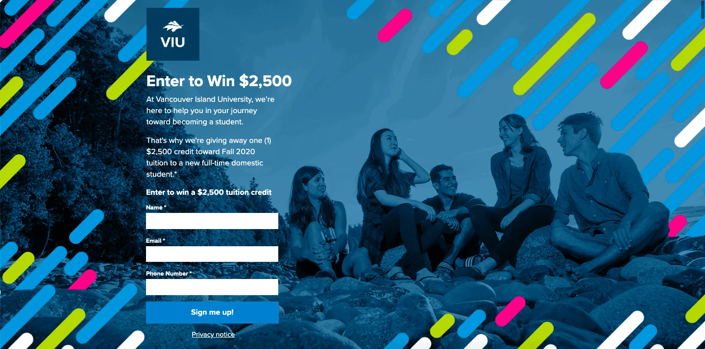
Who doesn’t love the idea of winning some free cash? College students would definitely be on board! Vancouver Island University recognized the draw of a lottery for reduced tuition and used it to its advantage. Their landing page offers a chance at $2,500 off tuition just for entering your contact info.
Why this works:
- It has clear copywriting that’s friendly, informative, and helpful.
- The strong color scheme reflects the school’s main website design.
- The simple information form is quick and easy to fill out.
- A strong headline targets one of the main pain points college students have — and tells them how to solve it.
ckbk
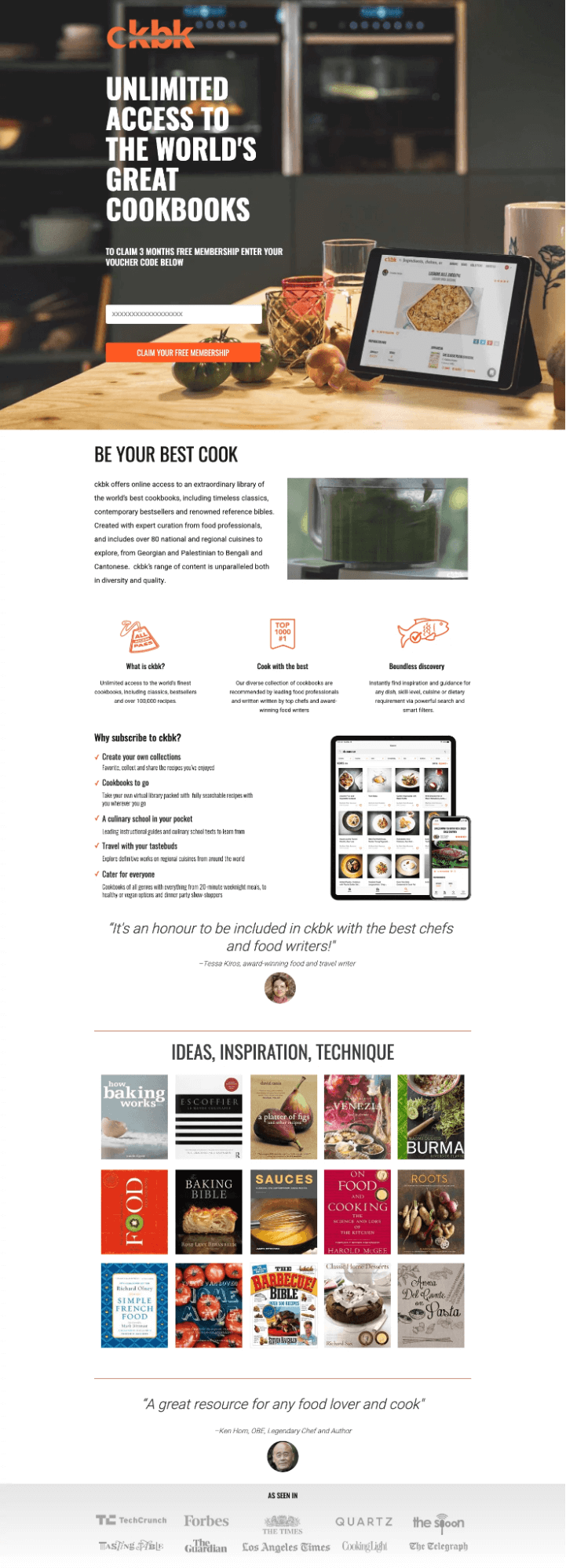
ckbk, a digital cookbook service, has a longer lead landing page design than our other examples. Despite that, it still manages to be incredibly effective! And unlike the other examples, this page isn’t looking to gather boring old contact info. Instead, it’s offering a free, short-term membership in return for a voucher code.
Why this works:
- The strong headline immediately tells you what you get when you sign up.
- It includes many instances of testimonials, trusted logos, and other social proof.
- There are plenty of compelling and relevant images.
- The copywriting is open and honest but still positive.
National Sewing Circle
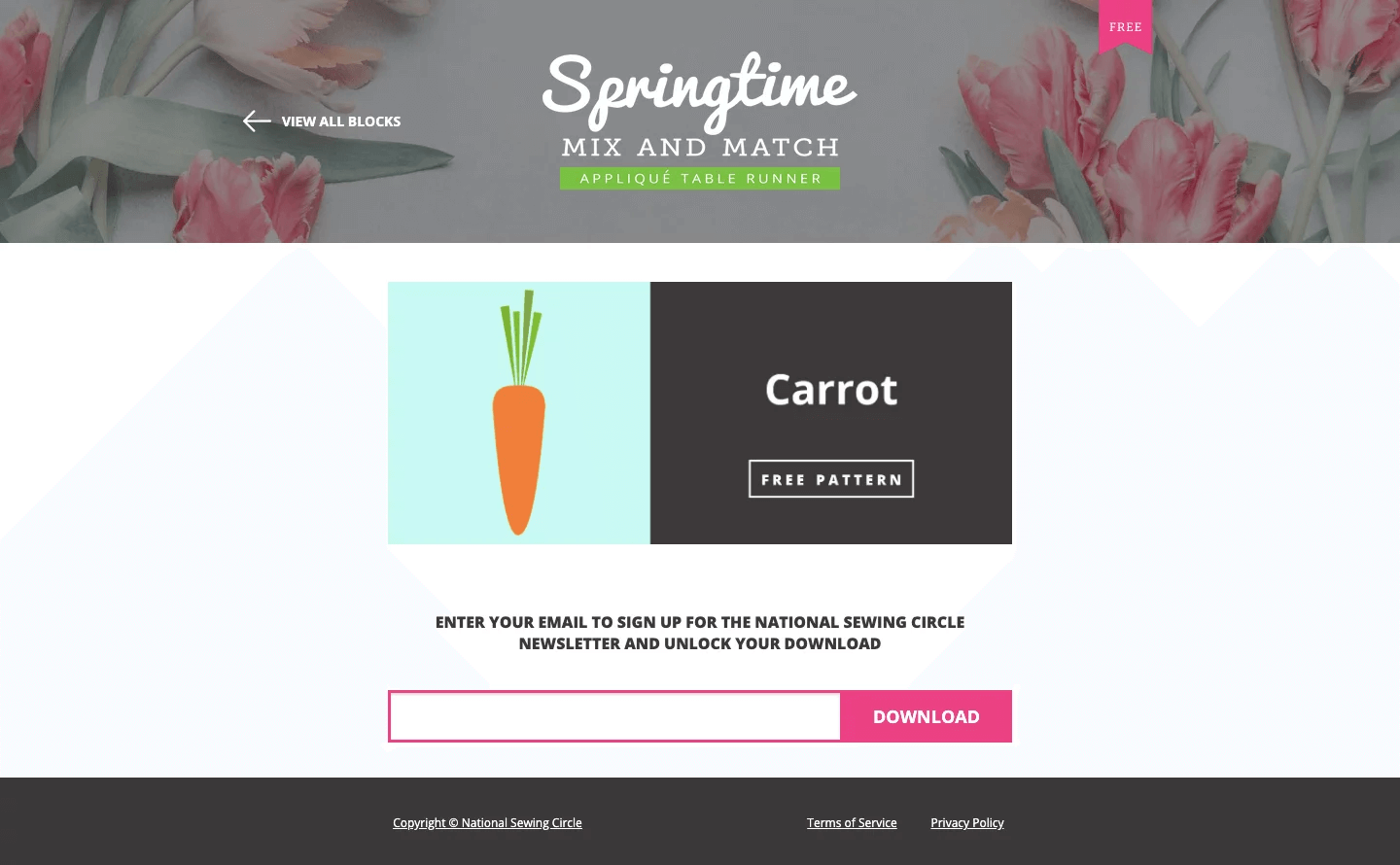
The online community at National Sewing Circle is pretty passionate about the subject of sewing. This helps make the NSC landing page much more effective. NSC makes the list of best lead landing pages thanks partly to a simple design.
Equally important, though, is their spot-on knowledge of what their target audience is interested in.
Why this works:
- The privacy policy and terms of service are included on the page.
- A fun visual download draws your attention.
- Minimal written content makes the page easily scannable.
- The form is as simple and easy to use as it gets.
UENI
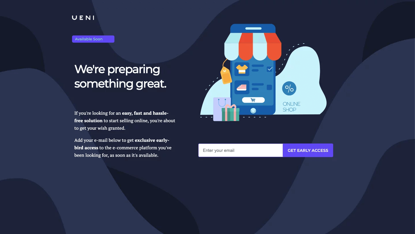
UENI, a website building service, clearly knows how rewarding anticipation can be. They promise that something great is coming but offer few details. And that only makes your curiosity stronger! Even we were on the verge of signing up until we realized we had a blog post to finish first. 🤩
Why this works:
- It creates a sense of urgency, thanks to the early-bird access offer.
- A strong headline captures your attention immediately.
- Plenty of white space makes the page feel clean and uncluttered.
- Additional copy offers a bit more information while remaining mysterious and interesting.
Australian Life Tech
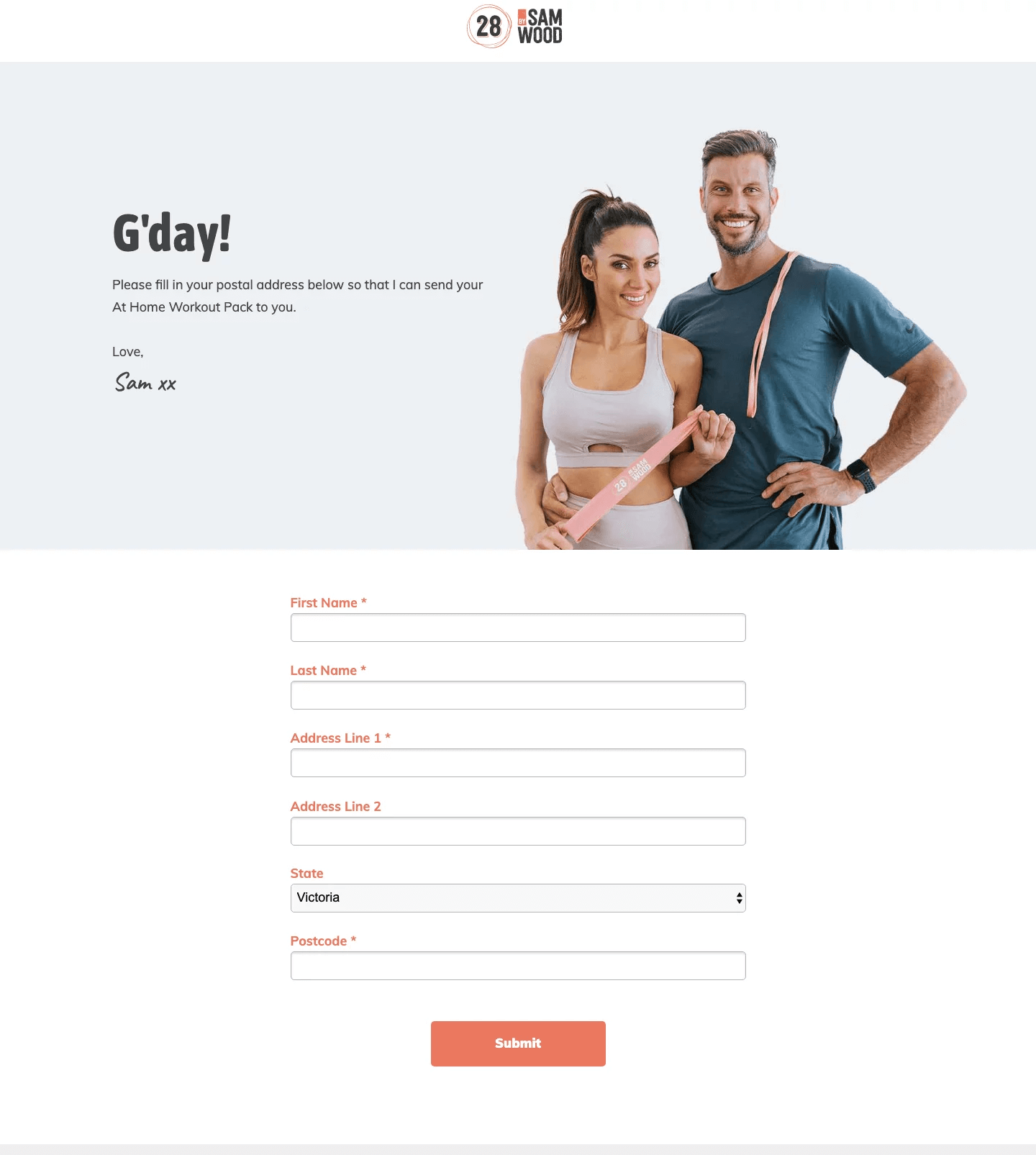
When it comes to health and fitness sites, a clean and simple design is usually the way to go — as Australian Life Tech clearly knows. Their lead landing page design may look sparse at first, but in reality, it’s got everything it needs to be a huge success.
Why this works:
- The hero image is upbeat, personable, and intriguing. 💪
- Minimal copy keeps the page easily scannable.
- The form may be a bit longer, but a drop-down menu option makes filling out info faster.
- The promotion is already tailored to appeal to a select group of site visitors.
Not sure if a professional design is worth it?
Why not try comparing Epiic design with your current content?
Ready to Convert Your Visitors?
Just because you’ve got a great brand, strong site, and superb product or service doesn’t mean you can sit back and relax. If you want your site visitors to turn into clients and customers, you’ve got to put forth some effort.
A quality lead gen landing page is just the thing to help your brand find new leads and grow. It’s worth investing in! Now you’ve had a chance to experience these lead generation landing page examples and tips. Are you ready to get out there and optimize your page to start generating more leads?
Jan 27, 2022


Andy Zenkevich
Andy is a seasoned CEO with years of hands-on experience in SEO, link building, content marketing and website development. His deep understanding of the digital landscape and passion for content marketing make him a trusted voice in the industry.