“Designers don’t get hired to make pretty things or win design awards. We get hired to solve business problems.” – James Bradley
Maybe you sell socks. Maybe you sell suits. Perhaps you’re running a successful tourism company or the head of a public safety agency. No matter your product or service, one thing is for sure: you know your brand is great. So how do you make everyone else recognize that?
There are lots of different ways to market your brand; and, of course, some are better than others. For example, did you know that in the past few years, online consumers have demonstrated a definite preference for visual content? Not surprising when you consider that 65% of people are visual learners.
If you want to communicate effectively with your target audience, visual marketing and design need to be a priority. But where to start? In this article, we’ll delve into what visual marketing is and why it’s good for your business. We’ll also discuss some solid strategies and visual marketing examples that will help you prepare for your next campaign.
What Is Visual Marketing?

To put it simply:
Visual marketing is the process of using multimedia content (i.e. images, videos, GIFs, charts, etc.) to communicate with your target audience and reinforce your brand. It’s an important piece of your overall marketing strategy, to help you introduce ideas and concepts much more effectively than with the use of text only.
One of the best things about visual advertisements and content is that they’re so diverse. When we say visuals, we mean things like:
- Images and screenshots
- Videos
- GIFs and memes
- Charts and data visualizations
- Infographics
- Presentations
- Quotes
- Interactive surveys or quizzes
- Interactive tools
and more
Even better than the variety? Unlike written content, visual content is more appealing to consumers. That means it’s often more effective. For most people, images are more pleasing to look at than solid texts. We can also absorb visual content quickly while retaining its message. This is a must-have benefit in today’s world of over-information and incessant scrolling.
And, of course, the right visuals can do wonders for your SEO. Visual marketing helps make your content more exciting, enticing, and dynamic. It elevates your brand so that you have a better chance to capture and keep your audience’s attention.
It’s for these reasons (and many more) that brands are jumping into visual marketing with all the enthusiasm of a cat going after a laser pointer beam.
Visual marketing is a great way to reach out to and engage with your audience while still getting important messages across.
Want to really capture your audience’s attention?
Learn more about how Epiic can help you today.
Top 5 Types of Visual Content Marketing
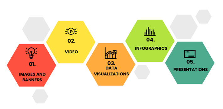
A 2020 survey by Venngage found that most participating content marketers used visuals in at least 91% of their content. These people think that visuals are important! With such high implementation though, it makes you wonder: what types of visual content are the pros using, and – why?
Here are the five most common types of content used in visual marketing and design and a few stats to go with them.
Images & banners
Images and banners are by far one of the oldest and most popular forms of online visual content. They’re versatile, easy to incorporate, shareable, and effective. They’re also critical to any visual marketing strategy. You can use images for anything from splitting up big blocks of text to showcasing your fantastic products.
Think about sites like Pinterest or Instagram where images are the main draw. Facebook, Twitter, and even blog posts also use pictures to capture your attention.
The stats:
- The average person recalls about 65% of the visual content they see.
- Content with high-quality images will receive 94% more views.
- Consumers are 60% more likely to choose your business if you use good images.
Videos
These days, almost no visual content is more popular than videos. Not only are they versatile, but they can also be fun and engaging for the consumer, keeping them on your page longer. Consumers are much more likely to take the time to watch a video than they are to read a block of text. Videos also have the added benefit of increasing your brand’s trustworthiness and bolstering your connection with consumers.
The stats:
- Landing page videos can increase conversion rates by 86%.
- 83% of video marketers say using video helps decrease bounce rate; 78% say video increased their sales.
- 93% of brands gained a new customer after posting a video on social media.
Data visualizations
Data visualizations are like the “middle child” of the visual content world — they’re probably not the first thing that comes to mind when we talk about visuals. While not as flashy as an infographic or as entertaining as a video, data visualizations can still make complex information manageable and interesting.
They can be anything from a simple bar chart to a compounded diagram. They’ve got fewer design elements than infographics, so it’s easy to stick a data visualization onto a presentation, image, or video.
Best of all? Data visualizations take almost no time to produce.
The stats:
- People will trust scientific claims that include a simple graph of the info.
- The most-read story from The Washington Post is a data visualization piece.
Infographics
This type of content lets you condense all your complex data and statistics into easy-to-digest visuals with a bit of text on the side. A huge bonus? Infographics are one of the most shareable forms of visual content — bloggers and social media users love them!
Infographics are more complex than simple data visualization. They also require some design savvy to ensure that they match your brand’s theme and personality. When you’re creating an infographic, it’s important to consider the layout, design, color scheme, and information. Do that and your visual will not only make sense, but it will also be sensational.
The stats:
- Infographics are 3x more likely to be shared on social media than other visual content types.
- Including infographics can boost your site traffic by 12%.
Presentations
A slide deck (or, for us – older folks, a presentation) is a great way to get your message to consumers without overwhelming them. Like infographics, presentations take complicated concepts and break them down for your audience. They’re the ideal content type for lengthy topics that don’t work well as text or other visuals.
Slide decks are also amazingly customizable and can look very professional when done right. This can give your brand the edge it needs in this competitive age.
The stats:
- Nearly 65% of slide decks receive positive audience feedback.
- Slide decks are a great way to summarize info — in fact, approximately 47% of all slide decks are created to make complex topics easier to understand.
Want to experiment with different visual content types?
Let us help you find a look you love!
How Visual Marketing Can Benefit Your Brand
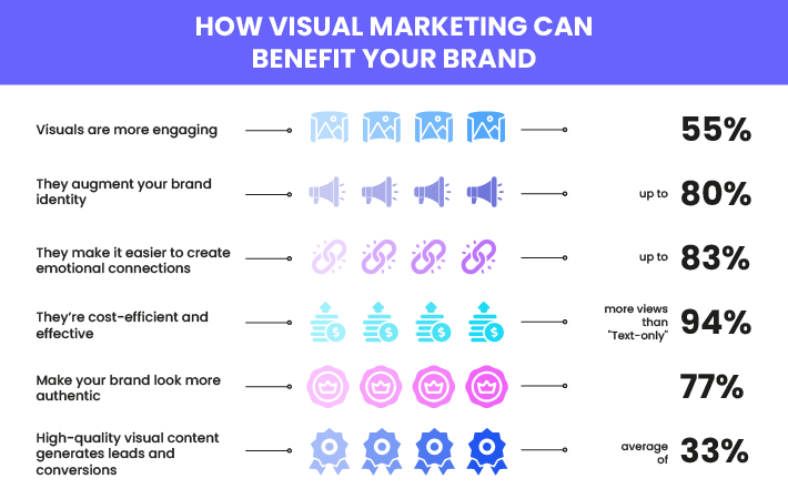
Still not sure if visual marketing is right for your brand? Here are six good reasons to make visual content a priority during your next marketing campaign.
Visuals are more engaging — in both the short and long term
Content is king, but only if consumers pay attention to it. That’s why visuals can be so powerful. Not only are our eyes naturally drawn to visuals over text, but it takes us only a fraction of the time to decipher pictures than it does to read a paragraph.
That means a lot, considering that most consumers will leave a page within 10 seconds if it’s not engaging enough. Compelling images and other visuals capture your target audience’s attention and keep them focused on your brand.
As for long-term engagement, a great visual can also keep your consumer coming back to your brand. Studies have shown that visuals linger in your long-term memory and that we remember pictures better than we do words.
They augment your brand identity
Much like your logo, your visual marketing content helps define your brand. High-quality branded content is going to make a big difference in the way that consumers view your company. It can even become closely tied to your brand identity!
The most effective imagery will stick with a customer long after they’ve left your page. So, choosing the right imagery helps “cement your visual identity” and strengthen your brand.
It’s easier to create emotional connections with visuals
There’s so much psychology that goes into visuals — which isn’t that surprising when you consider that we’re highly visual creatures. Certain colors and pictures will evoke certain emotional responses in your viewers and help them draw closer to your brand.
Images, videos, and other visual content can be processed almost immediately and create stronger reactions than the written word can.
They’re cost-efficient and effective
High-quality visuals may not be the cheapest resource in your marketing portfolio, but no one can deny how effective they are. Visual marketing (when done right) offers a great ROI. How?
- It increases brand awareness to reach new customers.
- It engages with current customers to keep them happy.
- It helps prevent bounces from your site.
- It promotes your brand identity in ways that words can’t.
And not only does it generate better consumer relationships, but a well-documented strategy can also help you understand your target audience better. This in turn can help you ensure that your customers stay happy with your brand.
Visuals make your brand look more authentic
Not only are images and other content types a great way to capture consumer attention, but they also do wonders for your authenticity. User-Generated Content (UGC) in particular is a great way to add social proof to your brand and appear more trustworthy and relatable.
Taking the time to show off your brand with high-quality visuals (or engaging with your consumers to create and share high-quality visuals) humanizes your company. That, in turn, makes consumers more willing to interact with your brand.
High-quality visual content generates leads and conversions
The right visual marketing and design strategy can lead to some serious results. We’re talking about increased sales, more unique leads, and greater conversion rates. With more consumers turning to videos and social media to learn about brands, it’s important to make sure you have a strong presence on these platforms.
Adding calls-to-action to your visual content creates a clear path for consumers to follow. This makes them much more likely to engage with your brand through purchases, shares, and in other positive ways.
We all seek pro results without the hefty price tag.
Now Epiic offers that!
3 Awesome Visual Marketing Design Examples
What’s one of the best ways to make a stellar visual advertisement or run a successful campaign? Learn from the experts, of course! We’ve got three great examples of visual marketing designs to help inspire you and your team.
Chipotle’s Back to the Start Video

In less than two and half minutes, Chipotle’s “Back to the Start” video tells a poignant story about “cultivat[ing] a better world.” This 2011 stop-motion branded video was so good it’s since amassed millions of YouTube views, has been widely discussed on social media, and was even played in movie theaters and during the GRAMMY Awards.
Here’s why it’s a success story:
- It’s simple, poignant, emotional, and entertaining.
- It reflects a cause that consumers can support and share.
- It tells a story not just about the brand but about the world.
- It promotes Chipotle’s sustainability ideals.
Starbucks Instagram Account
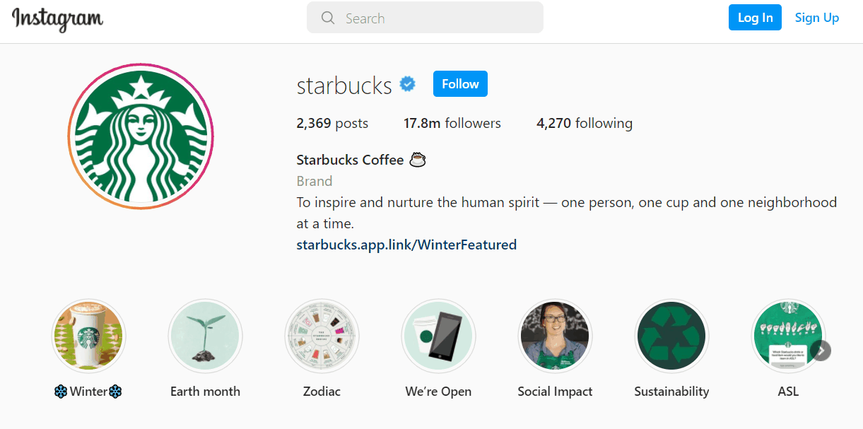
It’s got almost 18 million followers. It’s vibrant. It’s really fun to look at — yep, it’s the Starbucks Instagram account. Take a minute (or two, or 10) to scroll through this IG account and you’ll immediately see why this one makes our list. Starbucks is amazing at combining eye-catching visual content and campaign themes for great results.
Why we love this example:
- It’s got the Starbucks logo in nearly every post.
- It embraces UGC to get consumers involved in the brand and make them part of the story.
- It’s colorful, emotive, and relatable, which aligns with the brand identity.
- It makes great use of images and visuals to showcase and sell Starbucks products.
LinkedIn’s Well-Balanced Blog Infographic
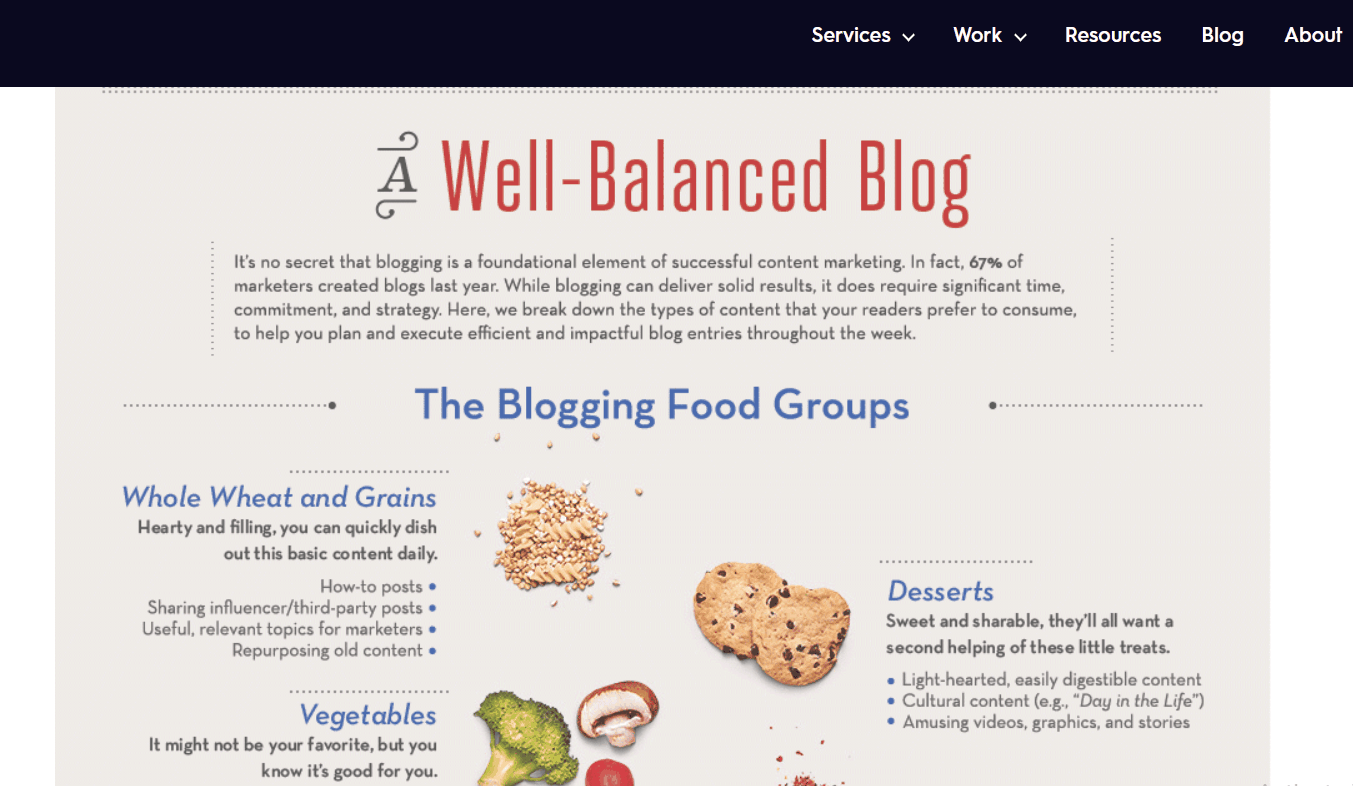
The Well-Balanced Blog infographic took the internet by storm — and for good reason. This engaging infographic has the right balance of wit, content, and visuals. It uses bite-sized data visualizations (all with a food theme, of course!) and short text elements to make one of the most enjoyable infographics we’ve ever seen.
This example made the list, thanks to the following:
- Its quirky and relatable theme is fun and shareable.
- It makes great use of data visualizations.
- It’s engaging to view but also offers helpful content.
- It’s simple and focused on the subject.
8 Visual Marketing Tips and Best Practices to Put in Place Today
Every visual marketing strategy is different, but that doesn’t mean that there aren’t some practices that areg better than others. Here are eight visual marketing tips to keep in mind.
You should always assume that your readers are in a hurry to leave your page as soon as possible. That means that if you want to grab their attention and keep them focused on your brand, you need to make things look elegant but simple. You can do this by breaking up complex or long ideas with visual content.
And simple should apply to design as well. Your visual content should be easy enough to understand at a glance. Your audience won’t take 10 minutes to decipher your confusing infographic when a competitor’s two-minute video explains the same information faster.
A happy audience is one of the best benefits ever — and that’s not just because they can boost sales! As we mentioned above, UGC is a great way to boost your brand’s identity, trustworthiness, and audience engagement. If your consumers are itching to make a positive impact on your marketing campaign, why not let them? Not only will you get some great (free!) content, but you’re also going to make your customers happier.
As a bonus, UGC can also tell you where your campaign needs to go next. Keep a close eye on what consumers are sharing, talking about, and engaging with so that you have a better idea of what strategies work and don’t work.
Confusing and irrelevant images won’t score you many points online. Your audience is more discerning than you think; they can tell when you’ve slacked off in the visual marketing department. If your visuals don’t add value to a piece of content, don’t use them! Remember that there’s a lot of competition out there. Consumers aren’t going to waste time on your site if it doesn’t offer valuable information, even if it does look as pretty as a picture.
Your first idea isn’t always going to be the best idea. Remember that it’s okay to go back to the drawing board! No one says that you can’t shake up your visual marketing strategy by adding a new type of content or being a bit different. Some of our favorite visual marketing campaigns have come from brands or companies that did something different.
For example, the Dumb Ways to Die campaign features a catchy, irreverent video that’s all about public railway safety. When Metro Trains (an Australian train operator franchise) put out this video, it showed the world that public safety doesn’t have to be boring.
There aren’t many design elements that cause us to cringe, but stock photos are one of them. Stock photos may be easier and cheaper than custom photography, but they can also make your business seem cold and impersonal. It’s hard to connect with a brand that doesn’t seem to care about its image! Generic content looks generic. If you have to use stock photos, spice them up a bit. You might consider using various color filters, overlaying your logo, or making other changes to a stock photo so that it better fits your brand.
There are a lot of content types out there, but it doesn’t mean that they’re all right for you. We know that everyone loves a good meme, but remember that your visuals need to represent your brand. Before you start distributing content, be sure to ask yourself, “Does this represent my values and brand?” If the answer is no, keep trying!
Your visuals should fit nicely into the theme and design of your site. That means that you need to consider colors, typography, messages, sizing, layout, and other elements. This ensures that every visual you use fits well with your brand identity.
A great picture is good, but a great picture with a clear CTA is better. Visual marketing can help you get customers to the next stage of their journey, but only if you point them in the right direction. If you want your customer to purchase after viewing a visual, give them that option.
If you want them to contact you for a demo or to learn more, give them that option. CTAs can lead your audience in the direction you want them to go.
After spending hours on a presentation or video, the last thing you want to do is submit it and forget it. Luckily, visual marketing content can (and should!) be repurposed. Whether you do this by reposting your original content or reframing it to create something new is up to you. Either way, this best practice will make it easier to justify the work it takes to create some visual content.
Don’t be afraid to get creative with your original content. Do you think that video would work better as a presentation? Go for it! Does your target audience have a fascination with infographics? Turn your data visualizations into a colorful infographic then!
Get the Picture?
Next time that you browse through Facebook or check your news feed, ask yourself this question: “What is it that stands out to me? The catchy headline? The clever hashtags?” Chances are, it’s the visuals. Get the Picture?
By now we hope that you recognize the power of a well-placed visual when it comes to your marketing campaign. If so, what are you waiting for? It’s time to start making the visuals work for you!
Visual content marketing is often used interchangeably with the term visual marketing. It simply means using multimedia elements to attract and communicate with your target audience.
Visual marketing is important because most people are visual learners. As we discussed above, visual marketing offers a range of benefits such as increased ROI and better audience engagement. Skipped that part? We won’t tell (as long as you go read it right now).
The most important rule to remember about visual marketing is quality over quantity. It’s important to ensure that your visuals augment your brand and communicate relevant messages. If they don’t, then your audience will likely end up confused and frustrated.
Jan 14, 2022


Andy Zenkevich
Andy is a seasoned CEO with years of hands-on experience in SEO, link building, content marketing and website development. His deep understanding of the digital landscape and passion for content marketing make him a trusted voice in the industry.