A great startup website can help accelerate your journey to success. It can help you build a formidable online presence and overcome steep competition.
Earning customer trust remains a startup’s biggest hurdle. Having an excellent startup website can help you overcome this problem.
It can help you tell a compelling brand story and convey your values. It’s a chance to connect with an audience that needs your product and services.
Are you a founder, a CMO, or a solopreneur wondering how to achieve this incredible feat? Here are 13 of the best startup website examples for inspiration.
What Is a Startup Website?
A startup website serves as your digital storefront. It helps connect potential customers with your brand. It informs them about your products and services, mission, and team. Startup websites are different because they focus on new businesses or products. They may require frequent web maintenance to accommodate your growth.
Startup websites aim to generate leads, gain investors, and build a brand presence. They must grab visitors’ attention and showcase a startup’s unique value. These websites usually have a smaller budget and shorter development time.
Building a startup website is a joint process. It involves the founders, web designers, developers, and digital marketers. The process allows you to create an engaging website that communicates your USP.
What Makes a Great Startup Website?
The best startup website resonates with your audience. It grabs and draws their attention to your brand. An effective startup web design introduces your brand and shows your customers what to do.
So, what should you consider for a great website design?
- Simple design: A minimalist design is perfect for a startup. It fades into the background to help your message stand out. A simple design lets your prospects know what you do and what you expect of them.
- Clear and compelling message: The website should highlight your unique value proposition (USP). It addresses the reader’s pain points and provides a compelling reason to buy.
- User-friendly navigation: Intuitive navigation creates a positive user experience. It helps prospects find the information they need. Clear menu structures, logical content flow, and tasteful CTAs ensure seamless navigation.
- Engaging visuals: Beautiful graphics, images, and videos help capture visitors’ attention. Select visuals that align with your brand and audience to improve user experience.
- Conversion optimization: Optimize the website for conversions by guiding visitors towards desired actions. You can prompt users to sign up for a newsletter, request a demo, or buy a product.
Working with a reliable web design agency can help you get the best startup website. It can also provide top-notch web maintenance services to help you outpace the competition.
13 Best Startup Websites
Here’s a collection of the best startup website examples that may inspire your journey to a successful launch.
Loom
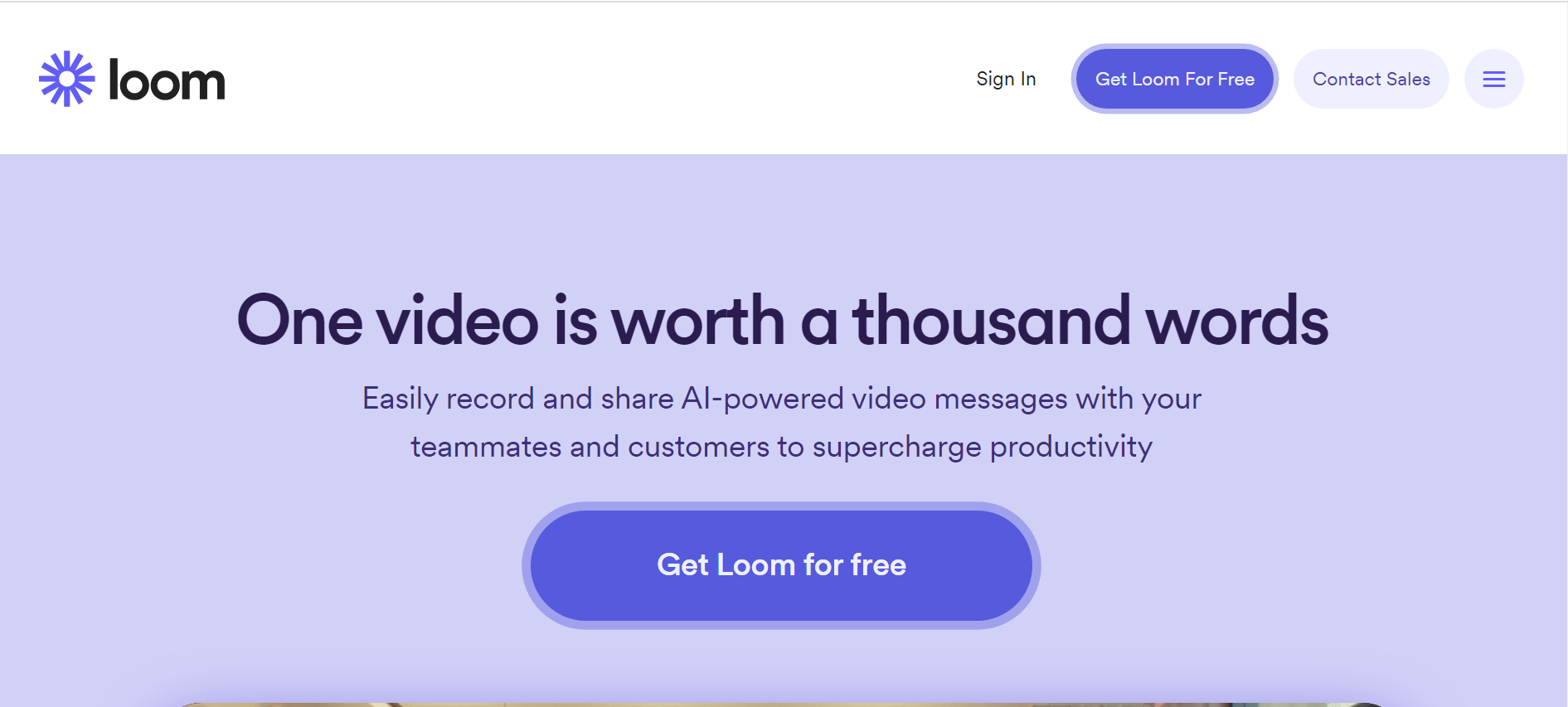
Loom allows you to record your computer screen. It uses a minimalist homepage to communicate its unique selling proposition. It uses a sticky headline to share the benefits and its USP. The homepage also features a video showing how Loom works and a clear CTA button.
- Pros: The design keeps the page simple and clutter-free. The tasteful purple and white background creates great contrast. Custom messaging, bold CTAs, and social proof drive conversions.
- Cons: You’ll need to scroll to the bottom of the page to learn about the features. That may be off-putting to some people who wish to learn more about the brand without signing up.
Cazoo
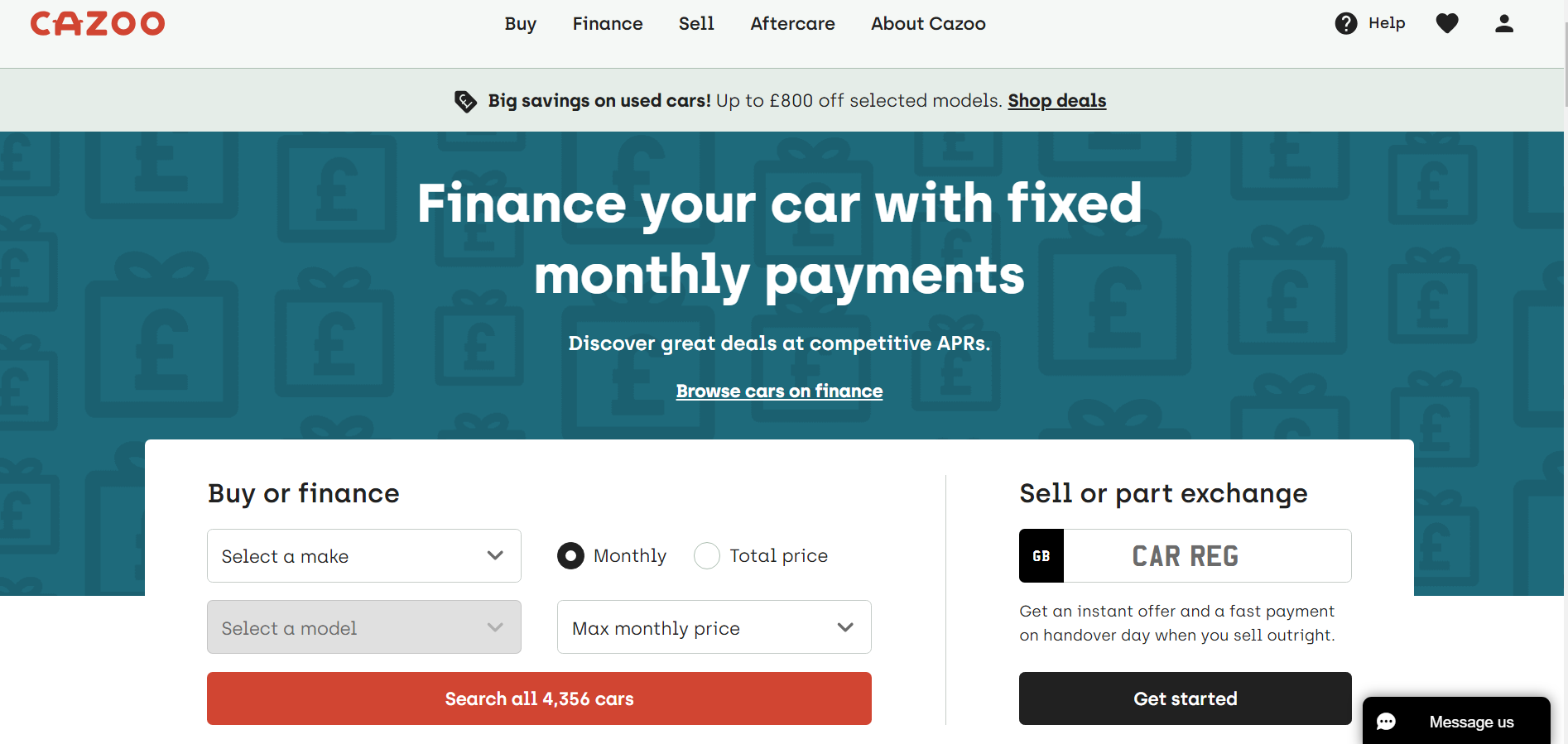
Cazoo is a UK-based startup that simplifies the process of buying and selling a car online. The custom homepage targets buyers and sellers. It also uses sticky headlines to communicate its USP. Tasteful use of fonts, white space, and colors gives the page a classy feel that engages the reader. It uses forms to help buyers search for cars by make, model, and financing option.
- Pros: Cazoo’s website shows a sound understanding of their customers’ needs. It uses various page elements to usher visitors into the correct sales funnel. The web page design makes for a frictionless process to recruit more users.
- Cons: Social proof is tucked at the bottom of the page, which may hurt conversions.
Clubhouse
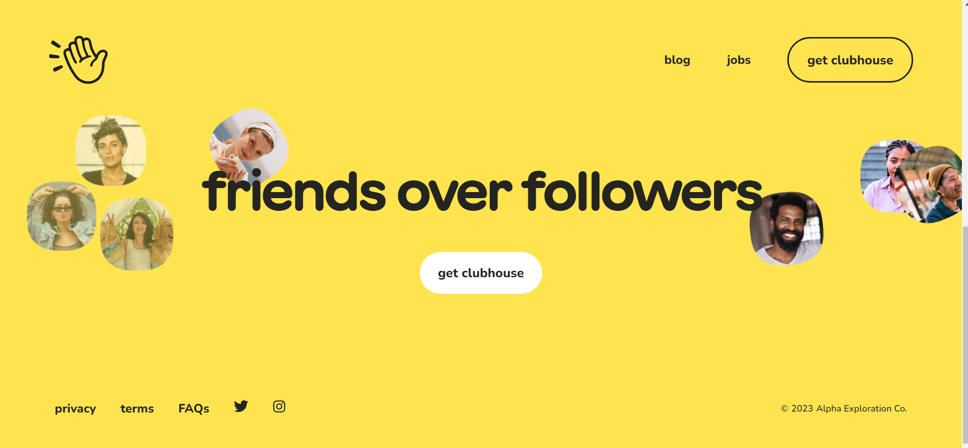
Clubhouse is an audio app that helps subscribers converse with each other. It cuts against the grain with a bold, animated homepage. The page turns yellow as you scroll up, and images of potential friends float around the screen. A sticky headline communicates the app’s USP. A bold CTA invites you to download the app.
- Pros: The website design encourages downloads. It doesn’t burden you with too much information or menu options. It uses animated features to take you on a mental journey.
- Cons: The page is entirely visual and doesn’t feature the app’s features and offerings.
Attentive
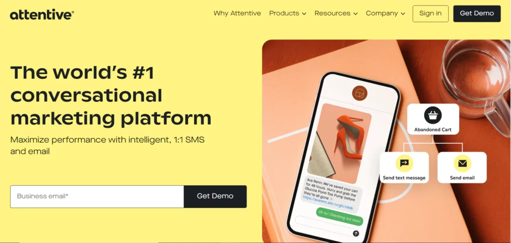
Attentive allows online businesses to target customers with personalized, automated text messages. The startup uses a colorful homepage with bold claims to showcase its value. A CTA button prompts visitors to book a demo.
The rest of the homepage shows how the brand fulfills its promise. It shows the current users who include major brands. It offers insights and examples of how the service works.
- Pros: The website uses colors, persuasive copy, and social proof to attract the reader. Visual elements such as images, videos, and buttons help drive engagement and conversion.
- Cons: The social proof includes brands using the service but lacks customer reviews.
Krochet Kids
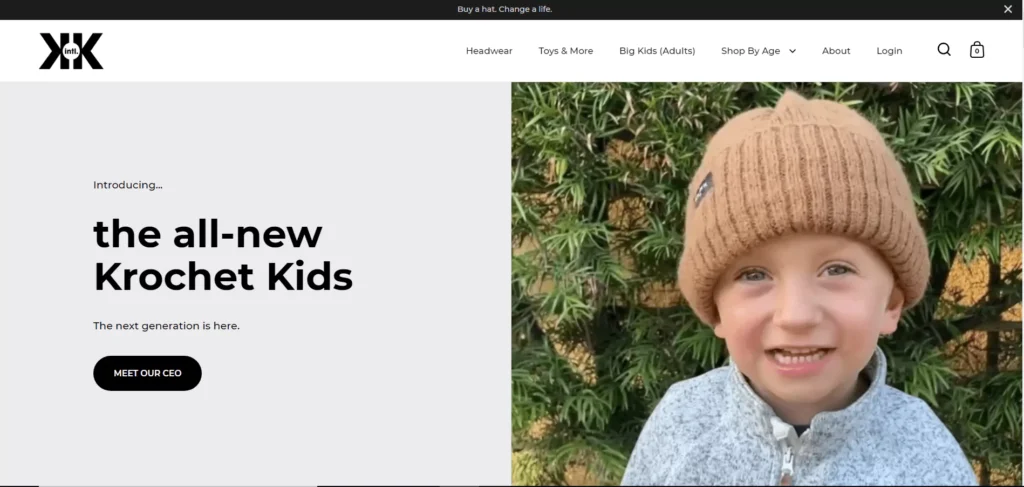
Krochet Kids empowers women in third-world countries by marketing their headwear and accessories. The startup’s website harnesses the power of visual storytelling. It uses images and videos to take you on an emotional journey. It uses minimal text, but every word is chosen for impact.
- Pros: Every element of the startup website is meant to appeal to your emotions. The images of kids wearing products and the women crocheting them scream compassion. The website uses CTAs and product listings to drive sales and conversions.
- Cons: The homepage doesn’t make good use of social proof. It doesn’t tell how buying its product helps to transform lives.
Shadowmap
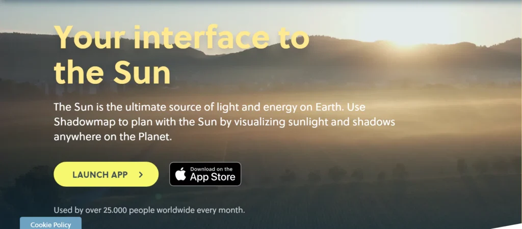
Shadowmap helps designers create realistic shadows in their 3D models. The startup website uses a video in the hero section to inform you what they do. A bold CTA invites you to try out the technology without an account or download the app.
- Pros: The startup website is eye-catching and informative. It shows a keen understanding of their target audience. It combines images, persuasive copy, and videos to address the user needs. It uses interactive images to deliver its USP.
- Cons: The social proof lacks user input and may potentially affect conversions.
A standout website in the fiercely competitive startup landscape can make all the difference. With our game-changing Website Builders service, we help startup founders tilt their scales in their favor. We’ll build a custom startup website optimized for conversions to help you dominate the market. Our comprehensive web maintenance service will keep your website running smoothly. Get started today!
Common

Common helps people conveniently find apartments and coliving spaces in major US cities. The startup features a quiz on its homepage to improve navigation. The dynamic quiz complements the eye-catching design to enhance user experience. The page uses clear images and compelling copy to showcase Common’s USP and offerings.
- Pros: The web design prioritizes helping prospects understand the startup’s offerings. A search function delivers custom results for each user. It combines images, concise copy, and FAQs to address potential concerns.
- Cons: The innovative design pivots radically from the typical real estate web designs.
Apothékary
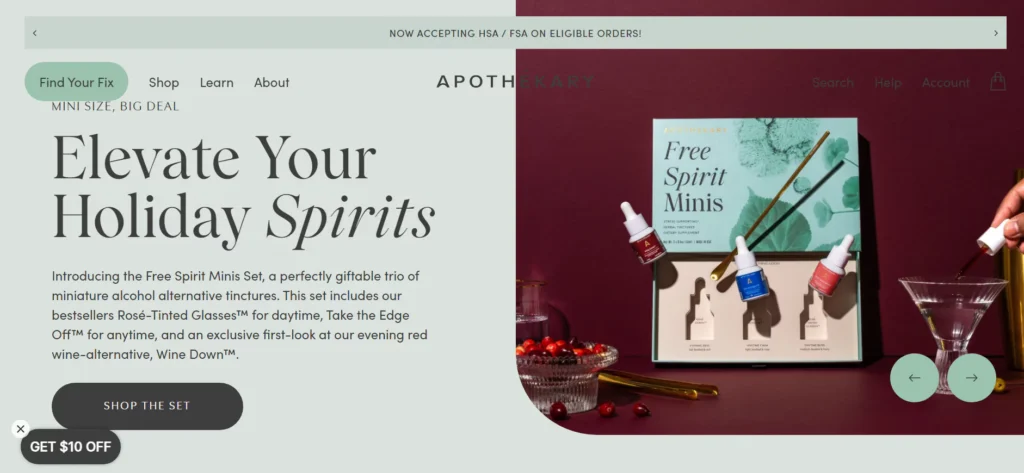
Apothékary promotes wellness through personalized natural solutions. The startup uses an interactive website to connect with its prospects. The brand demonstrates excellent customer insights. It includes a quiz and interactive content on the homepage to drive engagement. Motion graphics, targeted product offerings, and an appealing layout help drive sales.
- Pros: The startup website accounts for the brand’s diverse product offerings. It saves users the hassle of endlessly scrolling through the site. Users can use the quiz to find the perfect product or chat with an expert.
- Cons: The design doesn’t incorporate user reviews for the brand, just individual products.
Lightyear
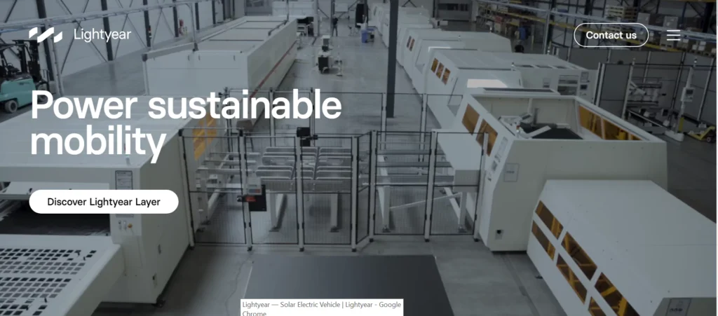
Lightyear produces innovative solar products to help customers switch to sustainable energy. The homepage features a video showcasing its state-of-the-art manufacturing facility. The rest of the page uses white space, clear copy, and images to craft a compelling story.
- Pros: The website has a clean, professional look and focuses on the startup’s products. The startup maps the content on the page to their prospect’s buyer journey. That ensures seamless navigation and improves user experience.
- Cons: The website is media-heavy and may not display correctly on slow connections.
Squadeasy
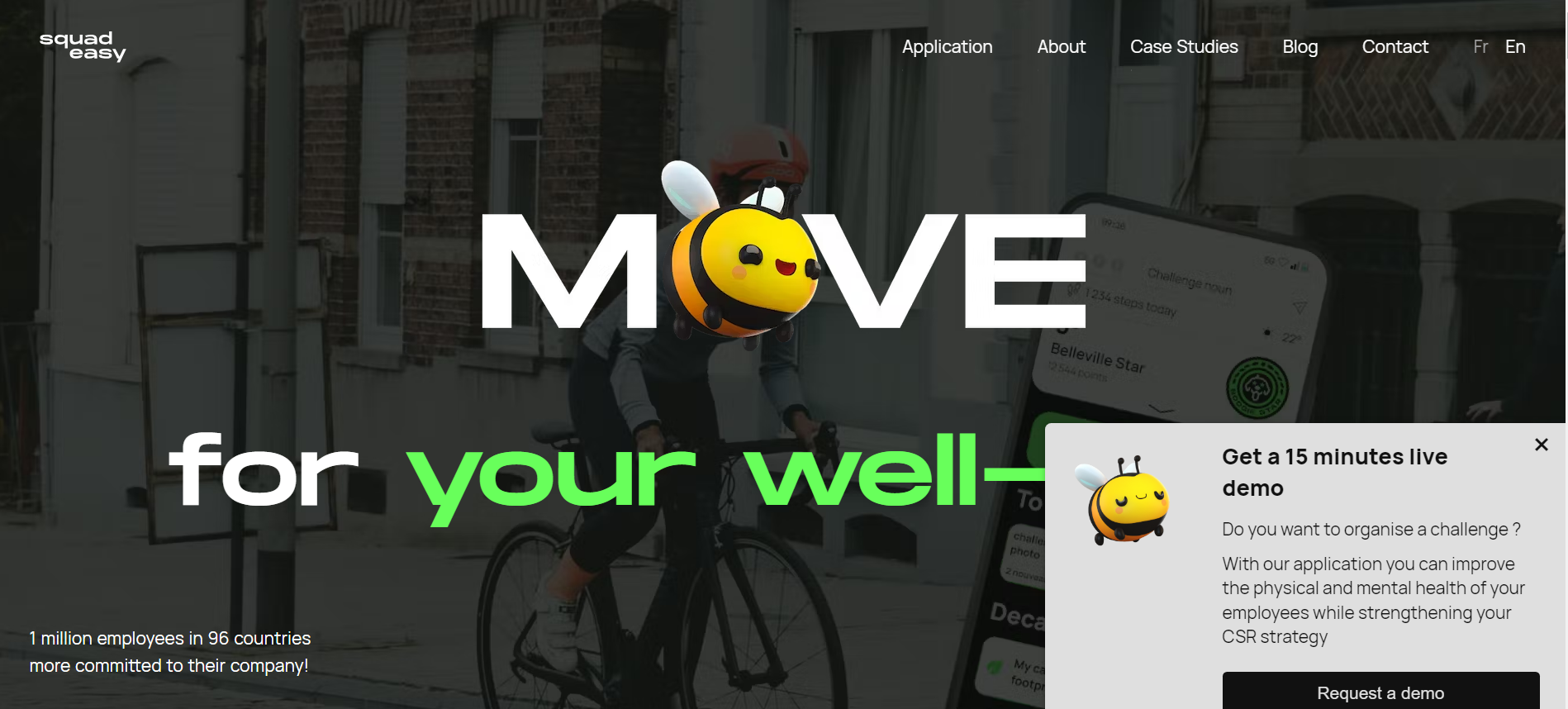
Squadeasy gamifies physical activities to encourage people to embrace an active lifestyle. The startup’s website reflects this theme. It uses animations, interactive graphics, and appealing typography to improve user experience. The startup presents content in a fun and exciting manner to drive engagement.
- Pros: Using a fun theme and interactive content makes the website unforgettable. An interplay of stylish design, helpful content, and interactive images encourages readership. The unique approach makes the startup stand out as a fun brand instead of being another health app.
- Cons: The over-the-top animation may turn off some prospects.
January
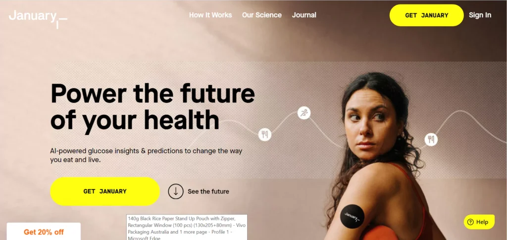
January is a virtual glucose monitor that continuously tracks your blood sugar. The startup website is the epitome of refined health marketing. Alongside the innovative design, the website is optimized for conversion. The startup pairs helpful content with tasteful pop-ups to capture leads.
- Pros: The startup website complements the buyer’s journey. It fills each stage with quality content to help prospects make informed choices. It also uses pop-ups to capture leads to drive a targeted email campaign. January understands its target audience and has optimized its website for lead generation.
- Cons: The website uses a comprehensive approach that may intimidate potential users.
GoHenry
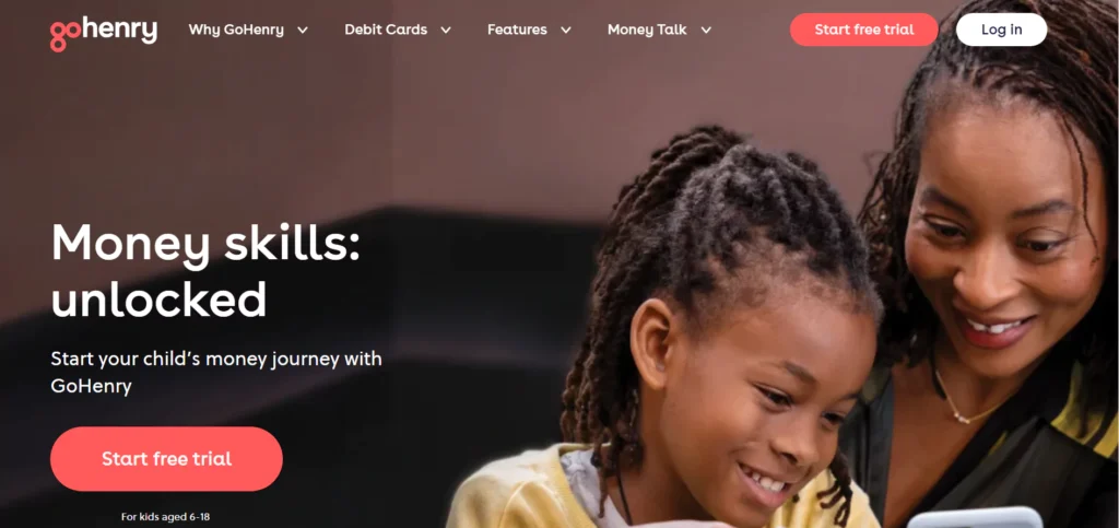
GoHenry is an online solution that helps parent track their child’s spending. The startup uses web elements to create a resonance with its target audience. It uses concise copy to appeal to parents and vibrant visuals to appeal to the kids. The page layout demonstrates a keen understanding of a parent’s buyer journey.
- Pros: The web layout helps the startup capture the attention of the targeted audience. It also walks them through the sales funnel. Enchanting visuals, customer reviews, and persuasive copy help drive engagement and conversions.
- Cons: The social proof doesn’t include feedback from the kids. Detailing how the app helps improve financial habits can help increase downloads.
MikMak
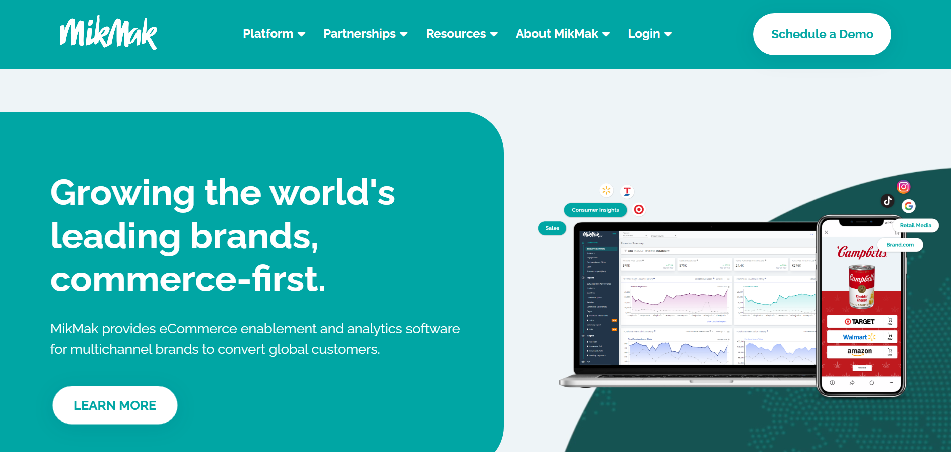
MikMak is an online B2B solution to help manufacturers grow their sales. The startup’s website demonstrates deep audience knowledge. The design allows MikMak to provide its audience with in-depth information. Excellent copywriting enables the startup to create heavily informative but clutter-free sections.
- Pros: An excellent website design allows the startup to create a custom sales funnel. It comprises actionable guides, resources, testimonials, and case studies. The website is heavily informative and still does a great job pitching the reader.
- Cons: The website uses limited motion graphics. Increasing motion graphics can eliminate unnecessary clicks and improve user experience.
Build the Perfect Startup Website
A startup website lets you show off your brand. It’s an opportunity to connect with your target audience and showcase your offerings. The best startup website designs allow you to recruit new users and convert them into sales. A successful online presence requires a great web design and a reliable web maintenance service.
Ensure your startup site:
- Conforms to modern design trends
- Is responsive and mobile-friendly
- Maps the customer’s buying journey
- Has effective messages
- Uses great visuals
These guidelines will help grow the brand following and maximize conversions while keeping your cash register ringing.
We’re a Web Development service provider that goes the extra mile to ensure you have a strong digital presence. While we prefer building sites on WordPress, we also use other website builders and CMSs to meet client objectives.
Our Website Development service includes:
- SEO
- User experience
- Content
- Design
- Development & Testing
- Analytics & Tracking
- Technical SEO
Nov 16, 2023


Andy Zenkevich
Andy is a seasoned CEO with years of hands-on experience in SEO, link building, content marketing and website development. His deep understanding of the digital landscape and passion for content marketing make him a trusted voice in the industry.