Puzzled over your school website design? Want to create a site with a real “wow” factor for your school, college or academy, but not sure how to go about it? Coming up with the perfect website design for your school isn’t always easy, but it can be done – and we’re here to show you how.
In this article, we will demonstrate exactly what your school website needs in order to make it a success. From the benefits of a good school website to what makes a good (or – awful 🤢) website design and why – we answer all your questions and set you on the path to success, just like you do for your students. 🧑🏫
With tips, tricks, loads of helpful school website ideas and examples of the best and worst, this article is the all-in-one web design school you need to help you create an A+ site.
Benefits of an Engaging School Website
1. It could help you attract more students
For those lucky parents who are in a position to make the choice about their children’s education, the web presence of a school, college or academy can make all the difference. In 2018, Education Week reported that the information available on a school website, and even how that information is presented, influences parents’ choice of school. Your website needs to make the right impression on your target audience – parents.
2. It can make life easier for teachers and students
If you get your website right, it can open all kinds of doors for easier communication between teachers and students. The best teacher website examples show us that you can use your website for things like assigning and marking homework, setting tests, and even hosting online classes, which have been vital during the pandemic.
3. It helps you communicate with parents
There are plenty of events in the school year that parents need to know about, from social functions and school trips to PTA meetings. Your website gives you the opportunity to communicate all important information with parents so they feel included and never miss out.
You can also use your website to host an online forum for parents and teachers, enabling more participation and feedback from your students’ families.
4. It makes your school look great
Your school has a lot to celebrate, and your website is the ideal place to do it! The best school websites show off the campus and facilities, give details about the curriculum and extracurricular activities, and showcase students’ academic and sporting successes.
Don’t be afraid to boast! 💪 Your website is there to present your school in its most positive light.
An amazing website needs to be pro-quality designed.
Our talented team of designers here at Epiic is always here to help.
A+ School Website Design Examples
So, now that you understand why you need a great website for your school, you need to know how to create one and what to pay attention to.
To help you, we have selected some of our favorites, grouped by their clever school website ideas and cool design features. This will help you include all the elements that the best school websites possess and need, from great looks to intuitive functionality.
Amazing background images or videos
1. Little Sprouts
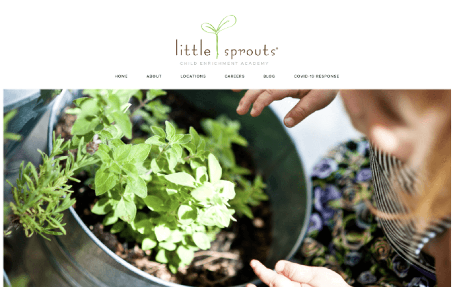
The Little Sprouts Child Enrichment Academy website instantly draws you in through its use of rich, beautiful background imagery, making this preschool look like a caring, nurturing environment. There are plenty of high-quality photos on the site so you can get acquainted with the school’s facilities, as well as with all the info you need about the program of classes.
2. Stuartholme
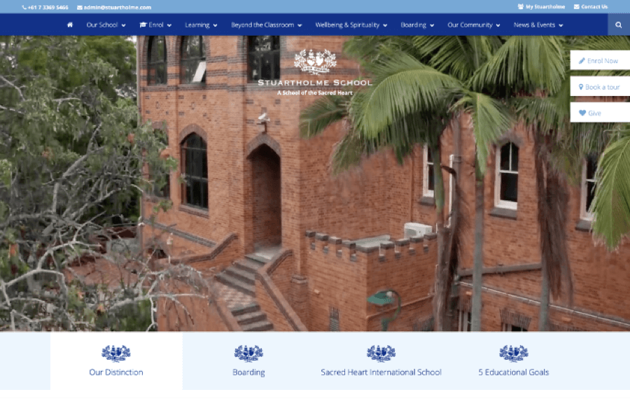
Stuartholme School’s website uses video to great effect. You are greeted on the homepage with impressive footage of the school’s campus and facilities, showcasing the beautiful buildings and setting. This really conveys the atmosphere of the school and gives a feeling of what it would be like to attend.
3. St Joseph’s Preparatory School
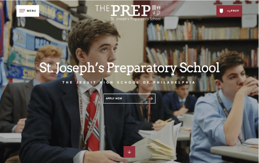
The sjprep.com website also shows a fantastic use of video, this time as a storytelling device. We see the school through the eyes of a student, touring the facilities, attending classes and interacting with other students. We get a real impression of what life is like at this prestigious school.
4. Our House Preschools
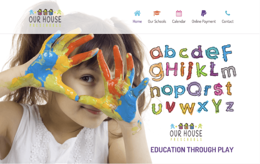
Just look at these happy faces! The Our House Preschools website is obviously designed to attract kids as much as parents. What preschooler wouldn’t want to get messy with paint? 🤪
The photos chosen here are ideal for conveying a fun and welcoming environment for kids of varying ages.
Great menu design
1. Trinity Grammar School
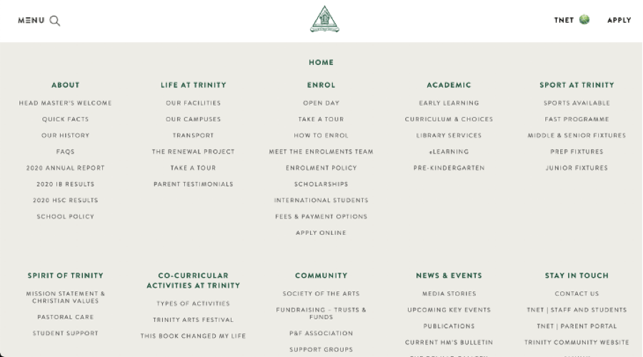
We can’t fault the menu design on the Trinity Grammar School site. It’s extremely user-friendly, easy to read and easy to navigate. All tabs are shown as a general list so you can see all the sections on one screen without having to move back and forth. Bonus points go to this site for offering a virtual tour, too!
2. Lausanne Collegiate School
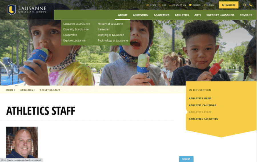
The menu layout for Lausanne Collegiate School is so intuitive to use. It makes great use of color, with every menu section highlighted in a different shade. This really simplifies things and enables you to take in a lot of information easily.
In addition, there are separate menu tabs for community involvement and alumni, making it easier for people to stay connected.
3. Blake
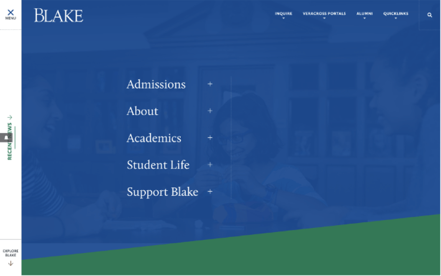
The Blake School website features a deceptively simple menu design. It’s as easy to navigate from the side as it is from the top. This makes the entire site much more user-friendly, and also makes it easier for you to revisit the pages that are of the most interest to you.
Awesome color scheme
1. The New School
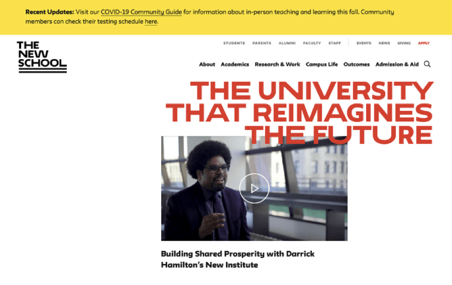
The use of color on this college website is so impactful. You are drawn in right away by the bold red typography combined with a streamlined design mainly featuring black and white. The whole impression is contemporary and rather eye-catching, making you want to find out more about what the school has to offer.
2. NYU
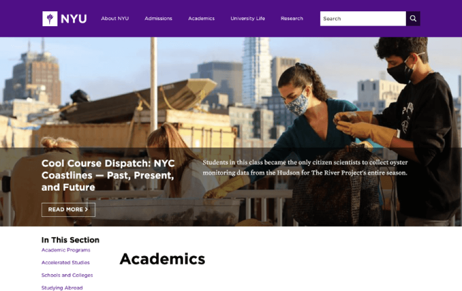
Click onto the NYU site and you’re instantly hit with a modern color palette of different shades of purple. This gives the entire site a cohesive look that’s punchy and modern, and also makes it surprisingly easy to find the information you’re looking for at a glance.
This site will definitely appeal to today’s prospective students and their parents. 💪
3. The Archer School for Girls
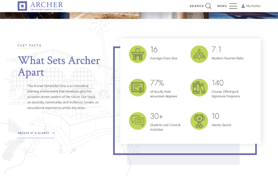
The Archer website has an extremely classy look and feel due to its use of beautiful pastel colors. This creates a peaceful setting and makes the site very easy to read. The site also uses infographics to simplify the information and make it more memorable.
We also love the video footage on the homepage – bonus points for the cute dog! 🐶
Structured layout
1. The Lion
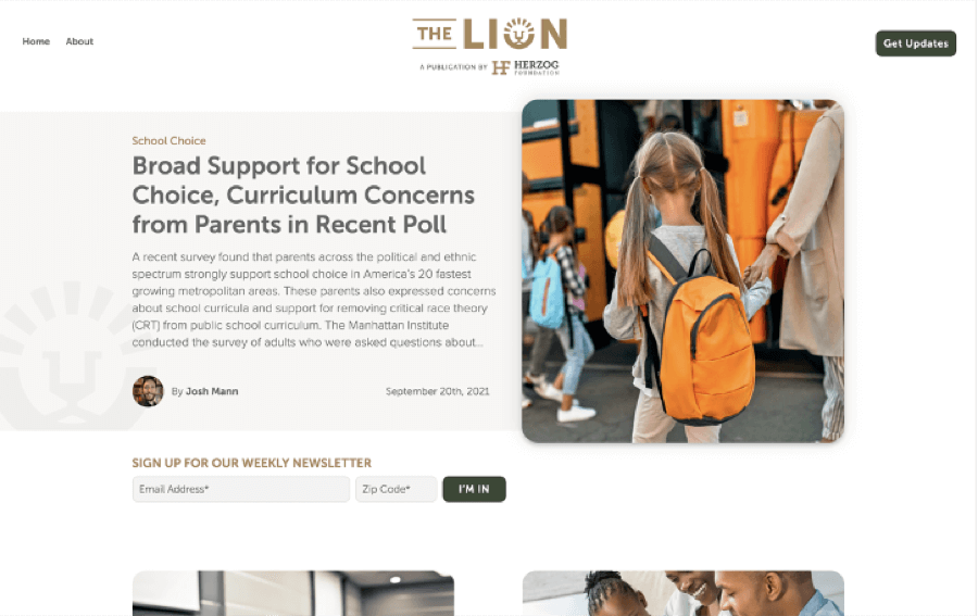
Although not strictly a school website, The Lion offers information about Christian education, and we’ve included it in this list because of its comprehensive layout. It uses blocks divided into different themes, which make it extremely easy to access the information you need.
2. Mentone Girls’ Grammar
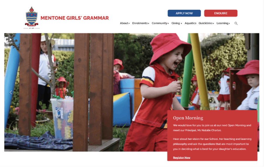
The simple structure of the Mentone Girls’ Grammar site instantly catches the eye. You can easily navigate to the campus you want, as these are separated into different sections on the site. The use of icons also makes it super-easy to contact the school or book a tour, which will appeal to parents looking for a smooth experience.
3. St George’s School
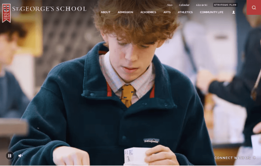
The St George’s School website has a more unusual layout than the others on this list. However, it is structured in a way that draws the eye neatly from one section to the next. This makes the site easy to navigate while still making the school stand out from its competitors online.
Typography in design and menus
1. Cedar Hills
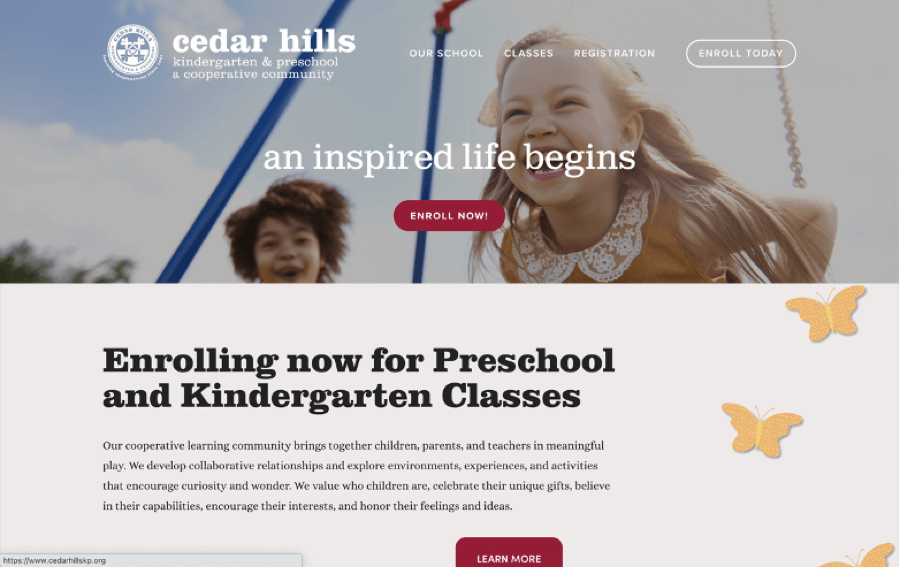
The site for Cedar Hills Preschool and Kindergarten is so simple in its structure but so effective. It relies heavily on written information, but this is presented in such a straightforward and beautiful way that it makes it very easy to read. Happy images feature alongside the text, which makes the site more visually memorable.
2. Strathallan
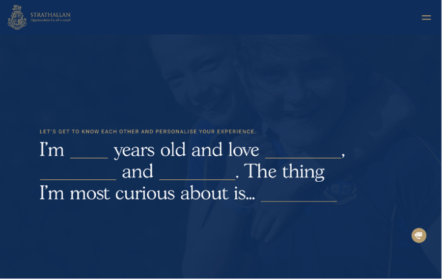
This is a great example of typography being used interactively. As soon as you land on the Strathallan site, you are invited to enter information about yourself, from the point of view of a child, to personalize your experience. This part is a great move, a clever piece of design: as from the start, it involves you in the site and makes you feel it is talking to you directly.
3. Abbotsleigh
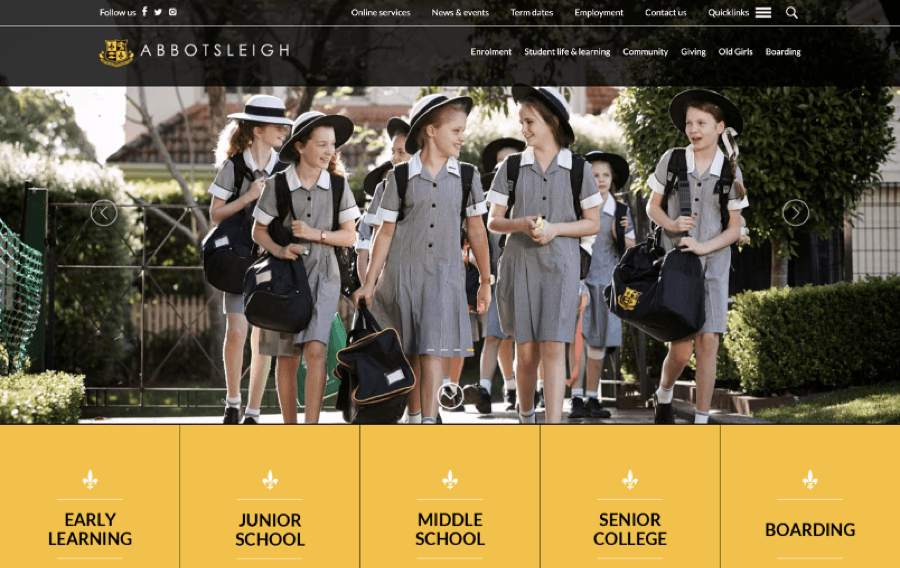
The Abbotsleigh site demonstrates exactly the right way to combine text with images. The typography is clear and makes the site so easy to read, presenting the information in a structured, natural way. When you hover over some of the sections, the text is replaced by an image, giving a visual representation of the school as well as a written one.
Affordable pro-grade design… You’ve stumbled on
a rare gem, my friend! 😉
We have design plans that revolve around your budget.
Awful School Website Design Examples
So, now that you know what to do, let’s dive into what not to do if you want to create a winning school website. If your site doesn’t look appealing or it’s difficult to use, it won’t attract students or parents.
Disclaimer: we don’t want to be mean about anyone’s efforts, but some school websites just don’t look = don’t work as well as others. 🤷♂️ Here are some school website ideas that miss the mark.
1. The Indian School
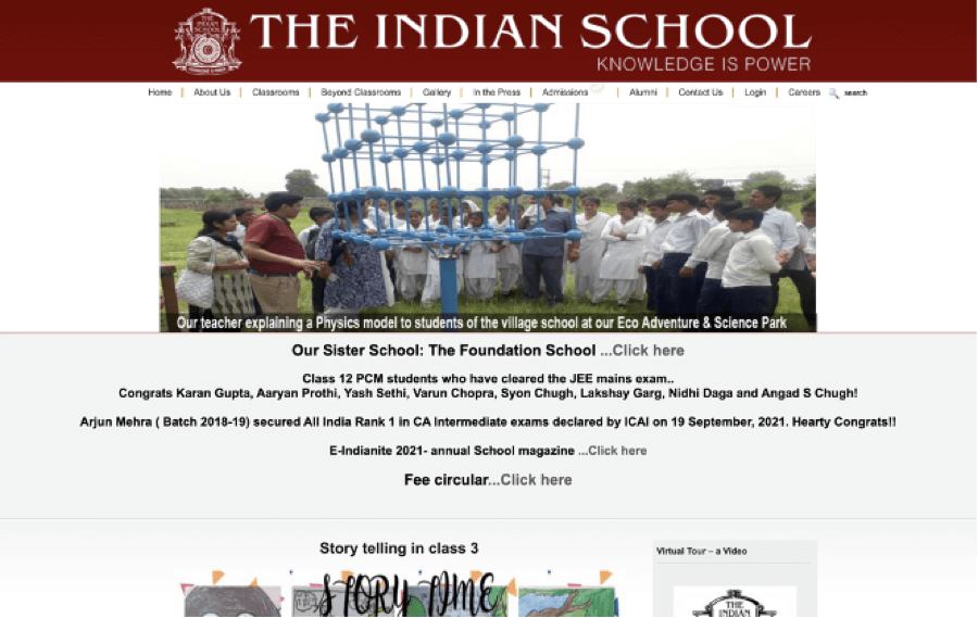
This is a pretty strange-looking site, and it hasn’t been put together well. The photos are obviously the wrong size, as they look as if they’ve been squashed to fit on the page. The fonts are all different and some of them are hard to read, while the menu doesn’t stand out at all. 😕
2. LittleRock
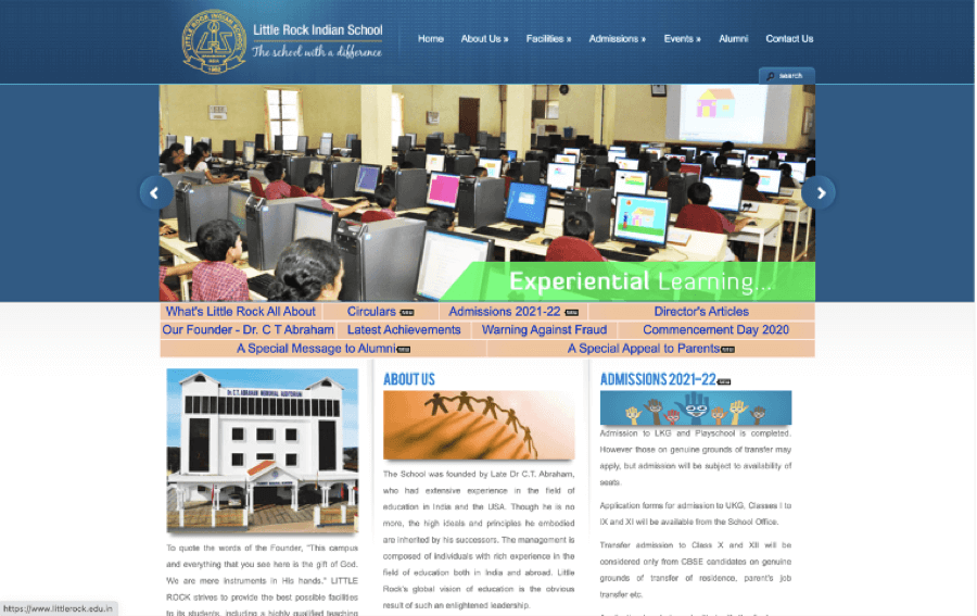
The choice of colors here is a bit ugly, and the site isn’t user-friendly at all. Some of the pages are laid out like blog articles, and they are not grouped together by topic.
There are a lot of links to click on, but it’s difficult to find the right one, and the information you need is very hard to find.
3. Bahrain School
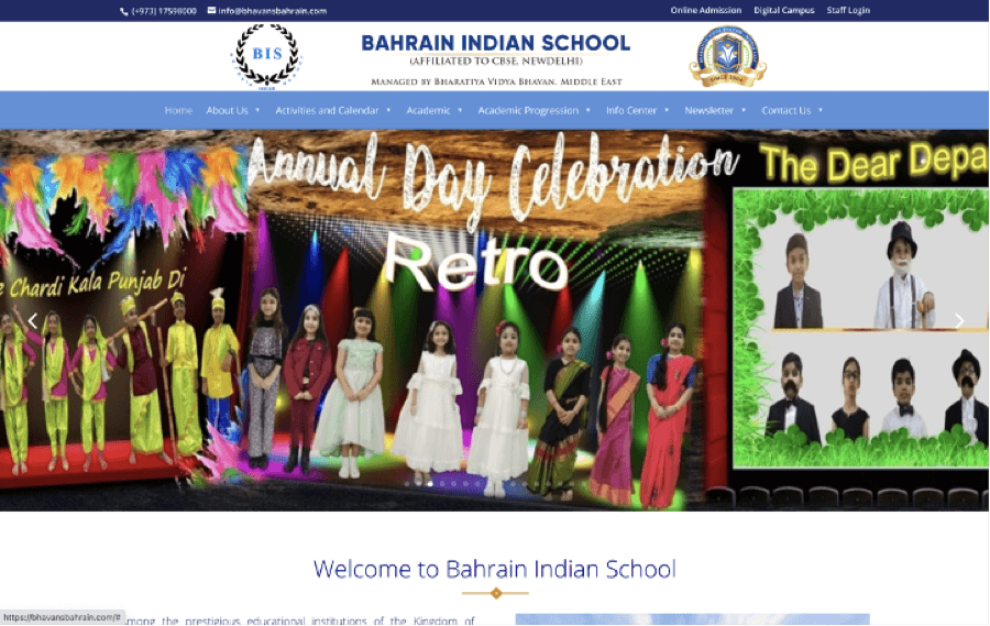
Too many unrelated images, too many fonts, too many bright colors, and not enough information. The menu is barely readable, and the overall impression of the site is that as soon as you click onto it, you want to leave as quickly as possible. 🏃
4. GemsEducation
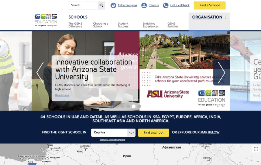
The design of this site looks academic, but it’s just too busy. There are so many headers that it makes relevant information difficult to navigate to.
The different information blocks seem to overlap, impacting the user-friendliness of the site. Overall, it has the look and feel of a bulletin board on an amateur local news site.
5. Chemawa School
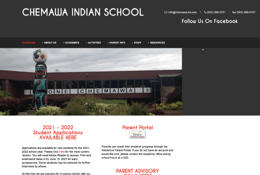
This site is a little scary-looking. 😨 The use of too much black on the homepage makes it appear gloomy, and the different sections, while highlighted in red, don’t particularly grab any attention…
In addition, the choice of images here is all wrong. It wouldn’t make you want to visit the school ever, let alone attend.
So, the school and teacher website examples we’ve given you here above cover all the basic dos and don’ts. But, we’d also want to make it even easier for you to create a standout web design for your school.
This checklist can help you choose the right school website elements and take advantage of some useful experience and ideas, regardless of whether you’re designing your site yourself or choosing to use professional school website design services. 🤗
As you want your site to be instantly associated with your school, it’s a good idea to use your school colors in your website design. Think of ways to incorporate these colors into the look of the site, creating a cohesive overall design. When it comes to fonts, use as few as possible, and keep them extremely simple and easy to read.
If there is a school logo in existence already, run it past an experienced graphic designer to make sure it will appeal to a modern audience online. If your school does not have a logo yet, now is high time to get one created by a pro designer.
We’ve seen the impact that high-quality images have on school websites. Imagery tells the story of your school, so all pictures must be relevant, attractive, and high resolution. Banners are also extremely important, as they grab the user’s attention and make the site easier to navigate.
The secret here is to keep it simple and intuitive. Your layout needs to be comprehensive, leading the user effortlessly from one related section to the next in the way that they would expect. They’ll thank you for making it as easy as possible for them to find the information they need.
Did you know that mobile devices now account for over 50 percent of internet usage? This means there’s no point in designing a site that looks great on a desktop, only to find out it doesn’t function properly when accessed from a smartphone. Your site needs to look great and work effortlessly on every type of device as well as – browser.
You need the right balance here. Too much text, and your readers will zone out. Too many images, and the site will look cluttered and confusing. Always remember to leave some white space to give the eyes a rest and the brain a chance to pause and take in the information.
We’ve seen on some of the best school websites just how effective video can be. It really tells a story and showcases the school’s best features. If you are going to use video, though, note – it has to be of high quality too; otherwise, your site will look unprofessional.
All the information on your site, from parent communications to blog articles, should be clear and easy to understand. Aim for a fifth-grade reading level, and don’t forget to use headers and bulleted lists to break up the content.
Frequently Asked Questions
If you’re going to create a school website yourself, you’ll need to use a template and find a hosting provider. Alternatively, you can use professional school website design services, who will do all the hard work for you.
Some of the elements you should include are:
- School logo
- Images and video
- Menu
- Information about the curriculum and facilities
- Contact details
These are just the basics, though – you can always add more information depending on what parents and students need.
As we’ve seen, there are many different ways to judge a school website. However, the best school websites have a number of factors in common:
- They present information clearly;
- They use attractive images and/or videos;
- They make it easy for users to find what they’re looking for;
- They showcase the school or college in its best light.
Aug 09, 2023


Andy Zenkevich
Andy is a seasoned CEO with years of hands-on experience in SEO, link building, content marketing and website development. His deep understanding of the digital landscape and passion for content marketing make him a trusted voice in the industry.