When it comes to the roofing business, finding clients can be difficult. Why?
Unlike other industries, you can’t rely on a job well done to provide you with repeat clients. In fact, a job well done often means you won’t see that client for quite a while, since the average lifespan of a roof is anywhere from 10 to 30 years! 🤓
Attracting new clients for your roofing business is a must. But how do you get the leads you need to stay in business? A well-made website can play a key role in your success.
How? A great website can make you more accessible to clients and offers a dedicated space where you can show off what makes your business the best.
A great roofing website starts with a great roofing website design, and we’re here with all the basics you’ll need to create your stellar site. Keep reading below for some inspiring website ideas, common website mistakes, and a checklist that will help you get your site up and running.
15 Great Roofing Website Design Examples That Go Above and Beyond
There’s no one-size-fits-all policy when it comes to website design… but there are definitely some sites that are better than others. We’ve collected 15 of the best roofing website ideas from around the internet to help you get excited about your site.
We’ve organized our examples according to their main cool design features. As a bonus, we’ve also included some other standout elements you can glean some inspiration from. 😉
Thoughtful background images/videos
1. Old Line Roofing & Solar
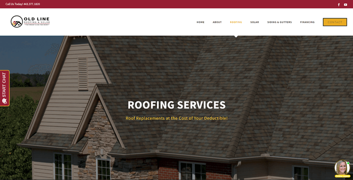
We love the clean and clear hero image on Old Line Roofing & Solar’s homepage. Not only does it fit their color scheme and provide a great example of their work, but it also adds some texture and visual interest to the page.
Other notable features include:
- The professional grayscale color scheme with pops of yellow and red.
- Lots of social proof to increase trust.
2. Baker Roofing
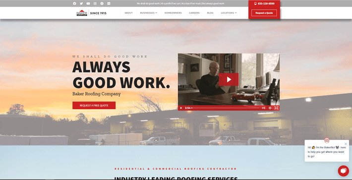
It’s no secret that videos can help drive customer engagement, and that’s one of the reasons we love this site. Their video explains a lot about their company and introduces a human aspect that text would have trouble getting across.
We also like:
- The clean and easily navigable layout.
- The simple header menu doesn’t take up too much space.
3. Roof Works USA
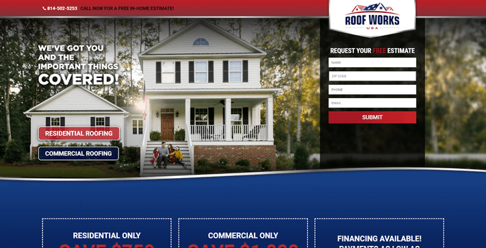
The bold and powerful image on Roof Works’ site perfectly matches its powerful color scheme. We love how the image is crisp, clear, and evokes emotion to make it more effective and impactful.
Take note of the following:
- Scrolling banner that keeps the CTA (call-to-action) within easy reach.
- Fun geometric shapes throughout the page.
User-centric menu design
1. First Quality Roofing & Insulation
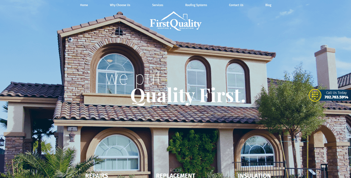
This site has a nice dropdown menu that makes it easy to find all the info you need. We love that the clean and compact look doesn’t vie with the rest of the page for our attention.
We’d like to point out the following:
- Gorgeous visuals that reinforce the idea of a high-quality brand.
- Awesome logo design.
2. Premier Roofing Company
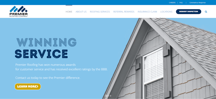
Premier Roofing has a simple dropdown menu that keeps things clean and well-organized. We like how everything is contained in one section, so it doesn’t get overwhelming.
Get inspired by the:
- Embedded video to increase visitor engagement.
- Different typography designs.
3. RoofConnect National Roofing Services
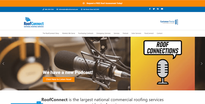
The RoofConnect site offers a scrolling menu that keeps all the info you need at your fingertips, no matter where you are on the page. We like how the simple white and black design doesn’t distract from the rest of the page.
Take note of the:
- Social proof/testimonials section.
- Neatly organized layout.
Eye-catching color schemes
1. Lowe’s
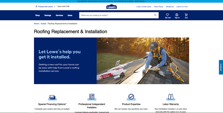
The Lowe’s site utilizes a blue color scheme (a popular brand color that’s often associated with trustworthiness) to great effect. The result is a professional, serious-looking site where everything is tied together by a common color.
We also like the:
- Extendable FAQ section at the bottom of the page.
- USPs right under the hero image.
2. Tecta America
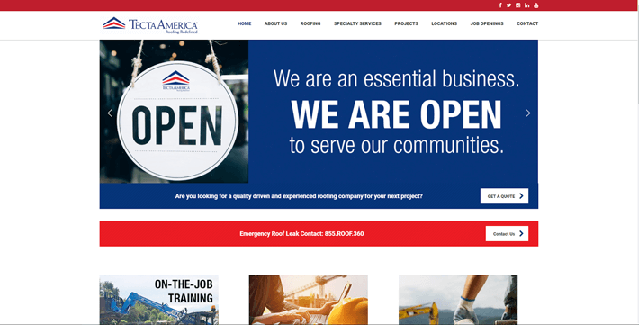
Red can be an overpowering color, but it works on this site. Here, there’s just enough red in the design to help important info stand out and keep the page from being too monochrome — but not enough to be an eyesore.
Other great features are the:
- Scrolling hero image that keeps the page uncluttered.
- Menu design that’s easy to read and access.
3. Canadian Roofing Services Inc.
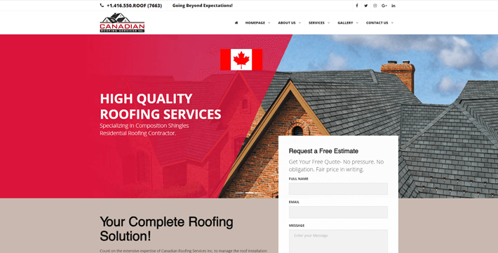
Here’s another site that went with a bold color scheme. By combining powerful reds with more relaxing beige tones, this site keeps things looking nice. We also love how the red complements the logo and the country flag.
We also love the:
- Homepage gallery/portfolio that showcases their work.
- Upfront and center CTA and lead generation form.
A layout that flows
1. US Siding & Roofing
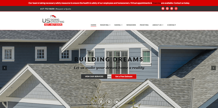
The US Siding & Roofing site uses white space to its advantage, creating a lovely layout that’s a breeze to navigate. The offset service sections look great on screen, and the combo of typography and images help break up the written content.
Be sure to note the:
- Scrolling menu design.
- Plethora of high-quality images.
2. All Stars Roofing
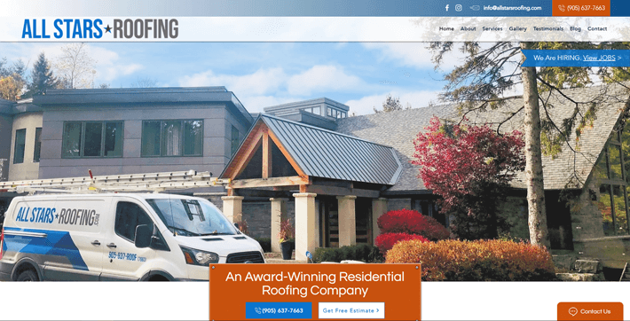
Here, the designer has used colorful blocks to create an easy-to-navigate layout. The colors help keep sections distinct and also add some interest to the page.
Get inspired by the:
- Use of different typography sizes and styles.
- Engaging written content that flows well.
3. Haitu Steel Co., Ltd.
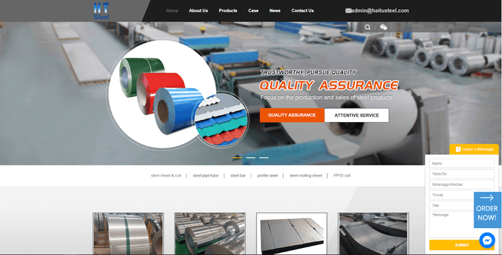
Offset pictures and text help create manageable, bite-size informational segments on this site. The overall layout is designed for someone who’s visiting in a rush and looking to find their information quickly.
We’re fans of the:
- Clean and simple typography.
- Very visible CTA buttons.
Thoughtful typography
1. Scro’s Roofing
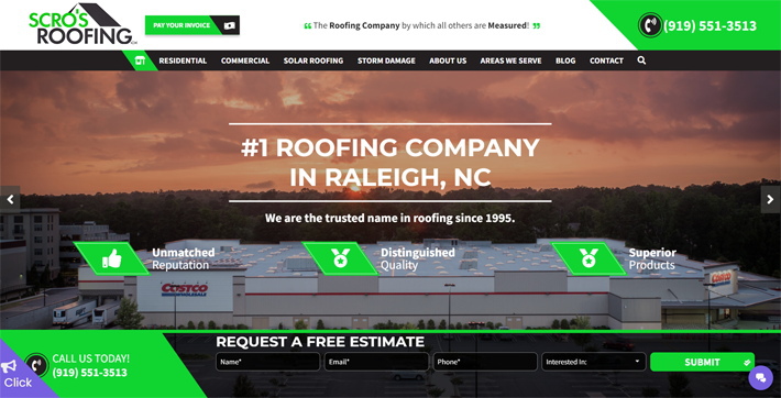
You thought the neon green would land this site in the color schemes category? We’re more impressed with the typography. With so much happening on this page, we’re glad the design utilizes a simple, clean typography style.
Take inspiration from the:
- Bold color scheme (you were right, it does make a statement).
- Interactive visual elements.
2. Gerard

Here, a unique typography style adds some fun and interest to Gerard’s homepage. The dominant font is easy to read and is both bold and functional. We love how this site utilizes a mix of sizes and colors to add interest and create a great layout.
Check out the:
- Great use of visuals across the page.
- Clear USPs section.
3. BMI
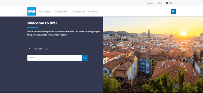
We love this friendly font that isn’t too over the top; it’s easy-to-read aspect helps the site feel more professional and readable.
We’re fans of the:
- Social Wall section to share relevant news.
- Clear, high-quality pictures that add interest to the page.
Feeling lost in (cyber) space? 😉
Epiic is here to make website design easier than ever.
Don’t Try This at Home:
Poor Roofing Website Design Ideas to Avoid
Not every site gets it right the first time — and that’s okay. 👌
Here are a few examples of sites that need some work so that they can look as great as the ones above. Take a peek below for some roofing website design don’ts.
1. Aspen Contracting
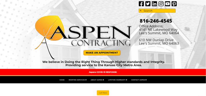
This site has a lot going on in a small amount of space, which makes it feel cluttered and unprofessional.
We also think the typography choices and potent color scheme don’t mesh well with the overall feel and make the site less effective than it could be.
2. CS Roofing
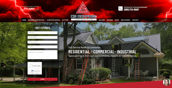
Unlike our Gerard site example, the lighting image on this site doesn’t make a lot of sense. And uninteresting or nonsensical images are one thing your site definitely shouldn’t have.
We’re also disappointed with the walls of text on the page and the heavy use of red in the color scheme. ☹️
3. Canadian Roofing Company Ltd.
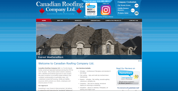
Here’s a site example that’s starting to look a little outdated. The rounded menu tabs, lackluster typography, and thick blue border are less than impressive.
Add in the very cramped header and unresponsive design, and it’s safe to say this site has room for improvement.
4. The Roofing Company
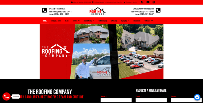
Let’s give a shoutout to the nice logo on this page, which we appreciate for its simplicity and effective design. 👍
Everything else? Well, it needs some improvement. Here, the color scheme is by far the worst culprit. White and red text on a black background makes the written content very hard to read.
5. Atlanta Roofing Specialists
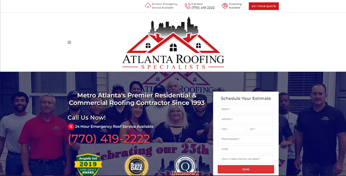
This site isn’t too bad above the fold, but scroll down and it isn’t quite as impressive. The layout and the visuals could use a little work to create a more cohesive site. We’re not wowed with the typography style, uninspiring CTAs, or grammatical mistakes, either. 🤐
If at first you don’t succeed… our expert designers are here for you.
Don’t settle for a subpar site. 😉
Build a Stronger Website: Your Easy-to-Use Website Design Checklist
A good website design is (hopefully) going to raise demand for your services through the roof. If you want a functional and aesthetic website that’s going to be an asset to your business, there are a few basic rules to keep in mind.
Here’s a quick checklist to follow when designing your roofing website.
Color and font are very visible design elements, which means it’s important to get them right. Make sure to choose appropriate colors that look great and reflect your brand identity.
When it comes to typography, it’s okay to get a little creative as long as your font is still readable. And remember, different fonts, colors, and sizes can also help make your page interesting!
Your logo is one of the first things a customer will see. It’s also one of the best ways to ensure your brand is memorable. We usually recommend a professionally designed logo to help you make a good first impression and attract customers.
If you design your own, remember to keep it simple, impactful, and scalable.
Including quality images on your site tells visitors that you care about how you present yourself. This is especially true if you’re taking the time to create and upload custom photos. As a bonus, original photos can also increase your SEO ranking and better showcase your brand.
Measure twice, cut once, right? We know you want to dive in and get your website online, but a little planning goes a long way. Before you upload your site, take the time to outline a layout either on pen or paper, or using a dedicated layout design tool.
It’s no surprise that mobile traffic has grown over the years. If you don’t optimize your site to be mobile-friendly, you’re going to lose lots of your leads and potential customers. Take the time to ensure your site looks great on desktops, tablets, and smartphones alike.
Aesthetics matter just as much as your content does. It’s important to balance your site by including images, text, and adequate white space. This will help keep things functional and uncluttered, so your site is easy to use and pleasant to look at.
86% of video marketers say that the right video can positively impact leads. Others also note that videos contribute to increased sales, engagement, and user understanding of the brand.
We recommend uploading your video to a hosting platform and embedding it on a page to help ensure your website still loads quickly.
Your content communicates who you are and what your business does. Great content can also help you rank higher in Google searches, so you have a better chance of being discovered by potential clients.
Be sure to include all the important info on your site (i.e., services, contact info, about us, etc.). You can also take the time to create unique blog posts, FAQ pages, and other extras that will help you stand out even more.
Enjoy stellar site design, even on a budget.
Get professional results at affordable prices with Epiic.
Nailed It: Creating the Best Roofing Website for Your Business
A great roofing website design may not be high on your to-do list — but it should be. A quality roofing website with a great design will often quickly pay for itself in lead generation and customer satisfaction.
Your roofing business deserves a great website! So, what are you waiting for? Take these roofing website ideas and get started! 😎
Mar 14, 2022


Andy Zenkevich
Andy is a seasoned CEO with years of hands-on experience in SEO, link building, content marketing and website development. His deep understanding of the digital landscape and passion for content marketing make him a trusted voice in the industry.