For businesses these days, having a website is pretty much as essential as having a bathroom. If you’re a plumber, you’ve probably come across a lot of bathrooms. Some people like them clean and basic while others prefer to show off their style with a fancy design and lots of cool features.
The same is true when it comes to your plumbing website design. As a plumber, you’ll also know that style aside, a badly designed bathroom can be disastrous.
YouTube is full of DIY plumbing disasters, and we’ve seen our fair share of DIY website disasters. It’s always a good idea to get the professionals in if you don’t possess a “more-than-minimum” desired level of skills and experience to do the job.
Technical skills aside, we’re sure you have a vision for your website, too. So, we’ve put together this list of fantastic plumbing website designs to give you inspiration.
There are also some examples of just how badly things can go wrong if you don’t know what you’re doing when it comes to web design.
Benefits of a Quality Plumbing Website
Before we get started, it’s important to understand why it’s so critical to have a good website in the first place.
A well-designed website is a great investment for any business. Local service-based businesses like heating and plumbing companies may get most of their customers via their website.
Your Website Helps Customers Find You
Plumbing isn’t the sort of service that most people need on a regular basis. Instead, your clients are more likely to need your services because they’re carrying out renovations or they have an emergency.
These people will use the internet to help them find out who they should call. If your website is easy to find on Google and has clear information about your services, you’re going to be a lot more likely to get the business.
Makes You Stand Out from Your Competitors
Your website needs to stand out from your competitors who are all going for the same customers. If you have a poorly designed site, it’s likely that this is what people will remember about you and not necessarily in a good way.
But, if you designed your website to make your business look professional and trustworthy, a customer is more likely to pick you.
Makes It Easy for Customers to Contact You
Before everyone was using the internet and smartphones to communicate, you’d rely on your business telephone number to connect with customers.
But if someone is standing in an inch of water in their kitchen or their toilet won’t flush, they’re not going to wait around for you to pick up the phone if you’re busy on another job.
Instead, a quick click onto your website can get them help right away. They can quickly contact you via a contact form or chat app or write a more detailed message for less urgent jobs. Including helpful information on your site, such as what to do in a plumbing emergency, can also help people if you’re not able to take their call at some moment.
How to achieve all these quality website benefits?
Learn about Epiic and if it’s the right choice for your business.
Beautiful Plumbing and Heating Website Design Examples for Inspiration
All the websites in this list have their own unique design, but they also work hard to give customers a great user experience.
As well as a preview of the design, you can read more about why we think they’re some of the best plumbing and heating sites we’ve seen.
We’ve grouped the sites by their standout features so you can get a better idea of the principles of great web design. Don’t forget to keep reading to the end of the article to get our top hints and tips for achieving an amazing plumbing website.
Stunning visuals: background image or video
1. GM Plumbing Corporation
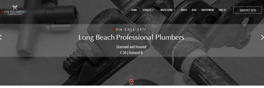
This site uses a series of dark and moody closeup images of pipes and plumbing tools as the backdrop for the above-the-fold content. This makes the white overlay text really pop and lets you know immediately what the site is all about.
We also like the “click to call” feature on the phone number, meaning you can get in touch instantly in an emergency.
2. Mr. Rooter Plumbing
mrrooter.ca
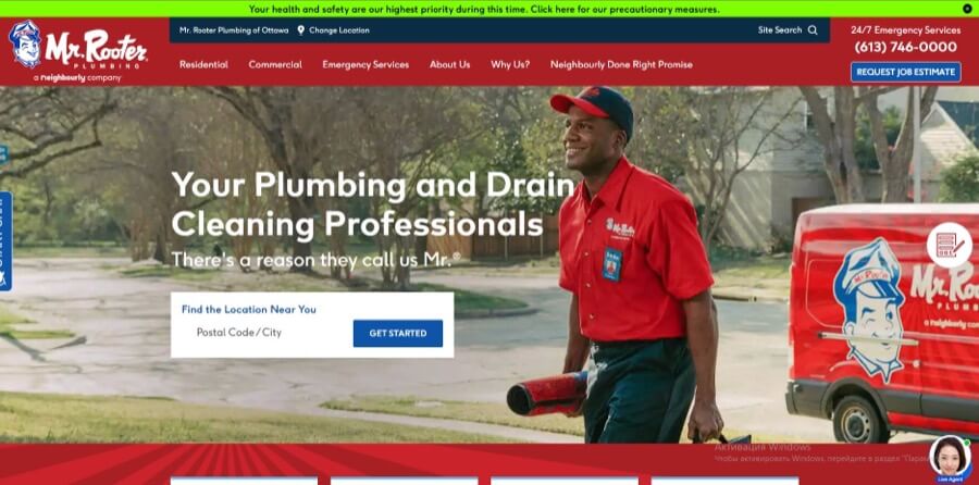
When you have a plumbing emergency, you’ll be inviting a stranger into your home. You’ll want to be able to trust them completely.
Mr. Rooter reassuringly uses an image of one of their plumbers with a smiling face, ID badge, and professional, branded uniform. This means you know exactly what to expect when you give them a call.
3. Tony LaMartina Plumbing Company
tonylamartinaplumbing.com
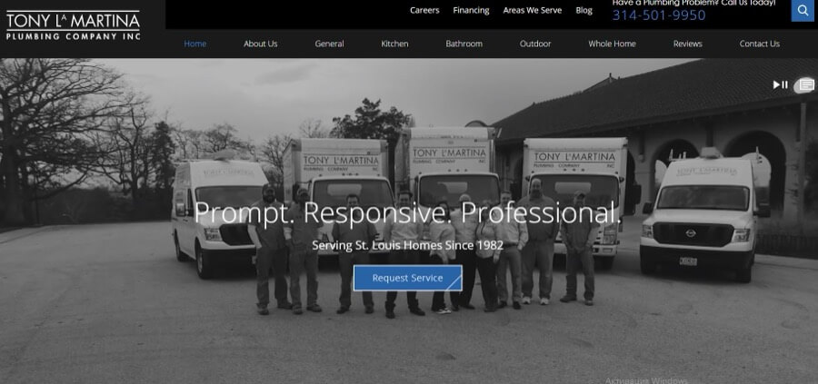
This website is another great example of how you can use images. The site evokes a feeling of trustworthiness and professionalism.
The stylish black and white videos showcase the fleet of vehicles. They also show the team carrying out their jobs proficiently and quickly, without any mess left behind.
You’ll also find this reflected in the brand values printed prominently in the website header: “Prompt. Responsive. Professional.”
4. S&E Plumbing Enterprise
seplumbing.com.sg
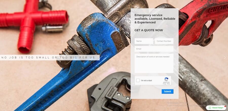
The design approach of this site is similar to GM Plumbing. It uses images of tools and pipes, only in a brighter, more vivid color scheme. The red and blue in the first image perfectly mirror the colors used in the logo and website elements.
5. Fremantle Plumbing
freoplumbing.com.au
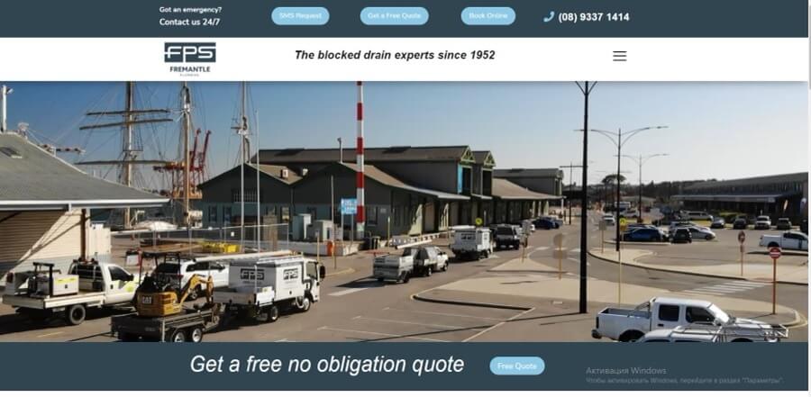
The drone videography illustrates the scale and professional nature of this business. It’s definitely not just a man in a van with a bag of tools!
This site has also hidden away its menu in a dropdown, leaving prime space for the contact number and essential CTAs (calls to action).
Effective website menu design & navigation
1. Plumb London
plumblondon.com
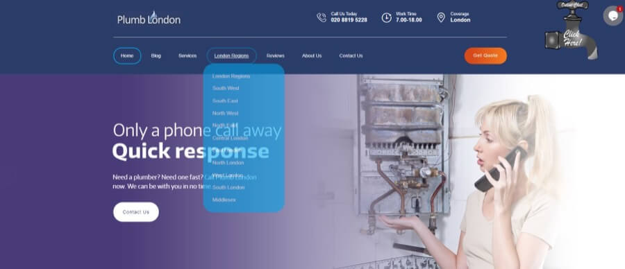
The unique combination of animation effects and rounded corners in the main menu gives the user interface a tactile feel. This has the added effect of making it instantly stand out from competitor sites.
The “Get Quote” call-to-action button is also well-placed in the top-right corner of the site so it’s very visible.
2. ADP Toronto Plumbing
onetorontoplumbing.com
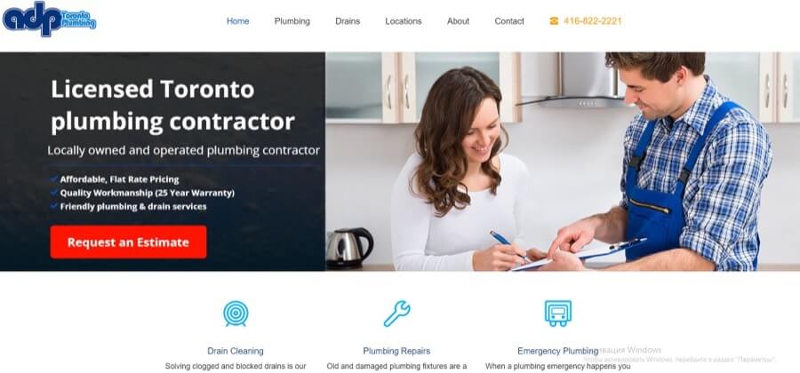
This site uses a simple dropdown menu, with the menu items listed in multiple columns to make the most of the space. Use this menu as a model of how you can display a lot of links without cluttering the page.
Visitors can also use the location buttons on the homepage to go directly to contact details and information for each suburb and area in the city.
3. Tony’s Plumbing
tonysplumbingcompany.com
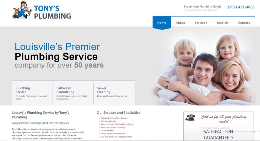
The eye-catching hover and dropdown animation effects on this website menu make it stand out while still being easy to navigate.
The homepage also includes direct links to the most frequently requested services. This makes it quick and easy to find what you’re looking for.
Clever color scheme
1. Priority Plumbing
priorityplumbing.ca
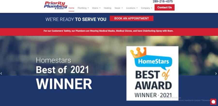
This site uses the red and blue of their logo as the accent color for their entire site. Red is used to draw attention to CTAs and important information. Blue is the backdrop for featured content and the color of choice for headings.
Sticking to these colors gives a uniform and cohesive feel to the site and makes for an easy-to-read and aesthetically pleasing user experience.
2. Bob Hamilton Plumbing
bobhamiltonplumbing.com
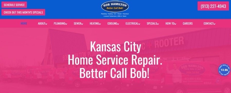
Hot pink is an unusual color choice for a plumbing company website, but it works to attract attention and stand out from the crowd.
It’s definitely eye-catching and actually has the overall effect of being a modern version of the red and blue favored by so many plumbing brands.
3. The Great Plumbing Co.
thegreatplumbingco.com
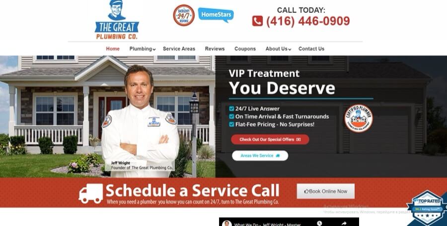
Toronto-based The Great Plumbing Co. uses an orange-and-blue color scheme combined with retro graphics to give the site a fun and quirky personality.
These colors also work great for CTAs. They’re bright and bold enough for users to notice and draw the eye to the contact number and other important pieces of content.
Well-structured layout
1. Anta Plumbing
antaplumbing.com
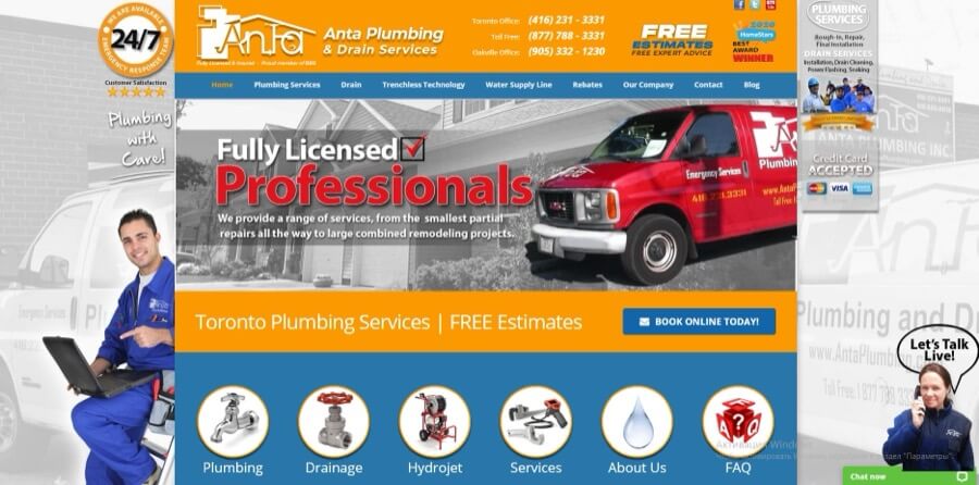
While the design of this site is visually quite busy, the information is laid out in a clear and linear way so it’s easy to navigate as you scroll down the page.
Large icons lead to key areas of the site, and it’s easy to see at a quick glance the services and areas covered by the company.
2. K Komfort Heating & Cooling
kkomfort.com
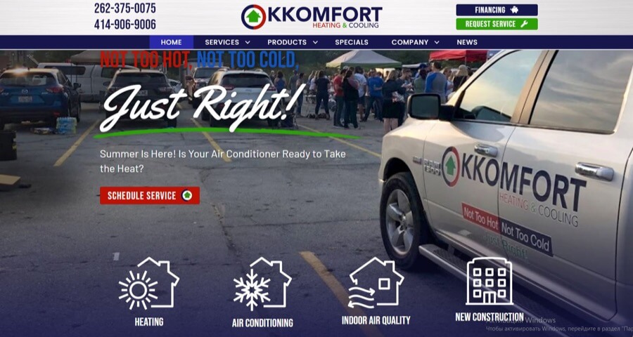
This site has chosen to break the homepage content up into visually defined sections, which makes it easier for a user to quickly scan through.
Large icons overlaying the header graphic direct browsers to the main sections of the site, and users can easily see exactly what services are offered without having to search for the information.
3. AC Repair Las Vegas
acrepairslasvegas.com
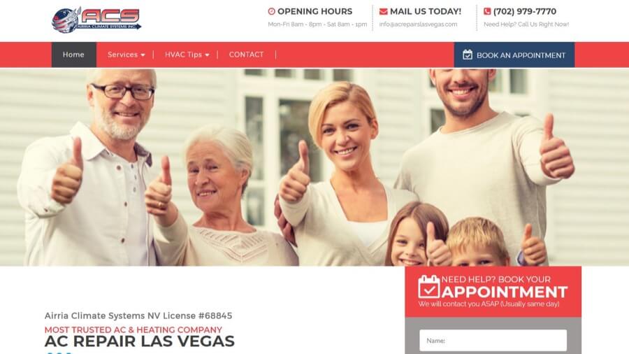
AC Repair Las Vegas makes a simple layout more visually appealing by using a variety of different content types and styles.
A contact form to book an appointment is located right on the homepage, while services are listed in a clear grid below.
Typography-focused design
1. Williams Mechanical
williamsmechanical.com
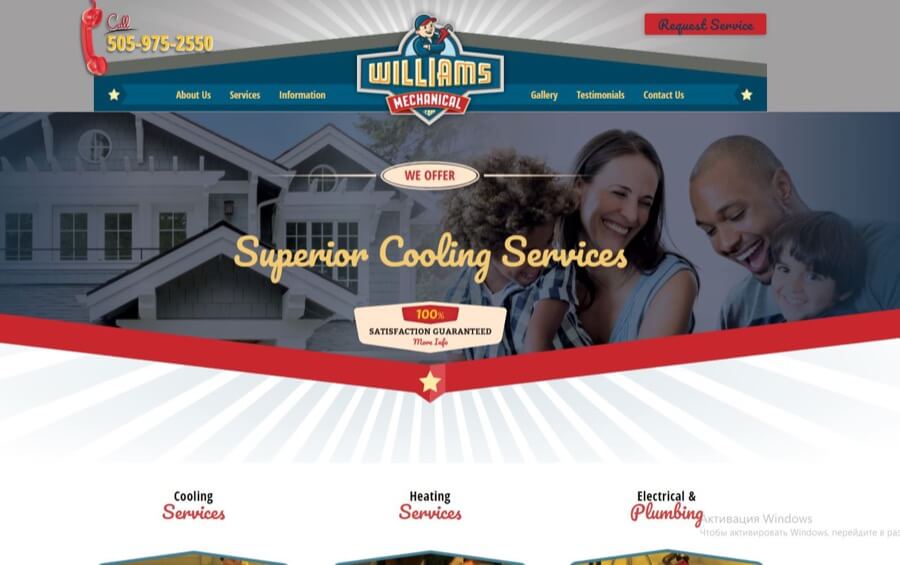
The retro ’50s style typography and graphics on this site work really well to create a fun yet professional effect.
Handwriting-style fonts instantly lend a casual feel to any site while still maintaining a modern and fresh appeal. This can be a useful trick for giving a more “human” feel to a business-focused site.
2. Brothers Plumbing
brothersplumbing.ca
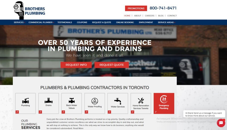
The bold all-caps headings on the Brothers Plumbing website contrast nicely with the simple sans-serif font used for most of the body text and help to make it easy to read.
The design also uses variations in font size and weight to create a visually interesting effect and highlight important content parts.
3. Prestige Plumbing
prestigeplumbingservices.com
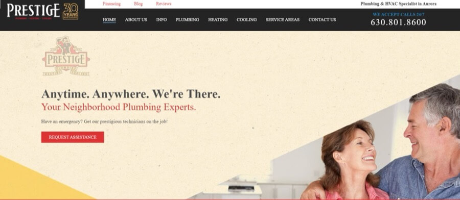
The Prestige logo uses a stylish and traditional serif font to replicate the look of vintage product packaging. In contrast, they’ve chosen to use a modern sans-serif font for the body text and headings for maximum readability.
This design is a fantastic example of the way different fonts can be used to create a cohesive overall theme.
Want to see what goes into designing a great site?
Take a tour of epiic design service
Badly Designed Plumbing Website Examples
Now you’ve got a better idea of what exactly a good plumbing website design looks like. But it’s also worth considering what makes a bad user experience and/or – impression, so you can be aware of some common mistakes when you’re building your site.
Unattractive and poorly crafted websites won’t win any design awards. But they’ll also land you with much bigger problems. A bad website can put off potential customers before you’ve even had the chance to make a good impression.
1. Unprofessional design with poor user experience
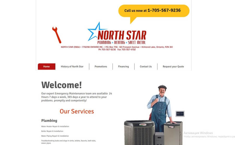
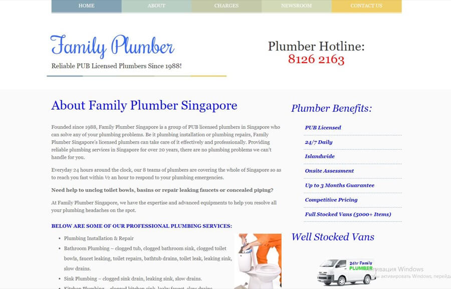
The design of this site is both unattractive to look at and difficult to use. The tiny text on the homepage is difficult to read, and the logo takes up too much space, pushing the content off the screen.
In addition to the bad design, there’s just not really any useful information on this site. Apart from a brief overview of services, there’s no information about the company or why you should choose them.
2. Low-quality graphics
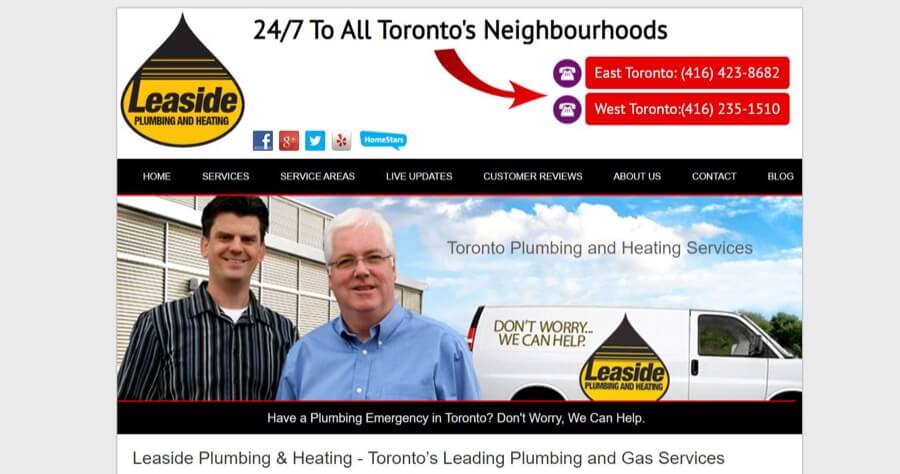
The layout of this site isn’t too bad, but it’s really let down by the amateurish header and homepage image. The people and the vehicle have obviously been pasted onto the background image, which makes it look fake and unprofessional.
The logo is also far too big. This, combined with a dull font and cheesy clipart graphics, draws attention to the worst part of the design.
3. No navigation or content
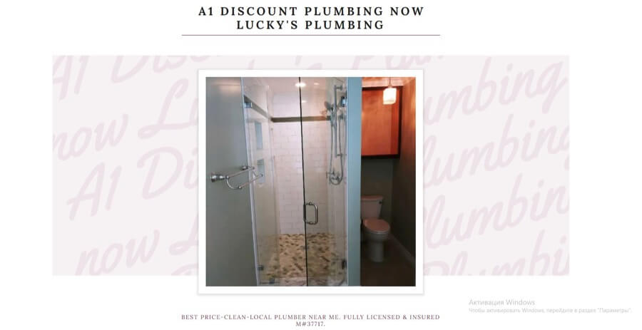
There’s so much wrong with this site that we don’t really know where to start! There doesn’t seem to be any content on this site or at least any way to navigate to it.
The low-quality Polaroid-style snap of a shower and toilet is also an odd choice for the main homepage image.
Anyone stumbling across this site would most likely click right off it again.
4. No cohesive design
The “designer” who built this site clearly has no idea about basic design. The mishmash of clashing colors, fonts, and no logo result in an amateur look. Furthermore, this site has no clear branding — it could be a page on any random website.
There are also very few images on the site, which makes it feel quite empty and dull. Just adding a header image and choosing a color scheme would make a big difference.
5. Lack of suitable images
For some reason, this site has chosen to use a giant logo in place of a hero image on the homepage. Even worse, the logo seems to be a low-res watermarked version, suggesting they didn’t pay for it.
The only other image on the site is of a bucket — not exactly an image that inspires confidence when you’re choosing a plumber!
Does your current website look more like the examples right above?
Don’t worry — we can help!
Your Checklist for Great Web Design
So now you should have a better idea of what makes a great website design. We’ve also shown you some examples of the best plumbing and heating sites we’ve seen to get you inspired.
If you want your site to be successful, it’s really important that people can quickly and easily find the information they’re looking for and enjoy the experience of browsing your site.
The following checklist is designed to help you avoid common mistakes and improve your site overall. This stands for whether you’re building your site on your own or using a professional specializing in plumbing design services.
As the ugly plumbing and heating design examples above so clearly demonstrate, it’s important that your color scheme is cohesive and easy to look at.
You should also choose fonts that are clear and readable so they don’t distract visitors from the main content of your site.
When it comes to headings, you can loosen up a little and choose fonts that fit well with your logo and match your brand. Handwriting fonts feel friendly and casual, while bold newspaper-style fonts are more serious and formal.
If you don’t already have a logo for your plumbing business, you definitely need one before you start designing your site.
Your logo is the first thing people will see, and it’s what will help them to remember your brand. It can also help you choose the colors and overall look and feel of your website.
Take a look through some of the sites above to get logo ideas. Simple symbols (like a tap) often work best, but a more unique design will get you noticed.
All good websites need high-quality images. Looking through the examples of bad plumbing websites, you’ll notice that they all fail miserably in the image department.
Great images can make even the most basic web design shine, while bad images can make a great design look terrible.
You can use stock photos if you don’t have the budget for a professional photographer, but make sure you include a few photos of your team, too. People like to see a familiar face when they invite service workers into their homes.
Think about how people will use your website to find what they’re looking for, then plan around it. For example, if you think most of your clients are going to be homeowners who want a drain unclogged as soon as possible, put your services page front and center.
Think about the paths people are likely to take through your site. This isn’t just about where you put content — it’s also how that content will be displayed on the screen. People tend to prefer clicking buttons rather than text links, so make sure you have eye-catching buttons for your main CTAs (calls to action).
Most people looking for a household plumber will be searching on their mobile device, so it’s important to make sure your site looks great at all screen sizes.
If you’re using a template theme or website builder, the good news is these sites are usually mobile-responsive by default. But it’s still important to test that everything works properly and is easy to navigate.
Once you’ve designed the structure and layout of your site, you can start adding content. But don’t forget to make it look good!
Good design means having purposeful blank spaces that draw the eye down the page and give the text room to breathe. Breaking up text with graphics, tables, bullet points, and boxes makes it easier to scan and can help to keep users on the page for longer.
Videos can be very effective on plumbing websites because they allow you to demonstrate your skills and expertise in a quick and easy-to-digest way.
You could create videos of your team working on jobs or talking about the services you offer. You could even create some video testimonials from happy customers.
If the idea of creating videos scares you, don’t panic! It’s much easier than you think, and a basic smartphone will do the job.
Upload your videos to a hosting platform like YouTube before adding them to your site. This means they won’t slow your site down and can even be a good way to get more traffic.
The text on your website is just as important as the design. Great copywriting will engage visitors and help you to convert them into customers. Every piece of text on your site needs to be considered, from menus to headings and CTAs.
If you’d rather do the writing yourself, make sure to keep it short and punchy — people are often at their most impatient when reading website text, so every word needs to count!
If you’re not confident that your website copy is up to scratch, it’s a good idea to hire someone who can do the job for you.
Time to Call the Professionals In?
As we mentioned at the start of this article, trying to do a DIY job on your plumbing is a disaster waiting to happen. So why would you take the same risk with your website?
Dec 10, 2021


Rachel
I’m an online marketing professional with over 10 years of experience. I have a background in web development and SEO, which I leverage to provide high-quality content strategy and content creation for businesses.