If you have a medical problem, what’s the first thing you do?
You might ask a friend or a family member for advice. But many medical issues are embarrassing or private matters that you don’t want to discuss with others. So nine times out of ten, your first thought will be to hop straight on your computer and consult Dr. Google. 🙂
The medical and healthcare industry is one of the largest in the world. As a result, the competition for patients and talent is fierce. So it’s vital to have a medical website design that appeals to potential patients and stands out from your competitors.
Trust and authority are more important in the medical industry than any other. Your clinical website design must give your visitors confidence in your ability to help them. You need it to be clear, easy to use, and full of helpful information. Patients will use your website to decide if you’re a good fit for their needs.
One of the first things you should do before you start building your site is to look through some examples of other medical websites. We’ve done the hard work for you and compiled this list of great vs. terrible healthcare websites so you can get a feel of what works and what to avoid.
We’ve also included some handy and effective website design tips below to get you started. 💡
Looking to hire a pro to design your website?
With Epiic it is quicker & easier than you think.
Tips & Hacks for an Attractive Medical Website Design
There are tons of examples out there when it comes to bad websites. But when it comes to great websites, they are a lot harder to find.
When you do find good websites, you’ll soon realize that there are specific things they have in common. Focus on these key principles when coming up with medical website ideas to ensure you have an excellent foundation for success.
#1. Make sure it’s mobile-friendly
More than half of all patients will look up your website on their mobile phones. So you need to make sure it looks good and is easy to use on small screens.
In most cases, simply shrinking everything down won’t result in a great user experience. Instead, you’ll need to rethink your design on mobile devices.
Make sure your site is built with responsive design principles. This applies whether you’re using a pre-built template or working with a web designer. You should also test your site thoroughly before you go live on all devices, including mobile.
It can also be beneficial if you integrate features on your website with mobile apps. For example, users can click to make a call or send appointment requests via Facebook Messenger.
#2. Prioritize user-friendly navigation
Good websites not only look attractive. They also have a clear structure and are easy to navigate.
This is especially important for clinical website design. Patients may be visiting your site during an emergency or while experiencing symptoms.
Imagine what your patients will think if they have a bad experience visiting your website for the first time. What if they find themselves utterly lost in a labyrinth of irrelevant pages and links?
Make sure you have simple, straightforward navigation. Include just enough options so that people never feel frustrated or confused about where to go next.
#3. Make sure it loads quickly
There’s only one thing more frustrating than a disorganized website: a site that’s agonizingly slow to load.
Nobody is patient when they’re in pain. And, patients need to be able to find their way around your site quickly so it can help them as soon as possible.
You can do many things to speed up your website. These include investing in good hosting, using a CDN, and compressing images.
But you’re only going to have limited success with these steps if your website is poorly coded and designed from the start. Make sure you’re working with an experienced web designer. Good designers understand the importance of a fast-loading website.
#4. Publish valuable content
There are various ways a user could end up on your website. For example, they might type in your URL directly if they see it printed on a flyer or displayed at your clinic. They also might search for the name of your medical practice if they don’t know your website address.
But many more visitors won’t know your healthcare business exists at all. Instead, they’ll be searching for help with a medical issue by Googling symptoms or looking for clinics in their local area.
This is a fantastic opportunity for getting new patients in the door, but only if you have valuable content on your website.
High-quality, informative content is beneficial to your business for several reasons:
- It helps patients with their health queries, and they’ll then be more likely to trust you for medical advice and services in the future.
- It improves your SEO by adding more relevant keywords to your site that users might be searching for.
- It helps to build brand awareness in a positive way.
- It reassures nervous patients by giving them clear information about what they can expect when they choose you as a medical provider. It can be very stressful preparing for a procedure as a first-time patient. Having an FAQ section and step-by-step descriptions or videos of common procedures can help ease some of that stress.
#5. Choose a clean, professional design
You probably put a lot of effort into making sure your hospital, clinic, or medical office is clean and well-presented to put patients at ease.
It’s just as important to put the same thought and time into your website. This counts whether you’re working with a web designer, using a template, or building it yourself from scratch. Everything should work together to create a clean and professional look.
Luckily, we’re well out of the days when a modern website design meant using 3D-effect graphics and animated text.
Today’s design trends are much more minimalist. The focus is on clean layouts with plenty of white space. This makes it easy for visitors to focus on what you want them to see: your content.
#6. Use strong images
The right kind of image can go a long way in explaining what you do and conveying trustworthiness.
Medical website design is full of cliched stock photography. Stock photos are fine if you’re on a budget and choose them carefully. But it sure gets confusing for patients when they keep seeing the same “doctor” popping up on multiple websites! Would you trust a clinic that used a fake doctor as the face of its brand?
Include some photos of the real people who run your practice. Patients want to see the people they’re entrusting their health to.
Images of your building, equipment, and office spaces can also be reassuring. This shows patients that you have a clean and professional space they’ll feel safe in.
#7. Make it interactive
Your website shouldn’t just be an electronic version of a printed flyer. Instead, your site is a fantastic opportunity to connect and engage with your patients.
You can include features like:
- An appointment request form
- Email newsletter signup forms
- A live chat feature for medical advice
A patient portal can be another way to make it easier for patients to communicate with you and reduce your admin time. By providing a secure area for patients to log in and edit their contact information, update insurance details, and make appointments, you’ll be able to spend more time on patient care.
Systems like this are relatively simple to implement, but they create a much better user experience for your patients. Happy patients mean they’re more likely to keep coming back and recommend your services to others.
Find out how our team of Epiic designers
can create or update your website for a flat monthly fee.
Medical Website Design Examples: The Good
OK, now it’s time to get onto the good stuff! We’ve scoured the web for these examples of medical website ideas done well. Take a look through the list and see if you can spot the trends and techniques that make them work so well.
We’ve grouped these sites by the design features they excel at to make it easier for you to learn from them. For example, some sites feature amazing images or a gorgeous color palette. Others have incredible layouts and intuitive navigation.
Eye-Catching Background Images or Videos
1. MedHelp
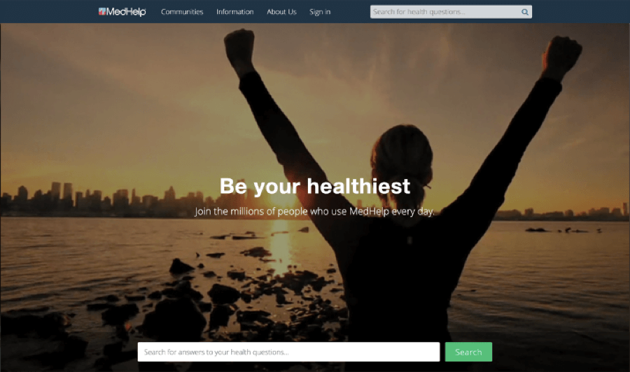
Put your hand up if you’re sick of seeing stock photos of people in white coats! We love the imagery on this website because it focuses on health and vitality. Instead of a picture of medical professionals nursing patients in a sterile setting, you’re greeted with a picture of people living life to the fullest. That’s what good health is all about, after all.
Other things we love about this site include:
- Clear CTA buttons on the homepage lead to different sections of the site.
- A prominent search feature leads you directly to the information you’re looking for.
2. Roche Diagnostics
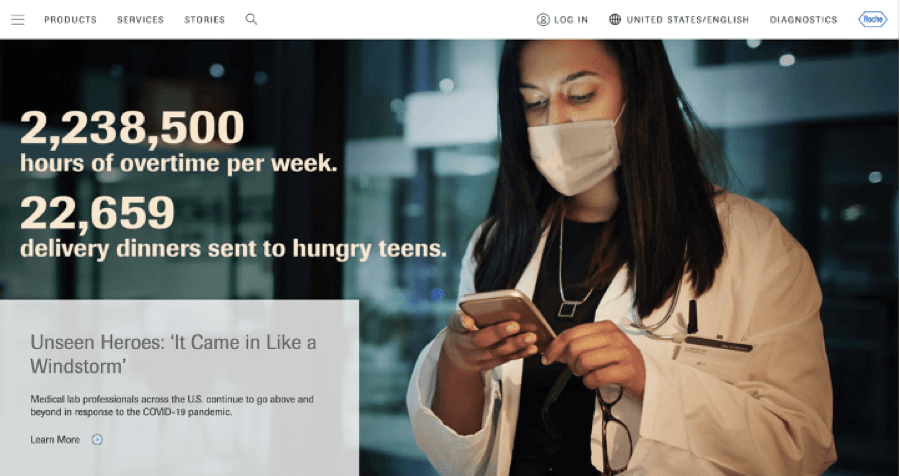
The images on this site are chosen very carefully. The focus on people brings a feeling of instant human connection to the clinical subject of diagnostic testing. The colors in the photograph also evoke a sense of calm and reflect the branding colors of the site.
This site has other great features such as:
- A straightforward, easy-to-use menu and simple navigation
- A lot of content that’s organized well with advanced search functions, so it’s easy to find what you’re looking for
3. Boston Scientific
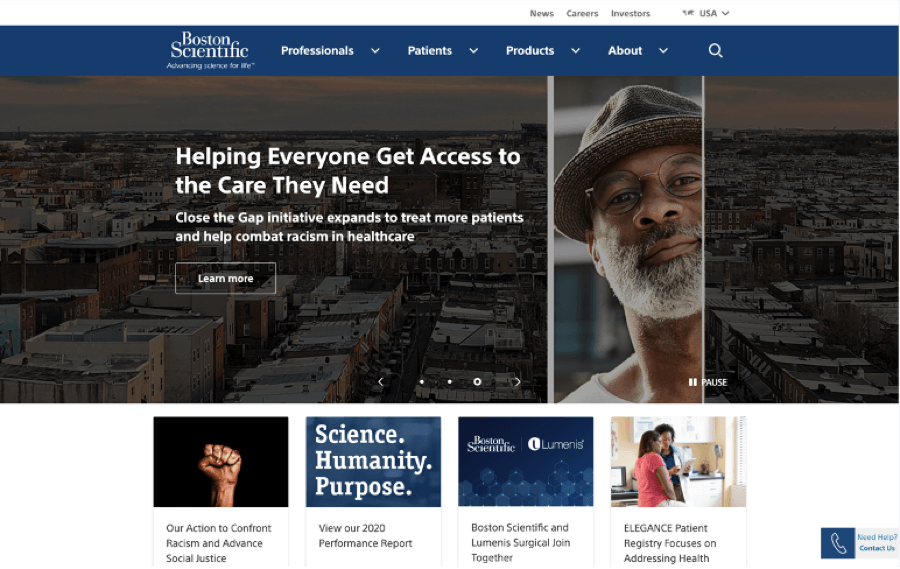
This site uses images to connect with different segments of its audience. For example, healthcare professionals see pictures of equipment and people at work. Meanwhile, patient sections feature lifestyle photographs focusing on the people, not the illness.
This site also features:
- A simple, high-contrast main color scheme accentuated with brighter pops of color to draw your eye to specific features
- A clear navigational menu that doesn’t distract from the rest of the page’s main elements
4. Cynosure
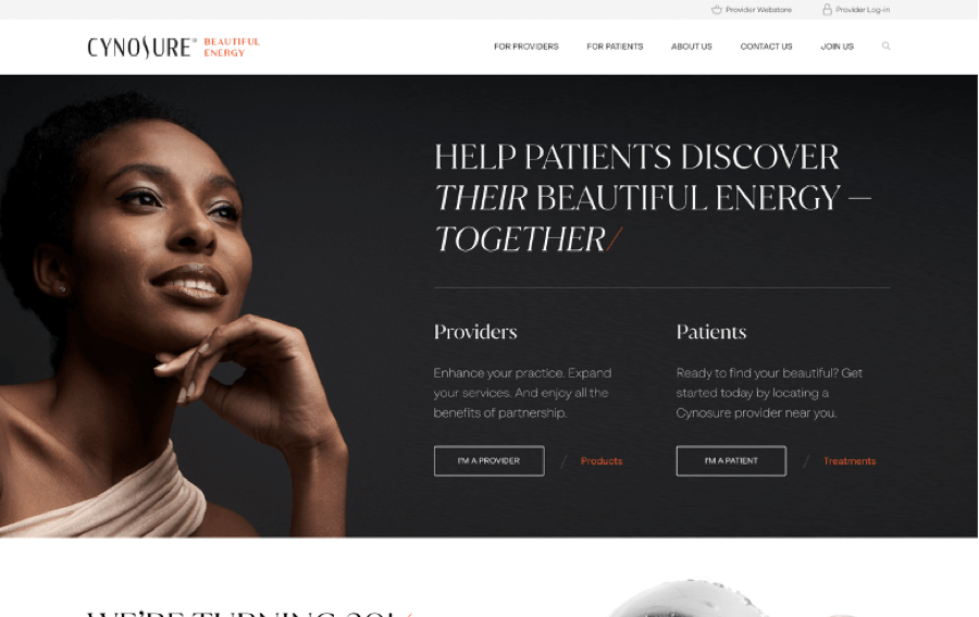
The tagline of aesthetic medical firm Cynosure is “Beautiful Energy.” The photographs on the site reflect this branding perfectly. Both the images and typography look and feel of a high-end fashion magazine.
Other things we loved about this site include:
- The bright orange of the logo is used as an accent color to draw attention to CTAs and navigational items.
- A well-constructed layout and professional copy make this site easy to read and browse through.
Thoughtful Navigation & Menu Design
1. Rush
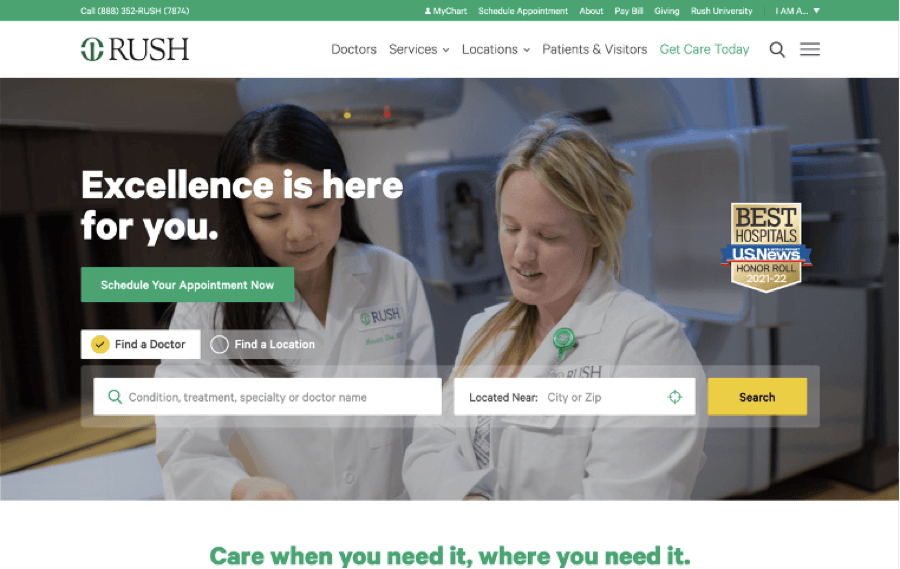
So many sites squeeze their navigation menu into a tiny strip at the top of the screen. Rush’s site is generous with the space it allows for the menu, with a large font and plenty of white space, making it easy to read. The menu also includes only the most popular pages in each category, so it doesn’t become overwhelming to navigate.
Other great features of this site include:
- A search form to find a doctor is located right in the middle of the homepage.
- The content on each page is carefully laid out with relevant images, highlighted sections, and links to other relevant pages.
2. Healthline
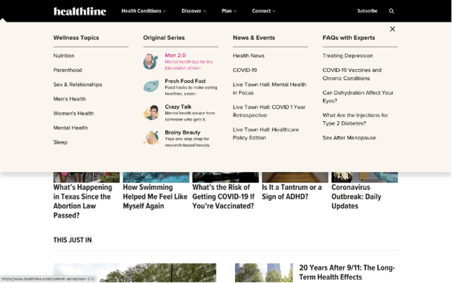
It’s clear that a lot of thought and time has gone into designing the menu and navigation on this site. The menu not only looks great but is also a joy to use, with animated transition effects and illustrated icons. Each section of content on the site is given an appropriate illustration, making it beautiful as well as easy to navigate.
Healthline is an excellent example of how to organize a lot of content well. Also, check out features such as:
- Featured content such as “Editor’s Pick” is displayed centrally on the homepage to draw your attention instantly.
- A combination of high-quality copy, well-produced videos, and professional illustrations raises the standard of this site above its competitors.
3. American Diabetes Association
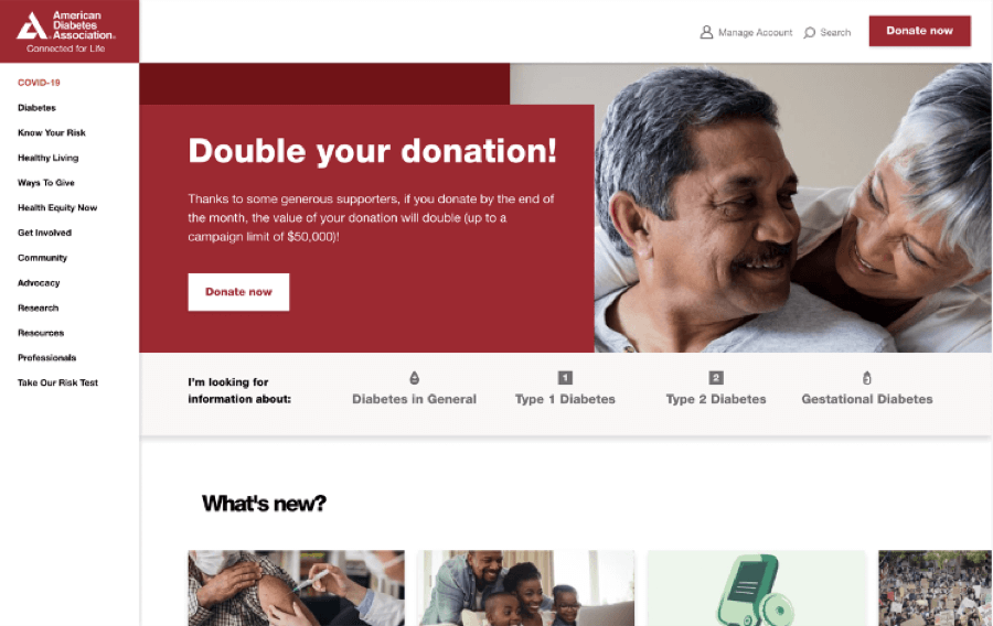
While most sites use a horizontal menu as their primary navigation, the American Diabetes Association has opted for a vertical menu in the left-hand column. This means that there’s more space for main menu items without looking cluttered. The menu sublevels are also easy to read from left to right, just like regular website copy.
Other features to note on this site include:
- Moving the menu leaves space for a search box, an account management button, and a CTA across the top of each page.
- Interactive features such as a diabetes risk questionnaire make the site more engaging for users.
A Color Scheme that’s Easy on the Eye
1. Zocdoc
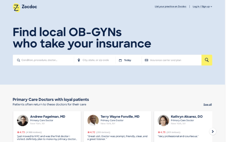
Blue is a popular branding color for healthcare businesses because it signifies trust and reliability. Zocdoc’s site features a pale blue background, which gives a calming feel to the site. The bright yellow of the logo is used to add visual interest to the site illustrations and make the CTAs stand out.
Other features of the design that make this site work include:
- No menu means that users are pushed toward the CTAs.
- Playfully illustrated icons add a fun feel to what could otherwise be a standard corporate web design.
2. Big Sky Health
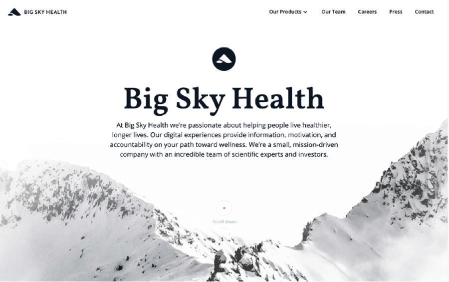
This site’s black and white color scheme instantly makes it unique and stand out from its competitors. At the same time, the site feels light, airy, and modern.
The Big Sky Health site has lots of other great design features such as:
- Clever use of artistic landscape photography combined with parallax scrolling and animation effects keep you wanting to scroll down the page.
- The typography and copy on the site are carefully planned. Plenty of white space and short paragraphs make it easy to consume the information on the homepage.
3. Northwestern Medicine
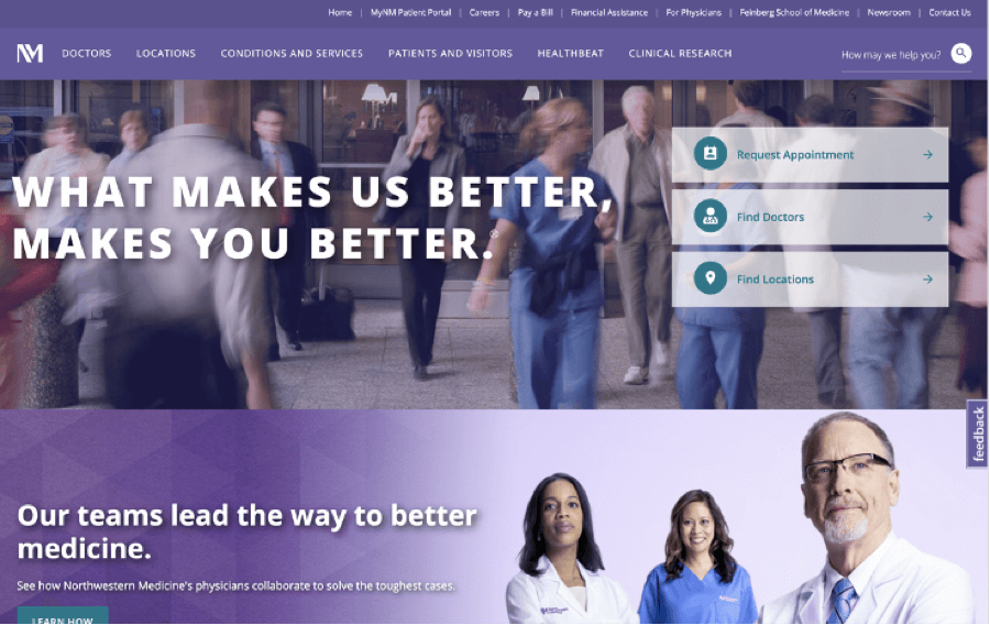
Northwestern Medicine has chosen a bold color palette for their site, with shades of purple and teal. The effect is striking but not garish, and the high contrast makes the site easy to scan and read.
Other features we liked on this site include:
- The double menu makes it easy to access multiple areas of the site in a single click.
- The strong images help to draw your eye to important information.
4. Doxy.me
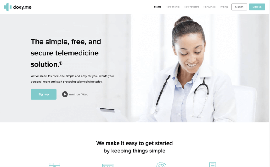
This site uses a pastel color scheme of gray and turquoise. This color combo has a clean and modern feel, which makes the site feel fresh and welcoming.
There’s a lot to like on this site in general, including:
- It has a simple, grid-based layout with plenty of white space.
- The main menu options are simply the brand’s three primary audience groups. This makes it easy for site visitors to quickly access the information that is relevant to them.
A Clean and Structured Layout
1. World Health Organization
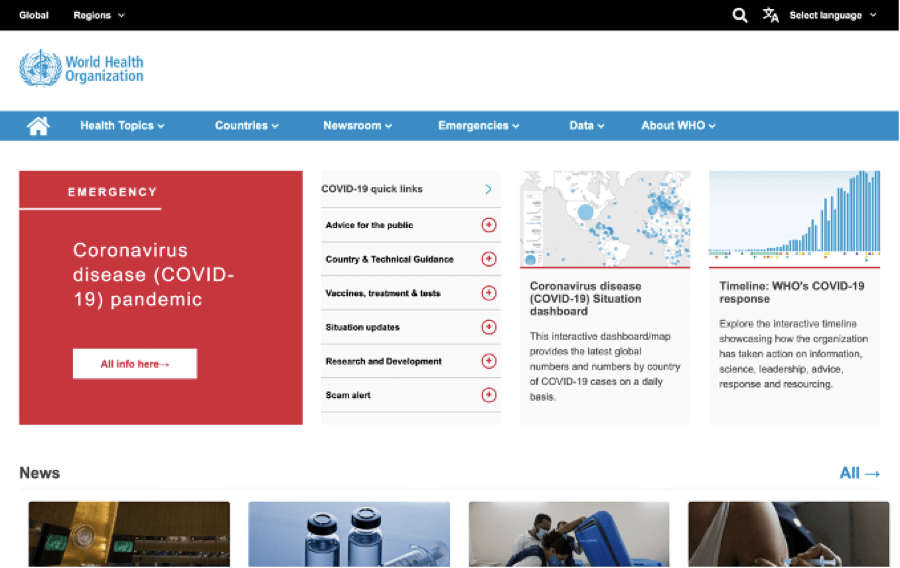
The WHO is a massive organization that serves an audience ranging from members of the public to government organizations all over the world. With so much content to display, this is an excellent example of a site that’s carefully organized and easy to navigate. Clean drop-down menus, a simple grid layout, and labeled content sections simplify finding the information you need.
Other features to note in this design include:
- A site strip with quick links allows users to change the language or region. This is useful for sites serving global audiences.
- People-focused images give a friendly feel to the site and make it relatable.
2. Everyday Health
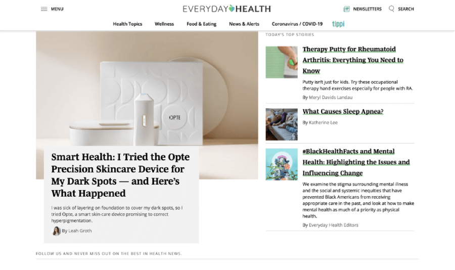
This magazine-style site divides its content into blocks based on topic. This means it’s easy to find the type of content you’re looking for, even without searching.
On this site, we also liked:
- The pleasant, pastel color scheme and illustrations
- The articles that are clearly labeled with their main topic, making it easy to find similar content in one click
3. Phoenix Children’s
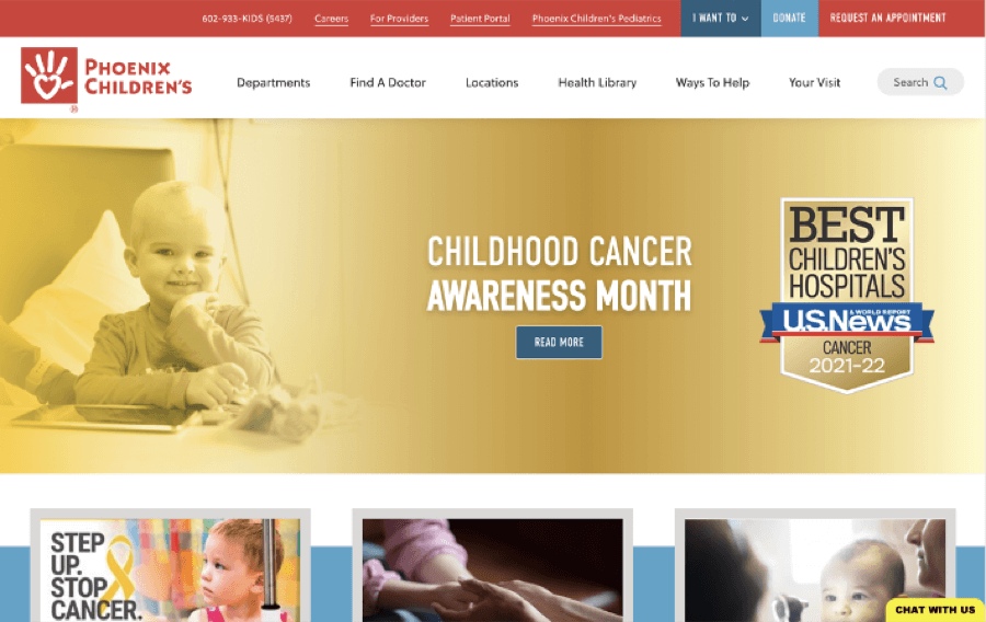
This site takes a unique approach to its main navigation. Instead of organizing content into sections by topic, it links directly to pages based on need. For example, you can choose from options including “I want to….” find a doctor, pay a bill, refer a patient, or make a donation. In addition, doctor, nursing, and location pages and informational articles are linked via search to avoid long lists of links.
Some other nice design features of this site include:
- The logo is repeated throughout the content to reinforce branding.
- A more colorful palette than most medical sites is appropriate for this children’s hospital.
4. Columbus Regional Health
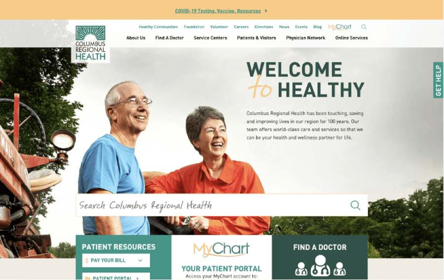
The structure of this site makes it easy to find what you’re looking for, whether you’re an existing patient or you’re visiting the site for the first time. Services and specialty centers are listed both in the menu and in a section on the homepage, and there’s a direct link to the patient portal.
Other things that make this site accessible and enjoyable to browse include:
- A cheerful color scheme makes the site feel friendly and helps to separate the different content sections.
- Positive and inspirational photographs of real people give a human touch and enhance the approachable feel of the site.
Readable & Beautiful Typography
1. Nuffield Health
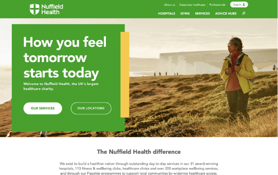
The strong typography combined with a bold color scheme on the Nuffield Health site automatically draws your eye to the brand value proposition and CTA. The designers have also used varying text sizes and weights to make the most important content on the homepage stand out. In contrast, less essential pages are less visible but still accessible.
Other features we liked about this site design include:
- High-quality photographs of a wide range of people illustrate that these services are for everyone.
- Detailed descriptions of procedures, including costs, alternatives, and hospitals close to you, help patients make informed health choices and reinforce the brand’s trustworthiness.
2. Ramsay Health
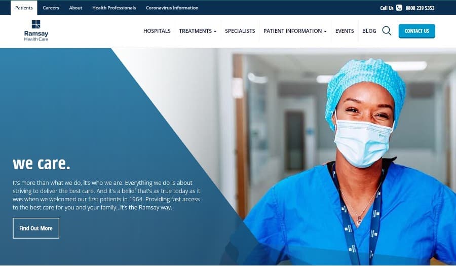
The first thing you see on this site are the words “we care.” It’s interesting to note that the site designers have displayed this in lower case rather than the typical heading style. This helps to create a calm and casual feel. The whole site uses typography very well to clearly display a lot of information without looking cluttered or overwhelming.
If you’re looking to this site for inspiration, make sure to also take note of:
- The high contrast and simple color scheme, which is both professional and easy to read
- The use of icons and images to clearly label content sections alongside their text headings
3. Health-on-Line
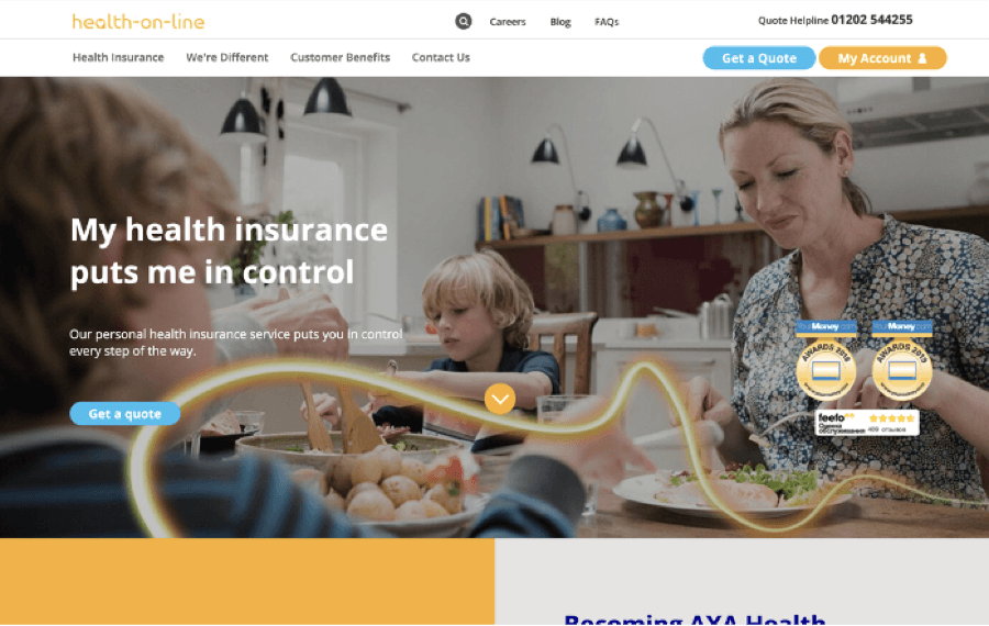
This health insurance company sticks to one font on its website and uses variations in size and weight to draw the eye to CTAs and headlines. As a result, it’s easy to quickly scan through the different content sections on the homepage, and the content is clear and easy to read.
Other great features of this site include:
- The bright and modern color scheme works to separate content sections and highlight CTAs.
- A sizable drop-down menu with plenty of white space is easy to navigate and doesn’t compete with design elements on the homepage.
4. British Heart Foundation
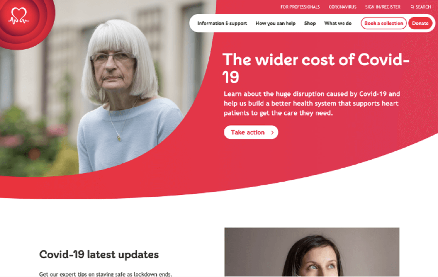
Strong typography with a unique font combined with a vivid color scheme makes this stand out from its competitors. It’s a great example of why it’s worth spending that little bit of extra time on getting your font choices just right.
There are lots of other little touches on this site that give it a quirky and memorable look, such as:
- Rounded corners on the menu and content boxes reflect the shapes in the logo and the main site font.
- The CTAs are prominent and clear in each content section.
Want a website as good as these examples?
Turn your project over to the professionals at Epiic.
Medical Website Design Examples: The Bad!
Now that we’ve looked at the cream of the crop, it’s time to scrape the barrel and take a look at some of the design fails out there on the web.
We don’t want to name and shame these sites, but we think it’s crucial that you know what NOT to do!
A poor design for your healthcare business doesn’t just mean you won’t be winning any design awards. It can also seriously affect your reputation and put off patients from considering your services.
1. Outdated and cluttered design with awful color scheme
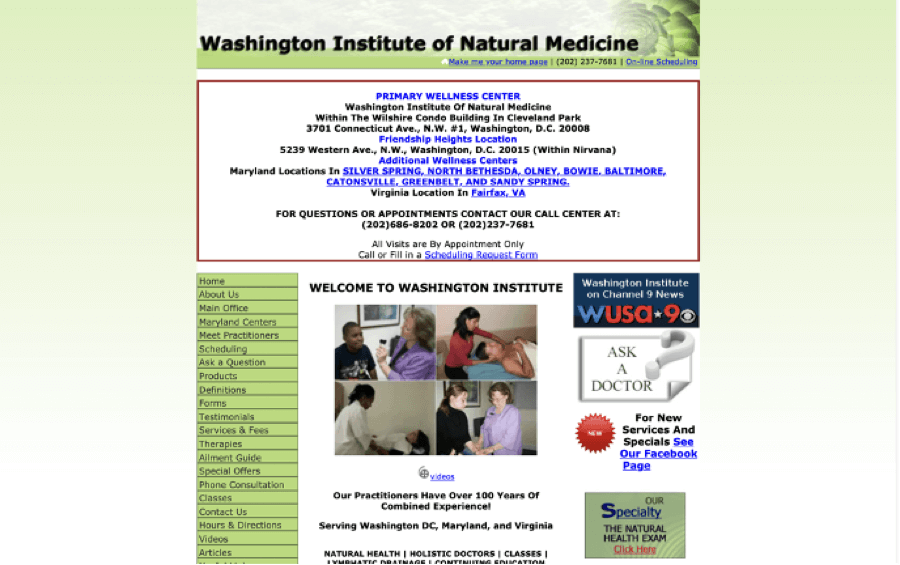
We saved the worst for first! We’re not sure what to say about this site except to keep it in your mind to avoid creating a site like this at all costs.
Not only is the entire site a rather unattractive shade of green, but the text is also difficult to read. In addition, there’s no hierarchy or organization to speak of, and it’s quite obviously hadn’t had a “facelift” in many years.
2. Dull design with uninspiring visuals

This site feels as gray and bland as its color scheme. The gloomy, serious photos don’t exactly entice you to keep reading. Also, there’s no excitement or personality to speak of in general.
Overall, this site feels like it’s unloved and just not somewhere you’d want to stick around and keep reading. If we want to be depressed, we’ll read the news – thanks!
3. Visual overload
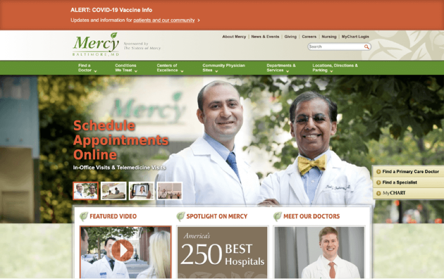
This hospital website is the polar opposite of the previous example. They’ve obviously attempted to add visually attractive images and a bright color scheme, but they’ve gone a bit overboard.
The overall effect is chaotic, with no real focal point and text that’s difficult to read. This site would benefit from a basic clean design with more white space and fewer images.
4. “Cheap” looking graphics
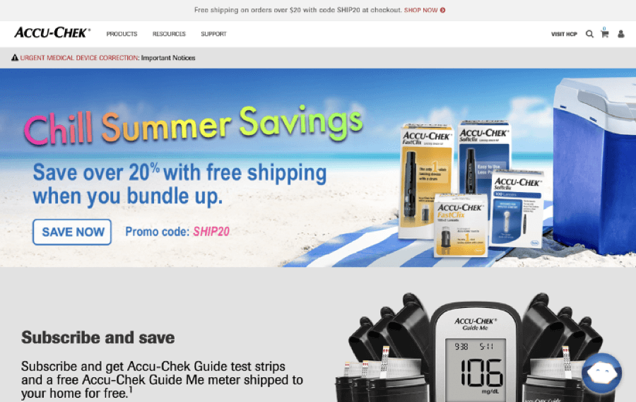
This is another example of a site that’s trying too hard to be cheerful and upbeat. Take note, if you’re trying to spruce up your own site, adding rainbow-colored clipart is not the way to do it!
Once you get rid of the ugly graphics, this site actually isn’t so bad. But it just goes to show how bad design choices can really affect your brand.
Professional web design doesn’t have to cost the earth.
With Epiic, you can have a skilled web designer for a flat monthly fee.
Checklist for Creating a Healthcare Website
Now you’ve got a good idea of what the final result should (or shouldn’t!) look like; you can start thinking of some ideas for your own site.
Whether you’re starting from scratch or revamping an existing site, there are a few effective website design tips you should keep in mind.
This advice stands whether you’re building your site yourself, choosing a pre-built template, or contracting a professional offering medical website design services to create it for you.
Choosing a suitable color scheme is vital for your site’s identity. You’ve probably already got an idea from the examples above. Grays and blues give a corporate, professional feel, while brighter colors are great for a more casual, young feel.
Don’t overlook typography either! In general, serif fonts are more formal, while sans-serifs feel younger and brighter. It’s best to stick with just a couple of fonts. Choose one for your headings and another for your primary website copy.
If you don’t already have a logo, this is a great time to create one. Your logo represents your brand. You’ll use it across your website, social media, and printed marketing materials, so it’s essential to get it right.
While many amateur websites create their own logo, if you’re serious about growing your business, we recommend hiring a designer to make one for you.
We already mentioned how important it is to have strong visuals on your site. If you can afford a professional photographer, it’s worth the investment to get some high-quality shots of your team and facilities.
If hiring a photographer isn’t in your budget right now, search for a stock photo library with lots of suitable photos in your chosen color scheme. You can also take your own photographs of the staff and practice so patients know what to expect when they visit you.
Design is important, but it’s also critical to get the layout and navigation of your site right from the start.
Take some time to plan the layout of your site before you start building it. This will ensure each page is laid out in a way that’s both easily navigable for visitors and simple to manage for yourself later on.
Every computer, tablet, mobile phone, and browser will display your site slightly differently. So make sure you test it thoroughly while you’re building to find any display bugs or navigation problems.
It’s especially important to check how your site looks on small screen sizes and that the responsive design features are working correctly.
Nobody wants to be greeted by a wall of text when they click on your website.
Make sure each page has a nice balance of text, images, and white space. This will ensure that your site is easy to navigate visually and comfortable for visitors to read.
Also, take the time to break up text with subheadings, bullet points, blockquotes, and other formats that break up the page into manageable chunks.
Videos are engaging, shareable, and memorable and can really improve the content on your website. In addition, some people prefer to watch videos rather than reading text on a page. As such, it’s a great way to get more people interested in your content.
It doesn’t have to cost a fortune to produce videos either. You can create quick behind-the-scenes peeks into your practice with any smartphone. You can also easily create videos from images and text using free software.
Poorly written copy can really let your site down, even if it looks great. So make sure each page has a well-written, concise copy that is easy to read.
If you need help with this, it does worth turning to an agency for pro-grade writers’ assistance to get the text on your main pages right. As well as including all the relevant information in an engaging way, they’ll also add compelling CTAs to your website copy.
These are just a few ideas for how you can upgrade your medical and healthcare website design in 2022. Some minor changes like these will go a long way toward improving the experience people have when visiting your site.
FAQ
If you’re confident in your design and coding skills, you can build a site yourself from scratch.
Using a drag-and-drop website builder with pre-designed templates is also an option if you don’t have much experience in web design.
For the best result possible, hire a developer who specializes in creating healthcare websites.
Always include your location and contact information, the services you offer, and plenty of photos to give visitors an idea about what they can expect when visiting your practice.
You should also consider including interactive features such as an appointment booking form or online chat.
Commissioning a medical website from scratch from a designer or developer can cost anything from $6,000 and up, depending on your requirements. You should also budget around $1,000 a year for ongoing website services, such as maintenance and updates.
Dec 09, 2021


Rachel
I’m an online marketing professional with over 10 years of experience. I have a background in web development and SEO, which I leverage to provide high-quality content strategy and content creation for businesses.