In today’s technological age, your jewelry business needs a site that stands out from the competition while still staying true to your brand identity.
Why? Well, let’s think about just how important your site is through some statistics:
- Online jewelry and watch sales revenues measure nearly $8 billion in 2021.
- 81% of shoppers head online before visiting a store to make a purchase.
- 75% of website visitors admit to judging a company’s credibility based on the website.
In other words, online jewelry sales and searches are pretty huge and your website visitors will often judge your products as well as your brand authority by your site design.
We’re here to walk you through the basics of what makes a great jewelry website design. Below we’ll explore the dos and don’ts of site design, look at some jewelry site examples, and discuss must-have elements for a successful site.
Great Jewelry Websites on the Internet
We love looking at beautiful jewelry almost as much as we love looking at beautiful websites — so these 16 sites caught our fancy! 😍
Each site is characterized by the feature they implement the best. We’ve also pointed out a few other great ”bonus” elements for each site to get you inspired for your own design.
💪 Background Images and Videos
Mejuri
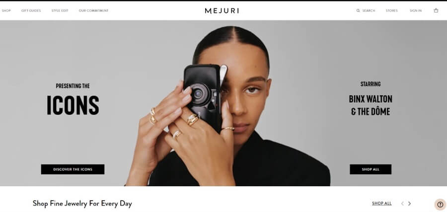
The Mejuri site puts visuals to their best use! We love the boldly colored background images that stand out from the rest of the page, as well as the pictures of jewelry pieces that fit in perfectly with the overall color scheme.
Check out the:
- Streamlined minimalist layout
- Easy-to-navigate site menu
Bluboho
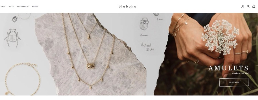
A picture is worth a thousand words — that’s why the Bluboho website is so potent, even with minimal written content. We love how the main image reflects the personality of the brand, which is heavily influenced by nature and adventure.
We also like the:
- Gorgeous pastel color scheme
- Unique store locations section
Jenny Bird
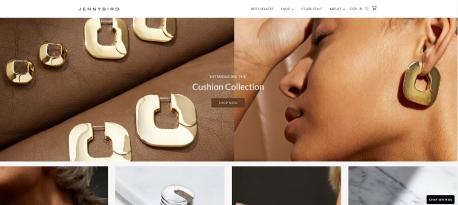
Jenny Bird jewelry professes to demonstrate a combination of creativity and a bold, fearless spirit. And we totally believe the claim. Their site boasts strong, sharp images that showcase that same striking and modern personality.
Take note of the:
- Visible CTA (call-to-action) buttons
- Well-balanced layout that’s easy to navigate
Lily Belle
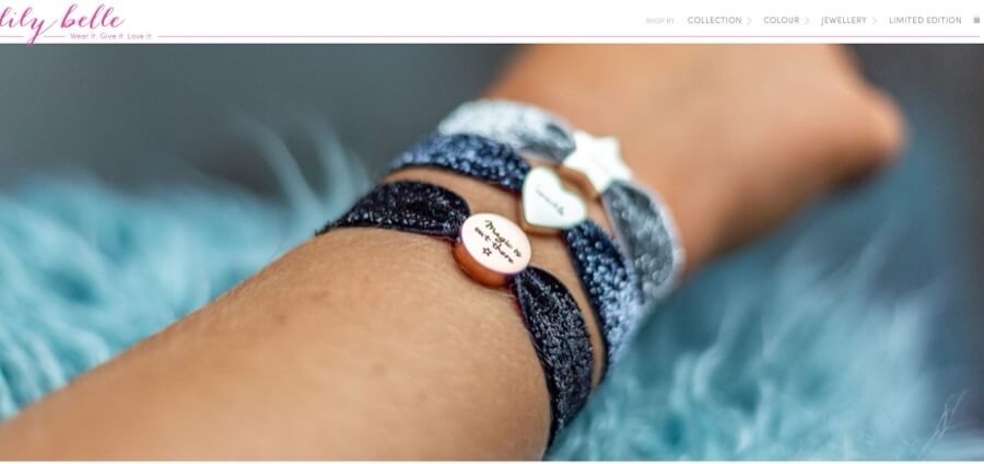
You can tell immediately that Lilly Belle is a place for the young at heart. Take a look at the background images! Glitter, bright colors, patterns, and whimsical style abound, capturing the essence of this company.
We’re big fans of the:
- Fly-in CTAs on each picture
- Lively color scheme
😮 Menu Design
Michael Hill
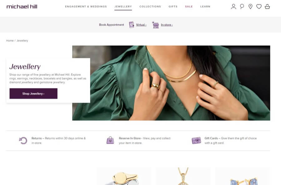
Few things make a website more enjoyable than a great menu, and Michael Hill has got that covered. We love their snappy menu design that makes it easy to find exactly what you’re looking for without wasting any time.
Other great elements include the:
- Homepage FAQ section
- Interesting and appealing visuals
Kendra Scott
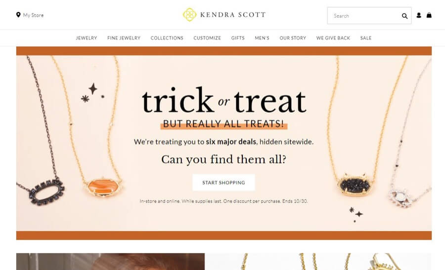
The menu design on the Kendra Scott site is a treat to use. It’s easy to navigate with plenty of sections, so you can narrow down your search and find the right jewelry piece quickly and easily.
We also like the:
- Responsive elements of the site
- Visuals that hold our interest
By Charlotte
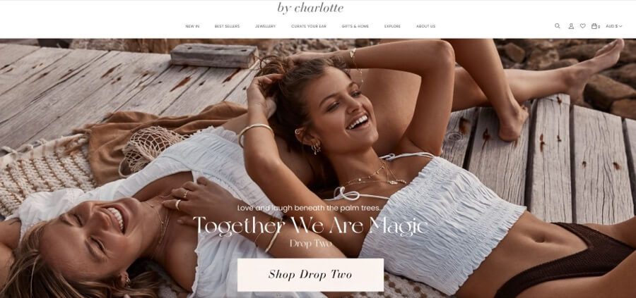
By Charlotte jewelry pieces are intended to uplift and inspire with simple and beautiful modern jewelry designs. We love how the simplicity, perfection, and effectiveness of the menu design mimics that of the company. It creates a truly cohesive look.
Don’t forget the:
- Interactive visuals
- Minimalist typography style
🔥 Color Schemes
Anice
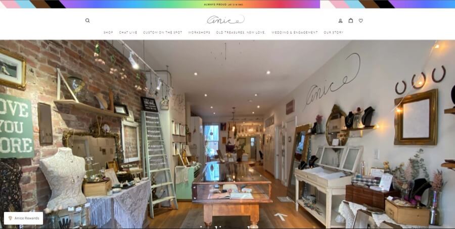
This lovely color scheme is a winner due in part to how different it is from other jewelry sites. Anice uses dynamic, saturated colors to stand out from the crowd and coordinate their images across the homepage.
More favorite features include the:
- Inviting typography
- Lovely and memorable logo
GLAMIRA
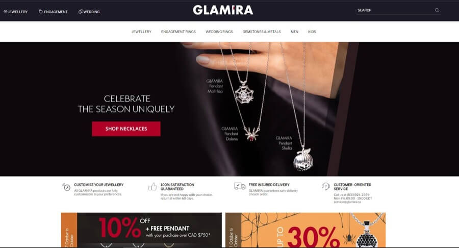
Here’s another example that forgoes pretty pastels and instead aims for bold and unique: GLAMIRA. We love how this site uses an intense color scheme of dark red and purple to contrast with the rest of the content.
We also love the:
- Easy-to-access guides and education section
- Concise menu design
Stone and Strand
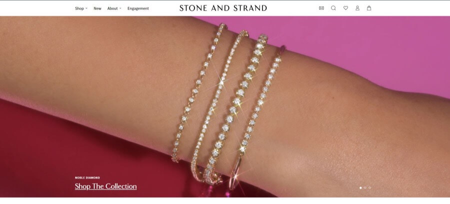
You guessed it — more non-pastel color schemes! Stone and Strand offers yet another great example that jewelry sites can use strong color. In this case, it’s gorgeous jewel tones that really make the site’s pieces pop.
Also, take a look at the:
- Playful use of shaping images
- Minimalist page design
🧱 Well-Structured Layout
Zales
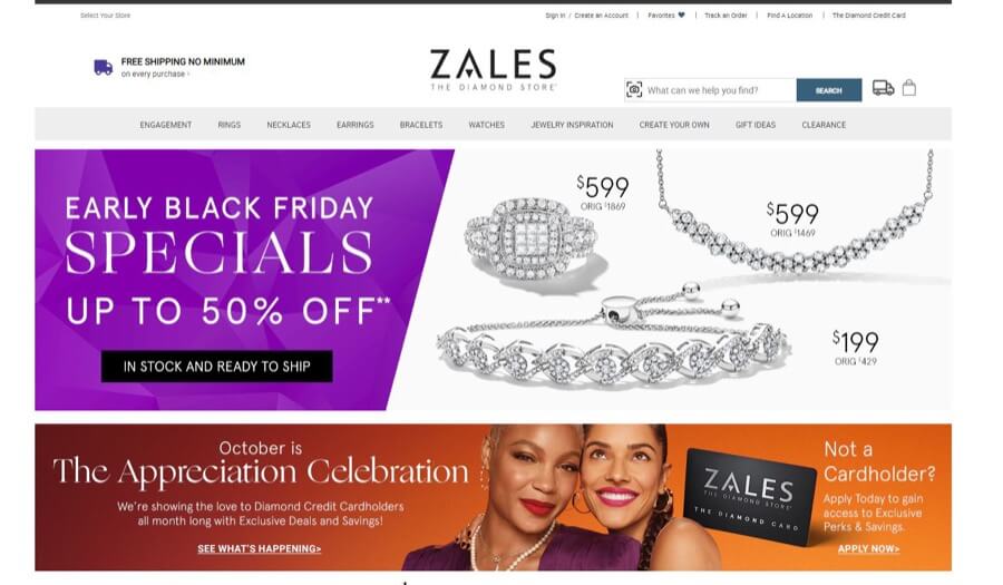
The Zales site offers a lot of information in one place, but a well-organized layout makes it easy to read. Combining thoughtful typography and related images means that the page content naturally falls into navigable sections.
We’re impressed by the:
- Well-organized menu design
- Highly noticeable promotional offerings
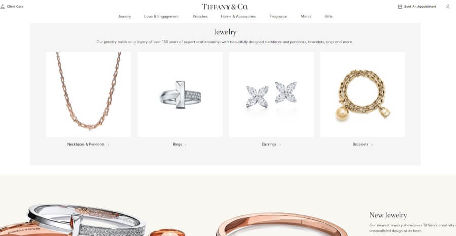
Tiffany & Co.
The Tiffany & Co. site uses a subtle color scheme and shading to create visual divisions between sections on the homepage. The result is an easy-to-browse, professional-looking site with a minimalist appeal.
Don’t ignore the:
- Great use of white space in the layout
- Well-designed menu
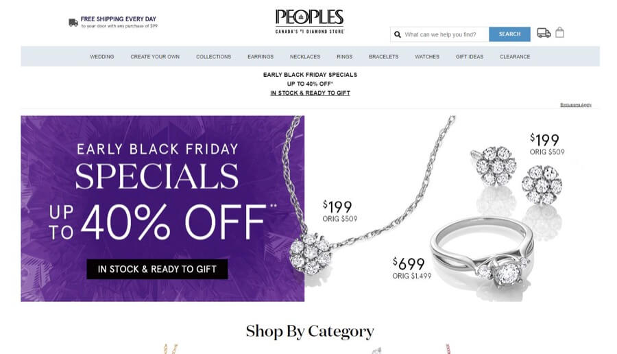
Peoples Jewellers
Wait…. Deja vu, right? No, you didn’t click on the wrong link! Peoples Jewellers and Zales have an amazingly similar site layout, perhaps because it’s so effective. The combination of image blocks with short content descriptions helps the site flow naturally and easily.
Also, consider the:
- Scroll-through gallery
- Bold typography
💎 Typography Style
Blue Nile
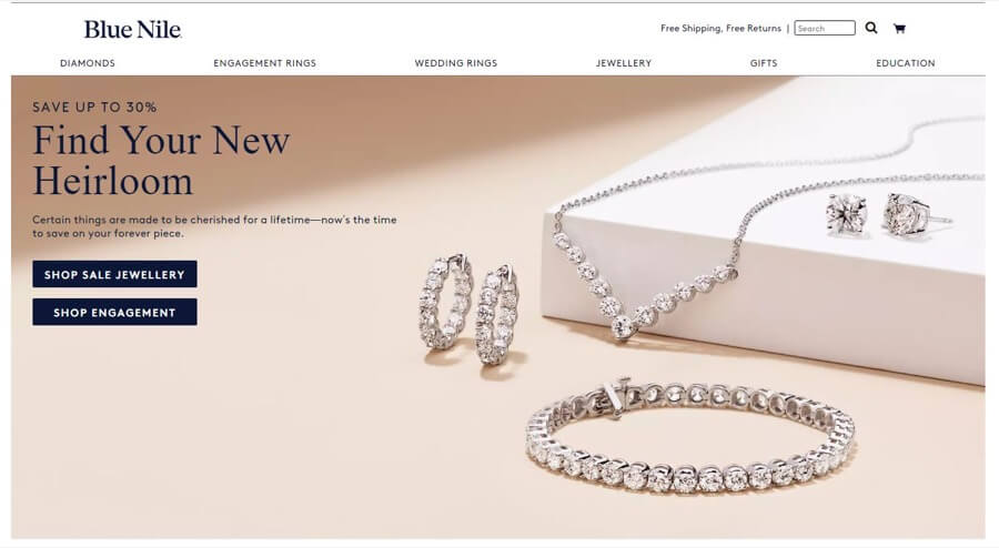
The homepage on Blue Nile combines a range of font sizes and colors to great effect. Despite the amount of content, the tasteful typography keeps things looking professional and readable.
Other great features include the:
- Noticeable CTA buttons
- Scrolling menu with images
Van Rijk
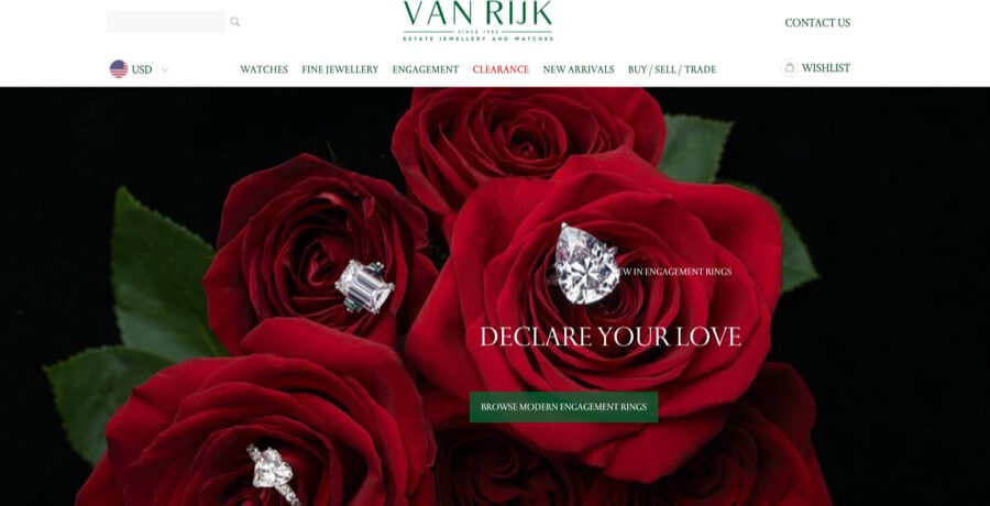
The Van Rijk site uses large, bold typography to ensure that its content packs a punch and isn’t overlooked. We love how their site typography is a great extension of their logo, creating a nice, cohesive design.
Take note of the:
- Vibrant scrolling hero images
- Consistent use of color
Reeds
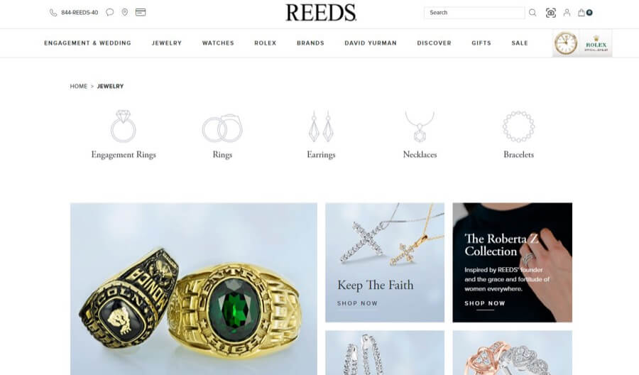
Reeds uses an easy-to-read typography style that fits in perfectly with its clean, minimalist website. As a bonus, the readable font means they can get away with longer blocks of text (like you’ll see at the bottom of the page).
We also enjoy the:
- Well-chosen images
- Interactive contact options
Want to have these design ideas on your site?
Epiic design services make it easy!
4 Unappealing Jewelry Website Designs
So, we’ve seen some of the best, but what about the other side of the spectrum? Here are four sites that could use “a little polishing” to ensure they make the right impression. Take note of the not-so-effective elements and try to keep them out of your site.
1. Unprofessional layout
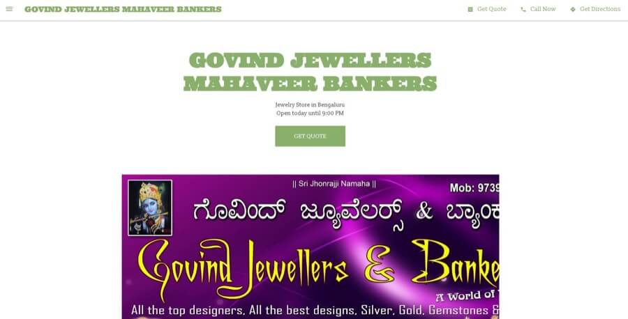
Govind Jewellers doesn’t present a strong layout. The site has too much white space, which makes the page feel empty and uninspiring. There’s a strange flow to the layout that’s not exactly user-friendly, either. We could also go for a stronger typography style and color palette to give the site a cohesive look.
2. Difficult and frustrating navigation/bad menu design
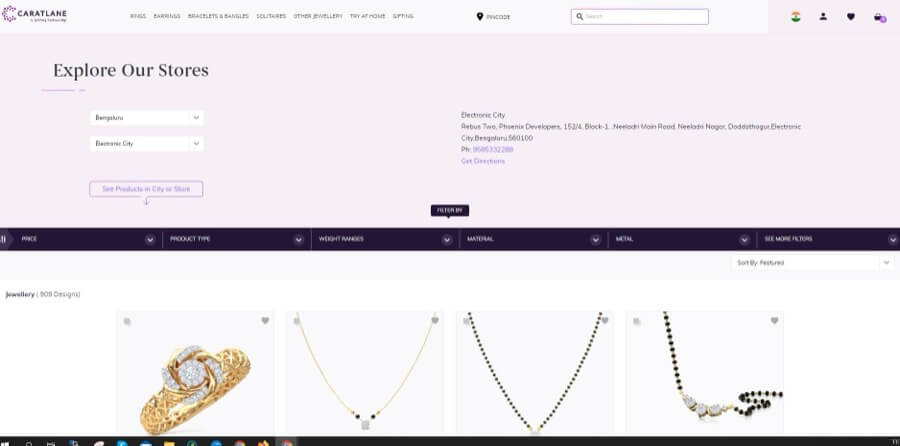
Our main issue with the CaratLane site is that it’s so hard to navigate! Trying to get to where you need to go is almost too frustrating to bear since all the stock is located on the homepage and constantly reloads as you scroll. A more streamlined approach would definitely be a bonus here.
3. No cohesive design
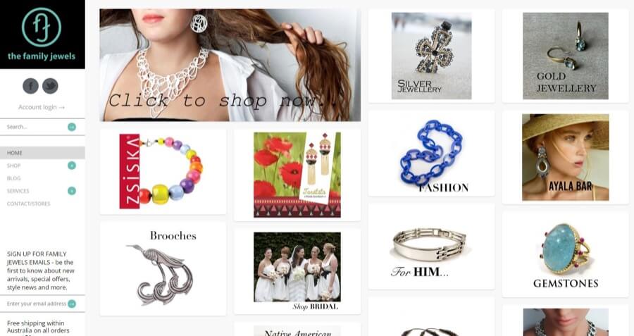
The Family Jewels site is heavy on the visuals (some of which are a little confusing) and lacks a cohesive design that will pull everything together and make it truly effective. We’d like to see some more written content, image sizing differences, and a tighter color scheme with typography style.
4. Forgettable and unimpactful homepage
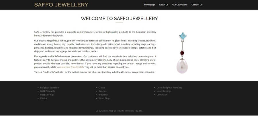
One-screen home page with minimum info?… Mmmm, seriously?
Saffo Jewellery went for a too-minimalist style with just a huge chunk of text and one visual element. The result is an uninspiring, unengaging, incredibly short home screen with hardly any relevant info. We’d suggest implementing a color scheme and typography and reconsidering the written content for a better design.
Want some pro-grade help designing your site?
Epiic design team is here to help you get results.
Quick and Easy Jewelry Website Design Checklist
- Examples?.. Check!
- Talk about the importance of having the best jewelry web design?.. Check!
- Pause reading for a snack break?.. Check!
- Find a convenient checklist that lays out the steps for the best jewelry web design?
…here it is!
Whether you’re designing your own site or working with a professional, this nifty list will help ensure the process stays on the right track.
So, are you ready / know how to:
Get the process started by choosing color designs and typography styles for your website. Want to go bold and daring? Love the look of the pretty pastels with a delicate font? No matter what you choose, make sure it complements your style.
Avoid this: Picking colors or typography styles at random (or not using them at all).
Your logo will encapsulate everything your company stands for into one aesthetically pleasing, small design. Easy, right? Maybe not. Many jewelry stores utilize professional designers to create impactful logos, so don’t be afraid to do the same.
Avoid this: Choosing a forgettable or confusing logo. This is the symbol of your company, after all.
Your clients want to see the gorgeous things you create, so don’t disappoint. Because your modern jewelry designs are unique, you’re likely going to want to invest in custom images for your site that showcases every piece to its best advantage.
Avoid this: Using free online images instead of snapping your own.
Before you start uploading your site, sit down and plan the structure first. Pretend you’re a visitor to the site. Is it navigable? Does it look nice? Does it make you want to stay? If you don’t answer yes to those questions, then something is wrong.
Avoid this: Having a cluttered and confusing homepage that scares customers away.
So much website traffic takes place on mobile devices that it’s a big mistake not to take time for responsive design. You’ll want to make sure that your jewelry site is aesthetically pleasing and functional no matter the device people access it on.
Avoid this: Not choosing a mobile-friendly site template.
A great layout is all about balance. Make sure your visuals aren’t crowded together or they’ll compete for attention. As for text, double-check that your typography is easy to read and works well with the rest of your layout.
Avoid this: Using long blocks of text (or no text at all) on your site.
From design and crafting demos to videos of people enjoying your jewelry, there are lots of ways to implement this media form. For the best results, upload your video to a video hosting platform and link to it from your site.
Avoid this: Uploading your video directly to your site, as this can slow things down.
For the final touch, break out your incredible writing skills (or hire a professional with incredible writing skills) and create content for your site. Make sure that everything you include is clear, easy to read, and relevant.
Avoid this: Flowery, fluffy, or confusing language that can annoy site users.
A good website doesn’t have to break your budget.
Discover affordable design at Epiic today.
Jewelry Website FAQs
If you want to try your hand at website creation, there are plenty of web tools out there, such as Squarespace, WordPress, and Weebly. Simply find one that fits your budget and tastes, then get designing!
If you’re slightly less crazy and want to leave the site design to the experts, you can always reach out to a professional design team like Epiic.
As we (hopefully) showed above, there’s no “the only” right way to make a great jewelry website. However, the best sites use the same impactful elements, including:
- An impactful color scheme and typography style;
- Clear and concise copywriting;
- A clean layout;
- Easy-to-navigate menus;
- Various types of media (videos, images, etc.).
That’s like asking someone to pick their favorite child! 😉 Okay, maybe not that dramatic, but still. When it comes to jewelry website design, there is no such thing as perfection — there’s something to love or improve on all sites.
The best jewelry websites are those that represent a brand’s style and offer a great user experience.
Dec 31, 2021


Andy Zenkevich
Andy is a seasoned CEO with years of hands-on experience in SEO, link building, content marketing and website development. His deep understanding of the digital landscape and passion for content marketing make him a trusted voice in the industry.