If you’re a healthcare provider, you need to attract new patients. Great healthcare website design is your prescription for better website health. With the effective website design tips in this guide, you’ll be all set to cure all your website woes.
Let’s start with why website design matters to doctors. Since healthcare is a highly technical field, website content often reflects that focus.
But hard-to-read content and cold, clinical design don’t cut it with today’s patients. Don’t let your practice fall into that trap.
Instead, use easy-to-read words to explain what you do. Imagery and design elements should welcome patients. Make them feel comfortable, not anxious.
In this guide, we’ll share some healthcare and hospital website design examples and ideas for making your practice stand apart from the rest.
Benefits of an engaging healthcare website design
Think about why you have a website. Usually, it’s because people search for a healthcare provider online.
So, at the very least, it needs to inform patients about what you do, your staff, and how to get in touch. But that’s not enough. You need to convince them that you’re kind, patient-focused, and an expert in your field.
And, you need a design that’s attractive and makes it easy for patients to find information.
In today’s digital era, a professional and user-friendly website is crucial for any business, and healthcare is no exception.
Our “Website Builders” service offers an invaluable advantage to healthcare businesses by helping them establish a robust online presence.
The “Website Builders” service includes:
- Expert Team: Our team comprises a Project Manager, HTML Coder, Graphic Designer, SEO Specialist, and Senior Coder. Together, they merge design, coding, and SEO expertise to provide a broad spectrum of website solutions.
- Custom Plans: We present meticulously designed plans tailored to fit your unique needs. Each plan assures dedicated focus from our specialists to meet your distinct requirements.
- Scope of Work: We serve both new and existing websites. Whether you’re initiating from scratch or wish to rejuvenate your current website, we’ve got your back.
An engaging medical website design has all those ingredients and more. So, when you follow some easy tips, your practice will stand out among the rest.
Healthcare website design best practices and tips
To have healthy patients, you and your staff need to follow healthcare best practices. However, you must balance those rules with well-reasoned insights.
Similarly, great design also must follow its own industry’s best practices. These tips will set your website apart in your field.
Here are some effective healthcare website design tips for your practice:
- Use clean design elements with plenty of white space: Studies show that too much information in too little space frustrates people. Leaving plenty of space between your design elements, on the other hand, calms them. Let your patients breathe.
- Make navigation and search easy for prospective patients: If your prospects can’t find what they need, they’ll go elsewhere. Make it easy for them with intuitive design.
- Include accessibility and ADA-compliant features in your design: It’s not just the legal aspects you need to consider. To show yourself to be a caring provider, you need to make your site easy to use for all people.
- Use engaging, original imagery: Photos of your office, community, patients, or staff work much better than stock photos. Stock photos are fine for blog posts. But, for your other pages, use originals.
- Incorporate videos into your website: Studies show that 65% of your audience are visual learners. So, reach them with videos that use both visual images and sound.
- Create informative, easy-to-read content: To attract patients, you need to showcase your expertise. But don’t make it all about you. Instead, use content that helps patients live healthier lives. And, leave the doctor-speak for the medical journals. Use words that all patients can understand instead.
- Include patient testimonials and case studies: Nothing speaks louder than the results you have achieved with your own patients. Use their experiences to build trust.
Don’t miss out on the benefits of an attractive website!
Get started with Epiic today.
Healthcare websites that get it right
If you’re creating a new website or revising your current one, it pays to have some examples of healthcare websites that get design right. Here are some great examples of healthcare website design.
Amazing background images or videos
1. Infinite Medical Express
infinitemedicalexpress.com
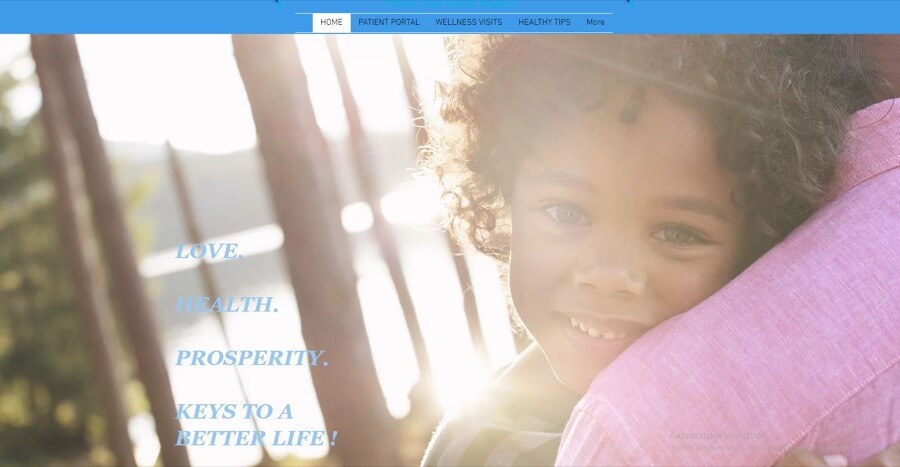
A carousel of photos shows off this practice’s patients and providers. These happy, smiling people glow with good health. You couldn’t have better proof of the care you provide than images like these.
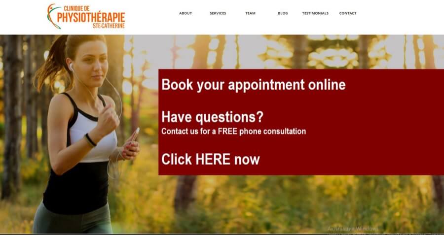
2. Clinique de Physiotherapie
There’s no better photo to show off the results of this physical therapy clinic’s work. This image of a fully recovered athlete getting in her daily workout gives patients hope that they, too, can get back to normal.
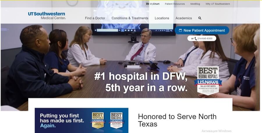
3. UT Southwestern Medical Center
Patient-centered medicine is a must in today’s competitive healthcare industry. This image shows that when you choose UT Southwestern, an entire team will center its attention around you. The image’s insert doubles down on that message.
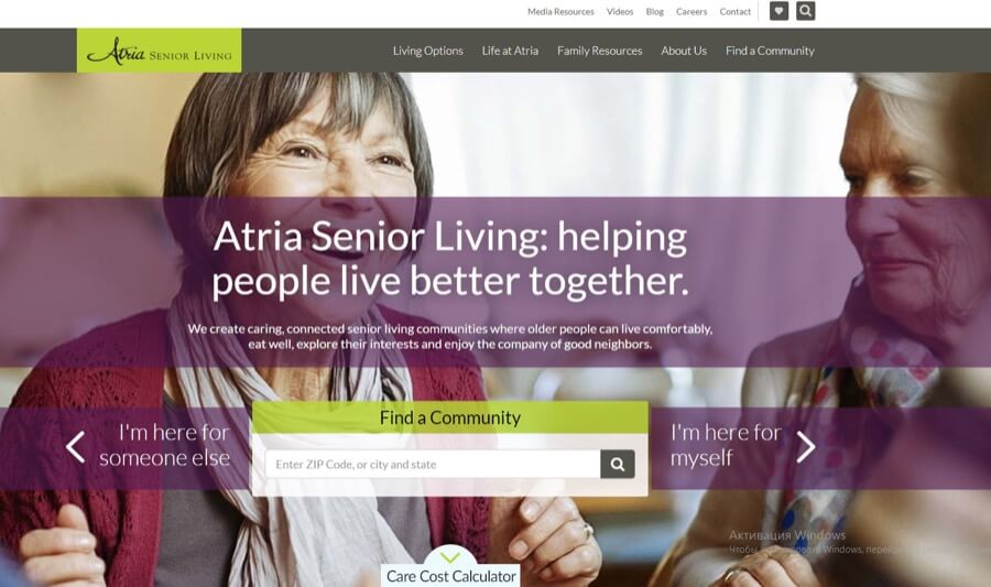
4. Atria Senior Living
One of seniors’ biggest fears is being friendless and alone in their golden years. The image this senior living facility chose for its home page assures seniors that they’ll be able to enjoy the company of other residents, take part in activities, and savor the best things in life.
Great menu and navigation design
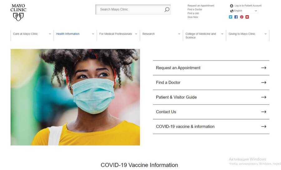
1. The Mayo Clinic
Whether you’re a solo practice or a world-famous clinic, it pays to have a menu that gets people the information they need quickly. So, like Mayo Clinic, you need to have a menu that is easy to read and navigate.
Both the menu and the hospital website design provide easy-to-find information for doctors, students, donors, patients, and hospital visitors.
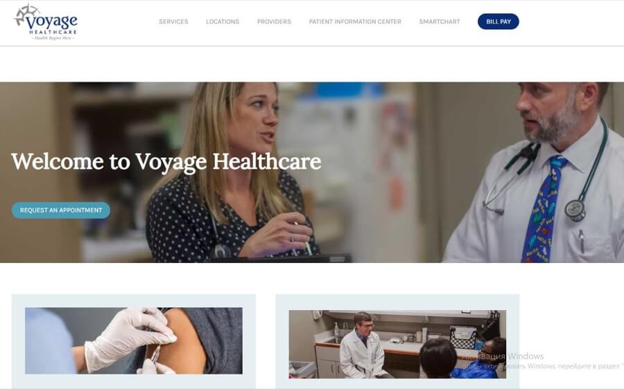
2. Voyage Healthcare
Large practices with many locations need to show patients the closest office to them. This easy-to-read menu does that and more. It invites patients to check out their services, look for a provider that is a good match for their needs, and access their medical charts. And, with a call to action right on the home page, patients who need an appointment can do so in seconds.
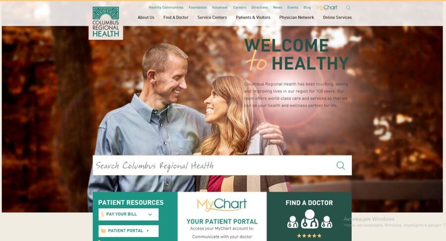
3. Columbus Regional Health
With a large menu that serves job applicants, volunteers, and patients, Columbus Regional Health’s website features short yet clear menu items. This easy-to-read menu allows people to find what they need quickly. And, with the shorter menu just below the image, patients can find a doctor, look up their chart, and pay their bills easily.
Engaging health content
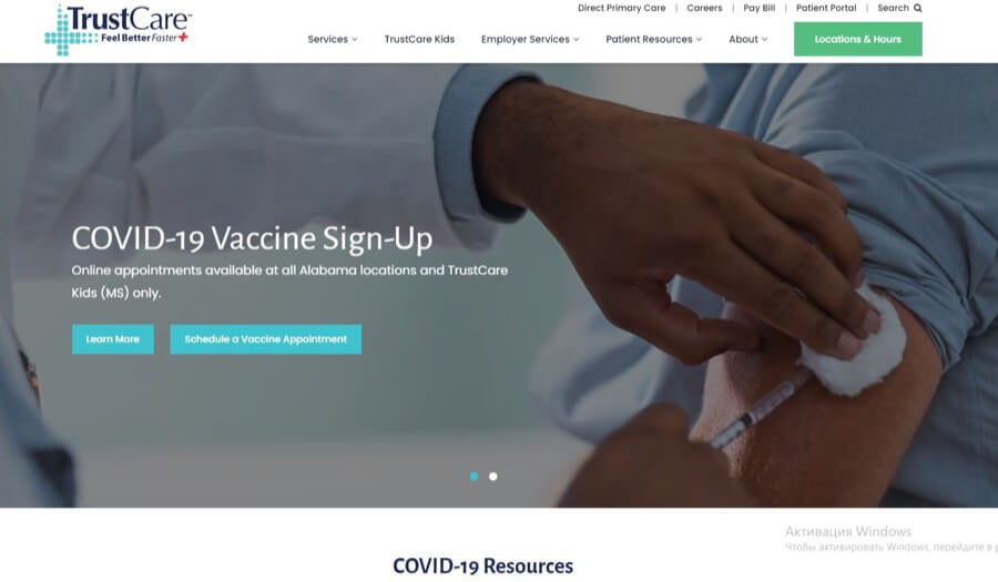
1. TrustCare
While we’d advise this practice to choose an image that’s more inviting than a needle going into an arm, the content below is much better. We especially like its clear, easy-to-read explanation of its unique take on family practice. A subscription model isn’t easy to explain in one paragraph. But they did it — and did it well.
We’d strongly advise leading with that since it dovetails with their brand — care patients can trust.
2. VitalAire
We love how this sleep apnea clinic explains what it does in a short paragraph. And, even better, they do so right at the top of the home page. The inviting image, plus their easy-to-read text, gives patients everything they need to know from the very start.
Also, instead of cluttering the page with lots of text, they link to it with a “read more” button. It’s all you could ask for on a healthcare home page.
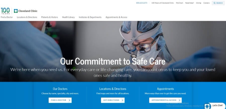
3. Cleveland Clinic
There’s a reason that the Cleveland Clinic has dominated healthcare content marketing. Its library of rich resources for both patients and doctors is second to none. It wasn’t always that way. When Amanda Todorovich, the clinic’s director of content marketing, joined the content team, its content was boring at best.
Through a data-driven strategy and a focus on engaging, informative content, its hospital website design and content became as famous as its healthcare.
Beautifully structured layout
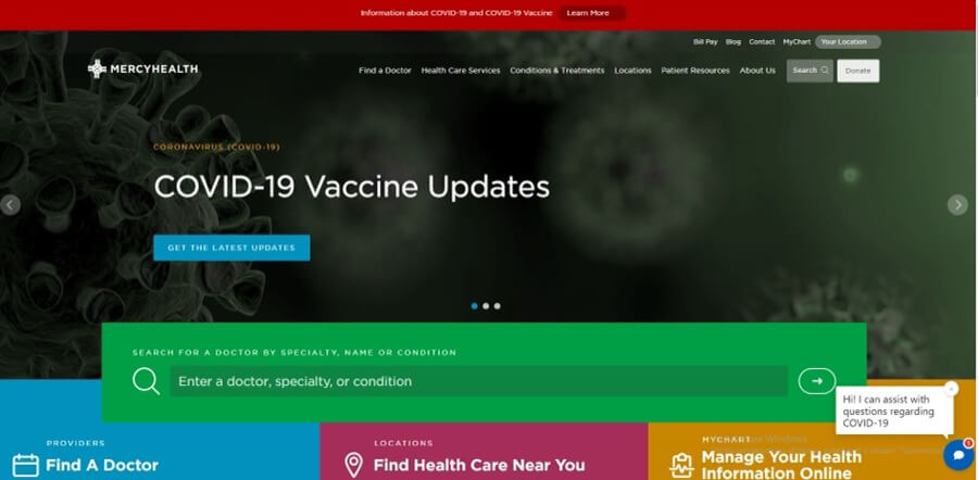
1. MercyHealth
While we’d advise them to lead with something more inviting than a group of floating viruses, we absolutely love how they’ve structured their layout with brightly colored boxes. Grouped by patient needs, these options are easy to find — and easy to read. At the touch of a button, patients can find exactly what they need in seconds.
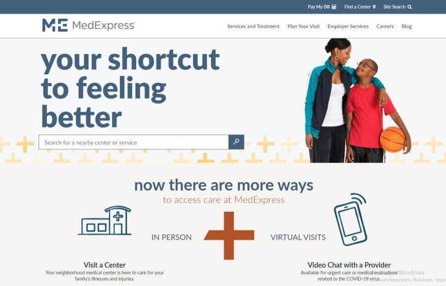
2. MedExpress
From the title to the image, this urgent care clinic’s website layout clearly spells out its mission. It shows all the ways that patients can receive care quickly and get back to living their life. Options are easy to find. Plenty of space between each element makes this website easy on the eye. And the color scheme uses calming blue and cheery primary colors — a perfect palette for an urgent care practice.
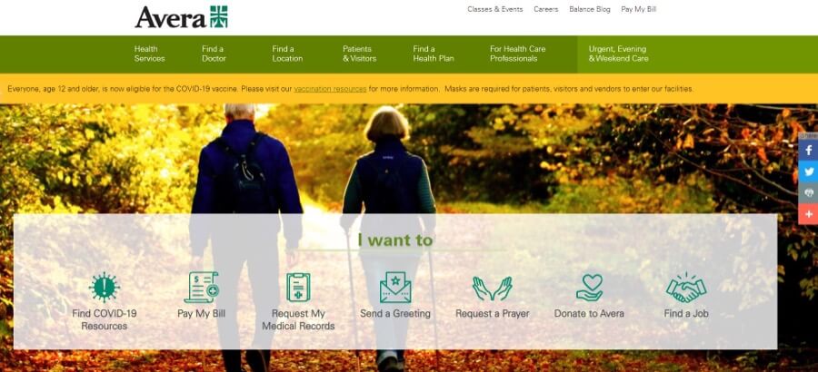
3. Avera
We love these images that add visual pop to each option. Using icons and text makes it easy for people with reading issues to find what they need easily. Below the visual menu, a list of timely blog posts offers even more information.
Don’t feel like coping with an amazing website alone.
Try us out today.
Healthcare website design no-nos
Outdated design, poor navigation, and “outlandish” color schemes all factor into the likelihood of prospects leaving your website, as HubSpot’s Anna Fitzgerald points out. And, if they leave your website, you’ve just lost them as a patient.
After all, who wants a doctor who ignores details? Attention to detail on your website marks you as a provider who will do so in your healthcare as well. So, avoid these healthcare web design no-nos when you plan your design:
Missed opportunity
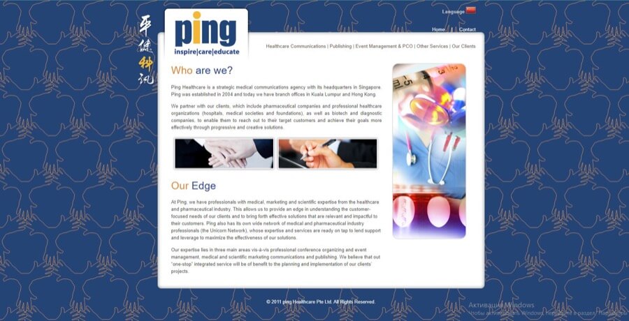
While we love this medical communications agency’s use of soothing blue color and medical imagery, it starts off all wrong. Look at the header. Is there anything about healthcare communications there?
First, they forgot to mention their main keyword — a missed SEO opportunity. This website’s main keyword, “medical communications agency,” should appear in the headline so search engines can classify it properly.
Secondly, busy doctors won’t have time to read the fine print to find out if it’s a healthcare communications firm. They’ll move on to another agency that took the time and effort to include the company’s main line of work in the headline.
There’s another design element that bears calling out. The pale-as-death pile of hands in the middle left image. Not a good look for a healthcare communications agency. Instead, show pictures of glowing good health.
Flashing images send a red light warning
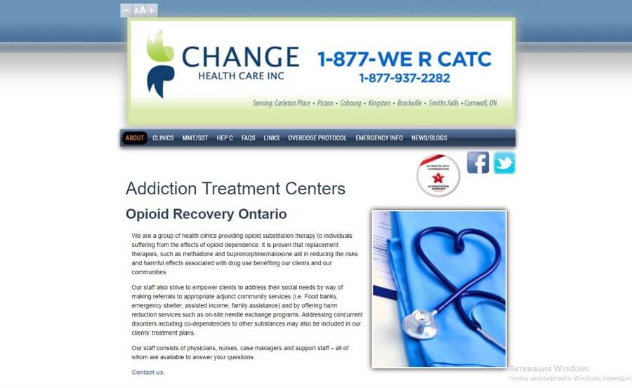
You can’t see this fatal design flaw in a static photo. But if you click on the link the website’s header flashes back and forth between images in split-second intervals. Look at it for even 30 seconds, and your eyes will need a serious rest before you read the next section.
Of course, you won’t be there. You will have clicked away back to the search results. Too bad, because this site’s content, menu, and color palette are spot-on for this addiction recovery clinic.
House of worship or a healthcare website?
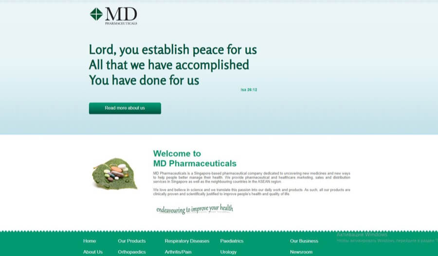
Don’t get us wrong. We’re all for giving the Higher Power thanks.
But, unfortunately, the “higher powers” at Google won’t look so fondly upon you if you don’t state your business at the outset. Neither will your patients.
Instead, put the faith-based content on your company mission page, which this site seems to lack. Start with a keyword-rich headline and what sets your work apart from your competitors.
Unreadable heading fonts
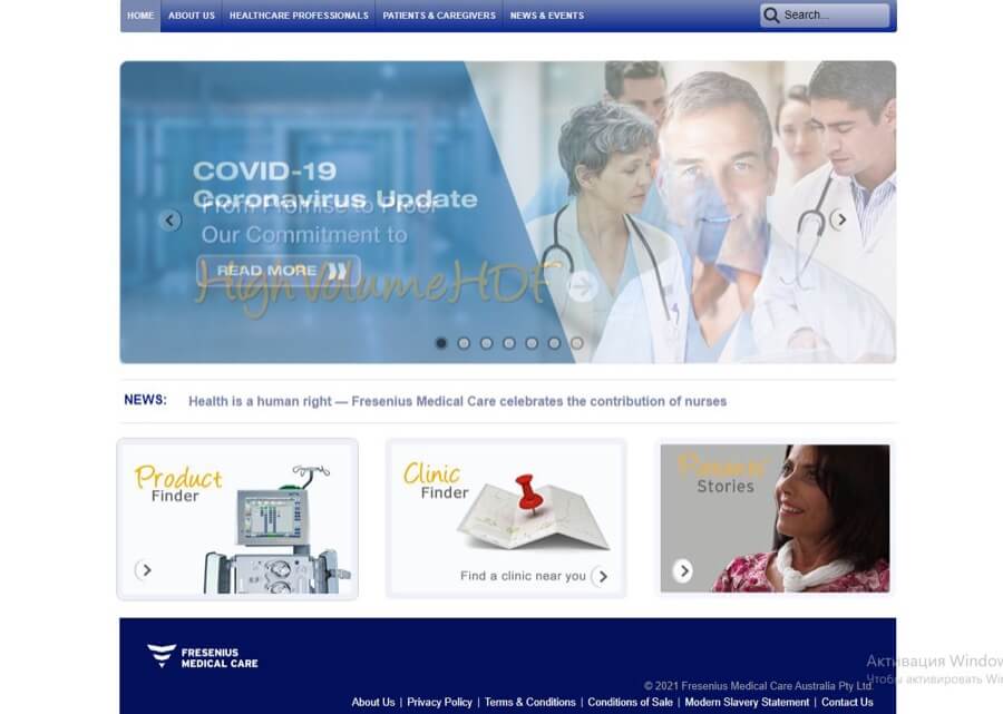
Let’s start with what this website gets right:
- A soothing color palette
- An image-based menu
- Images that tell people they’re on a medical website
However, look a little closer at the last image. Can you see the word “Patient” without straining your eyes? Neither could we. Switching from a cutesy cursive to a sans serif would help. So would black type and a white background, making the text easy to read.
Healthcare website design checklist
It doesn’t matter if you do it alone or hire a website designer. It pays to have a quick checklist to double-check your design against before you click “Publish.” Here are some items you need for an effective healthcare website design:
Color has a subtle yet powerful impact on your patients’ mindset. For healthcare companies, blue and green are great color choices.
Blue, as we’ve already discussed, represents trust, stability, and calmness. For a healthcare practice, those values are a must.
Green, on the other hand, is the color of growth, health — even fertility as Oberlo’s Nicole Ferreira reports. So, especially if your clinic offers nature-based medicine, green makes an excellent choice.
Yellow, too, works for healthcare sites. Its cheery vibe brings sunshine and hope into the picture. Combined with other primary colors, yellow is a great pick for pediatric practices.
As for fonts, we prefer an easy-to-read sans serif for blocks of text. Be sure to set it against a contrasting background so people can read it easily.
You can get a little more creative on subheadings. But be sure to make readability your top priority.
Logos need to align with your brand’s culture and mission as a healthcare provider. They can be abstract or symbolic, but they must reflect your brand.
Here’s where a professional designer is well worth consulting. They can translate all those lofty words from your mission statement into an image that gives you instant recognition.
If you can, use original images that reflect the great care you take with your patients’ health. Scenes of a doctor meeting with a patient, a recovering patient getting back to normal life, and a patient’s picture superimposed with a testimonial all build trust in your work.
Use banners that blend well with your chosen color scheme. Any text on the banners should focus on the benefits your practice provides to your patients.
From your menu to the blocks of images and text on your web pages, focus on engaging your prospects. Positive, hopeful messages that progress from one idea to another are essential for healthcare websites.
Make the call to action buttons easy to find. Navigation to other web pages should be intuitive — with little effort on your visitors’ part.
TIP! An experienced web designer can help you plan a layout that tests well with real-life users. After all, focusing on a great user experience is what they do every day of the week.
Statistics show that almost 55% of all web traffic occurs on mobile devices. That alone should spur you to make sure that your website is mobile-friendly.
That’s not all. It’s also important to make your website rank better in Google searches.
In addition, your website might appear differently in various browsers. It’s well worth checking to make sure that all your features work as you’ve designed them in all of them.
One of the most common mistakes we’ve seen on hospital and other healthcare websites is trying to cram too many images, graphs, and text onto a single page. Leaving space between these elements makes it easier for people to focus on the information itself.
Think of your web pages as a gallery to display various aspects of your practice. The walls — or the space — need not be white. They simply need to provide a space for the user’s eyes to rest.
Studies show that videos increase traffic to your website, better inform users, and generate more leads and sales. It’s no wonder that healthcare practices have adopted them for their own websites.
Videos teach your patients about their health. As you inform, you build trust. There’s nothing better than that to position yourself above clinics that treat people as just numbers on a chart.
Implement Clear Copywriting and Content Structure
There’s nothing that turns off patients more than sloppy, unorganized content. Just think: if you saw error-filled text on your doctor’s web page, you’d think twice about consulting her when you come down with troubling symptoms.
She might make the same mistakes on your chart. Give you an overdose of medicine. Mistake your healthy kidney for your dying one.
If you don’t have a writer or editor on your team, consider outsourcing your content creation to an agency. Make your content as accurate as your work.
Healthcare website FAQs
No doubt you have a few questions about how to come up with healthcare website ideas. Here are some common questions our clients have:
Start with your target patients. What are their fears? Their health goals? Their outside interests? Use those touchpoints to create a website that connects with their needs.
Healthcare web design starts and ends with the patient’s needs. Provide the kinds of imagery and content that will meet those needs. Always make it easy for them to get in touch with your practice.
A healthcare website is the digital home of your medical practice. It’s not a social media profile but rather content you own outright.
Since it’s your home on the Web, you owe it to yourself and your patients to make your website as welcoming as possible.
Jul 14, 2023




Andy Zenkevich
Andy is a seasoned CEO with years of hands-on experience in SEO, link building, content marketing and website development. His deep understanding of the digital landscape and passion for content marketing make him a trusted voice in the industry.