Your dental practice website is a critical tool for growing your business. The best dental website designs attract new patients and help you engage with your existing clients. They are also crucial for building your brand and reputation.
But a poorly designed website can have the opposite effect. It could drive away potential dental patients who find it off putting or unhelpful.
A blackened or crooked tooth can ruin your smile and your confidence. Likewise, a bad dental website design can hurt your online reputation and keep people away from your office.
Luckily, there are many examples of great websites that you can learn from when designing yours. We’ve compiled a list of some of the best and worst dental website examples for 2022. Along the way, you’ll learn what to do — and what to avoid — when planning your own dental web design.
Advantages of a Professional Dental Website Design
There are many reasons to put the time and effort into building a quality dental website. A website is an invaluable marketing tool that can help you attract new patients who are seeking dental professionals in your area.
Some other benefits of investing in your web presence include:
- Attract more business through SEO. Publishing helpful content about dental treatments helps you rank higher in search results. This means that more interested patients can find your website when making decisions about their dental care.
- Increase brand awareness. Your site is a reflection of who you are and what makes your practice stand out from the crowd. Showing people how professional, caring, and skilled you are will help you build your brand and grow your practice.
- Build trust by providing information about services. By educating patients about dental procedures, you can ease any concerns people may have before they even step foot in your dental clinic.
Epiic is an unlimited design service for a flat monthly fee.
Get access to a skilled web designer.
Outstanding Dental Website Design Examples for Inspiration
As you start planning your new dental website, check out these great examples of the best dental websites that are already making a big impact.
To make it easier for you to understand the anatomy of a great dental website, we’ve grouped these sites by their strongest features.
So grab yourself a cup of coffee or tea (without sugar, of course!) and get ready to be inspired by these examples of great design.
Stunning visuals
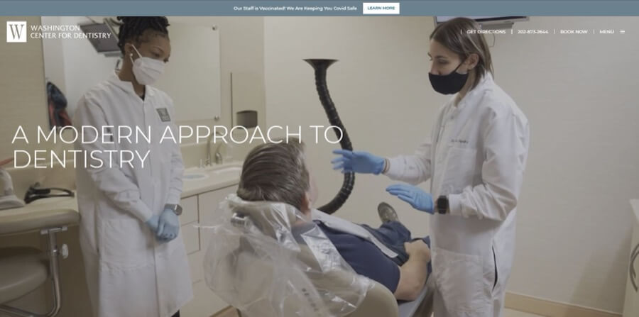
1. Washington Center for Dentistry
The fullscreen background video on this site does a great job of showing off the hi-tech equipment used by the dental team at this practice. Using video rather than a static image means they have a better chance of grabbing the attention of casual browsers.
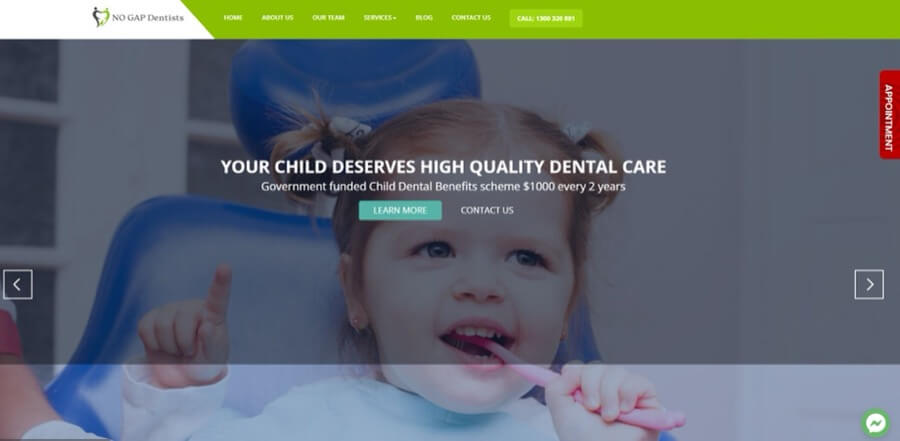
2. NO GAP Dentists
The first thing you notice when this page loads up is that all the patients featured on the homepage are smiling and look completely at ease. This is a great way to convey that you’re likely to leave with the same big smile they have if you choose this dental practice.
3. North Sydney Dental Practice
northsydneydentalpractice.com.au
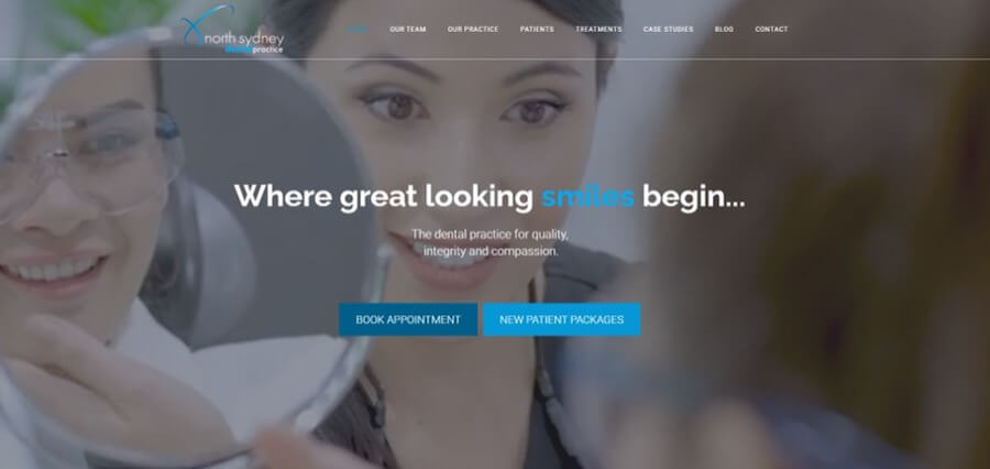
North Sydney Dental Practice focuses on what everyone really wants to achieve from visiting the dentist — a great smile. The montage video of smiles does a great job of showing off the cosmetic treatments available at this clinic. It also makes you feel more relaxed about your upcoming visit.
4. Little Smiles of Washington
This practice specializes in pediatric dentistry. This specialty is immediately obvious from the smiling kids that greet you when you load up the site.
As well as photos of children, this site has chosen a nautical theme for its logo and graphics. Fun treasure map background images and paper boat icons are effective at making the site seem more playful.
User-friendly navigation menus
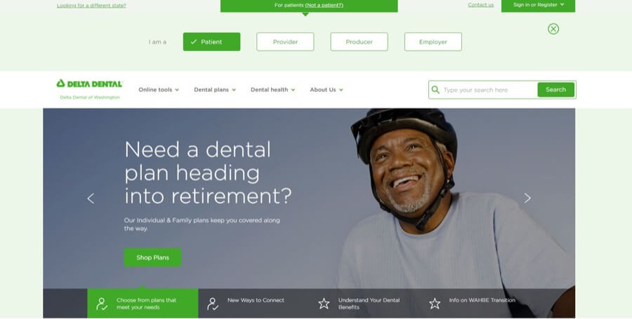
1. Delta Dental
The content on this site is aimed at four primary user groups: patients, providers, producers, and employers. By prompting you to select which group you are in at the top of the page, the site makes sure you’re viewing the most relevant content.
The menu also includes direct links to handy tools for finding a dentist, comparing costs, and downloading forms.
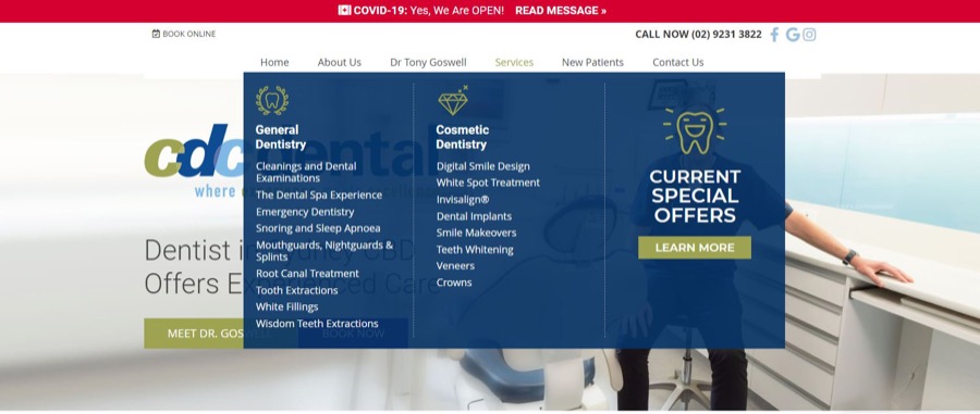
2. CDC Dental
On the “Services” section on the menu of this site, you’ll see a great example of how to give visitors a clear idea of what your dental practice offers. Services are plainly listed under “General” or “Cosmetic” dentistry.
As a bonus, the eye-catching call to action linking to special offers is sure to boost conversions.
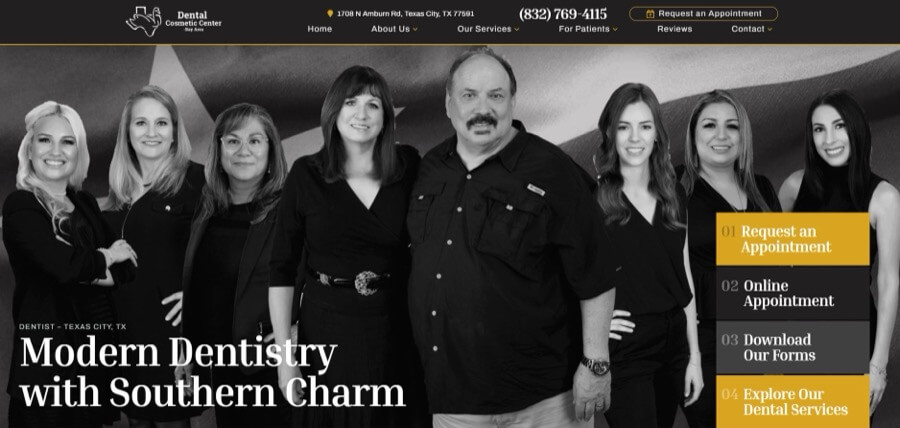
3. Cosmetic Dental Center
Dental patients are often unsure about precisely what type of treatment they need. Cosmetic Dental Center has a great process to help visitors narrow down their choices. Instead of simply listing services by name, they narrow down the option by presenting a list of issues.
Visitors can select options such as: “I have a cavity or a broken tooth” and “I fear the dentist’s office.” This means a new site user can quickly find helpful information to solve their problem.
Attractive color scheme and engaging content
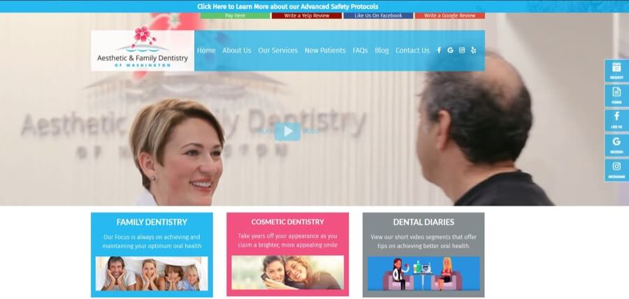
1. Aesthetic & Family Dentistry of Washington
The sky blue color this site has chosen for its menu, CTAs, and highlighted text has a relaxed and friendly feel. This color scheme prevents the site from appearing too corporate.
A series of videos “Dental Diaries” introduces browsers to the team while giving dental hygiene advice in an accessible format.
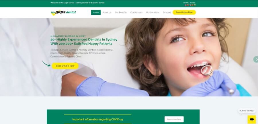
2. No Gaps Dental
Green is a naturally calming color, as it reminds us of nature, which makes it an excellent choice for web design for a dentist. Bright yellow CTA buttons contrast nicely, making it easy for users to quickly locate the most important information.
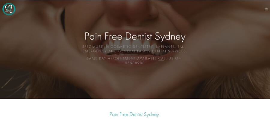
3. Pain Free Dentist Sydney
This dental clinic has produced both a library of free high-quality informational videos and a detailed blog. These give patients information about nutrition, orthodontics, and other important dental topics. Publishing educational content is a great way to attract search engine traffic to your site. This, in turn, will boost your authority as a dental professional.
The clean site design does a great job of showing that simple is often best. Rather than a full-color palette, they’ve opted for just black and white, with the green of the logo adding pops of color to headings.
Well-structured website layout
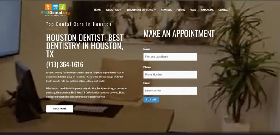
1. FMS Dental
FMS Dental places its appointment booking form front and center on the homepage. This immediately encourages visitors to get in touch.
The rest of the content on the page is also very well laid out and easy to navigate. Patient testimonials, a video tour of the dental office, and links to service areas are great examples of what to include on your homepage.
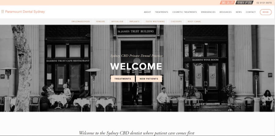
2. Paramount Dental Sydney
This beautifully crafted dental web design for a dentist would work equally as well for a lifestyle blog. The grid layout is built carefully to display a lot of content without it looking cluttered. Furthermore, the carefully chosen images and color scheme make it a pleasure to browse through.
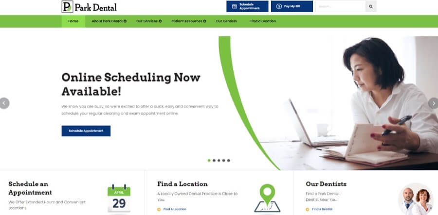
3. Park Dental
It’s all too easy to fall into creating an informational website with no real calls to action. Park Dental has successfully avoided this pitfall by directly leading visitors to its most important pages. These pages include an online booking form, location finder, and dentist finder tools. Putting these links above the fold reduces the risk of losing new potential leads.
Typography-driven design
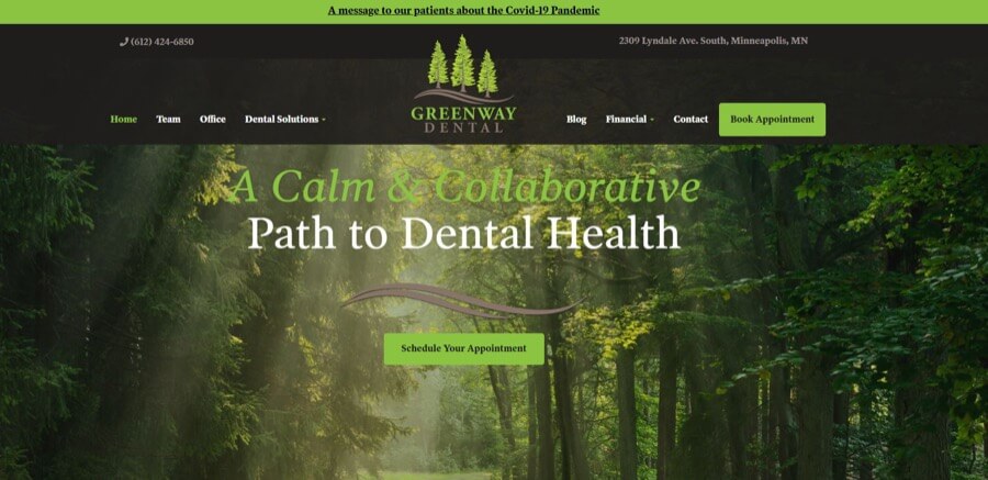
1. Greenway Dental
The elegant serif fonts used in this design give the site a classic feel, which perfectly complements the calming nature images. The overall effect is reassuring and calming. This is exactly what you should be aiming for when nervous dental patients are your target audience.
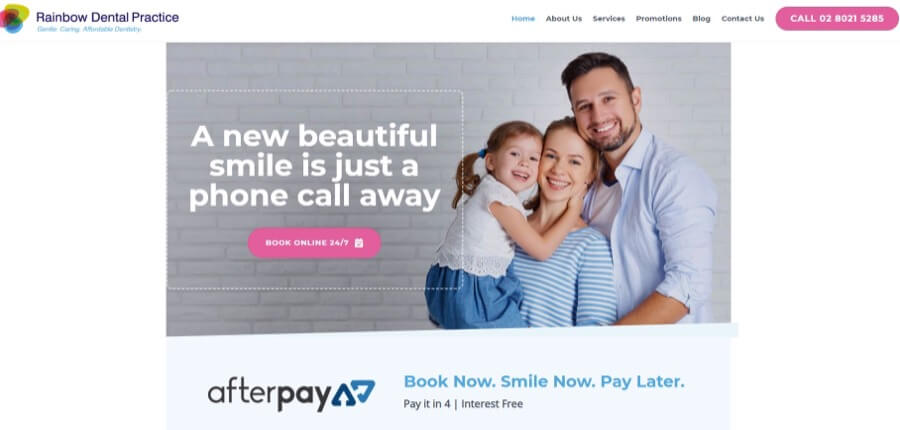
2. Rainbow Dental Practice
The modern sans-serif typeface chosen by Rainbow Dental Practice helps to give the brand a casual and friendly feel. This is accentuated by the bright color scheme and the family-focused header image.
We also like the rather clever CTA: “Book now. Smile now. Pay later.”
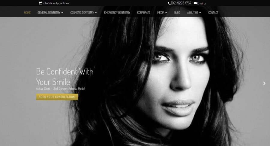
3. Pitt Street Dental Centre
The use of a contemporary sans-serif font has given this dental clinic website a modern and fresh feel. The black and white color scheme and fashion-style photography also work well. The complete effect helps the clinic compete in a market full of luxury cosmetic dentistry practices.
How Epiic can help you design a site like this?
Learn more about the alternative to freelancers and in-house teams.
Examples of Ugly Dental Website Design
Ugly websites not only look unattractive. They can also be difficult to use and find information on, which could lose you potential future patients.
As well as studying the examples of good dental website design above, you should educate yourself on what not to do. Here are some examples of common design mistakes so you can make sure to avoid them when designing your own site.
1. Terrible Choice of Images
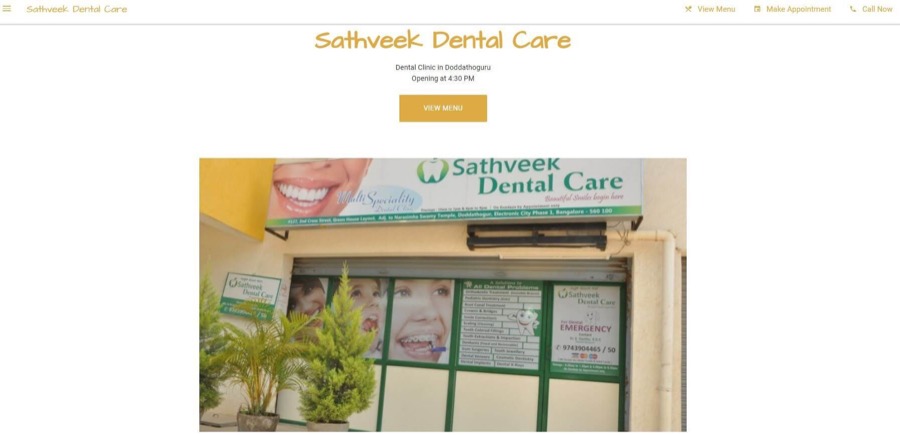
For some reason, this dental office thought that a poor-quality snap of the entrance to their clinic would make a great homepage hero image. To be honest, seeing the snot-green theme of their interior decor would be enough to put anyone off. We advise to get the decorators in, followed swiftly by the web designers.
2. No Image or General Design Theme
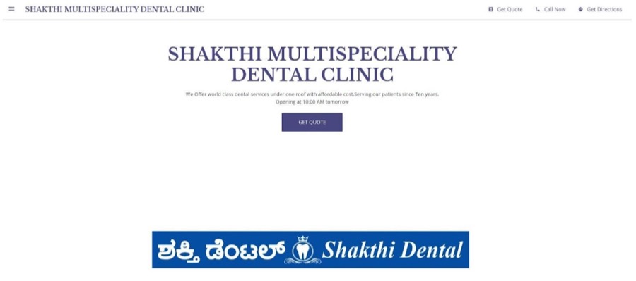
This site has almost the opposite problem. Instead of taking the time to (at least!) take some photographs or source quality stock images, they’ve simply left a blank space where the hero image should be. The effect is an unfinished site and an unprofessional business that you wouldn’t want to trust your smile with.
3. Too Much Text
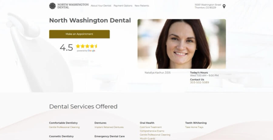
Some businesses make the mistake of cramming too much text on the homepage. You may have heard that lengthy website copy is good for dental website marketing and SEO, but this is not the way to do it. This site has no real layout, so it’s unappealing to look at and confusing to navigate.
4. Poorly Planned Design with Invisible CTAs
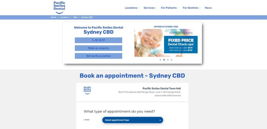
The website of this Sydney dental office somehow manages to look cluttered and boring at the same time. There’s obviously not much thought gone into the layout, and there’s too much text crammed into small boxes. Also, as the CTA buttons are the same color as the logo, menu, and headings, it’s too easy to scroll past without even noticing them.
5. Wasting Space Above the Fold
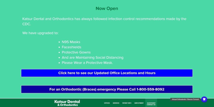
Many websites use an announcement bar at the top of the homepage to draw attention to important information. But on this site, that bar takes up the whole screen. If you bother scrolling down, you’ll be disappointed. The design is outdated, has an unattractive color scheme, and the text is too small to read.
A good website can be expensive…
Epiic makes it affordable with unlimited design revisions
for a flat monthly fee.
8 Steps to an Awesome Dental Website – Checklist
So we’ve wowed you with some of the best dental websites on the web. We’ve also shown you some of the worst. Now it’s time to focus on what makes a great site and how you can create one for your business.
Building plus designing a website can be an overwhelming task. This is true if you’re taking on the job yourself or even if you’re hiring a professional web design team to do the hard lifting for you.
It’s easy to lose sight of the big picture. So to help you out, we’ve created this checklist to keep you on track.
So, let’s double check it with yourself if you are ready (know how) to:
Your logo is one of the main ways people remember your brand. If you don’t already have a logo for your dental business, you’ll need to design one before you get started on your website.
Don’t just grab any clipart you find online. Make sure your logo aligns with your brand identity and looks clear and identifiable even at small sizes. You may want to work with a professional graphic designer to ensure you get this vital step done right.
You’ll also need to choose an appropriate color scheme and fonts for your site. As you saw from some of the examples above, the color palette you select can make or break your site.
You might want to use colors from your logo, or at least choose colors that complement it. Think about the target audience you’re trying to reach and how you want your brand to appear. Cool greens and blues are calming and reassuring, while brighter colors can make a site appear more youthful and modern.
The fonts you choose can also affect the look and feel of your site. It’s essential to pick fonts that are easy to read on small screens, as well as choosing styles that fit with the aesthetic of your brand.
There’s no point planning a fantastic design for your site if you’re just going to ruin it with terrible images. Photographs help your website visitors to imagine what it will be like to visit your office and meet you and your team.
In a profession like dentistry, many patients are fearful and reluctant to seek treatment. A friendly face can be the difference between booking an appointment or deciding that nagging toothache isn’t so urgent after all.
If you don’t have a huge budget, stock photography can be a decent option. Just be sure to supplement with a few snaps of your team so patients can see who will be treating them.
Wireframing is the process of sketching out the structure and layout of your site. This helps ensure your site is easy to navigate and that all of your main content is easily accessible.
You can do this on the computer or just sketch it out on paper. Planning out your site like this before you start designing can help you avoid layout mistakes that may be difficult to fix later.
Once your site is designed, you’re going to be keen to get it live as soon as possible. But don’t be too hasty. Before you publish your site, make sure to test it in a range of different screen resolutions and browsers.
Many people access the web from their phones these days. So whether you’re working with a designer, a template, or a website builder, make sure your site design is “responsive.” This will ensure that the content automatically adjusts to fit small screens.
As we saw from some of the horrors in our list of ugly sites, a wall of text with no images and no white space is a surefire way to get people’s eyes glazing over.
Crafting the perfect smile requires the ideal tooth color, shape, and spacing, and you can think of your content in the same way.
Balance your text with images, white space, and other media to make your content more attractive and easier to digest.
Videos can be a fantastic way to showcase your practice and introduce your team. They’re also great for informing patients about dental procedures.
Many people are scared of visiting the dental office because they don’t know what to expect. Creating friendly educational videos is a great way to allay these fears. It’s the easiest way to show people that visiting your practice is a much more pleasant experience than they might think.
You might think it’s a quick job to write the text for your website. But spelling mistakes, poor grammar, and awkward phrasing can make your site seem unprofessional.
The best way to avoid this is by getting a professional copywriter to help you. They’ll be able to write engaging content, craft compelling calls to action, and ensure that your site is informative and easy to read.
Frequently Asked Questions
There are many different ways to create a website. These include DIY options like a drag-and-drop site builder, or you could invest in professional web design. The method you choose depends on your skills, budget, and the time you have available.
Website design costs vary depending on the type of site you want to create. DIY website builders are one of the cheapest options, starting from as little as $10 a month, but expect a DIY result unless you have design skills. Expect quotes starting from $6,000 for a bespoke web design. Ongoing dental website marketing and maintenance costs add approximately $1,000 a year.
A good dental website has engaging, high-quality content. It’s easy to navigate and is responsive so that it looks great on any device. Photos of team members and smiling patients will help to build trust and reassure dentophobes that they have nothing to fear.
Dec 14, 2021




Rachel
I’m an online marketing professional with over 10 years of experience. I have a background in web development and SEO, which I leverage to provide high-quality content strategy and content creation for businesses.