Let’s face it, if you’re in charge of a construction company, you’re an expert in concrete, not coding. However, it’s important to have a high-ranking, visually appealing, and informative website to capture the interest of potential customers. For this reason, most companies choose to outsource their construction website design to an experienced web designer. Makes sense, right?
The problem is most web designers don’t have a lot of experience in the construction industry either. This means it’s easy to end up with a generic-looking site filled with stock photos of bearded guys in hardhats and ear protectors.
Any web designer can create a site like this. This type of website might look ok at first glance but it’s unlikely to be memorable or drive conversions. If you want to get ahead of your competitors, you need an innovative site design that creates a lasting impression.
So what are the construction website design features that will ensure your site is an effective online marketing tool for your construction company?
Let’s take a look at some of the top construction companies’ website designs out there for inspiration. From these examples, we’ll see if we can work out the essential DOs of construction and general contractor website design.
We’ll also have a look at some “less-than-inspiring” designs to show you why they’re not so great and demonstrate some common DON’Ts to avoid.
Cool Construction Website Design Examples (DOs)
So what is it exactly that makes a great construction website design?
Let’s face it, construction isn’t generally a glamorous industry… unless you’ve been lucky enough to land a contract for Beyonce’s new mansion, of course!
But that doesn’t mean that your construction website needs to be dull as cement. And let’s be real here – what attracts clients most is the end result, not the construction process.
In other words, your website should be as stunning as the best examples in your portfolio. Then, once you’ve pulled them in with the wow factor, you can show your expertise in the finer details.
In today’s high-speed digital world, a top-notch, user-friendly website is a must for every business, and construction companies are no different. Our Web development & optimization packages are a game-changer for construction businesses, helping them carve out a commanding online presence.
- Expert Team: Our team comprises a Project Manager, HTML Coder, Graphic Designer, SEO Specialist, and Senior Coder. Together, they blend design, coding, and SEO skills to deliver a wide range of website solutions.
- Custom Plans: We offer meticulously tailored plans designed to meet your unique needs. Each plan ensures dedicated attention from our specialists to fulfill your specific requirements.
- Scope of Work: We cater to both new and existing websites. Whether you’re starting from scratch or wish to give your existing website a fresh look, we have you covered.
We’ve grouped the examples below by their main design features so you can get a better idea of exactly why these sites work so well.
Amazing background images or videos
- McCowngordon Construction
mccowngordon.com
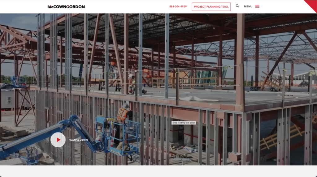
The fullscreen background video on this site immediately grabs your attention. The addition of bold and high-contrast typography makes it extra eye-catching.Yes, the guys in hardhats and high-vis vests are here too! But they’re clearly actual company employees. Focusing on people rather than buildings brings an immediate feeling of trust and authenticity.Other things we love about this construction website design:- Parallax scrolling and subtle animation effects keep your attention as you scroll down the page.
- A clear menu design linking to important pages such as portfolio and company information.
- A step-by-step project planning tool works as an effective lead capture form.
- New West Building Company
newwestbc.com
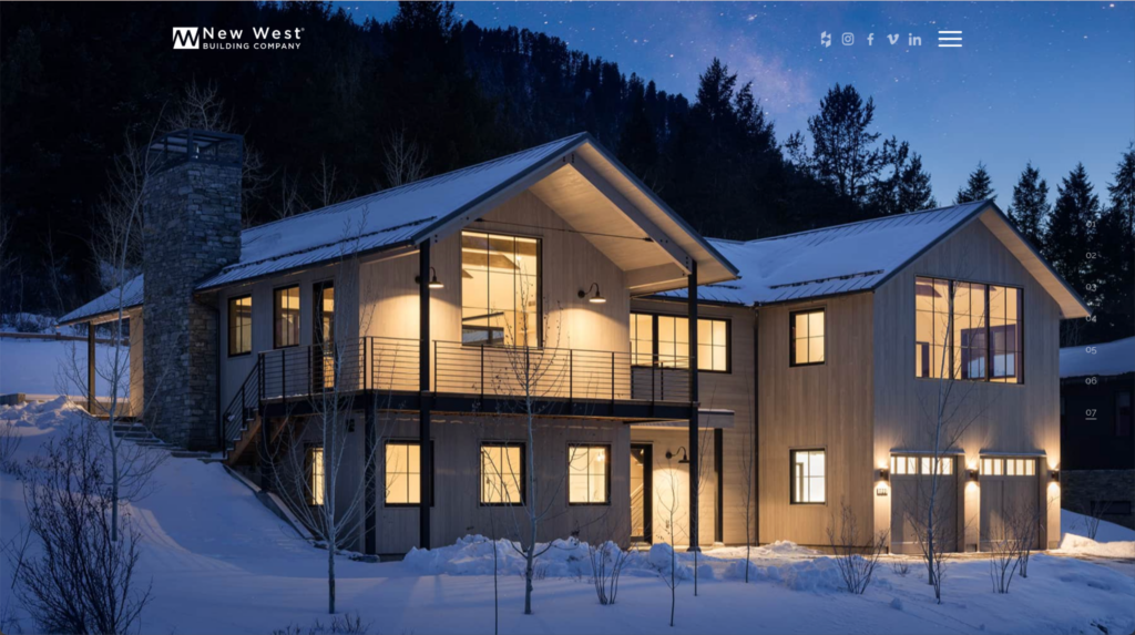
The stunning high-quality photography of building projects on this site draws you in. It makes you feel as if you’re actually in the picture. Once your site visitors start imagining themselves living or working in one of your projects, half the battle is won!Other features of this construction website idea that caught our eye:- The background images completely fill the browser. But the navigation and branding elements remain visible and exactly where you’d expect them to be.
- A simple layout with lots of white space lets the images speak for themselves.
- MATT Construction
mattconstruction.com
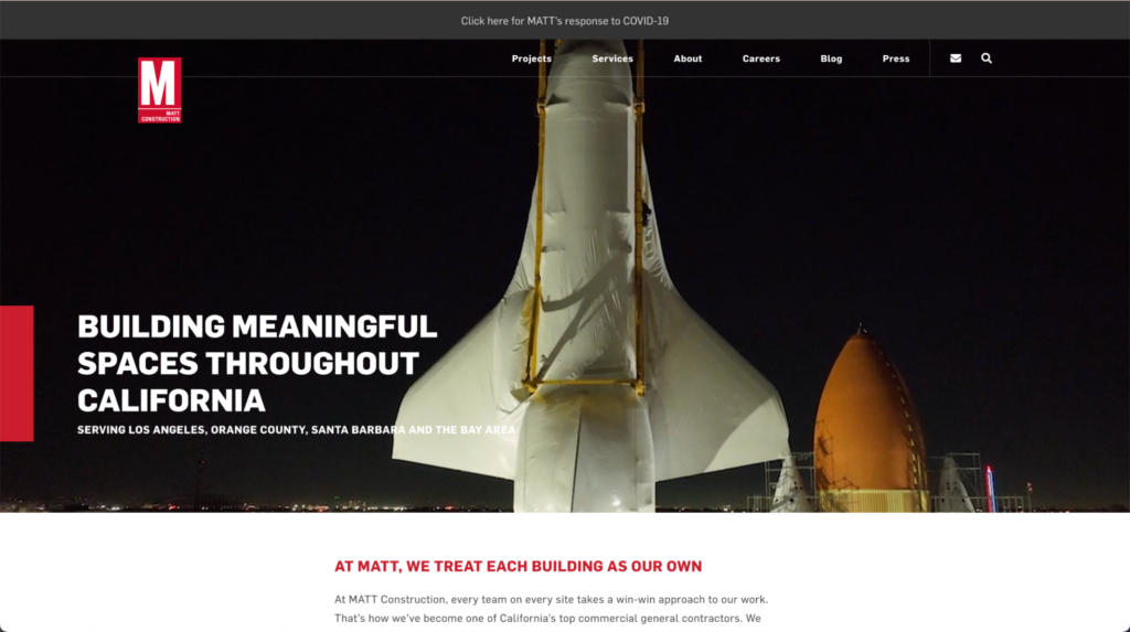
The aerial flyover videos on the background of this site would not be out of place in a Hollywood movie. Grab the popcorn; we want to see more!Once we’d stopped watching the homepage video on loop, we were also impressed by:- The bold but clean color scheme in black, white, and red is easy on the eye and creates a confident impression.
- The project portfolio, which uses clear categories and is easy to browse.
- Harper Construction Company
harperconstruction.com
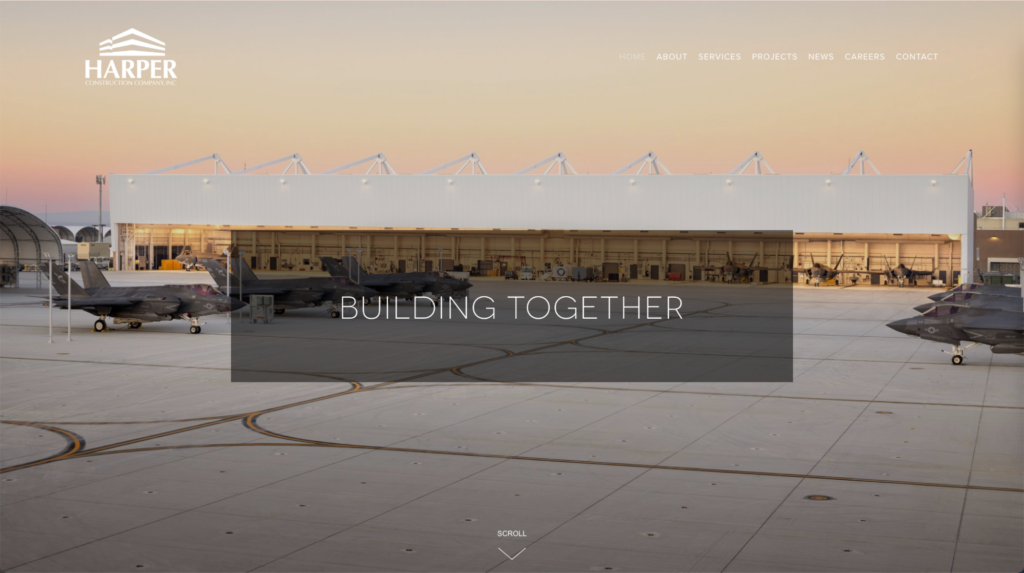
An attractive, high-quality image immediately gives you a picture of the sort of projects this company takes on.Why it works:- Minimal distracting content on the homepage keeps the focus on the portfolio images.
- The layout also uses gallery images as the secondary navigation. This reinforces the general contractor website’s focus on showcasing its projects.
- Technical Builders
technicalbuilders.com
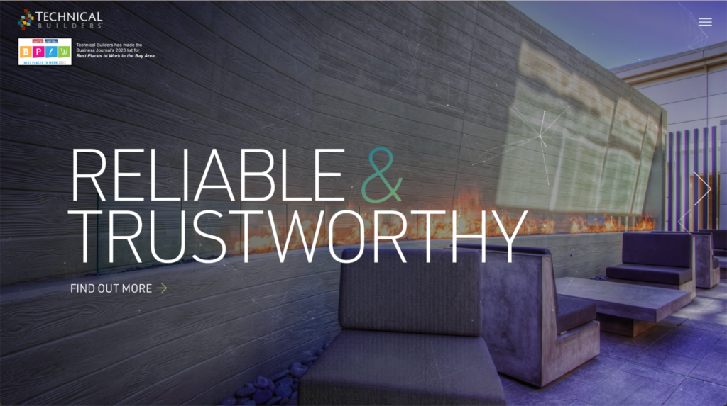
This construction website example showcases a series of unique background images with interactive hover effects. While this effect is subtle, it’s undoubtedly effective for keeping you on the page.Other things we like about this site:- The dark color scheme reflects the industrial theme of the architecture.
- The minimal elements and pop-out menu mean this site stays simple and doesn’t look cluttered.
Great menu design
- Dwell
dwellhomesla.com
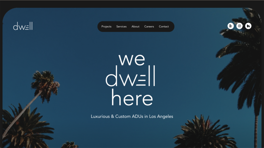
Dwell LLC uses a prominent menu to create a simple, clear, and user-friendly UX. This makes it easy to navigate around the site, and CTAs are highlighted too.Other great features of this construction website example include:- A creatively filmed homepage video showcasing the process and the results.
- Contact information and social links clearly accessible on every page.
- WMS Underfloor Heating
wms-uk.com
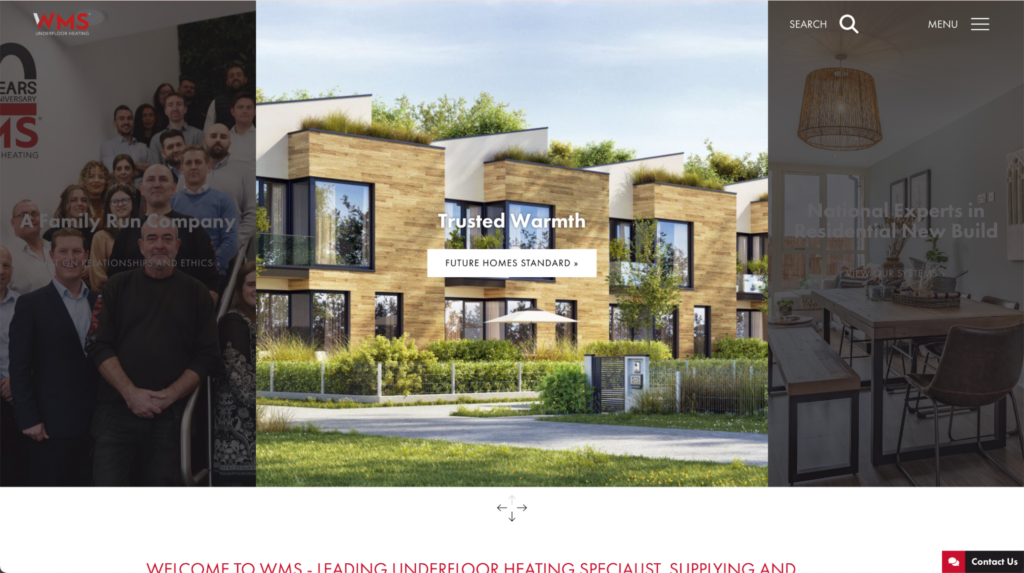
This site features a rather unique navigation system with a slide-down menu. This feature makes the site stand out from competitors but it’s still clear and intuitive to browse for new visitors.Other things we like about this site:- Featured content areas on the homepage encourage users to visit important pages on the site.
- Grid-based galleries and animated graphics clearly showcase the company’s products.
- Mrozinski Construction
mrozinskiconstruction.com
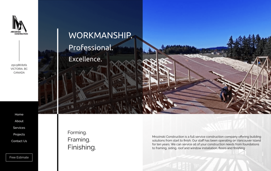 This construction website features a very light and neat menu that’s hidden away behind a button. Its simplicity is offset with animated hover effects and an unusual layout of content blocks and featured links on the homepage.On this site, we also liked:
- The birdseye-view fullscreen background video on the homepage.
- The black and white color scheme is bold and easy to read.
Awesome color scheme
- Naba Construction Company
nabaconstructioncompany.com
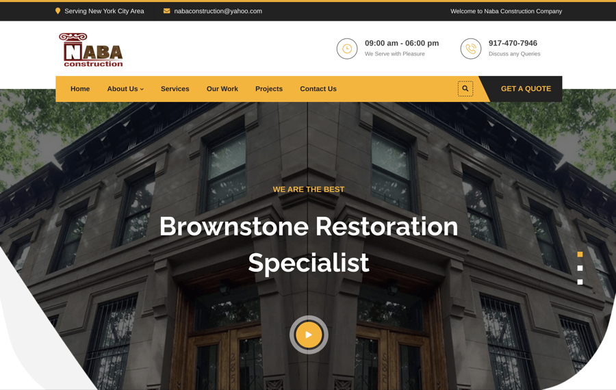 Yellow and black is a classic color scheme for construction companies and this site makes the most of it. The effect is striking and the clear typography is easy to read. In addition, the color accents help to highlight the most important information.Other things we like about this construction company website:
- Contact information and CTAs are clearly displayed above the fold.
- Subtle animation and transition effects keep the site from looking plain and help to guide users through it.
- Schimenti
schimenti.com
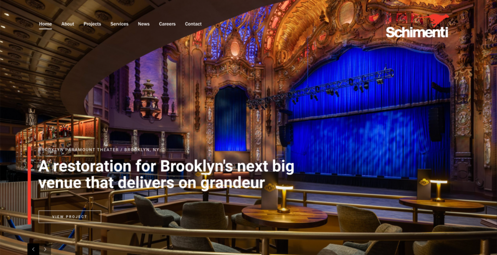
A color scheme of black, white, and red is simple and bold. Red is a very confident and strong color, and it’s the perfect choice for a construction brand.Other great features of this site include:- Fullscreen background images keep the focus on the company’s creatively designed construction projects.
- Clear typography is combined with images for an editorial effect that makes you feel as if you’re flipping through a design magazine.
- CIOB
ciob.org
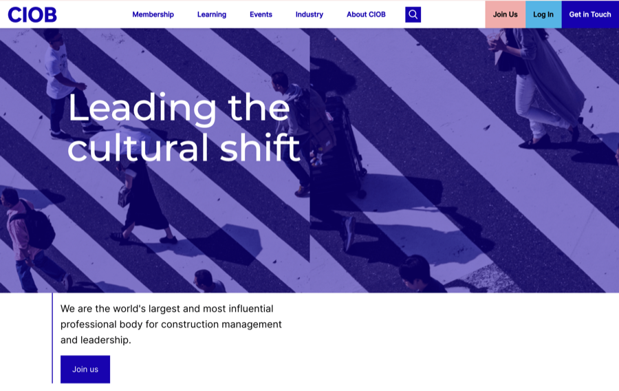 This site’s unusual pastel and bright purple color scheme immediately draws your attention. Plenty of white space and clear navigation means the colors don’t overwhelm.Other things we liked about this cconstruction website example:
- The subtle parallax scrolling effect adds a feeling of depth to an otherwise flat design.
- Offset images combined with a grid-based layout give the site a modern feel that fits with its creative industry niche.
- ADCO
adcoconstruct.com.au
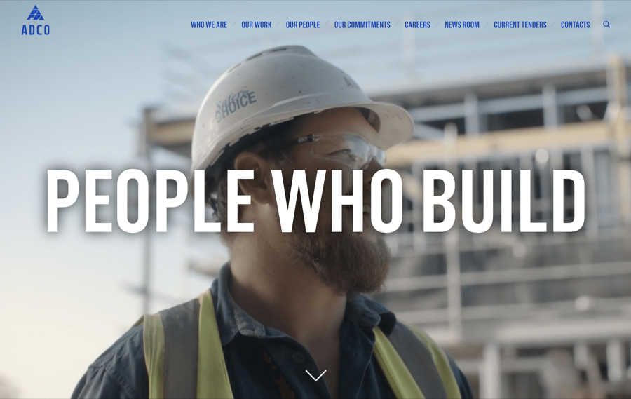 The simple color scheme of this site is professional and attractive. High contrast and plenty of white space make the site readable and easy to navigate.Other great features of this construction website include:
- The menu blends into the background at first, but scrolling or hovering over makes it instantly stand out.
- Bold typography exudes confidence and fits with the strong, masculine image of a construction brand.
Wish to avoid the pitfalls of designing your web site?
Turn your project over to the professionals at epiic.
Structured layout
- Vaughan Construction
vaughans.com.au
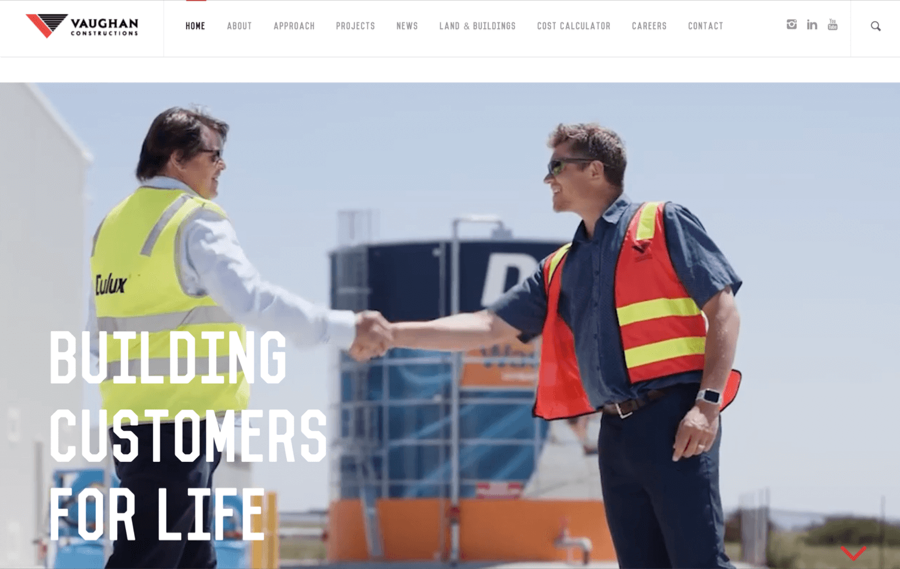 The block layout of this site makes it easy to separate different categories of content. Displaying bite-size pieces of information makes for a better user experience.We also like:
- The clear and easy-to-navigate menu.
- Subtle patterns in backgrounds reflect shapes in the architecture. This adds interest and detail, without making the text difficult to read.
- the Building Company website
thebuildingco.com
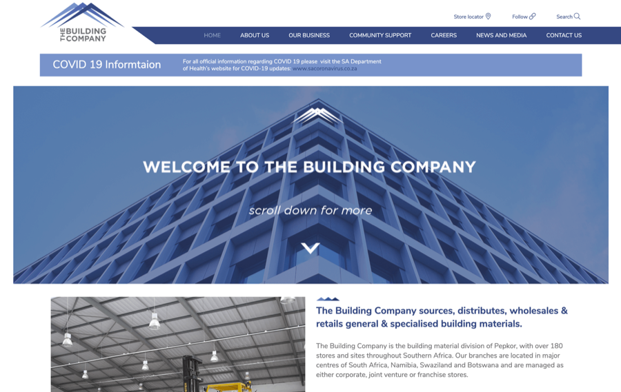 All the information on this site is separated into individual blocks, which makes it easy to navigate. The structure is simple but well-executed, with color helping to distinguish each section.Other nice features on this site include:
- A simple navigation bar that doesn’t distract from other content.
- The color scheme is restricted to the tones used in the logo for a uniform look that reinforces the brand.
- Level 10 Construction
level10gc.com
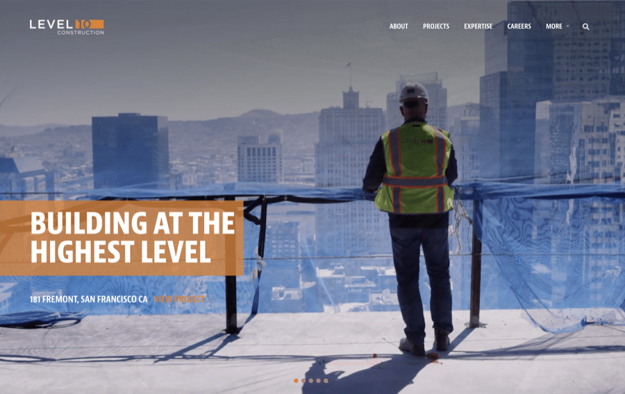 This beautifully made site uses an unusual layout that’s effective and gives it a unique feel. At the same time, it’s still straightforward to browse through.Other features of this site that impressed us:
- Images are carefully chosen to reflect the tones of the color scheme.
- A fullscreen video and image gallery on the homepage shows off the company’s latest projects.
- Client testimonials are prominently displayed to give potential customers confidence in the brand.
- Walsh Group
walshgroup.com
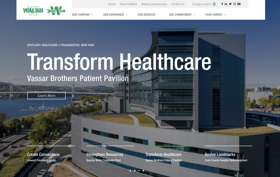 The well-constructed layout of this site means that it can display a lot of information in a way that’s not cluttered. The navigation is clear and functional, with great use of color to separate sections.Other things we liked about this site include:
- Featured projects are labeled as the benefits they bring to the community and area rather than just the project name.
- A double menu bar makes the site easy to navigate without having to scroll up and down.
Typography in design & menus
- Truebeck
truebeck.com
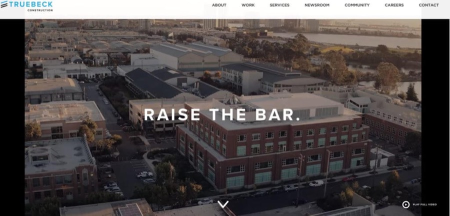 This site uses variations in the size and weight of the copy to guide the eye. This creates a minimal but attractive design that’s easy to navigate.Some other great features of this site include:
- Creative full video backgrounds that add flair while showing off the company’s work.
- Clear, simple navigation keeps users focused on the primary purpose of each page.
- Desert Star Construction
desertstarconstruction.com
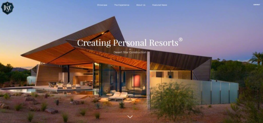 The stylish serif typeface used on this site gives an elegant feel without compromising readability. Furthermore, every block of text on the site is clearly structured and surrounded by plenty of white space to make it easy to read.Also great:
- The simple layout, which is easy to navigate and puts the focus on the images.
- A button to jump to the top of the page means that the navigation menu is always easily accessible.
- Weitz
weitz.com
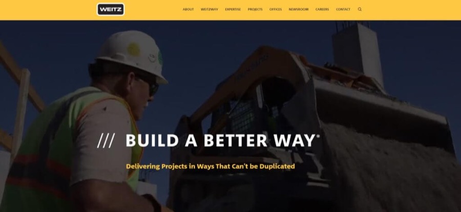 This site sticks to a single font but makes it the hero of the design with a strong weight and contrasting color. This simple approach is effective and visually striking.Some other great features on this site include:
- A bold and simple color scheme helps to create a clear division between content areas.
- A low contrast background video provides visual interest without overwhelming the content.
If you’re ready to scrap the checklist and call in the experts, you can try out our epiic design service for free: web design, logos, graphics and more.
All of this for a flat monthly fee.
To have a pro-grade designer back up?
It’s more affordable than you might think!
Awful construction website design examples (Do NOTs)
So now we’ve inspired you to think about all the fantastic things you can do to make your website stand out. But what happens when you get it wrong?
A poorly designed or ugly site is off-putting to visitors and potential clients. Remember, your website will be the first time many people come into contact with your company, so it’s essential to make a good impression.
We don’t want to pick on anyone. Still, the examples below have some common design mistakes we see on construction websites across the board. Don’t make these same blunders!
- Cramming in too much content
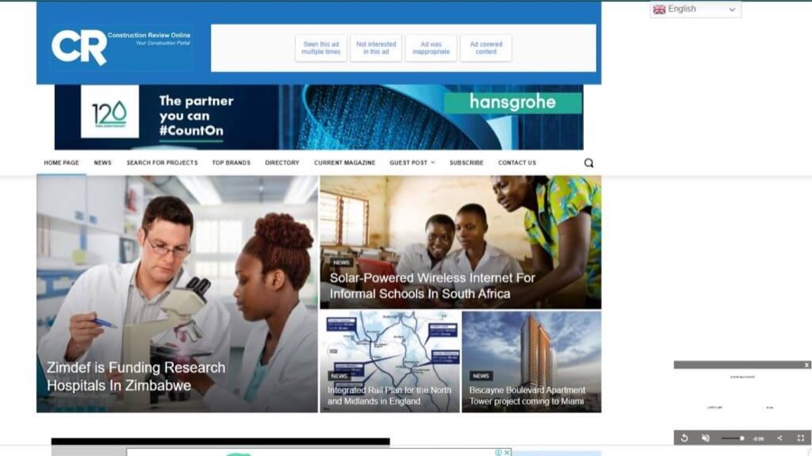 This site suffers from common problems that we see in magazine-style sites. First, it’s trying to display too much content in a cluttered layout with multiple columns and a busy design.Advertising banners take up almost half of the above-the-fold space, pushing the main menu down the page. It’s also not even clear what this site is about at first glance.
 - Lack of visual impact
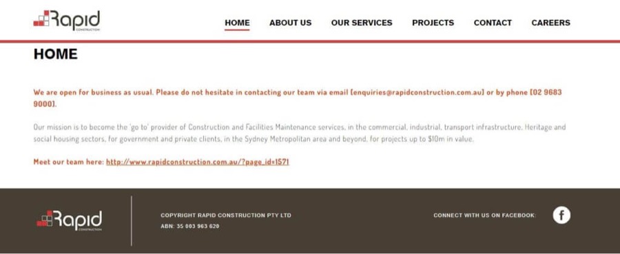 We almost don’t need to explain why this site is bad – it has no visuals at all! While text-only websites are valid for some purposes, this one simply looks like it’s broken or still being built.This unfinished feel continues in the copy with entire email addresses and URLs being pasted in instead of linked to with relevant text.Despite this site being completely text, there’s very little useful content on it. It’s surprising that Google has bothered to index it.Please, don’t do this to your site! It’s better to have no web presence at all than one that you’ve obviously thrown together in five minutes.
 - Dull design with weak visuals
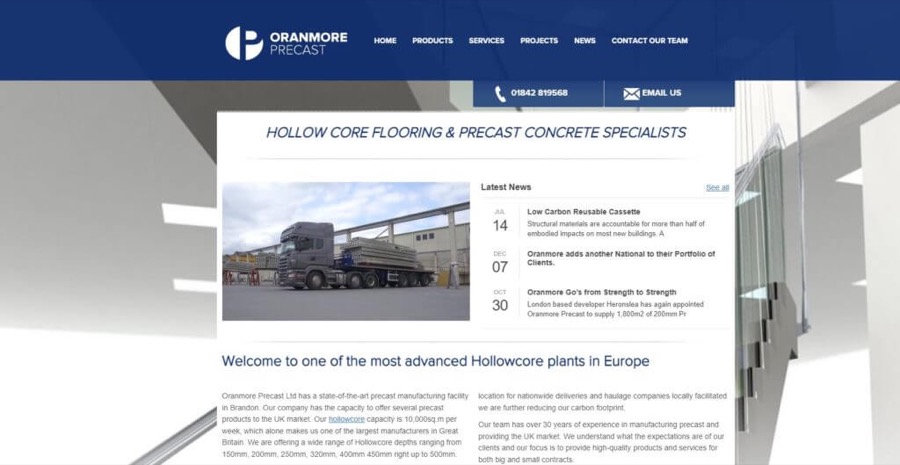 This site looks more like a company newsletter than a marketing tool to entice new customers. There are no CTAs, the service descriptions are unclear, and it doesn’t give any real reason for a user to stay and explore the site.It’s an easy excuse to say that concrete flooring is not exactly an exciting subject. But this site could be massively improved with some decent photographs and content written by a professional copywriter.
 - Irrelevant images
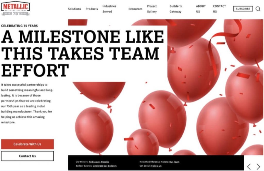 No, we haven’t got confused and included a children’s party planner in this round-up. But we’re not sure what balloons have to do with construction either.The menu on this site is also poorly designed, with text wrapping onto two lines. Overall, it’s difficult to navigate and an unpleasant user experience all around.
 - Outdated design
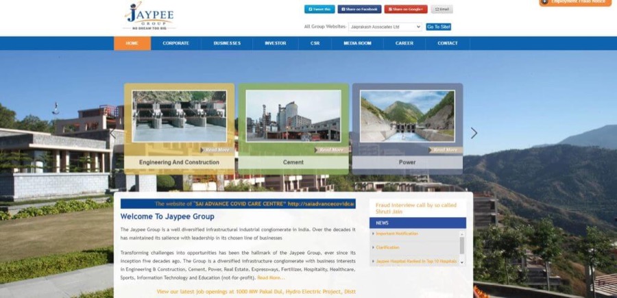 With its narrow column design and scrolling marquee text, this site looks like it hasn’t been updated for 20 years. There’s also no color scheme to speak of, and the site design is dull and uninviting.
 - Absence of Call to Action (CTA) buttons.
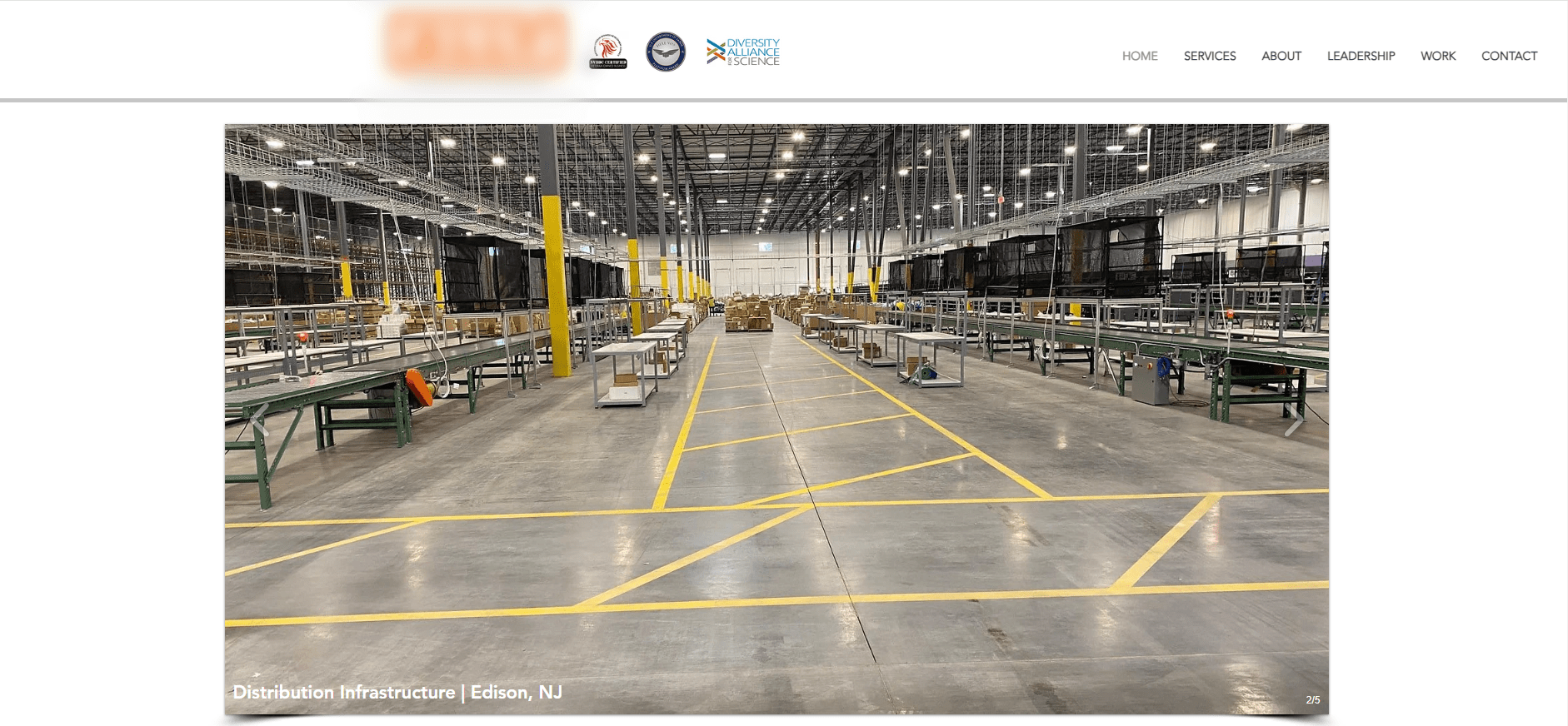 This website lacks clear “Call to Action” (CTA) buttons, making it challenging for visitors to know what steps to take next. Without these buttons, there’s no straightforward way for users to inquire about services, request information, or initiate contact. Adding prominent and clear CTAs is crucial to guide visitors and encourage meaningful interactions on the site.
Don’t make the same website design mistakes!
Get your site designed by professionals.
Construction website design key takeaways
Sounds like a lot of work doesn’t it? If you’d rather have a professional take care of everythingIt is. Good web design takes time and a lot of effort. Luckily, there’s no need for you to call up your clients and tell them their construction projects are on hold for a few months while you’re busy building your website.
The best construction websites have simple, clean designs that are easy to navigate. Visitors should quickly understand what sort of construction projects you take on and what you can offer them.
Your site must include high-quality visuals of your completed projects. Make sure you invest in professional photography and videography. This can make a massive difference to your site’s overall look and feel.
A great website should also be mobile-friendly and look good across all devices.
There are a couple of options here. First, if you decide to go the DIY route, you can use a website builder and pre-designed template. However, this will limit your ability to customize your site, and it will probably look a bit generic.
A better option is to hire a web designer or agency that specializes in website design for construction companies. This way, you can get a completely bespoke solution.
Professional construction company web design prices vary a lot depending on several factors such as:
- The experience and skill of the designer
- How many hours they spend on your project
- Whether you’re looking for design only or a complete solution.
On average, you can expect to pay an upfront charge of around $6,000 with ongoing maintenance costs of approximately $1,000 a year.
Some of the main pages that visitors expect to find on a construction website include:
- Our Work/Projects – a portfolio of your completed projects with plenty of photos and detailed information about each
- About Us – a page detailing the history of your business and the people behind the brand
- Services – a list of all the services you offer
- Contact Us – an easy way for visitors to get in touch with your business and request a quote or more information
- Blog/News Section – an area of your website where you can publish helpful and interesting content and keep visitors up to date with your latest news
- Other – you might want to include pages for vacancies/careers, awards & recognition, media mentions, and testimonials. Make sure to include terms & conditions and privacy policy pages for legal reasons, and don’t forget to link to your social media pages!
Jan 14, 2025



Andy Zenkevich
Andy is a seasoned CEO with years of hands-on experience in SEO, link building, content marketing and website development. His deep understanding of the digital landscape and passion for content marketing make him a trusted voice in the industry.