An on-point brand style guide will help you create a consistent experience for customers. Something solid they can sink their teeth into and remember. 🤓
The problem is, if you don’t get your brand guidelines right, you’re going to struggle to create a lasting impact. A poorly defined style guide can also dilute the return on investment for every marketing and ad dollar spent because your brand identity will be hard for customers to grasp.
This is why it’s important to know what you’re doing when putting together a style guide for your business or clients.
When you understand the essential components you need to have – and once you view our powerhouse style guide examples – you’ll have all the insights you need to create a solid branding rule book.
So let’s dive into everything you need to know about brand style guides. This article covers what they are and what to include in yours.
What Is a Brand Style Guide?
A style guide is a compilation of all the details a brand uses to define itself. It includes visual components, such as the logo, brand colors, and font choices. But the style guide covers more than parameters for graphic design. It also establishes the voice and personality you want people to perceive when interacting with your brand.
With clear brand guidelines, you can create consistency at every touchpoint, from a website visit to a pop-up shop. Basically, your style guide establishes the perception you want customers to have when they engage with your brand in any way.
Why Branding Matters
When you make this perception consistent, easy to digest, and relevant to your target audience, people start to develop familiarity. You create a recognizable identity that customers remember, and ideally, feel an affinity for.
Which is the end goal you want to achieve with your branding.
Look at it this way: What helps a brand stand out in the crowd? According to advertising iconoclast Bob Hoffman, it’s familiarity. How recognizable your branding is determines the power of your marketing and advertising efforts.
Hoffman argues that familiarity trumps everything, including brand meaning, values, and even differentiators.
And he’s got a point! Most people know a brand’s name, colors, and logo. But they probably have no idea what distinguishes one company from its competitors.
Think: Coca-Cola and Pepsi; Nike and Reebok; Bank of America and Citi… What’s different? The brand! 🤓
This is why it’s crucial to nail your brand style guide.
With solid guidelines, everyone who creates content for marketing or advertising purposes has a set of guidelines to follow. Essentially, all of your creatives are on the same page.
Who Needs a Style Guide?
Every type of business in every industry needs one. B2B, D2C, or XYZ. 😉 Solopreneur or international enterprise. It doesn’t matter. Every entity must have a brand people can recognize, so everyone needs a brand style guide.
5 Key Components of a Brand Style Guide
Whatever your brand’s identity, your audience should get a feel for it the moment they see your ad, pick up your product off the shelf, land on your website, or walk into your office.
To make this happen, you need more than a list of attributes. You need to create a holistic identity that brings together all the things that define what you offer, why you’re in business, and who should care. Company vision, brand personality, target audience – throw it all in!
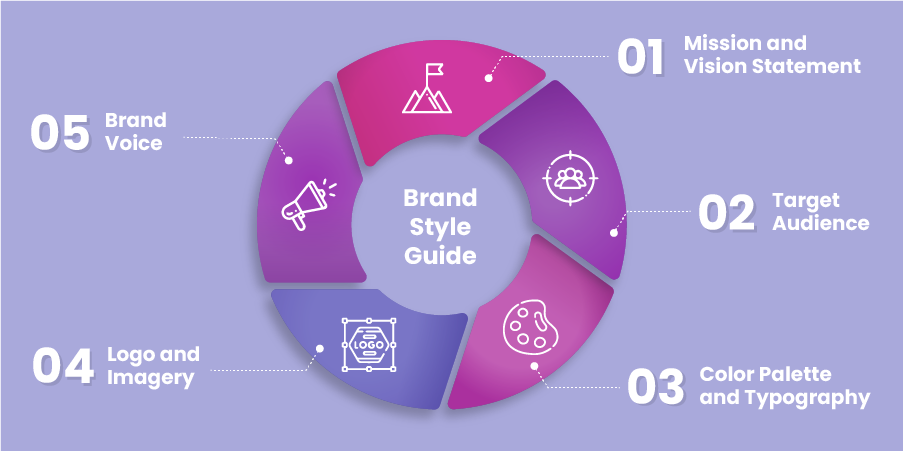
Let’s unpack the five key components you should include in your brand style guide.
1. Mission and vision statement
Aside from making money, why are you in business? The answer to this question is your mission statement.
What impact do you want your brand to have on your community, industry, customers, or the world? The answer here is your brand vision.
Both of these elements make up the roots of your brand story. It’s your reason to be and your dream for the future. Your mission and vision statements reveal what your brand stands for – and why your customers should stand behind your brand.
2. Target audience
Your target audience are the people who fall within the parameters of your ideal buyer. There’s a reason it’s so important to define your audience. If you want to resonate with your customers, you have to know who you’re speaking to.
What are their pain points? What matters to them? Where do they live? Who are you trying to connect with through your marketing messaging and branding?
The answers to these questions describe your target audience or buyer persona.
3. Color palette and typography
Your color palette is the set of colors your business uses on all branding materials. The logo, website design, packaging, social media graphics – you’ll use the same handful of colors everywhere.
The same goes for typography. You don’t want to use a handful of fonts – this will confuse your audience. It’s also best to avoid decorative fonts, no matter how much you love the way they look. It’s hard to read fonts with lots of loops, decorative curls, and other detailing.
Being consistent with these two components will create a sense of familiarity. And this will make it easier for customers to recognize your brand.
4. Logo and imagery
Your logo and brand imagery are the visuals that represent your brand. As a whole, they should create a clear aesthetic impression.
The logo is the most critical image your designers will make. It may appear simple or minimalistic, but every nuance of the logo is meant to speak volumes on what your brand means.
Open-minded, innovative, edgy, high-end, family-friendly: whatever your brand’s personality is, the colors, textures, font, and style of the logo should match.
Brand imagery refers to all the images that you might use across various digital and print assets. It includes social media designs, charts and graphs, the image and layout of your letterhead and company business cards, videos, infographics, and designs you use on your packaging.
These elements will convey a specific set of feelings and subconscious messaging. Also, they should complement one another, at least loosely. So, if you put all of your images on a board, they will look good together because they have the same colors and aesthetic feel.
5. Brand voice
Your brand voice is the tone and style that comes through in all your messaging.
Another way to look at a brand voice is to view it as your brand’s personality. Do you want to come across as quirky and fun? Elegant and sophisticated? Serious and trustworthy?
How your target audience perceives your brand impacts the experience they will have. It also determines if the right people – the type of people that fit your buyer persona profile – will have the impression you want them to have.
One thing you’ll notice when putting your style guide together is that these are interdependent parts. Who your target audience is determines what your color palette should be. Your logo and brand imagery will convey your mission and vision statement. Often in subtle ways, but that core sense of identity will always be the same across all elements.
This can be difficult to pull off without an outside perspective – which is why many businesses get help when creating their brand guide. An experienced branding professional will have an objective view of your business and combine it with your input and insights. This enables them to craft a style guide that truly reflects your brand.
At Epiic, we create on-point brand guides for businesses of all sizes.
Take the complexity out of the equation. 🤓
How to Create Your Brand Style Guide in 3 Steps
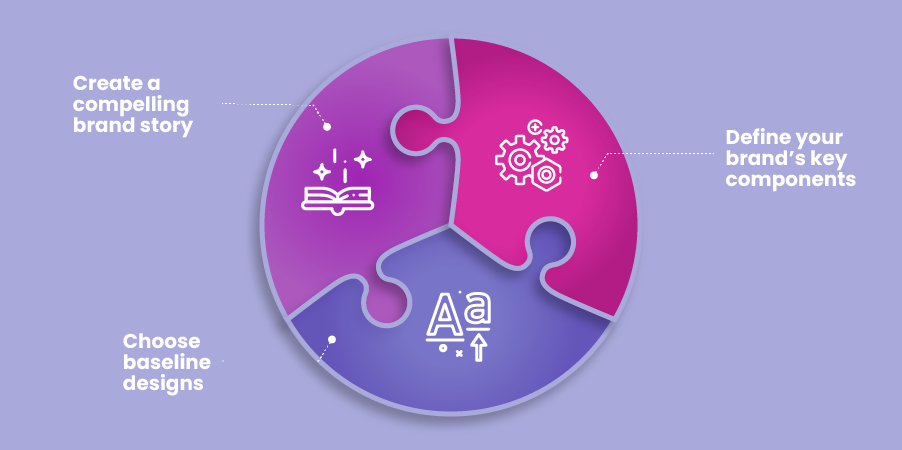
While there’s a lot of ground to cover when creating a guide, you can break down the process into three digestible steps.
- First, create a compelling brand story. This is where you let your target audience know why they should care about your brand.
- Second, define your brand’s key components. Dive into the details of your mission statement, target audience, color palette, and the other pieces of the puzzle.
- And finally, choose baseline designs that effectively express your brand’s personality. These primary designs serve as the guiding examples. They should help your graphic designers understand the brand aesthetic.
1. Develop your brand story
Essentially, the brand story covers your core values, mission, goals, and history. Some of the information in your brand story will overlap with your mission and vision statement.
But there is a distinction: the mission and vision statements will be one or two lines that succinctly describe your purpose. The brand story is the full story of your brand. It’s where you’re providing the context for all the individual components of the brand style guide.
There’s no rule book that describes what to include in your brand story. An emotional backstory. Illustrations, statistics, quotes from the founder. Short and sweet. Long and fact-based. Anything goes. In fact, how you craft the story says even more about the who, what, and why of your brand.
While the approach you take is unique to your brand, there are a few tips you can use to develop a compelling brand story.
- Show don’t tell. Include the things your business has done or is doing to back up specific traits. For example, instead of saying: “We’re a green brand that focuses on sustainability!” – talk about how you only use recycled packaging. Describe the steps you take to reduce energy consumption at the office. Or list the green initiatives you support.
- Use storytelling techniques. Who are your supporting characters – your founders, your customers? What’s their main conflict – no worthwhile products on the market, the need for someone better, the need for a simpler process? What’s the setting – where do your founders develop their great idea, or where are they helping customers – at home, in the office, in schools?
- Create tension. This is where you dive into the interplay between the unique personality of your brand – the story’s hero – and the supporting characters, the main conflict, and the setting. Because your brand has a specific set of personality traits, it will act a certain way in your brand story. For example, as an innovative brand, to solve a market need your founders will pour resources into research and development. Maybe they search far and wide for the best innovators in the field, or they spend years trying new iterations of a product to create the one that’s perfect. The details depend on your brand personality and the details of your story.
Once you have your brand story, you have the context that sets the stage for the rest of your style guide.
2. Define your brand’s key components
Your next step is to define the key components for your brand style guide:
- Mission & Vision Statements
- Target Audience
- Color Palette & Typography
- Logo & Brand Imagery
- Brand Voice
Let’s dive into actionable tips to help you flesh out each of these components.
- These can’t be empty words or your brand will appear inauthentic.
- They should explain the why and what of your business. So you’ll want to dig deep, consult with your team, and make your mission and vision statement really count.
- To give weight to your statement, favor concrete details over vague concepts.
- Be detailed – include demographic information, needs, wants, preferences, and more. The goal is to describe a three-dimensional persona people can envision.
- Update your buyer personas periodically. The reality is, your target audience will change over time, so you need to revisit this part of your style guide. The goal is to always ensure it reflects your actual customers.
- The best way to find out more about your customers isn’t to look at data on Facebook or another third party. To learn about your audience, talk to your customers. Send out surveys, listen to their feedback, and pay attention to conversations on social media.
- You can’t change your brand colors when the wind blows, so pick the best colors and fonts to represent your brand from the get-go.
- Consider how colors impact the way people feel when picking brand colors. If you’re not sure where to start, check out this guide to color psychology.
- You want enough colors to give your design teams flexibility. But don’t go overboard and confuse your audience. For color palettes, the happy medium is up to three primary colors and up to four or five secondary colors.
- The same goes for fonts. One main font is enough. You can choose one or two secondary fonts as well, including a script or decorative font to bring some of your brand imagery to life.
- Clean, simple, and traditional typography, such as serif fonts, Helvetica, and Times New Roman, is ideal for your main font. They are easy to read, allowing your audience to focus on the messaging conveyed in your designs.
- As with your colors, choose typography that reflects your brand’s personality. For example, Monotype Corsiva works well for luxury brands, but it’s not a good fit for a vegan ice cream shop.
- Draw upon the rest of your brand style guide to direct logo and brand imagery creation. What your mission and vision statements say, who your target audience is – these factors determine the aesthetic and feel you want your images to convey.
- Use enough empty space to make sure your logo looks clean. As this will be your brand symbol, ideally, for decades, it needs to be timeless. Avoid making your logo look too cluttered, too colorful, or too complex.
- With your brand imagery, be consistent but be flexible, too. You’ll mainly use the colors from your brand color palette. But don’t be afraid to branch out when other colors or typography can benefit a design. Know when to break the rules and use a design that contrasts or clashes with the rest of your brand imagery.
- Use a professional graphic designer or a pro design team to ensure your designs are high-quality and can convey the spirit of your brand.
- Be descriptive with your brand voice document. Include brand phrases, personality, vocabulary, and examples of designs that demonstrate your voice.
- Make it unique and true to your brand’s personality. If your brand voice feels generic, people are less likely to pay attention.
- Likewise, if it clashes with the rest of your brand persona, it will turn people away. For example, if your brand is professional and traditional, your graphic design shouldn’t be humorous. Likewise, serious statements, no matter how profound they might be, aren’t a good fit for a fun-loving brand.
- Make sure your brand voice is distinct from your competitors’. Research the main players in your market to check that yours doesn’t overlap with a competitor. This will help your company stand out in your niche.
- While these key components are vital to your branding, don’t get lost in the details. Focus on the essence of each. This gives your graphic designers space to create content that works for each specific project. And it prevents too many rules from restricting creativity.
3. Choose your guiding examples
Guiding examples are also useful. For visual learners, a list of brand personality traits and a color palette aren’t enough to convey the brand aesthetic.
That’s where guiding examples come in.
Take your best designs – the ones that best represent your brand – and include them in your style guide. These examples can serve as a reference for anyone creating content for your brand.
And, unlike your style guide’s key components, your examples might change. You might update them when your graphic designers create better representations of your brand. Or, as your marketing teams determine certain designs that better resonate with your audience.
On-brand designs will help all your creatives – writers, videographers, graphic designers, UX designers, event developers, and everyone else – get a better feel for your brand.
This is critical. Ultimately, the more context and clarity your style guide provides, the better work your content creators will produce.
Ready to take your branding to the next level? 😉
Book a demo today and discover what we can do for you.
6 Must-See Brand Style Guide Examples
To help you get started, we’ve selected some of the best brand style guide examples. These style guides do an excellent job telling the brand’s story through visuals and essential information.
But what’s also great about them is the way they’re organized. The colors, imagery, typography, and other info are laid out in a way that’s clear and easy to digest.
So here they are – the brand style guide examples you have to check out.
1. Wolf Circus Jewelry
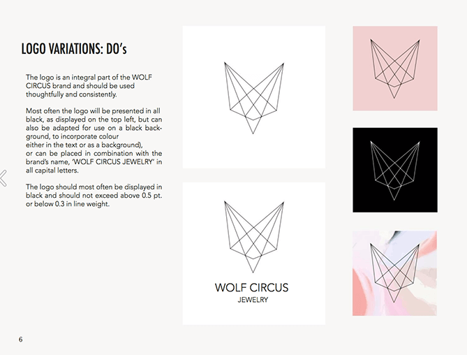
The Wolf Circus brand style guide is image-forward. This visual approach makes it easy to flip through the pages and immediately recognize the brand’s aesthetic: an edgy yet elegant feminine feel underpinned by a clean, earthy beauty.
The logo is a wolf head with a crystalline form. Right there, you get a sense of a deeper, nature-based luxury. It’s handmade jewelry that means something.
The color palette includes three primary and three secondary colors. And then the style guide details when and how to use the colors.
Same thing with the typography. Wolf Circus’s branding team sets out the essential points in the style guide – the when, why, and how to use each font. These concise text explanations next to the visual examples bring everything together. As a result, this style guide conveys a lot of information in a small space.
What else we liked:
- The pervasive minimalism – the brand clearly wants to use understated imagery to let the products shine.
- There’s a helpful Do’s and Don’ts section that shows (not tells) what type of imagery is okay to use in promotional content.
2. Barre & Soul Yoga and Fitness
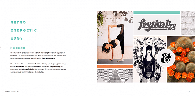
Barre & Soul kicks things off with a mood board. This is an excellent technique for getting across a holistic view of the brand’s aesthetic.
What’s great about this style guide is that the information is in-depth, so there’s no room for uncertainty. There is a lot of focus on logo presentation – how to use it and what not to do. This gives designers the clarity they need to nail the branding on all Barre & Soul promotional material.
Also brilliant:
- Instead of opening with a brand mission and vision statement, there’s a series of taglines tucked into the middle of the style guide. This gives the messaging more potency.
- The opening and closing of the style guide are personal and invite communication. This not only supports a collaborative design approach, but it also captures the nature of the brand – social and communal with a “let’s do this” attitude.
3. Love to Ride
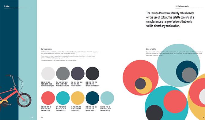
Love to Ride is an online cycling community that works to encourage more people to bike. Because it’s in a very small niche – cycling groups – the style guide has to work a little harder to explain the purpose behind each component.
Love to Ride pulls this off in a way that looks effortless – like riding a bike!
The bright colors and fun imagery in the guide take you on a journey. With this style guide, by the time you get to the end, you get a clear picture of what Love to Ride is all about.
What’s also great:
- The humor interwoven into the style guide is spot on. Using humor shows designers how fun and lighthearted the brand should appear.
- Love to Ride doesn’t stick with a small number of brand colors. But, it does use a versatile color palette that can be combined in almost any combination.
- This style guide includes a wider range of brand examples than usual. App screens, email newsletters, bus ads, business cards – it’s all on display.
4. NASA’s 1975 Graphics Standards Manual

NASA’s Graphics Standards Manual is a 220-page document that details the agency’s graphic design rules. This may be too much information for a typical style guide. Still, it’s worth exploring because of the insights it offers into one of the world’s most fascinating brands.
There’s a lot of info, but the actual branding visuals are minimalistic and streamlined. NASA uses a simple color palette and sticks with a sleek design style. The style guide even documents how to position the logo on spacecraft so it’s visible from land or space.
What else is cool:
- NASA’s use of red. It’s everywhere. Not just for the logo, but the bright classic red should be used on forms, vehicles, and advertisements. To take ownership over such a traditional color is a bold move, and shows just how confident the agency is.
- This document is from nearly half a century ago – yet the visual presence of NASA has barely changed.
5. Scrimshaw Coffee
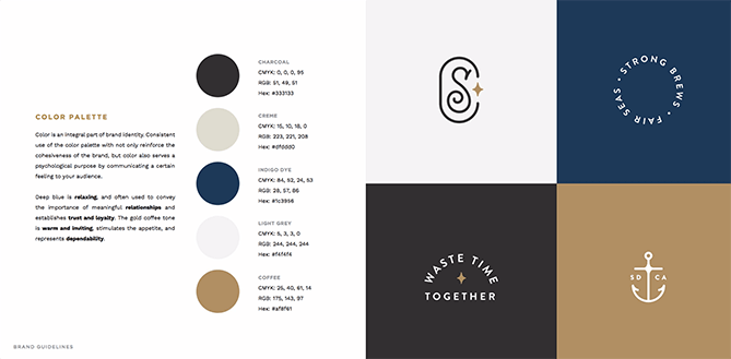
Vintage typography, a masculine color palette, and a laid-back hipster vibe all come together to tell Scrimshaw Coffee’s brand story.
Scrimshaw has an attractive and on-point logo for a San Diego coffee shop. But the brand guidelines take things a step further with secondary logos. It’s risky – customers have to get used to a handful of logo images. But, with a coffee shop that uses a lot of promotional materials, from t-shirts to whale pins, it works.
What else we like:
- The thoughtful use of photography and clear instructions. There are rules for what should go in the photographs, the depth of field, and even the aesthetic feel. This will help the graphic designers create a uniform feel.
- The font choices are perfect for the nautical, friendly but mature brand voice.
6. Alienware
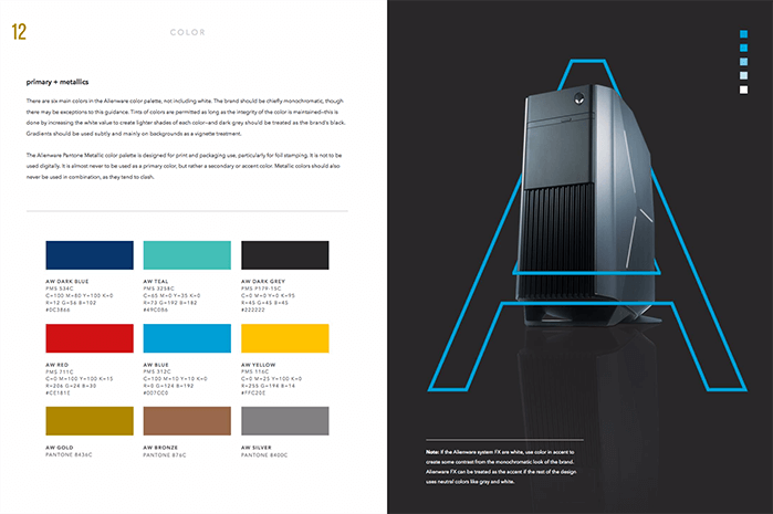
Alienware starts strong with a deep dive into the brand’s target audience. It then moves onto a profound mission statement.
This signals to art directors, graphic designers, and other creatives that this brand is serious about image. The rest of the style guide keeps the bar high. You’ll find clear rules for the logo and its variations, the color palette, and the other key components.
Why else this is a good brand style guide example:
- Alienware explains nuances that a lot of other brands leave out. For example, how the call to action should look and when to use different weights for the fonts.
- For the photography section, the style guide encourages photographers to push boundaries. With the freedom to use innovative techniques and creativity, they can achieve stunning images. But more importantly, they will evolve the brand image. This is a unique approach to branding that will help Alienware stand out now and in the future.
Creating a style guide is an art form in itself. The challenge is to strike a balance between detail and flexibility. You want to set parameters for what’s essential without drowning out your brand voice with too much noise.
The best part? There’s an Epiic design plan for every budget.
Set Your Brand Apart with a Professional Style Guide
Stop piecing together your brand image one design at a time. Bring everything together – your logo, brand imagery, color palette, and voice. Then you can establish the who, what, and why behind your company with a cohesive visual presence.
This familiarity is the key to building relationships with your customers. Once you set that strong foundation, there’s nowhere to go but up.
Feb 17, 2022


Andy Zenkevich
Andy is a seasoned CEO with years of hands-on experience in SEO, link building, content marketing and website development. His deep understanding of the digital landscape and passion for content marketing make him a trusted voice in the industry.